TravelWith | iOS App Design

Thomas Meijer

$6.2K+ earned

Redesigning Travel With

Overview

TravelWith had a strong foundation. The app was already thoughtfully designed and well-structured. My challenge was not to start from scratch, but to refine and elevate. The goal was to make the experience feel even more native, intuitive, and seamless for iOS users.
TravelWith is a personal travel companion app that helps users organize and manage every part of their trip. I joined forces with Mike, the developer and creator, to continuously improve its design. Through weekly tasks managed in Linear, we tackled interface refinements, new features, and deeper iOS alignment.
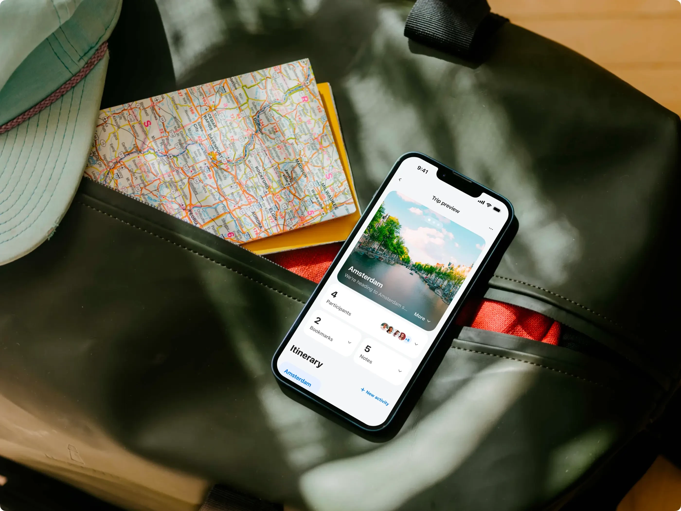
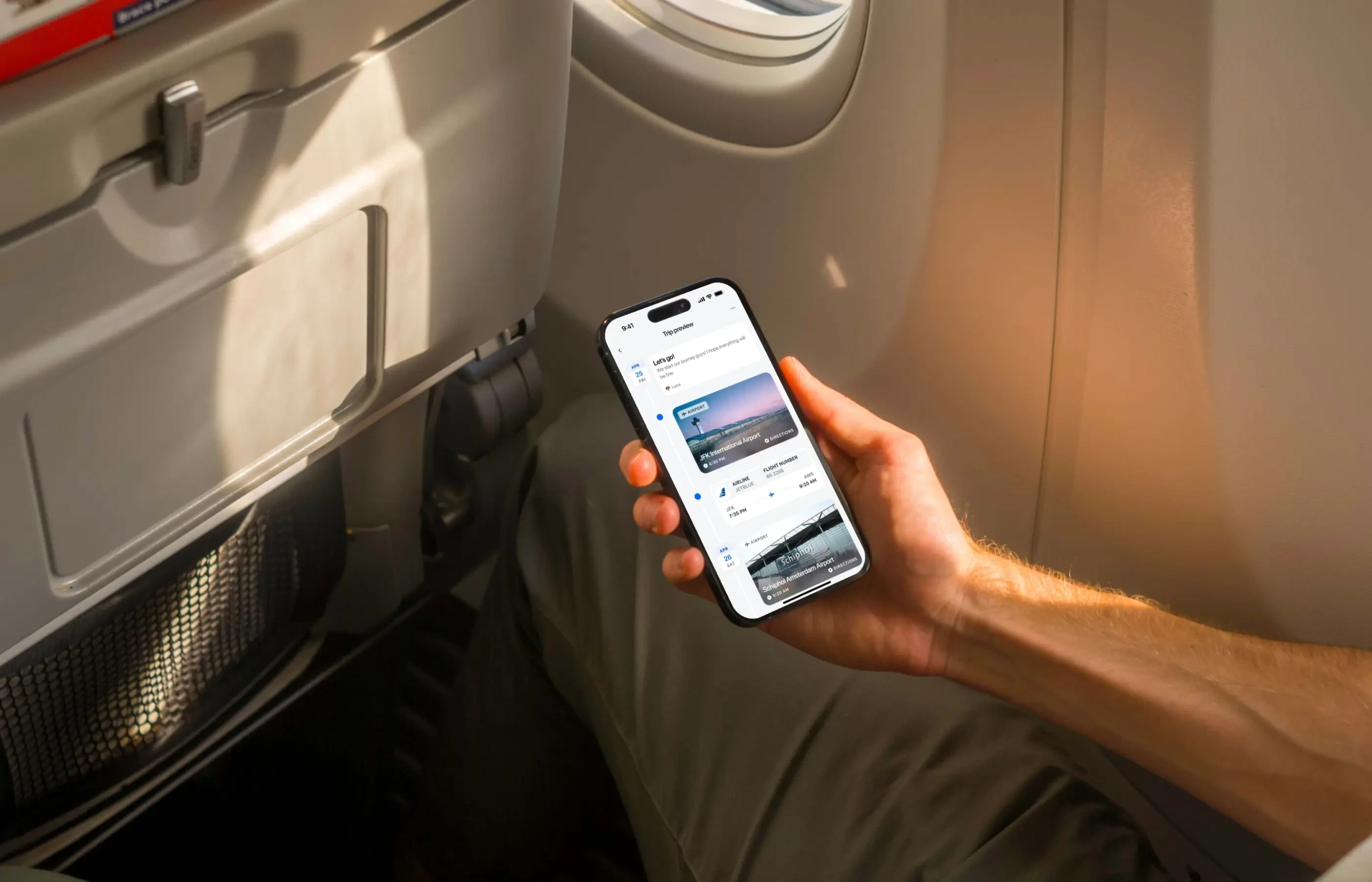
TravelWith Flight Detail Screen

Our Approach

We followed a user-first philosophy. Every design decision focused on making the app easier to use, more helpful, and visually consistent with iOS patterns. Apple's Human Interface Guidelines were our north star. Through ongoing feedback, regular design reviews, and quick iterations, we shaped a product that feels native yet distinctive.

Key Focus Areas

Itinerary Management

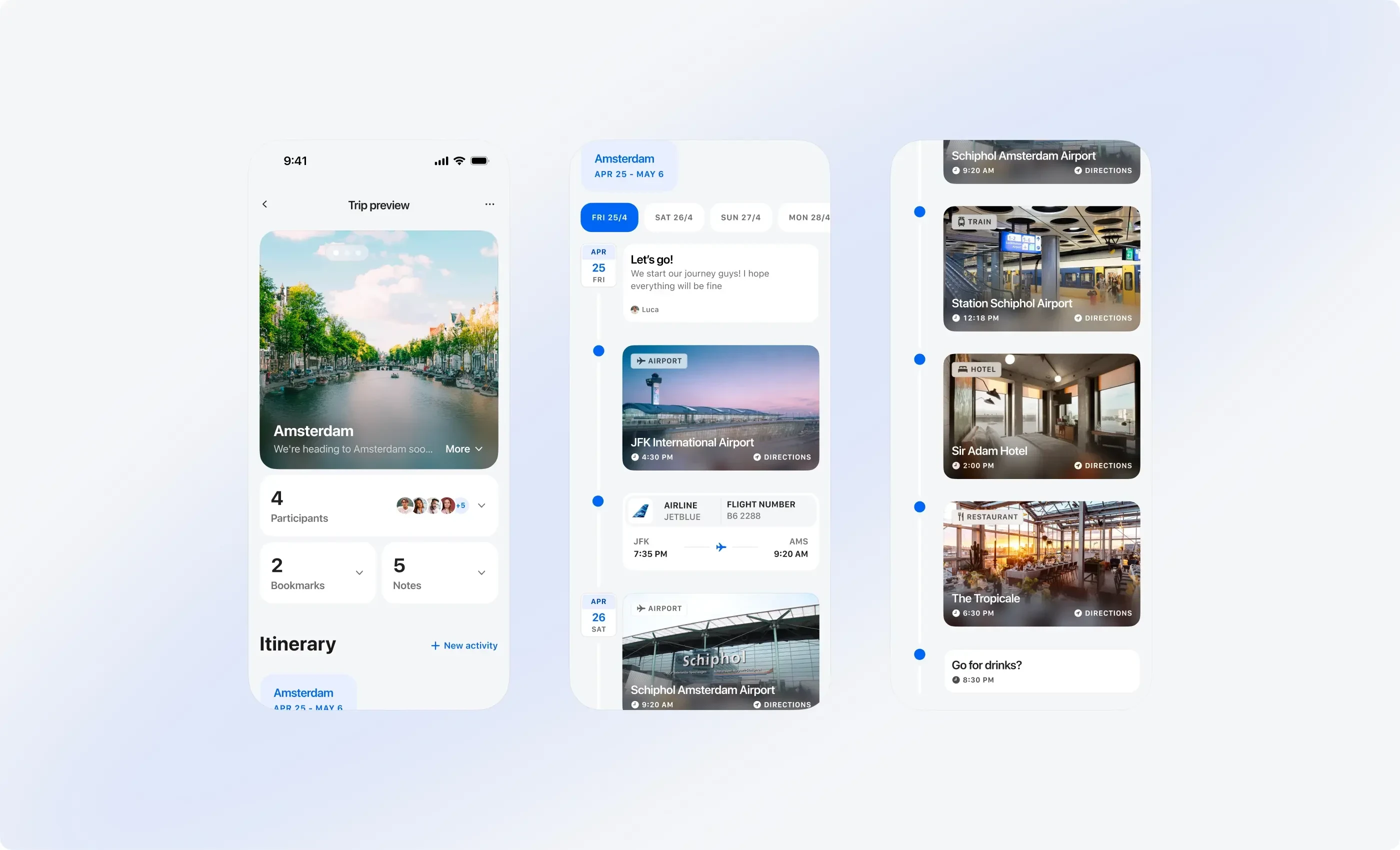
All-in-One Overview: Users can view flight details, hotel bookings, and activities in one organized space
Offline Mode: Key information remains accessible without internet, essential for travel

Collaborative Planning

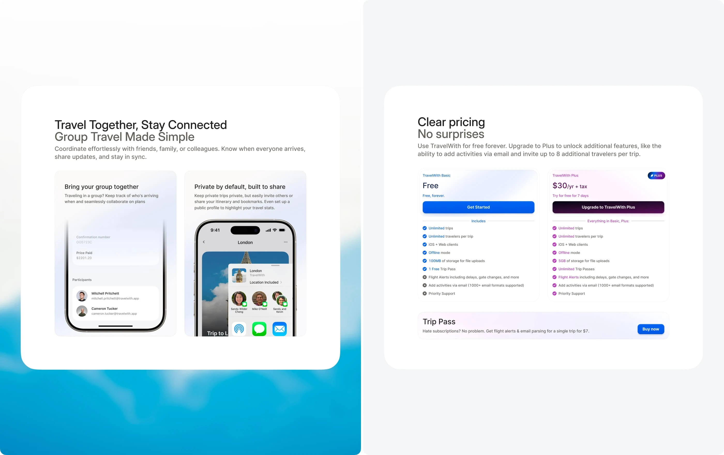
Shared Trips: Users can give friends and family access to trip details, keeping everyone on the same page
Real-Time Sync: Updates appear instantly across shared devices, reducing confusion and miscommunication

Personalization

Wishlist: Users can save destinations, ideas, and experiences for future planning
Interactive Notes: Each itinerary supports notes and comments, improving team communication during group travel
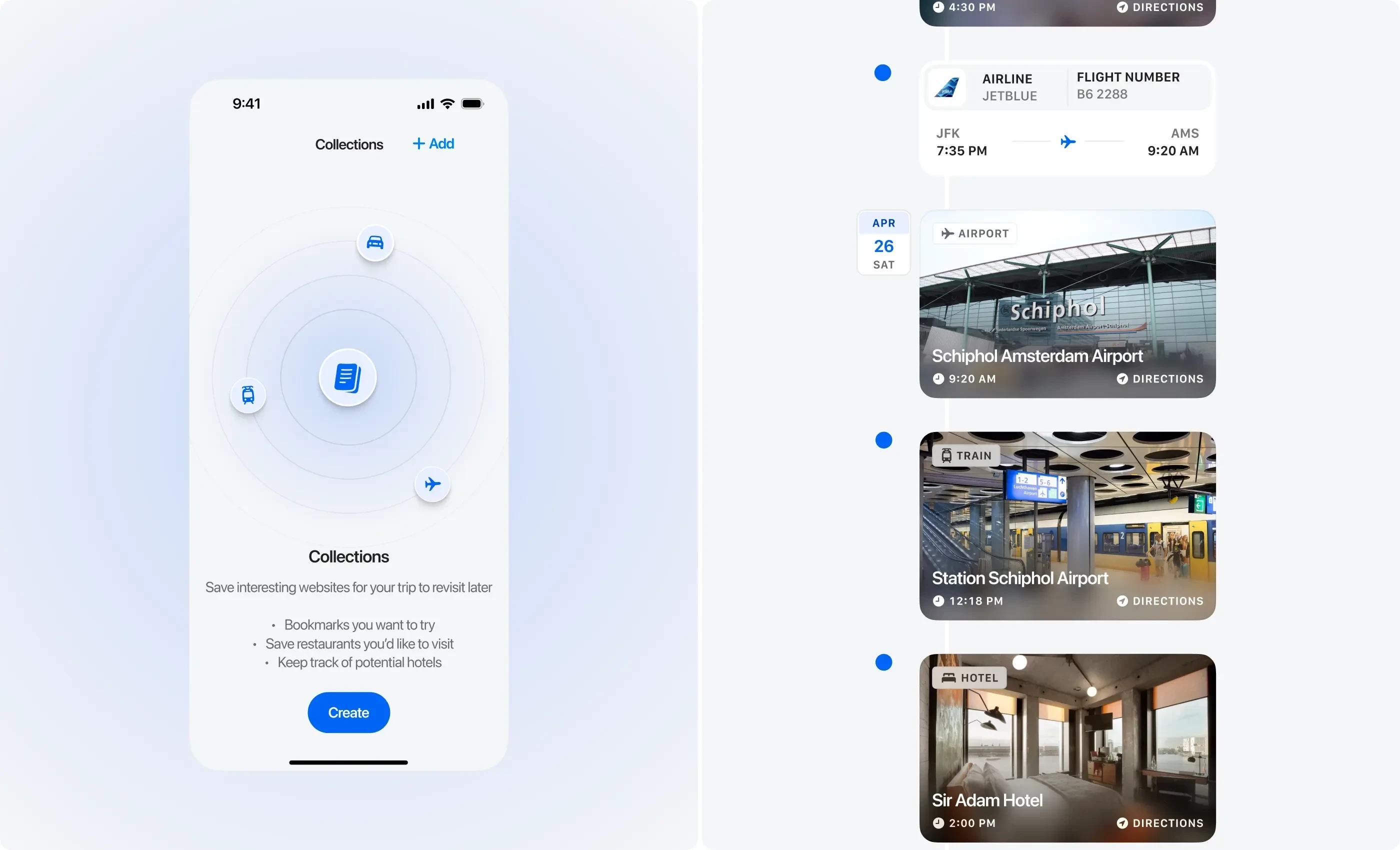
TravelWith Empty State Screen + Dark Mode

The Landing Page

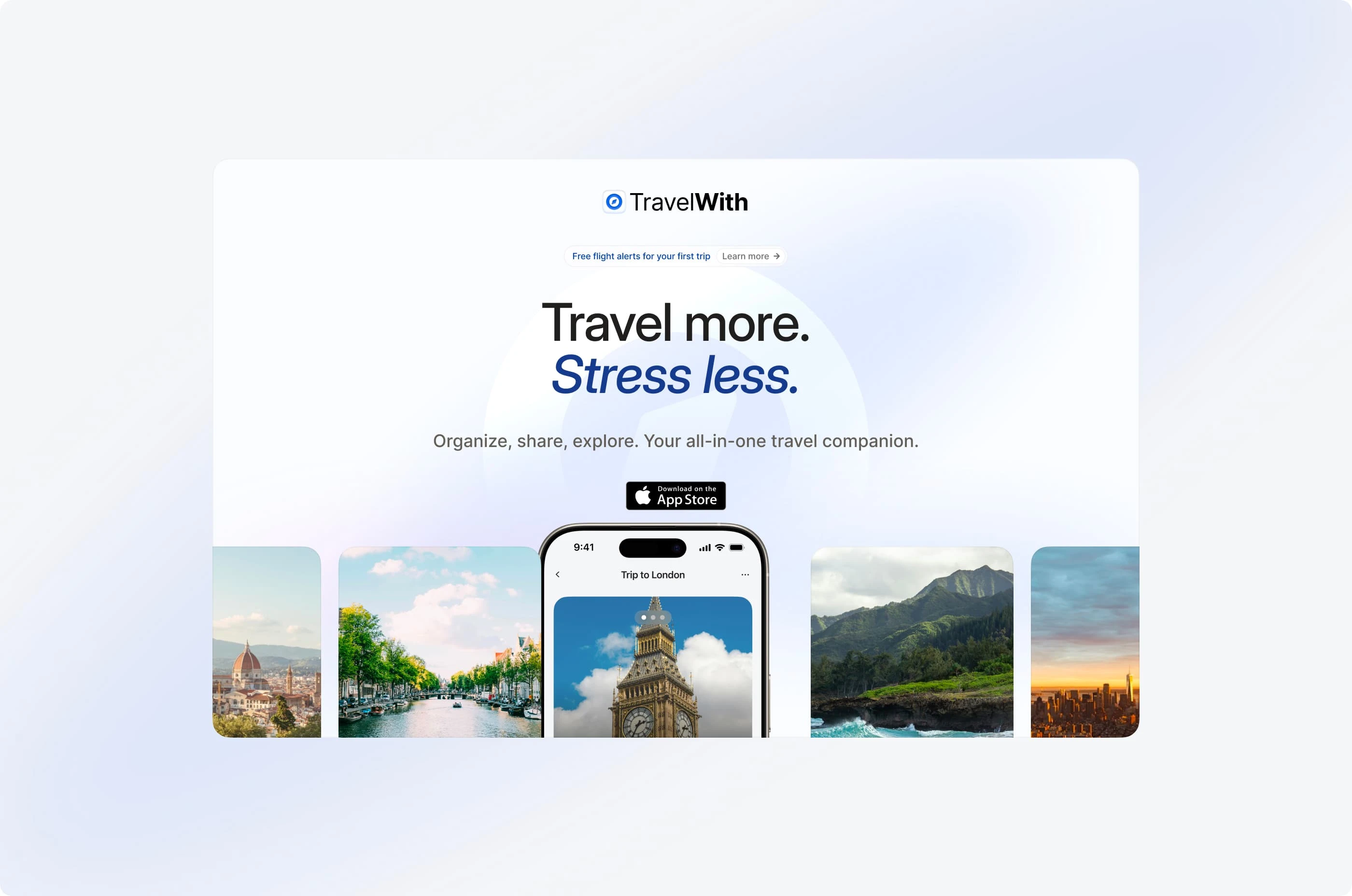
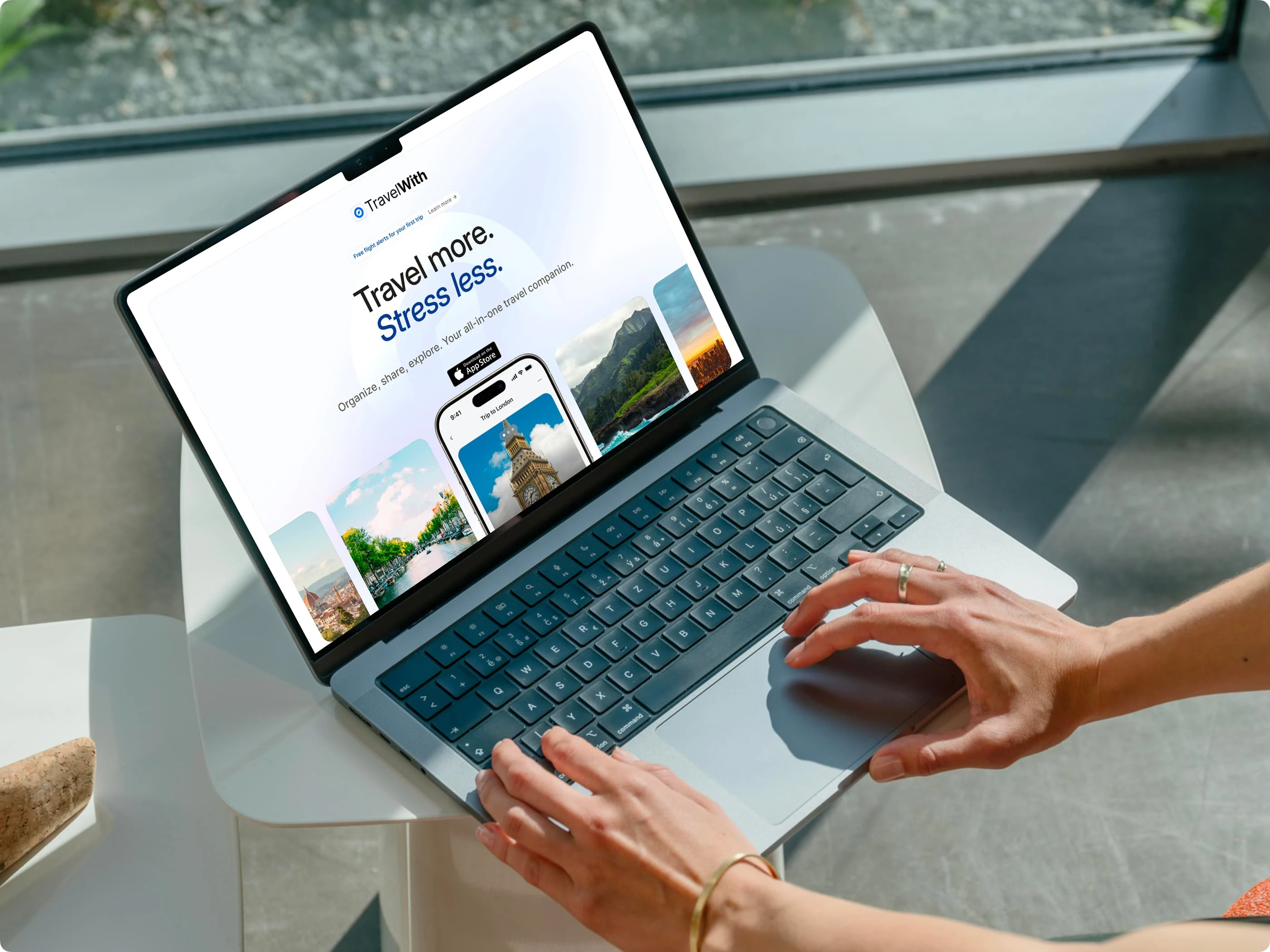
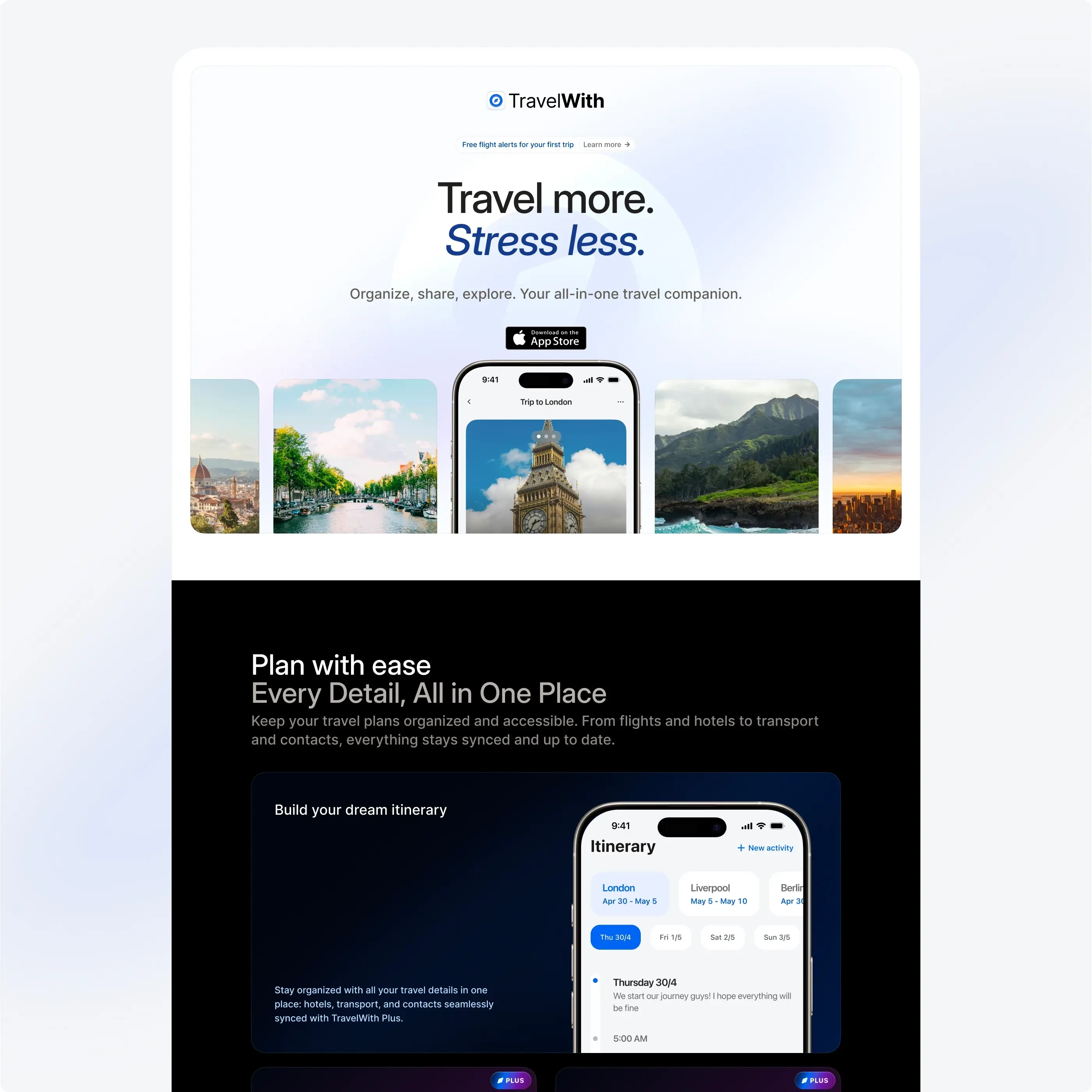
To better communicate the app’s benefits, I also redesigned the TravelWith marketing website. The new landing page focuses on feature clarity, emotional appeal, and scannability. It highlights what makes the app useful and enjoyable, helping potential users quickly understand the value.
The design puts key features front and center. It uses device mockups, short copy, and a clear call to action. Visitors now get a stronger sense of how the app supports them before, during, and after their trip.

Collaboration and Handoff

Working closely with Mike meant blending design with development in real time. We kept communication open and practical. Figma files were structured for easy handoff, with annotations that supported efficient implementation.
This setup allowed us to move fast. Features went from idea to release without friction.
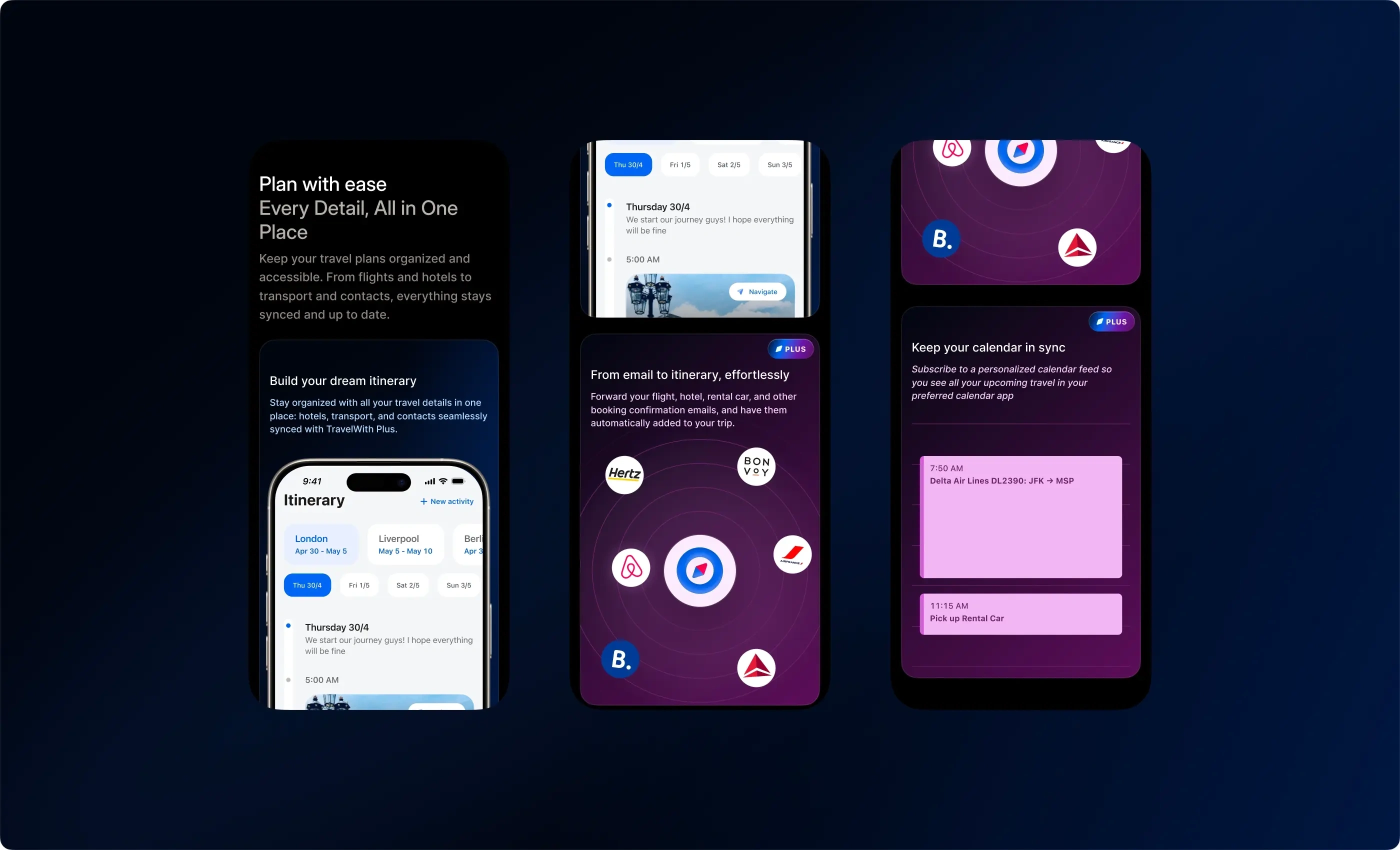
New itinerary screens

Outcomes

Better User Experience: The app feels cleaner, simpler, and more in tune with iOS patterns
Higher Engagement: New features like collaborative planning and wishlists boosted retention and daily use
Faster Delivery: Our collaboration shortened the path from design to code, making weekly updates achievable

Conclusion

TravelWith shows what happens when design and development move in sync. Small improvements, made consistently, have a big impact over time.
This project is a reminder that great design is not always about big overhauls. It is about listening to users, respecting the platform, and refining with care.
The work continues. And with every release, the app becomes more helpful, more beautiful, and more aligned with the real needs of travelers.
Like this project

Posted Jan 25, 2025

Designing the TravelWith app to enhance its native iOS experience, focusing on usability, collaboration, and personalization for seamless trip planning.

Likes

9

Views

70

Earned

$6.2K+

Timeline

Dec 5, 2024 - Ongoing

Clients

Backspace Travel LLC

Bastiaansen Modestad | Custom e-commerce design
Frequencii | Design for a learning platform