Built with Instant
Leifheit Product Page Redesign
Philip Wallage
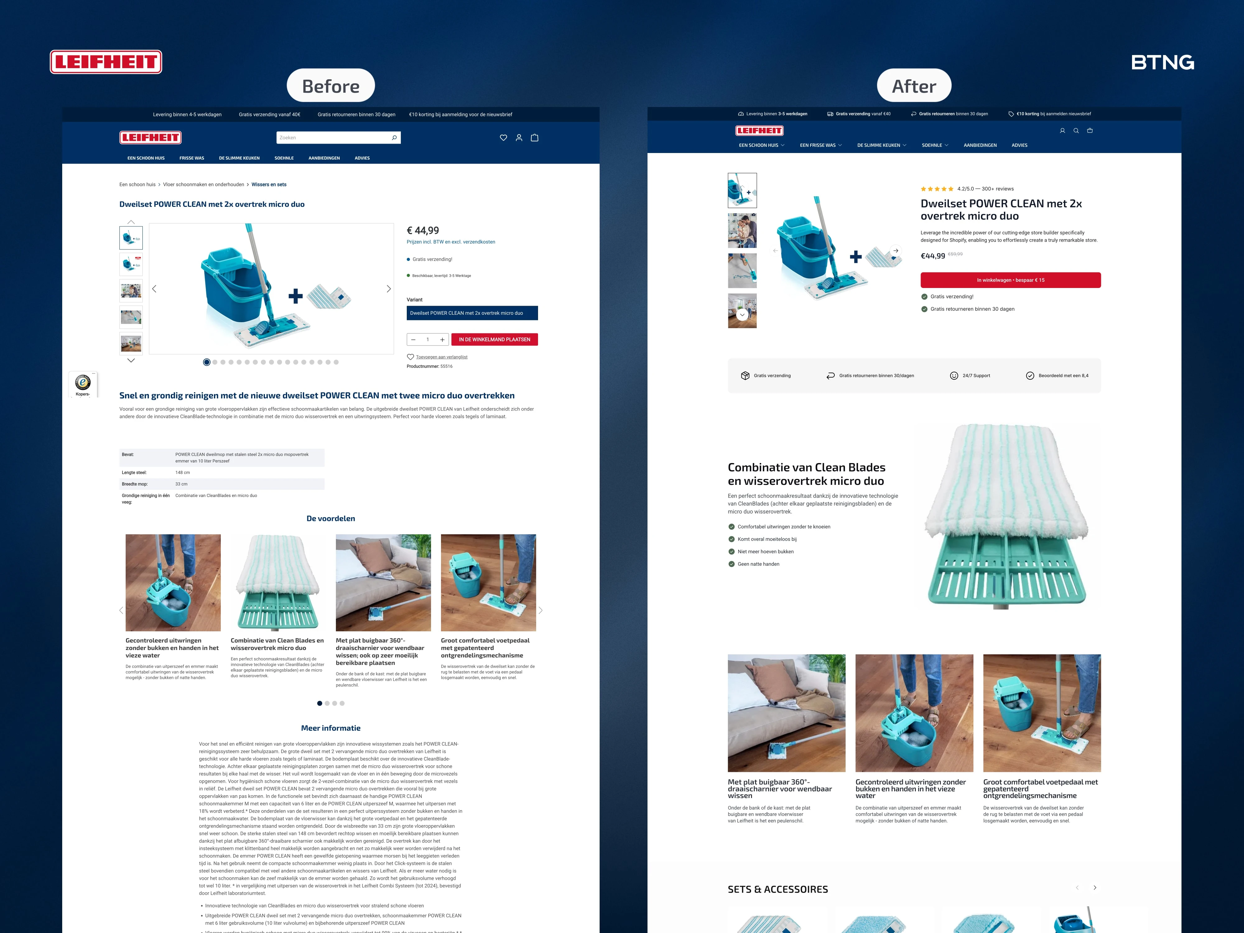
I redesigned Leifheit's product page. Then built it in Instant.
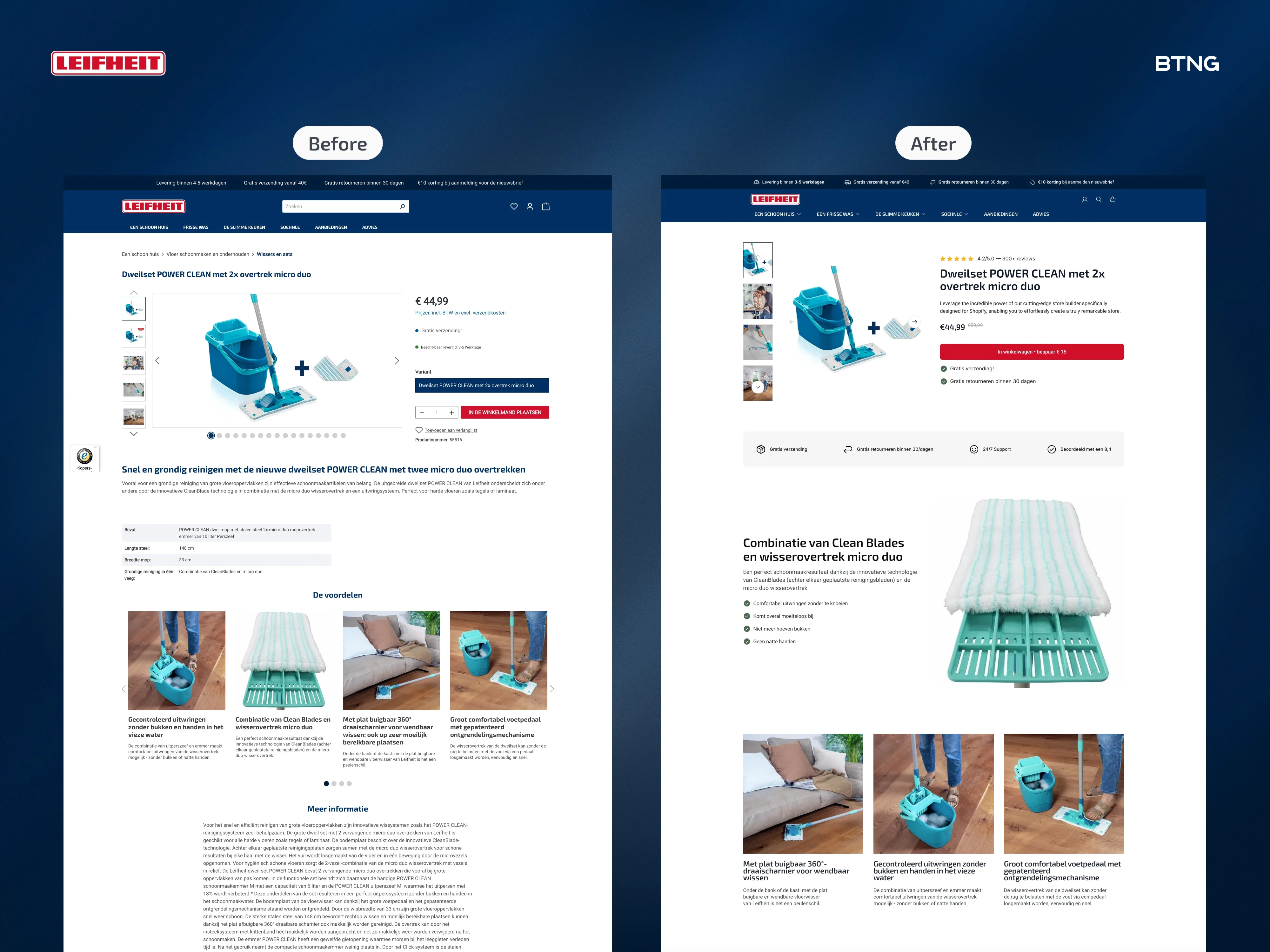
Most product pages scatter information everywhere. Title here. Price there. Reviews floating somewhere.
What changed
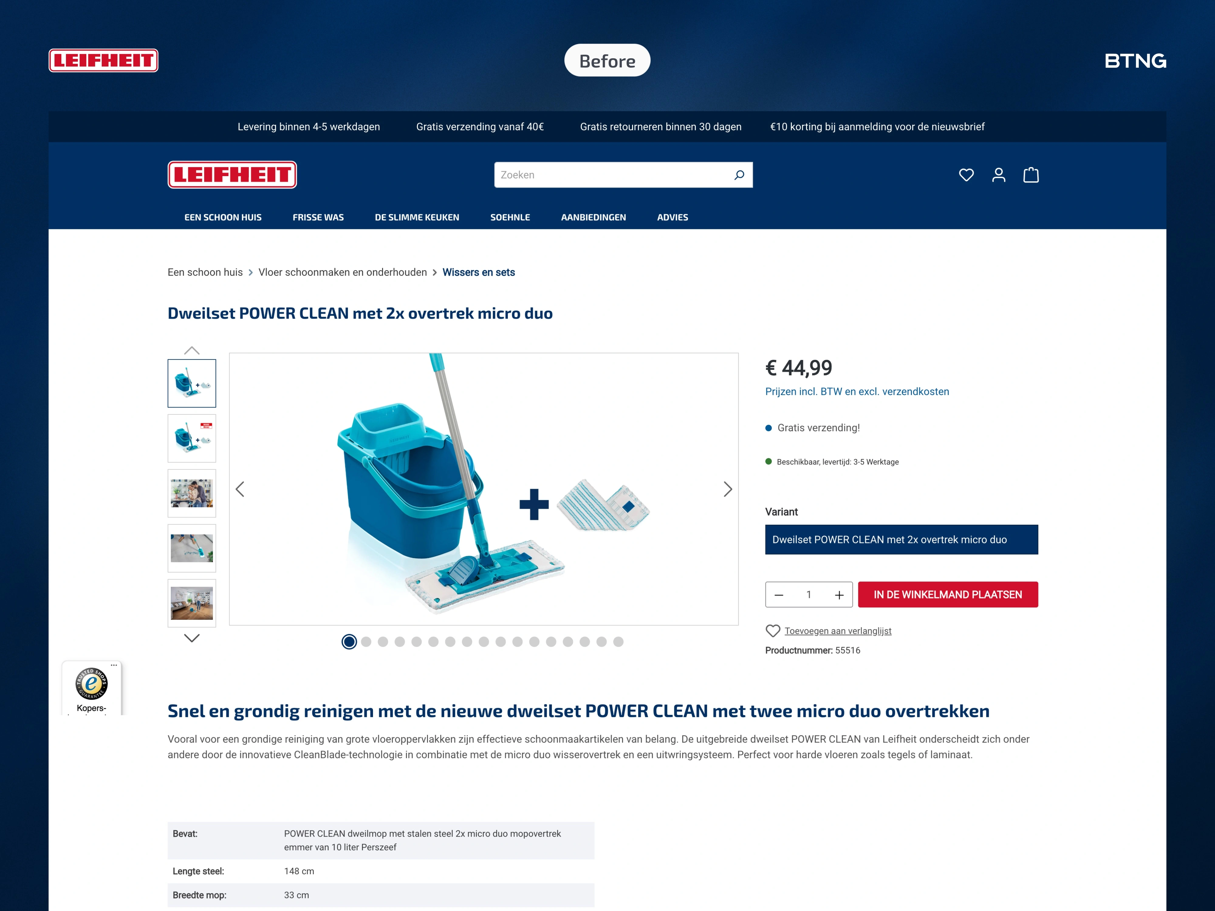
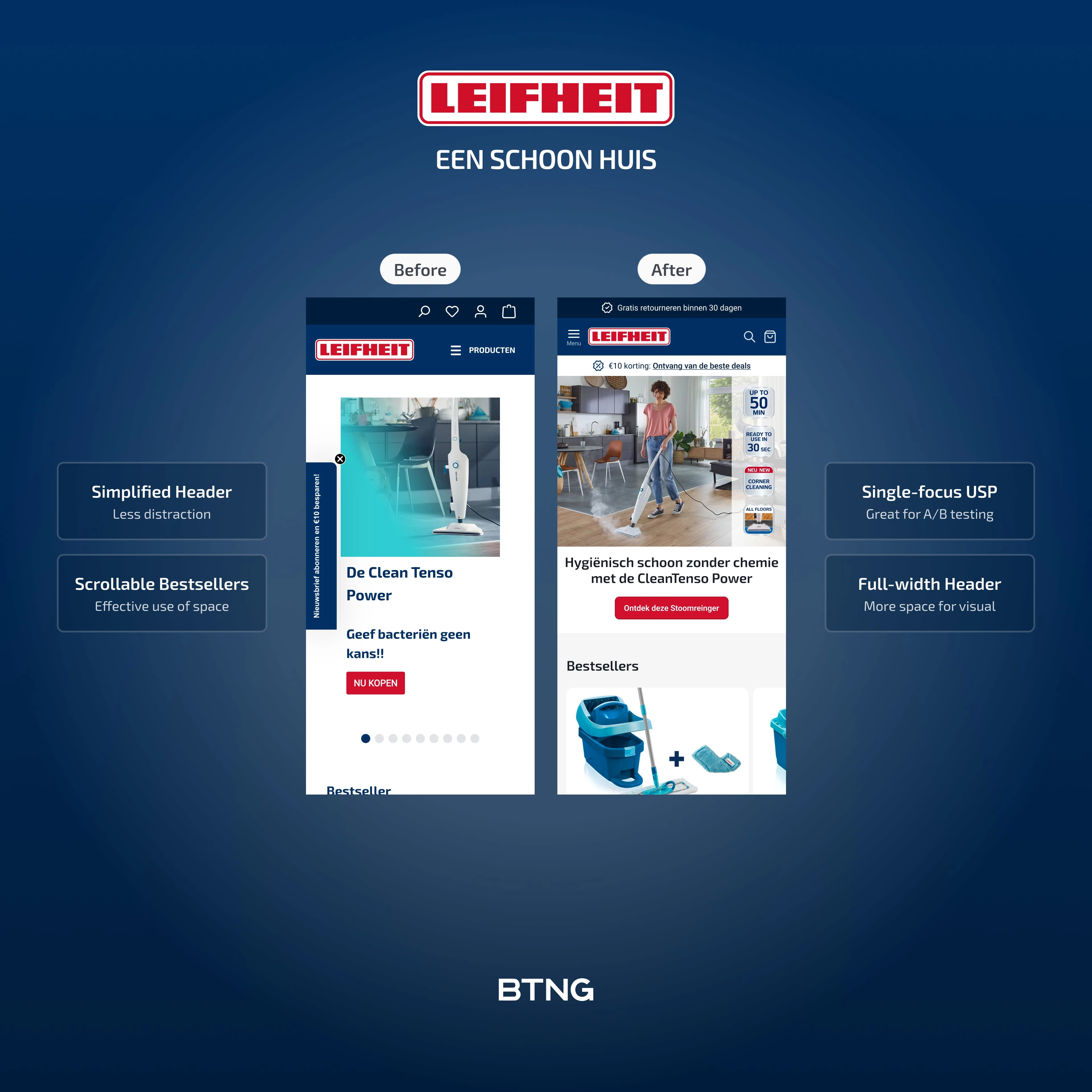
The old version had the product title weirdly placed above the image gallery. Everything felt disconnected.
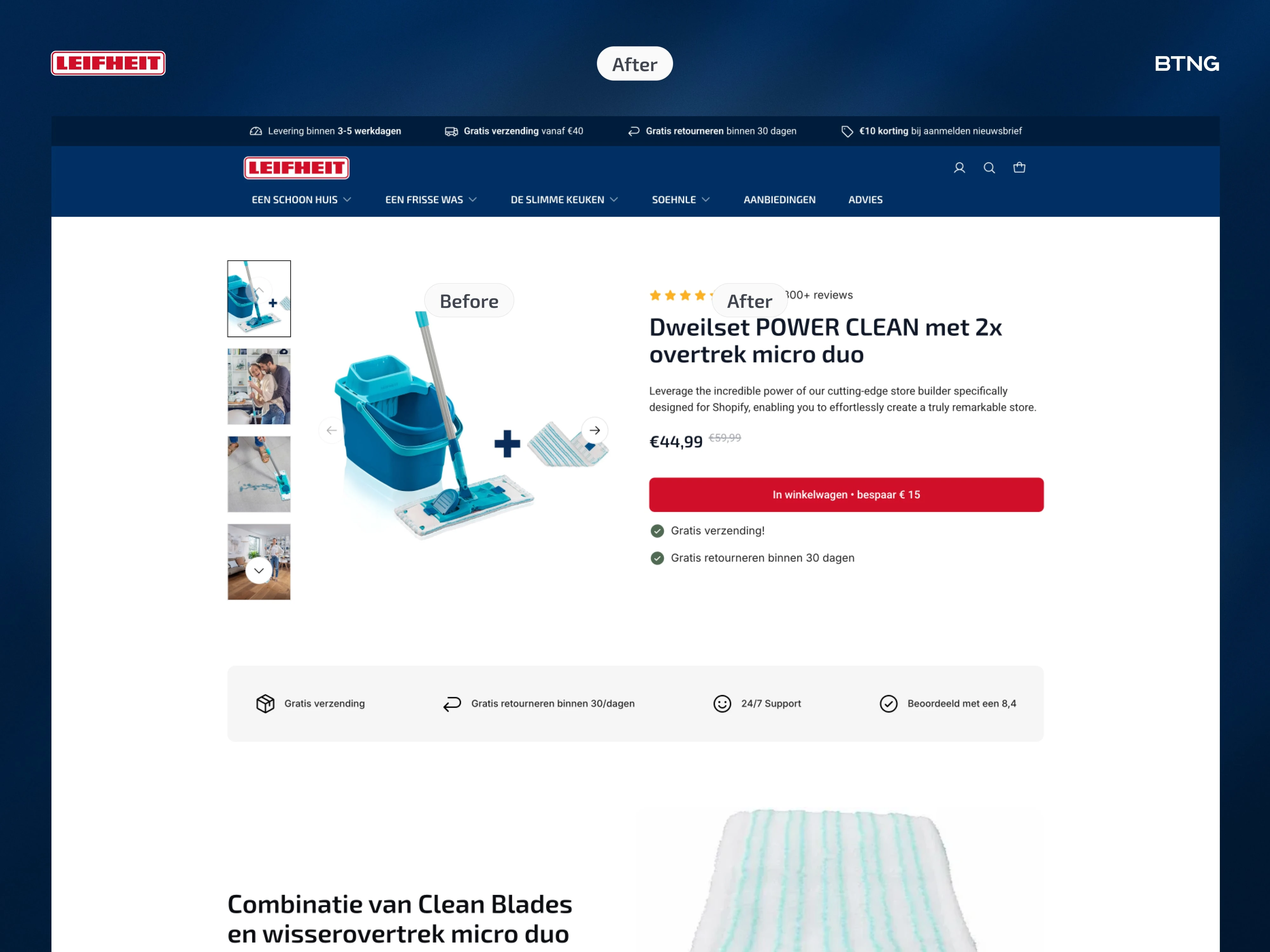
I grouped all the critical info on the right side. Title, subtitle, reviews, price, add to cart, USPs. Everything a buyer needs to decide sits in one clear block.
Information hierarchy
Specs are boring for a mop. Nobody cares about dimensions before they understand why they need it.
So I started with a USP bar. Then a big product zoom showing the actual fibers and technology. Why this mop is different.
Three benefit sections showing the product in use. Not just what it is. What it does for you.
Usell upgrade:
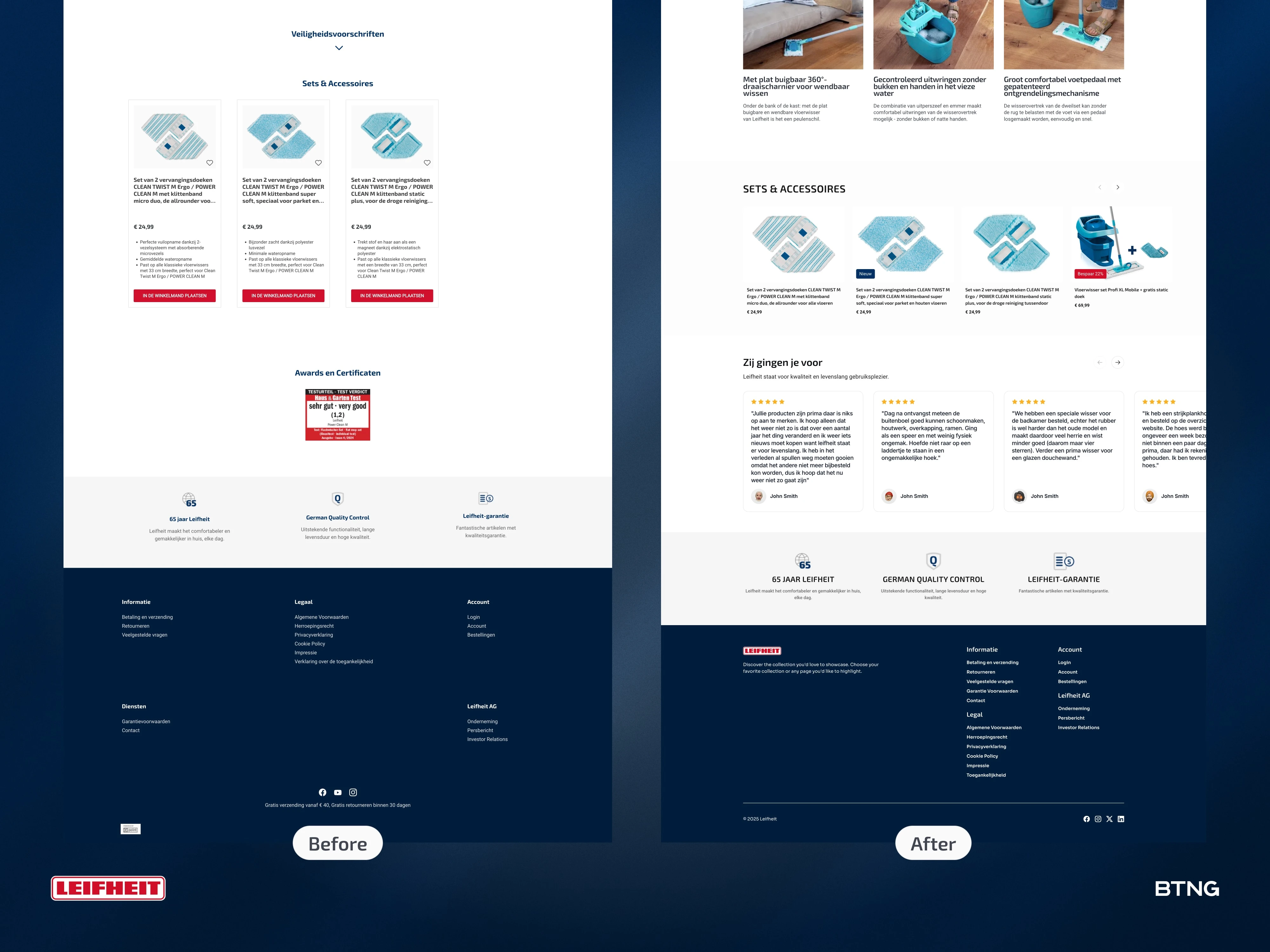
Related products got a real redesign. Not just thumbnails. Actual context for why you'd want the bundle.
Reviews moved to a dedicated section with photos. Brand values at the bottom for those who scroll that far.
Result? A cleaner experience. (No pun intended.)
From scattered to structured. From specs to benefits. From product page to sales page.
What's one thing you'd test first on your product pages?
Like this project
Posted Nov 4, 2025
Most product pages scatter information everywhere. Title here. Price there. Reviews are floating somewhere. Result? A cleaner experience. (No pun intended.)
Likes
0
Views
20
Timeline
Oct 27, 2025 - Nov 2, 2025
Clients
Leifheit