Built with Instant
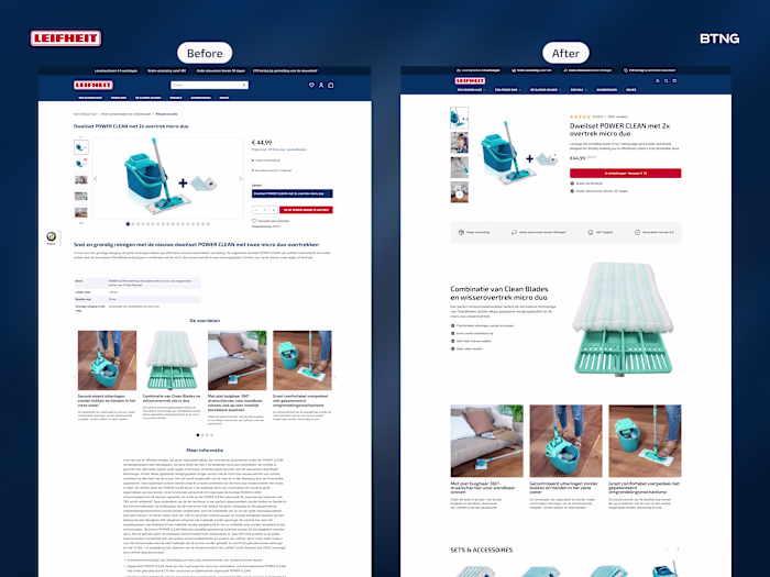
I redesigned Leifheit's product page. Then built it in Insta...
Philip Wallage
I redesigned Leifheit's product page. Then built it in Instant (link in comments).
Most product pages scatter info everywhere. Title here. Price there. Reviews floating.
What changed:
Product title was above the gallery. Everything felt disconnected.
I grouped critical info on the right. Title, reviews, price, add to cart, USPs. One clear block.
Specs are boring for a mop. Nobody cares about dimensions first.
Started with USP bar. Big zoom showing fibers and tech. Three benefit sections showing it in use.
Not what it is. What it does.
Result? Cleaner experience. (No pun intended.)
Scattered to structured. Specs to benefits. Product page to sales page.
What's one thing you'd test first on your product pages?
Like this project
Posted Nov 4, 2025
I redesigned Leifheit's product page. Then built it in Instant (link in comments). Most product pages scatter info everywhere. Title here. Price there. Revie...
Likes
0
Views
3
Timeline
Oct 27, 2025 - Oct 31, 2025