
Your Fractional Product Designer


Shopify freelancer for D2C and B2B brands, fixed prices
- 2x
- Hired
- 5.0
- Rating
- 12
- Followers
Shopify freelancer for D2C and B2B brands, fixed prices


Design the Experience. Deliver the Outcome.

Goal Planning Pro Edition
Miro template
A complete quarterly planning system for product teams, built inside a single Miro board. Plan your objectives, track progress through the quarter, run a structured retrospective, and close the quarter with AI-generated reports and slides. Everything your team needs, in one place, built to use again every quarter.
Includes a 7-step planning workshop, a full OKR tracking table, a retrospective workshop, six Miro AI Flows, and pre-filled demo content so you can see exactly how a completed quarter looks before you run your first one.
Demoed live at Miro Canvas London 2026.
2
140

I'm launching my new newsletter today.
Join 100+ founders and designers to get weekly:
- Short, practical notes on UX and product strategy (no fluff)
- Frameworks for clarity and alignment
- Early access to tools I use with clients
And get access to my Signal Prioritisation jam Miro template.
https://www.carolpoll.design/notes-by-carol
2
9
250
Do you know that today is International Thank You Day?
Here's an idea: kick off the week with a quick appreciation exercise with your team.
Not a long workshop. Not a retro. Just a simple pause to acknowledge the people you work with.
I created a lightweight Thank You Wall template exactly for this.
It's designed to help teams:
→ Make appreciation concrete and visible
→ Acknowledge contributions that might otherwise go unnoticed
→ Create a moment of connection, even in remote setups
You can use it at the start of a sprint, after a tough week, or anytime the pace has been intense and people need a reminder that their work matters.
Template here if you'd like to try it:
👉 https://miro.com/templates/thank-you-wall/
Sometimes culture is built through small, intentional moments like these.
2
19
340
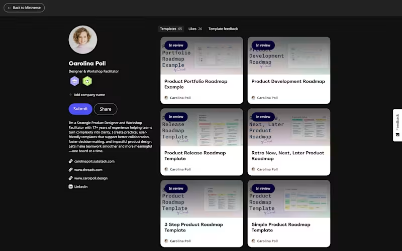
Kicking off the new year by reaching the incredible mark of 65 templates on Miroverse!
I just finished publishing quite a few templates for planning, tracking, presenting and keeping up with product roadmaps.
For designers, product managers, engineers, founders and managers – I'm sure one of them will fit your needs!
Keep an eye out on my profile, as they will be available as soon as the awesome Miro team approves them.
https://miro.com/miroverse/profile/carolina-poll/
1
157

UX UI designer / Multilingual (SP, EN, IT)
UX UI designer / Multilingual (SP, EN, IT)


I create effortless user interfaces that work
I create effortless user interfaces that work


View more →

Product & Brand Designer crafting impactful solutions
- 5.0
- Rating
- 11
- Followers
Product & Brand Designer crafting impactful solutions


Designed for 3x🦄 and YC, Sequoia, Softbank backed startups
- $5k+
- Earned
- 1x
- Hired
- 12
- Followers
Designed for 3x🦄 and YC, Sequoia, Softbank backed startups

A feature doesn’t exist in isolation. It exists in the context of your user’s journey.
When designing, you have to ask:
- Where is the user coming from?
- How familiar are they with the product?
- What mental models are they bringing in?
- How much have they already learned through previous actions?
Take one of my screens as an example. It’s filled with terms like: Atom. TVL. Tags. Contributors. To an outsider, it’s confusing. Almost unusable. But that screen wasn’t designed for an outsider.
It was designed for someone who:
- Has gone through onboarding
- Created their first identity
- Made their first claim
- Staked on something they believe in
- Spends time in the community (Discord, Twitter spaces, etc.)
They don’t just use the product. They live in it. And that’s the key. Good design isn’t about making everything universally simple. It’s about making it contextually clear for the right user, at the right time.
How do you get there? You track the journey:
- When users take key actions
- Where they drop off
- How their behavior evolves over time
That’s how you earn the confidence to design “complex” screens that actually feel intuitive. Designing products isn’t just about clarity. It’s about empathy, grounded in real user behavior.
2
256


Even when designing a single screen in Figma, I can’t help but build with components. It doesn’t need to be perfect, but it creates a solid foundation.
1
2
274

On Base, Intuition powers a directory where projects can be discovered, evaluated, and ultimately verified through staking.
People and the Base team can stake on projects they believe in, turning “verified” into an on-chain, economic signal, not just a badge. The result is a living map of the Base ecosystem, where trust and discovery evolve together.
3
466

Senior Product Designer | AI & Enterprise SaaS
- $1k+
- Earned
- 3x
- Hired
- 5.0
- Rating
- 6
- Followers
Senior Product Designer | AI & Enterprise SaaS


