Bosch Product List Page

Joyce Hanson


Bosch — Product List Page Redesign & Framer Development
Platform: bosch.de
OVERVIEW
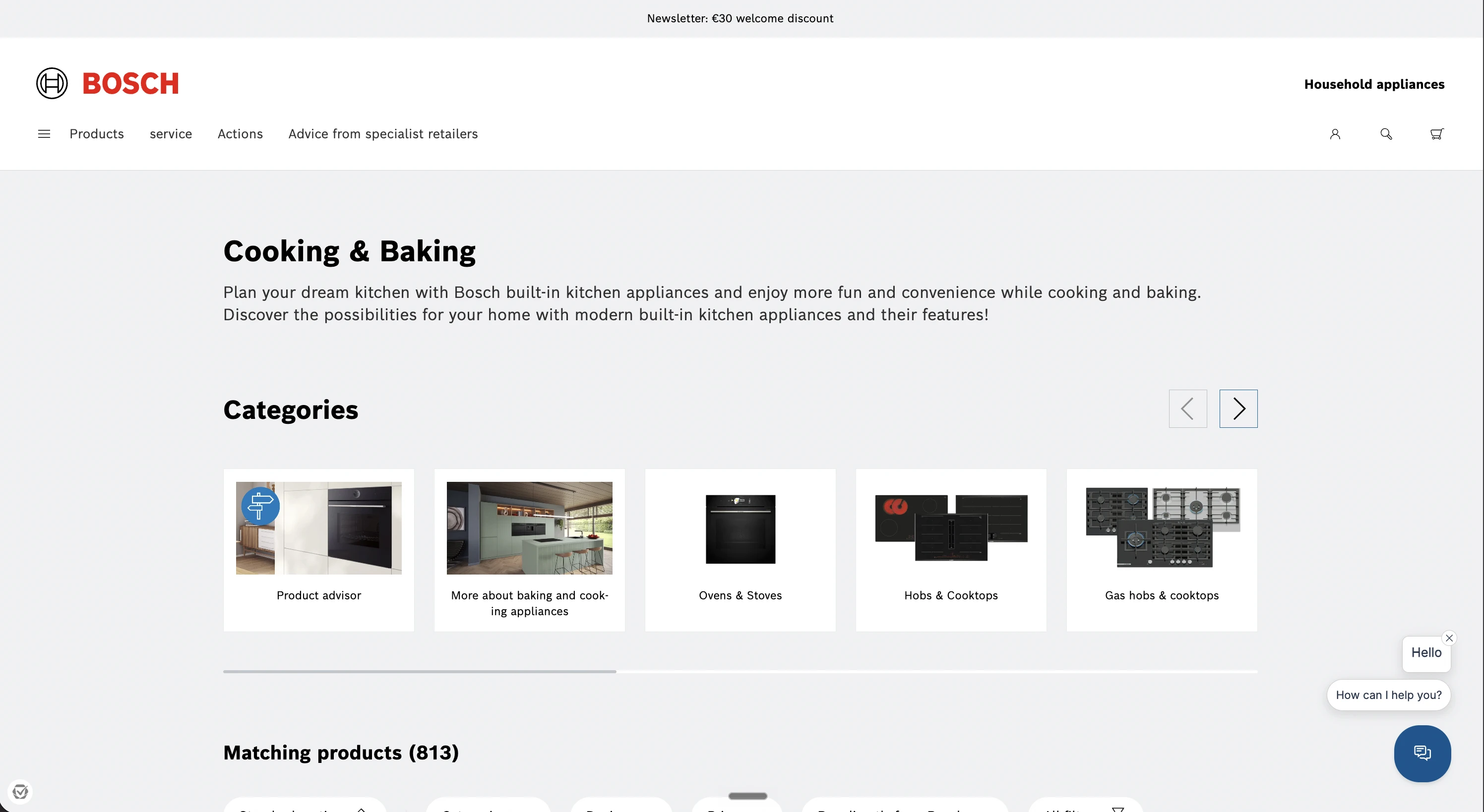
As part of work for Bosch, one of the most recognisable engineering brands in the world, the product list page was redesigned to bring it fully on-brand and make products genuinely easy to browse. On a catalogue of this scale, the list page is where most users decide whether they can find what they need, so it had to be both visually precise and functionally effortless.
THE CHALLENGE
A product list page for a brand like Bosch carries two competing demands at once. It has to hold to an exacting brand standard, the typography, spacing, and colour discipline that a global engineering brand expects, while also solving a practical usability problem: helping users cut through a large product range to the exact item they're looking for, without friction.
The existing page didn't do enough on either front. It needed to look unmistakably Bosch and work harder for the user.
WHAT WAS BUILT
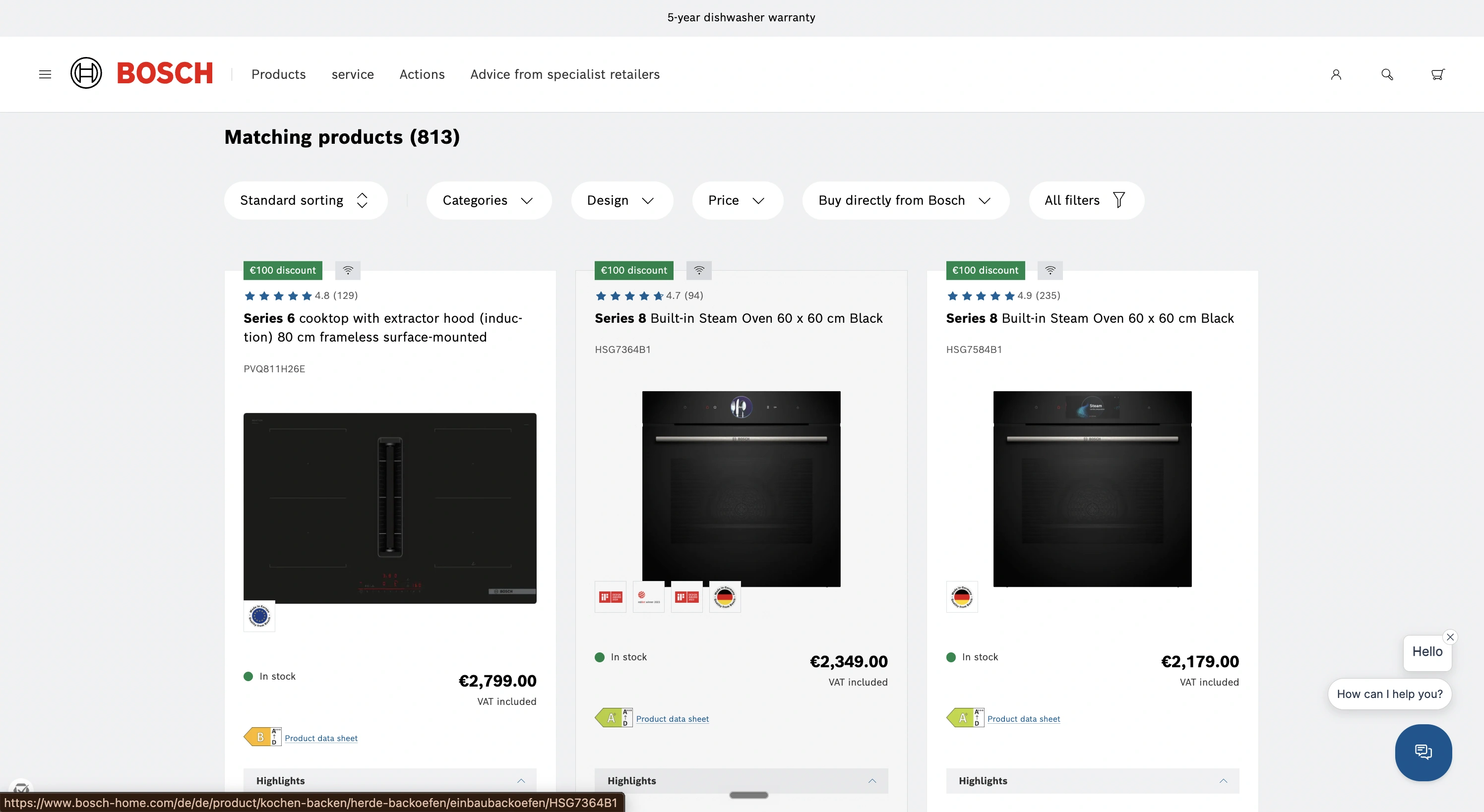
Redesigned product list page — A full redesign of the listing layout, rebuilt to be clean, structured, and precisely on-brand, with a clear visual hierarchy that lets products lead.
Custom tag components — Reusable tag components added to the product cards, giving each product clear, scannable labelling and a consistent, branded visual language across the whole list.
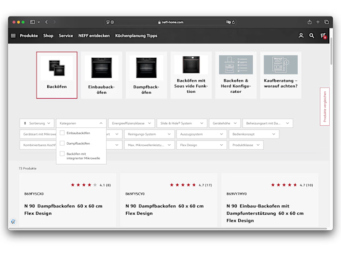
Filter component — An interactive filter added so users can narrow the product range quickly and find what they need with minimal effort, turning a large catalogue into something easy to navigate.
On-brand system — Every element aligned to Bosch's brand standards, so the page sits seamlessly within the wider Bosch digital ecosystem.
KEY DECISIONS
Treated findability as the core job. On a large catalogue, the list page's real purpose is navigation. The filter and tag components were prioritised so users reach the right product faster, rather than optimising purely for how the page looks.
Built tags and filters as reusable components. Rather than one-off elements, the tags and filter were built as components, keeping the page consistent, easy to maintain, and scalable as the product range grows.
Held to the brand standard exactly. For a brand like Bosch, precision is the brief. Every spacing, label, and interaction was aligned to the brand system so the page reads as authentically Bosch.
OUTCOME
A redesigned, on-brand Bosch product list page with custom tag components and an intuitive filter, cleaner to look at, easier to navigate, and fully aligned to the brand. Where the previous page made users work to find products, the new one puts the right item within easy reach.
Redesigned for brand. Built for findability.
Tags: Framer Designer · Framer Developer · Web Designer · UI Design · Component Design
Like this project
Posted Apr 7, 2025
Designed the Bosch product list page which serves as a key entry point for users exploring a wide range of tools and appliances.
Likes
0
Views
9
Timeline
Jan 3, 2023 - Oct 18, 2024