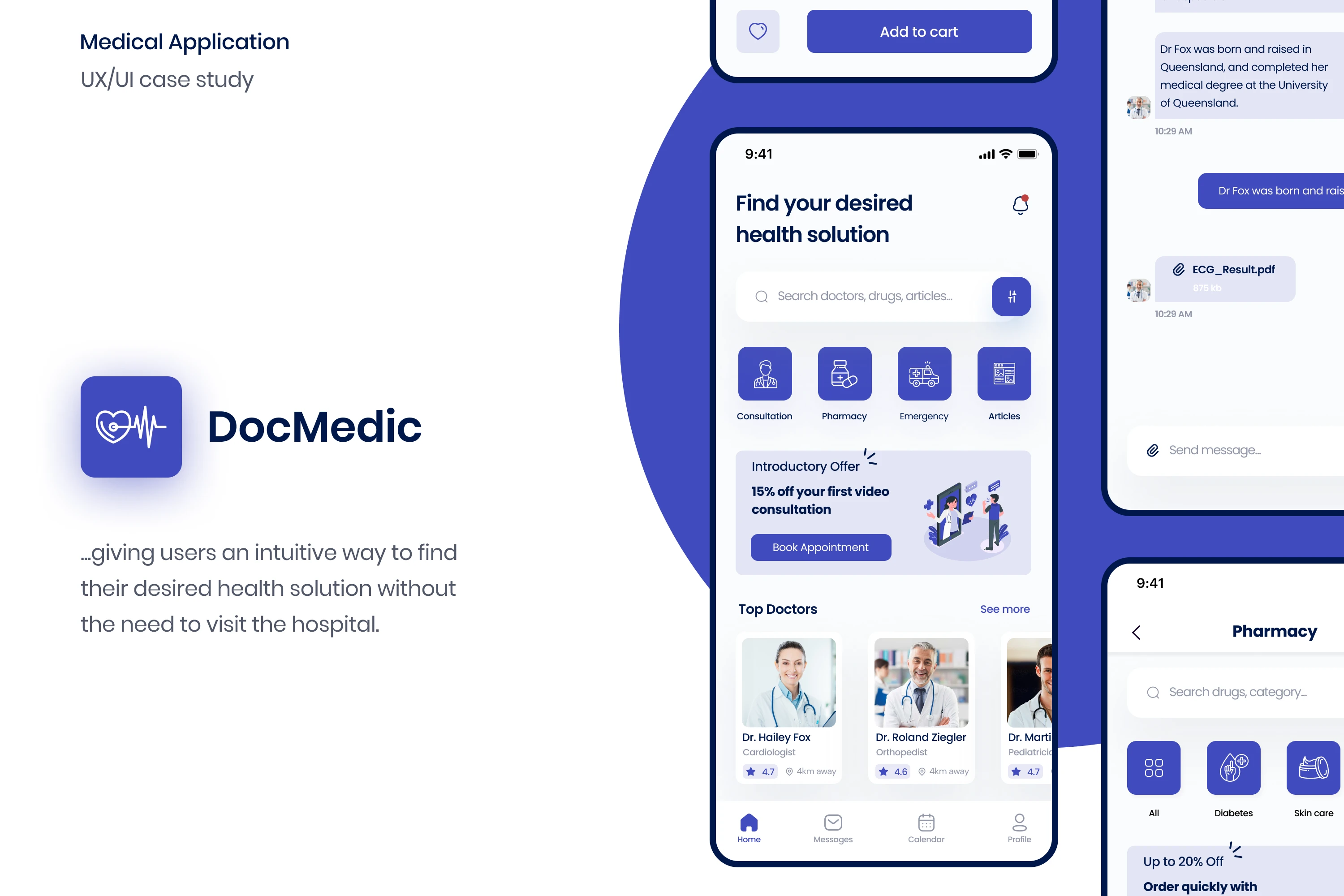
DocMedic UX Case Study
Joyce Hanson
Overview
Where should you go if you develop a cough, if you’re feeling anxious and depressed, or if you are curious about a certain vaccine?
The answer: your primary care doctor!
Your primary care doctor focuses on holistic health care, meaning he or she is trained in treating a little bit of everything and coordinates patient health care in one central location. With a primary care doctor, you only need to make one appointment to discuss a variety of health issues you might be experiencing, whether physical, emotional or mental.
Why DocMedic?
I choose creating an app with health experts because I have come to realise that most people don’t love talking to strangers, especially about their health care needs and concerns.
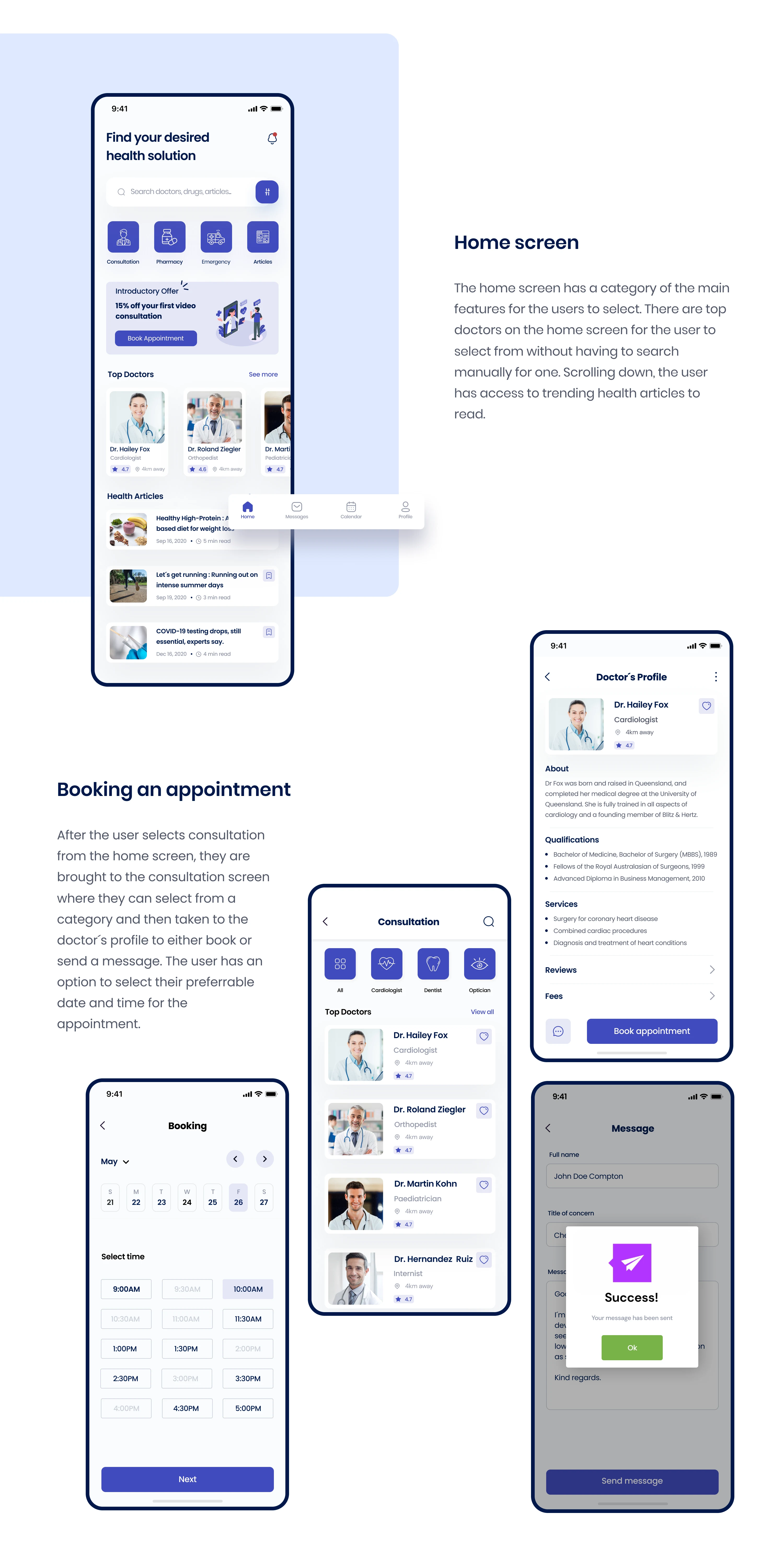
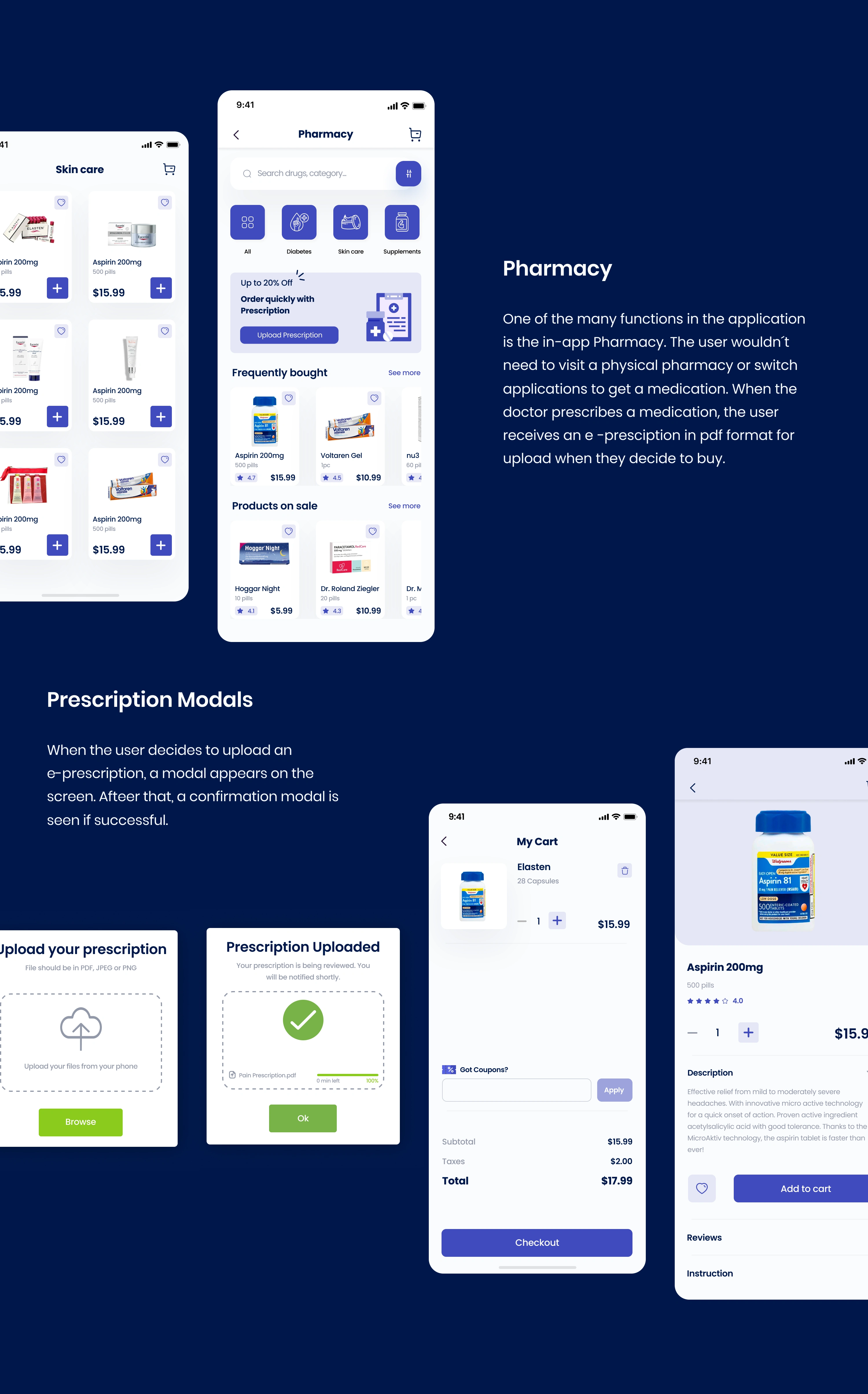
In DocMedic, the user goes through choosing a trusted primary care doctor, scheduling regular appointments with a doctor to discuss their concerns and overall health. Asides these features, the users can order for their prescription and also read from various health articles.
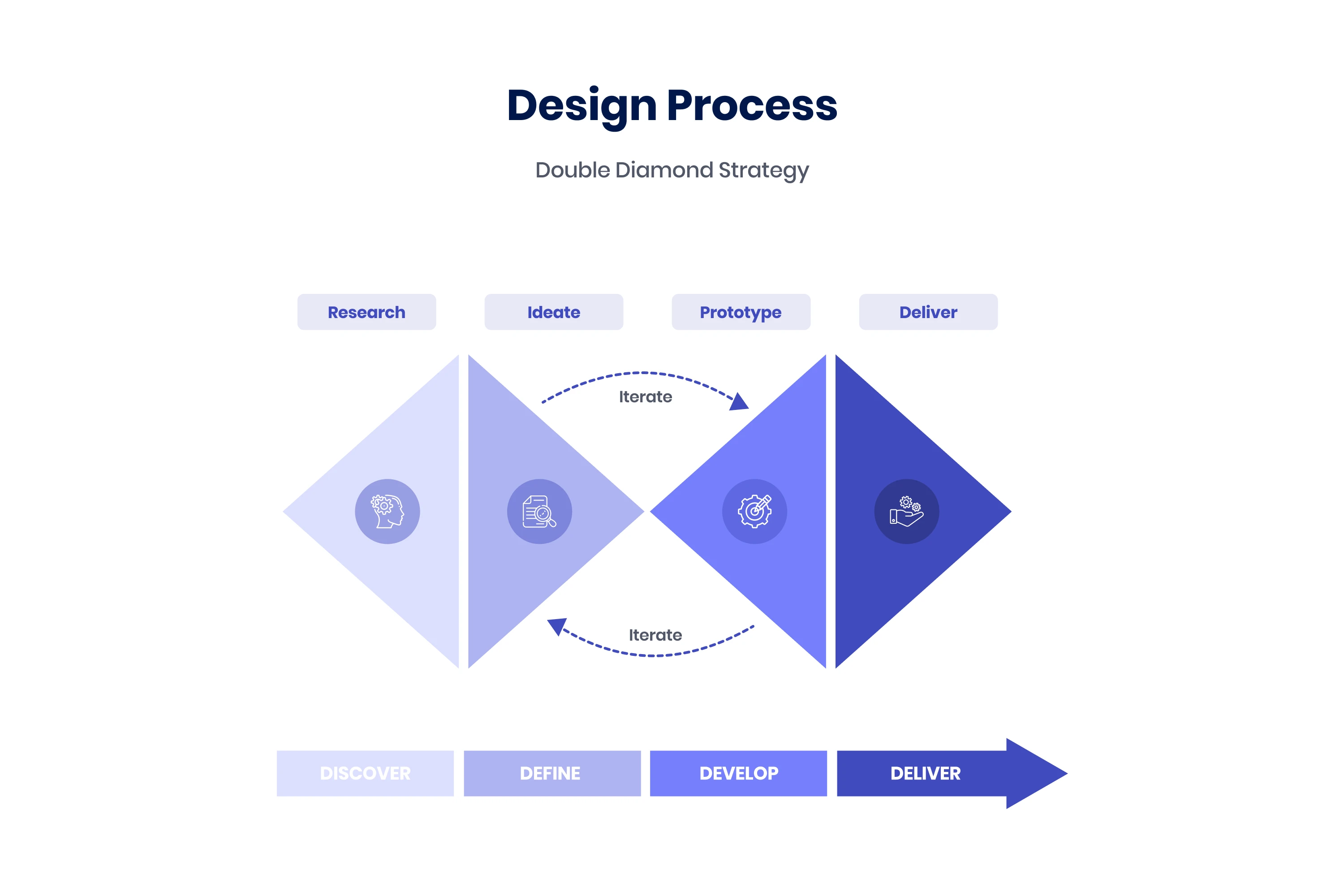
Understanding The Problem
Problem Statement
Whilst we're all staying at home as much as possible during the pandemic, we still need to fulfil our basic needs. Many people still require medications or need to get medical support for something other than COVID-19.
Proposed solution
To provide better healthcare access in such times, a complete application with a combination of certain important features will be needed. These features will enable users book appointments with health experts, buy prescribed medications with the possibility of uploading the digital presciption sent by an health expert, and read health-related articles and write-ups pertaining health solutions and up-to-date health news.
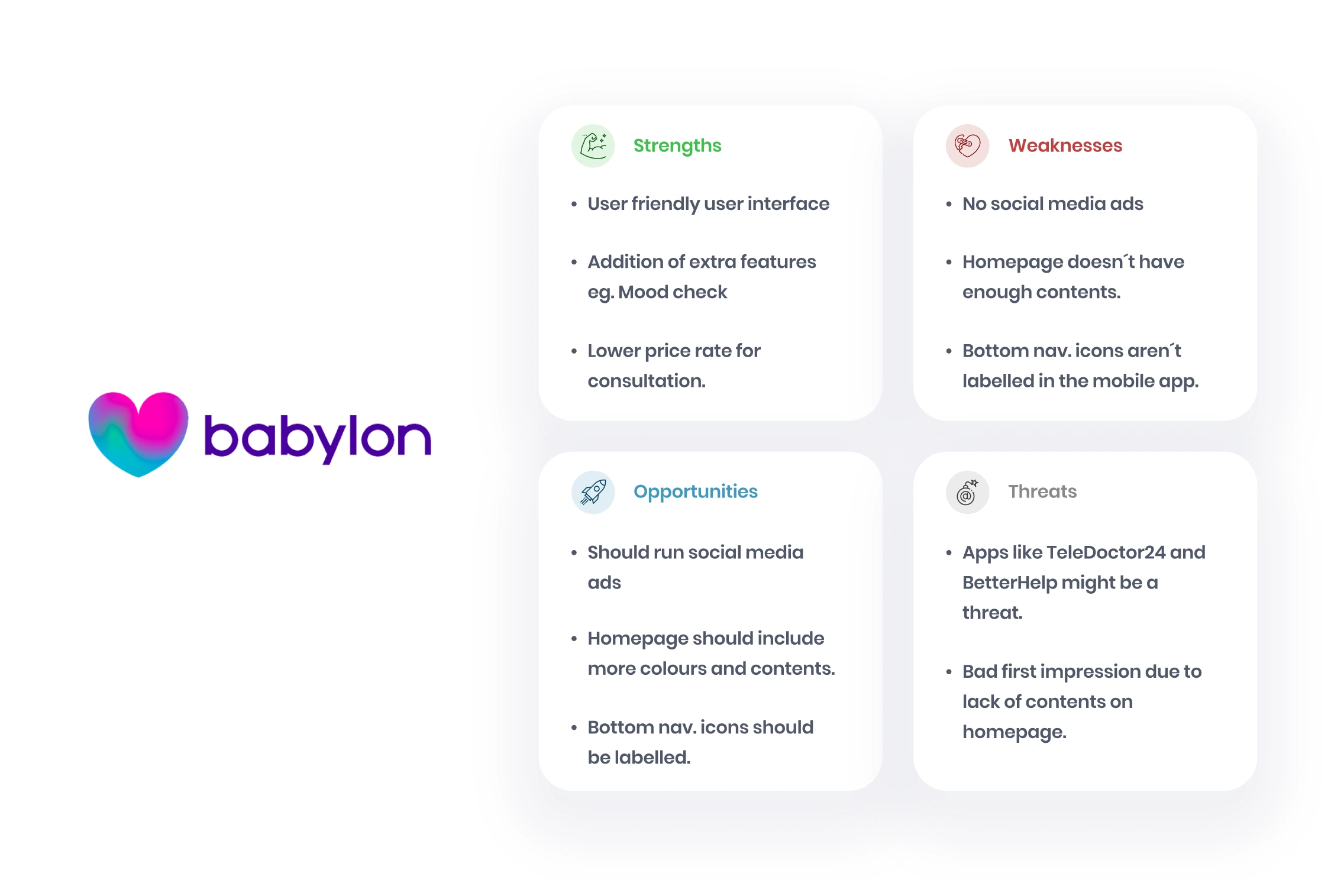
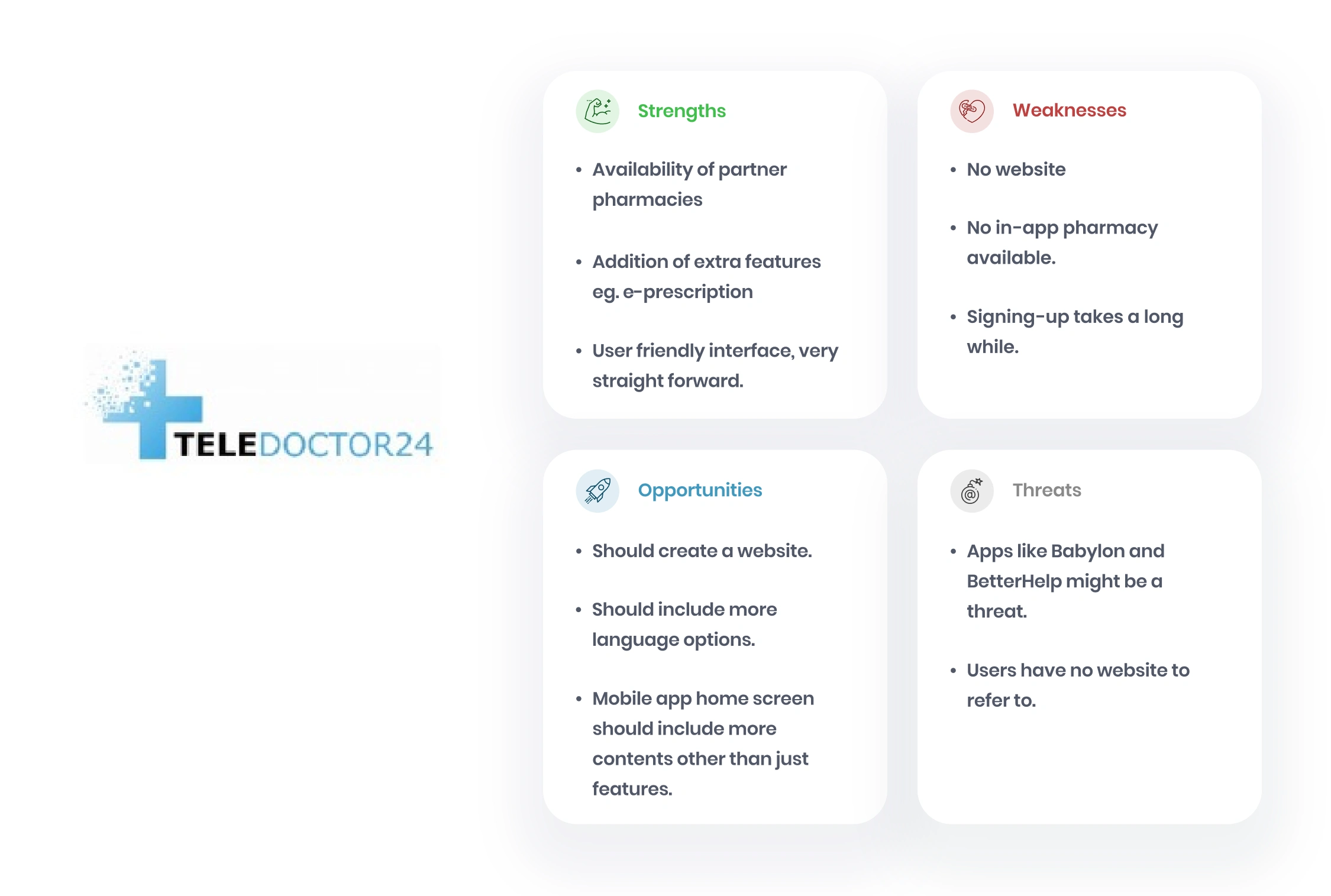
Competitive Analysis
S.W.O.T analysis
To understand the market and competitors and to also get a big picture of how DocMedic should position itself against competitors, i carried out an analysis of two similar apps. This provided insights about each competitor´s strengths, weaknesses, opportunities and threats.
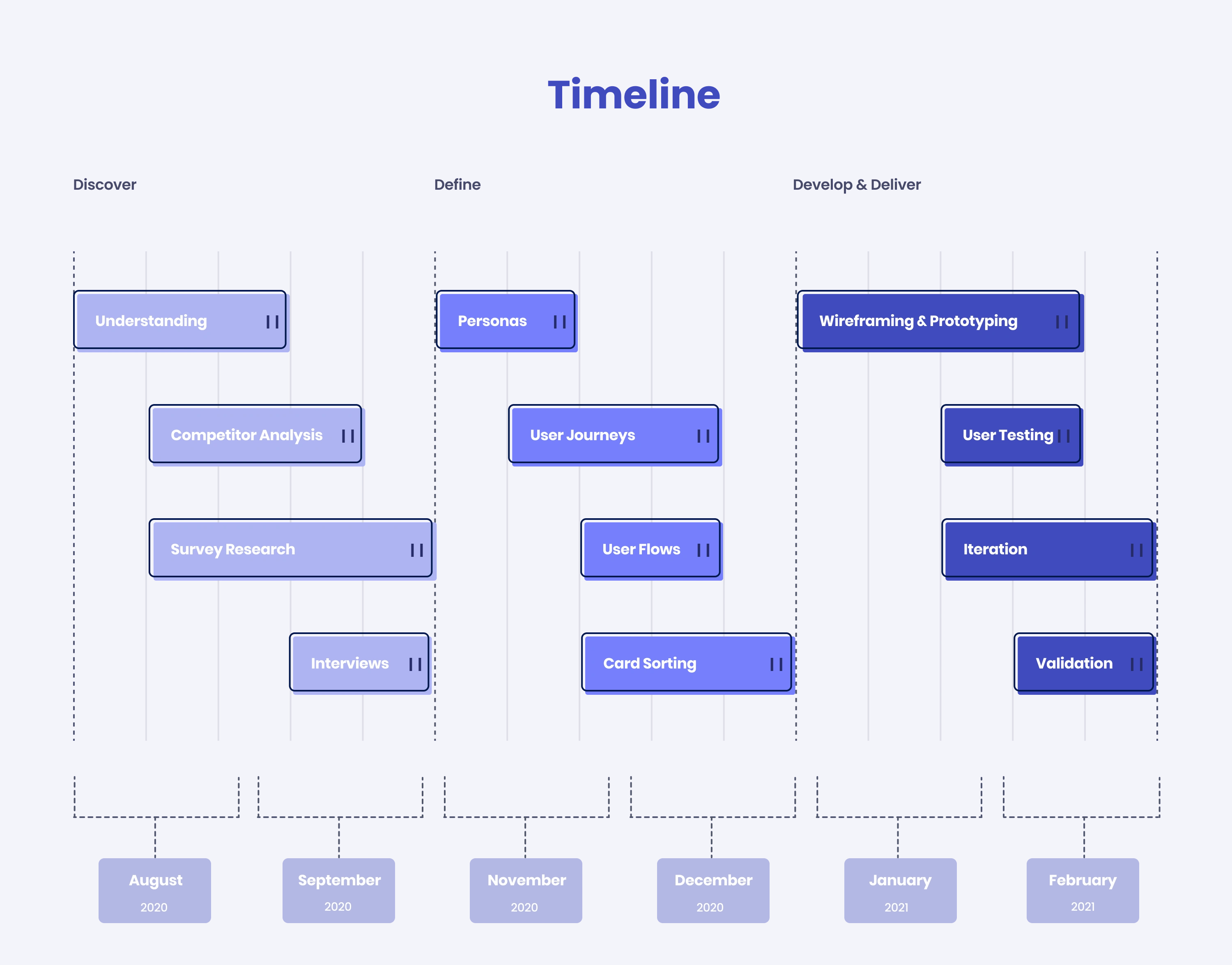
Survey Research
User Survey
I conducted a user survey by reaching out to more users through multiple choice questions. With the results from the survey, I was able to reach more users and gather initial or follow-up insights. This provided a useful basis for scripting interview questions that can dig deeper into survey findings.

Survey Insights
User Interviews
Interviews helped me understand the problem space as well as potential customers of DocMedic. I got to understand their mental models, pain points, needs and goals, suggestions and challenges. I categorized the findings into common themes.
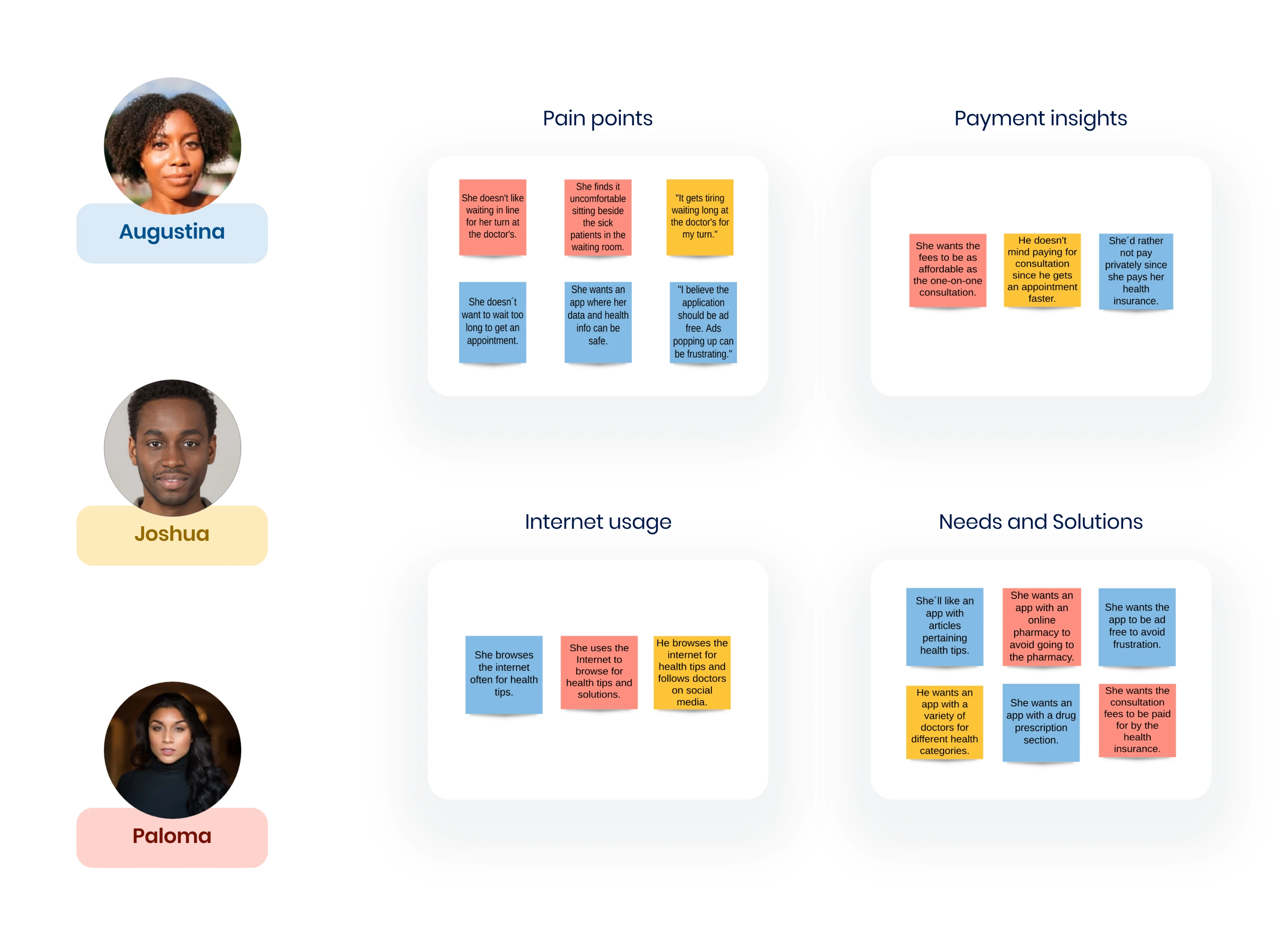
Interview Insights
The participants dislike waiting long in line for an appointment.
The participants want an app where their health records and data are kept safe from external malware.
Also, the app should be ad free to avoid user frustration.
The participants often browse the internet in search of health tips and solutions.
Participants don´t mind paying for online consultations.
Want the online consultation fee to be as affordable as the usual consultation.
One participant would rather not pay privately because she pays her monthly health insurance.
App should include articles with healthtips
App should include online pharmacy.
App should include variety of doctors.
Consultation fee should be paid by the health insurance.
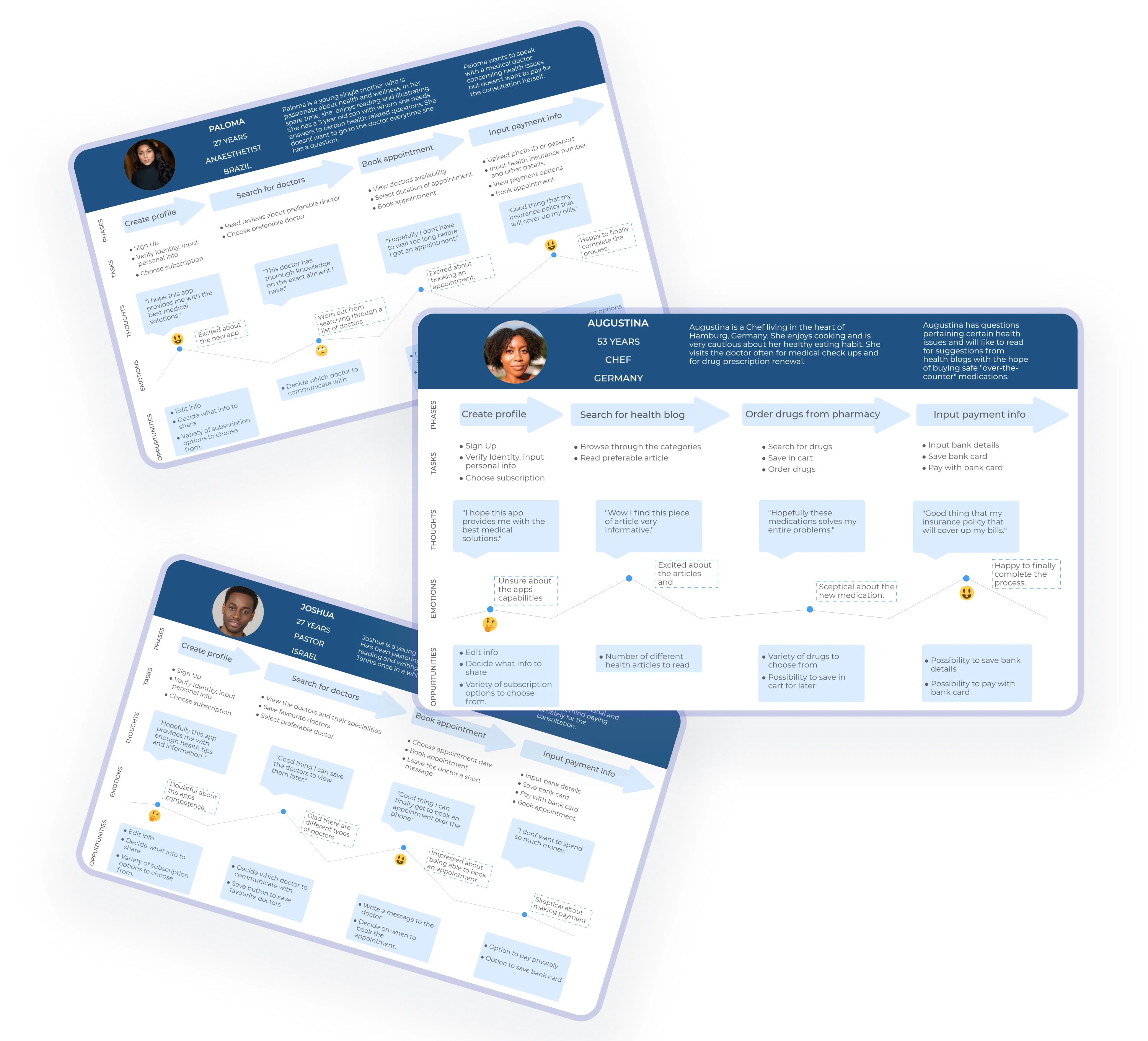
Personas
User Personas
Based on the research analysis, I identified 3 user personas from the demographics. These personas help in driving the design decisions by taking their common needs and bringing them to the forefront of planning before starting the design process.

Journey Maps
User Journey Maps
User journey map helped me understand the context of users and gave a clear picture of of the steps the users would go through when engaging with the product.
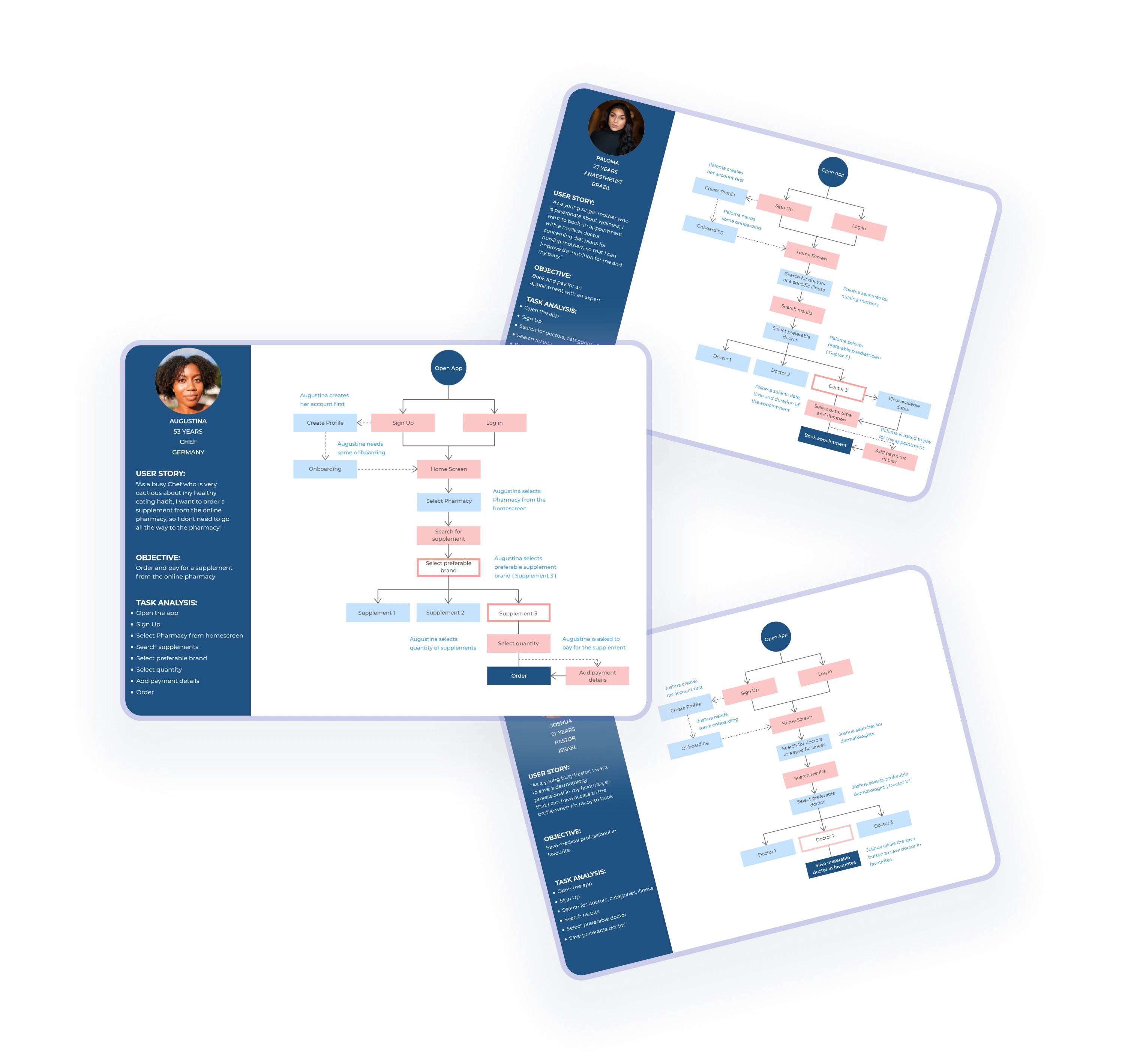
User Flow
Task analysis and user flow
At this point, the project had become well - grounded. I had thorough understanding about its core features, structure and functionality. The goal of this stage was to organise and structure all the content from the research phase. I created a basic flow of each step on the path of the users.
Card Sorting
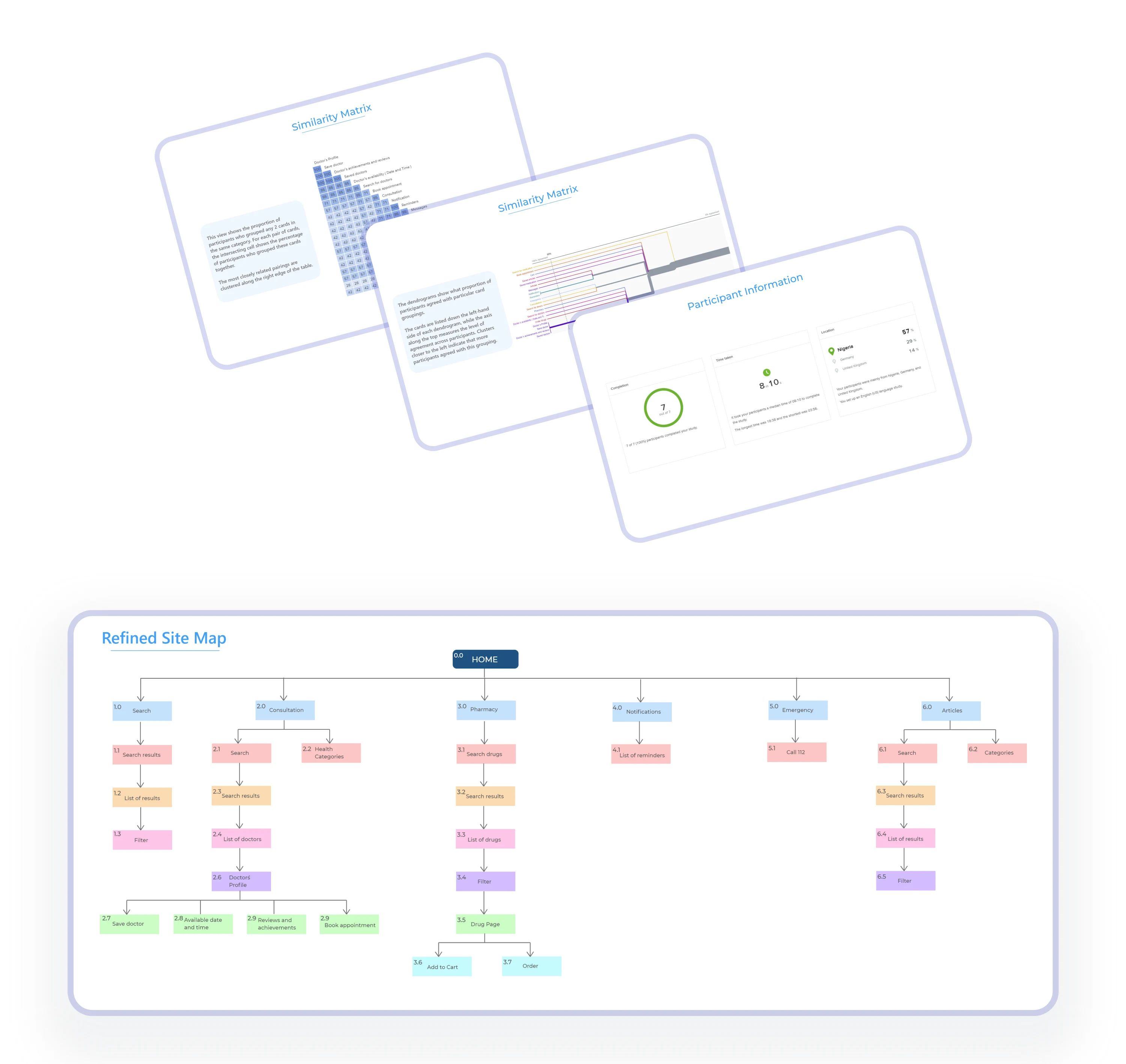
Card sorting and Information architecture
In this stage, I used the card sorting method to help refine, design and evaluate the information architecture of the app. In the card sorting session, participants organized and labelled cards and features into categories that made sense to them.
Wireframing
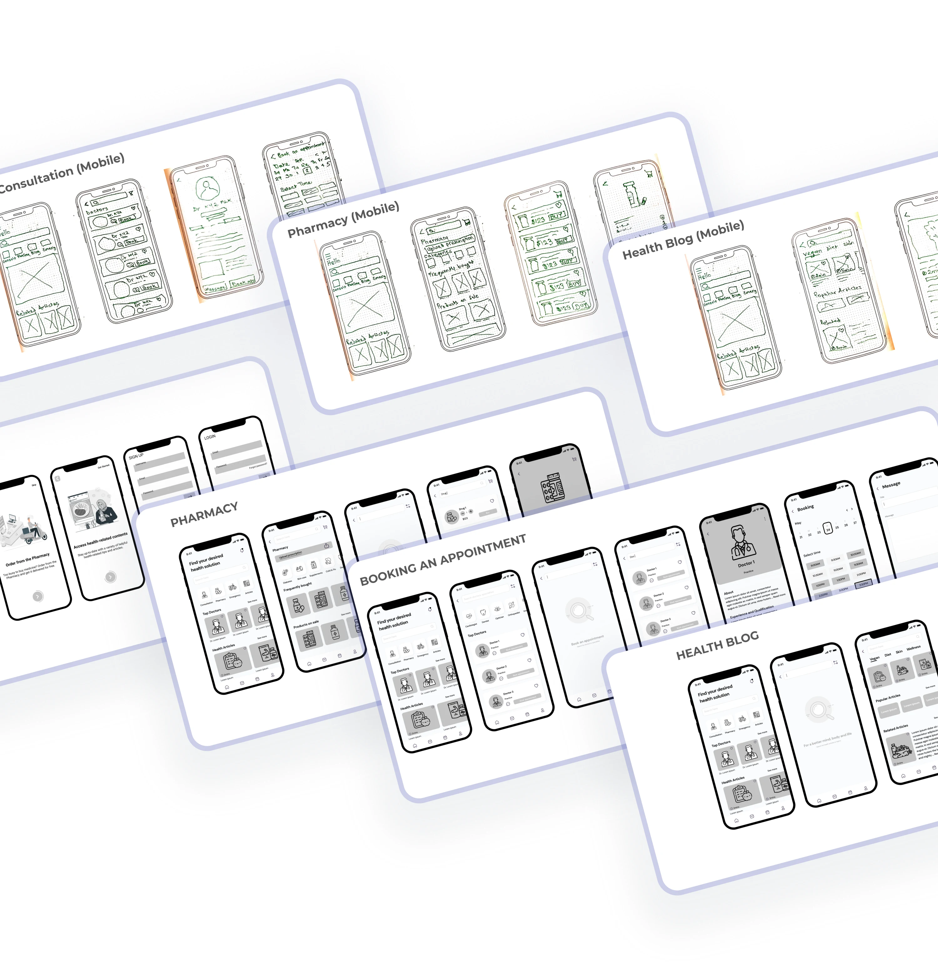
Low and mid - fidelity wireframes
Using the structure of the site map, I drew out sketches of the app´s main features first on paper. Main features like the flow to book an appointment, pharmacy and health blog. I went further by translating the low - fidelity wireframes to mid - fidelity wireframes.
After that, i created an interactive prototype of the screens in order to test the usability of the application.
User Testing
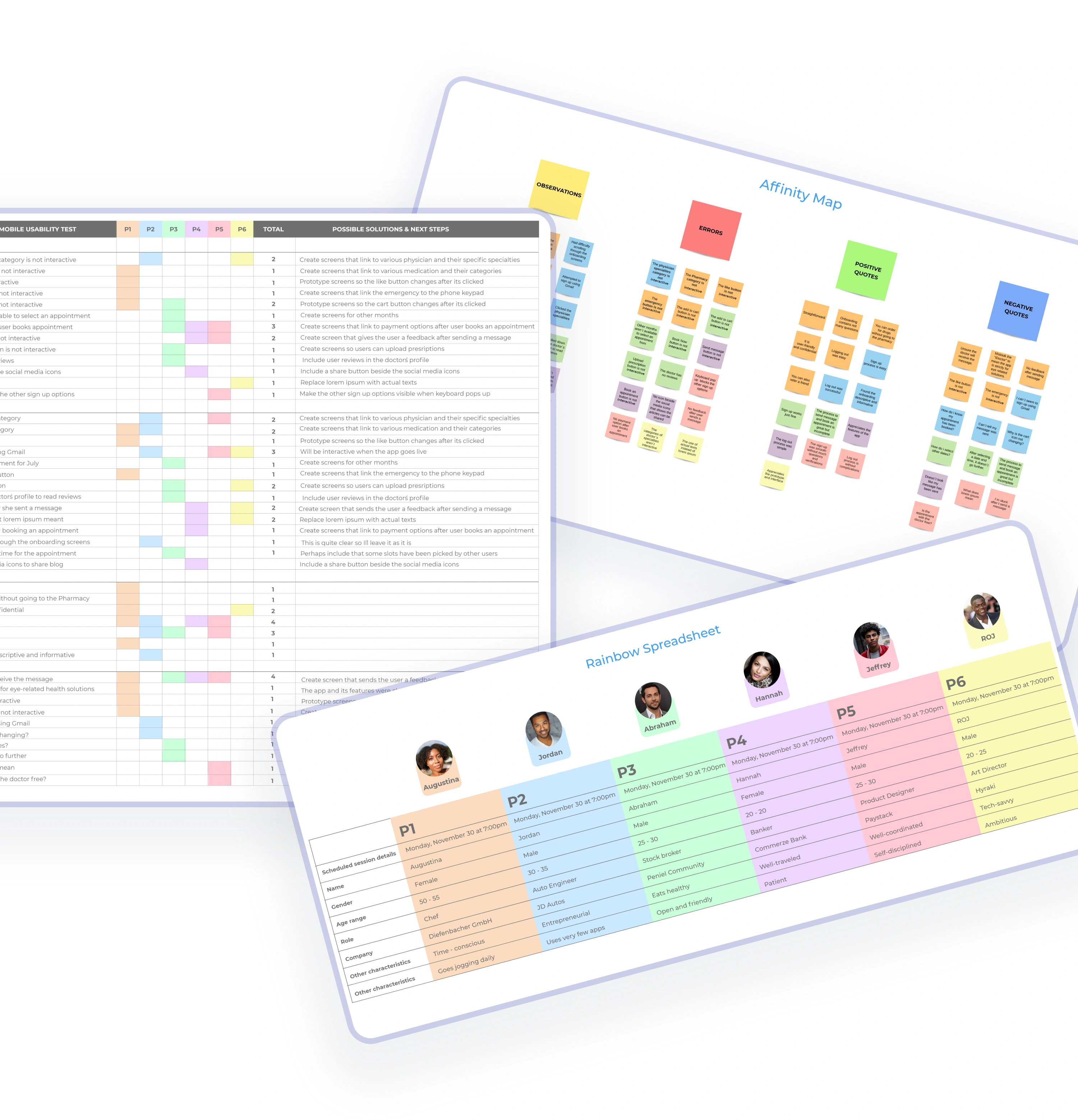
Usability Testing
I used the Rainbow Spreadsheet with different colours to represent the study’s participants. The spreadsheet includes all of the data collected during the UX study. I also involved the Affinity Mapping process to organize ideas and insights by sorting the observation, errors, positive quotes and negative quotes into groups.
Learnings and take-aways
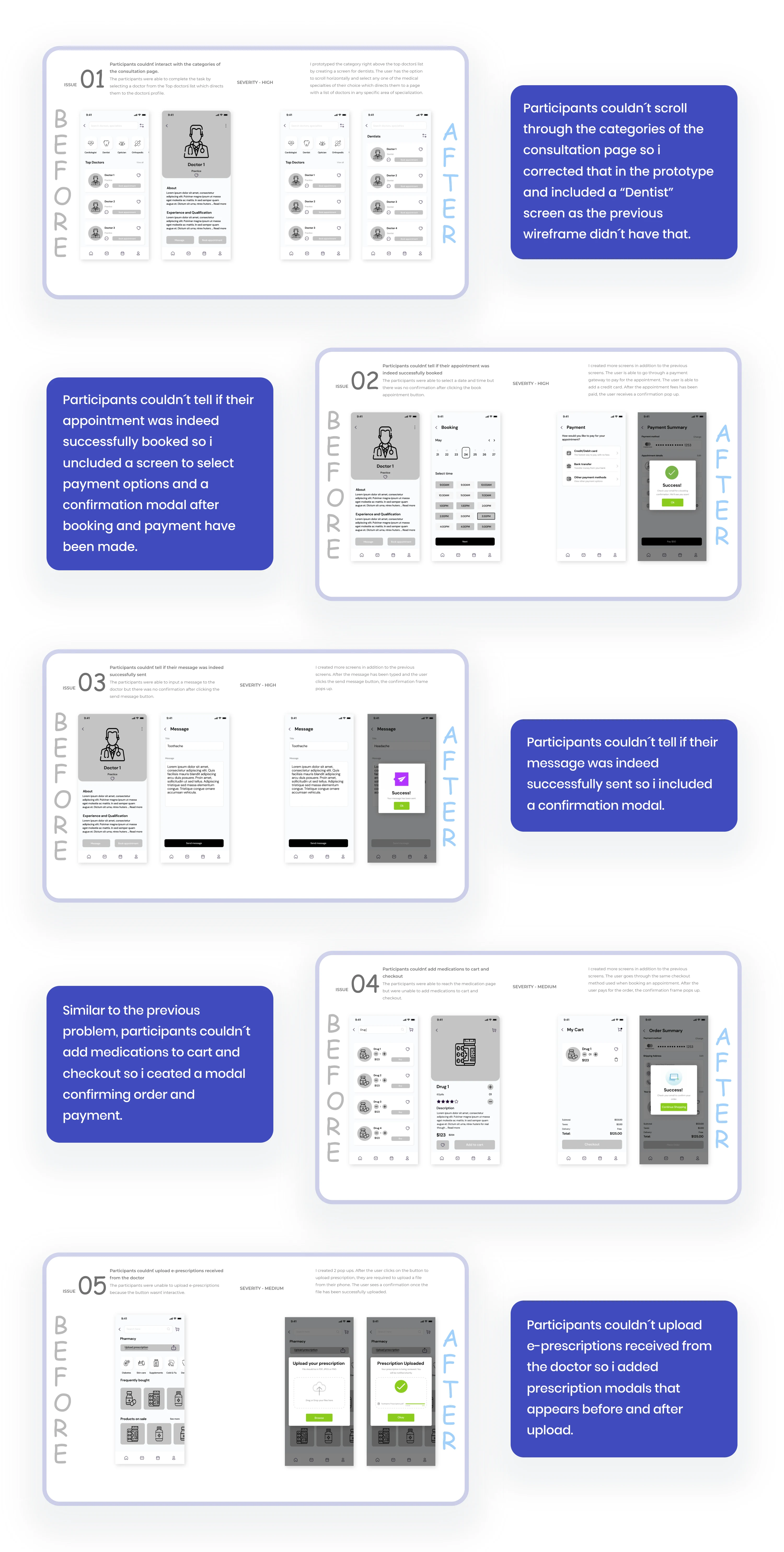
Replacing "lorem ipsum" dummy texts with actual texts as some participants couldn´t make out of what it meant.
I plan on creating more screens like a payment option screen which should appear after the user has booked an appointment.
Furthermore, I´ll create a screen that shows the user has successfully sent a message to the doctor.
I´ll also create a more interactive category section on the major screens so the user can scroll through different options.
I also plan to make the like buttons interactive so when the user likes a content or a profile, the like button changes state.
Iteration
Making changes
M Cobanli, the founder of OMC Design Studios, said; “Great design is the iteration of good design”.
I made further adjustments by taking what I learned from the usability tests and the other evaluation methods.
Validation
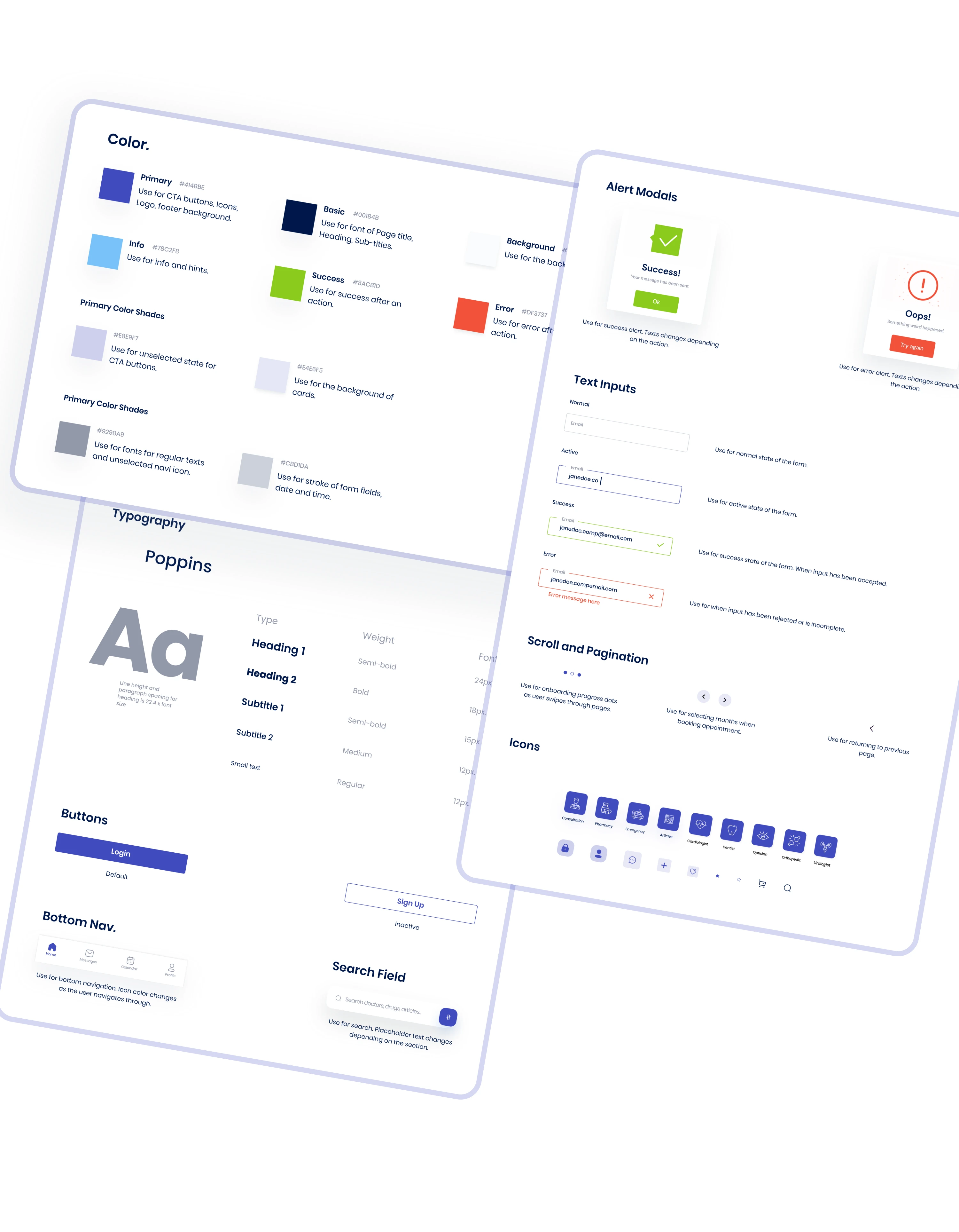
Style guide
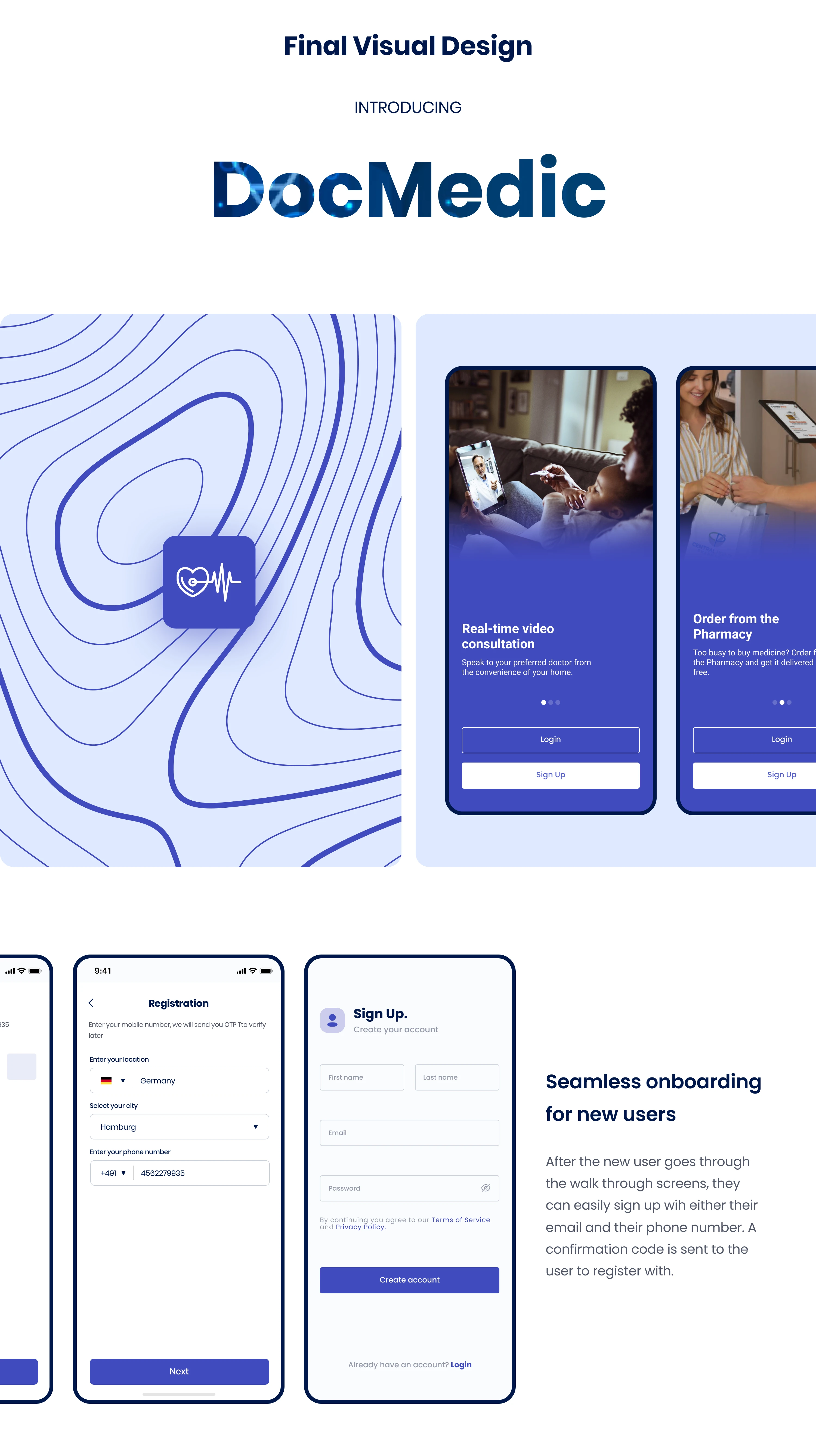
The finalized prototypes were designed into high - fidelity screens. Before then, i came up with a style guide in order to keep the design and development aligned. A medical sphere usually associates with the colour blue as it symbolises peace, calmness and serenity so i used a dark blue colour palette.
Like this project
Posted Jan 9, 2025
DocMedic helps you find doctors, book consultations, and access pharmacy and emergency services, all in one app.