
Mobile App Designer


Digital Product & Web Designer


Senior UX UI Product Designer & CEO ⚡ B2B SaaS, EdTech, AI
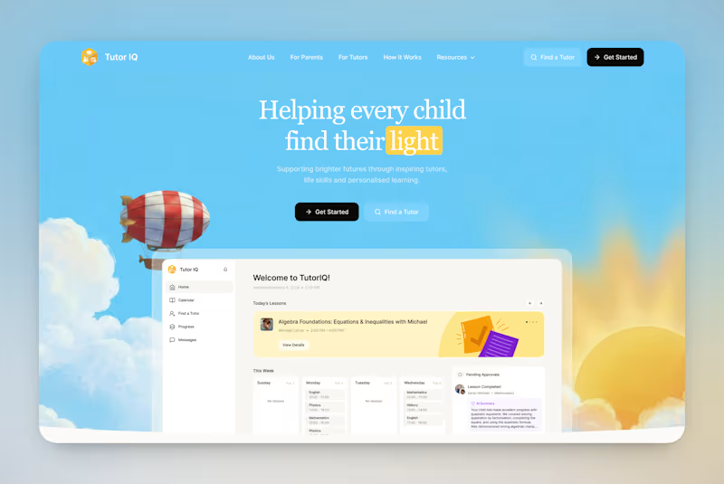
Your votes are in! Here's the final TutorIQ website ☀️
Thank you to all 20 of you who voted on the two concepts 🏄🏼♀️ It was close: 55% chose light and playful and 45% chose softer and calmer.
The final version mixes the two moods. Its bright colors are from the playful first concept. From the second one, it took the serif headline and the product preview on the first screen.
Quick context: TutorIQ is an AI tutoring platform for UK families. It matches each child with a tutor based on how they learn. Our task was a website that attracts parents and tutors before the platform launches.
Every parent comes with one question: 'Is this the right place for my child?' So the first screen answers it with the product itself. Parents see the lesson schedule and the AI summary they get after each lesson.
Now it's your turn 👇🏻 What would you keep from this version? And what would you change?
4
12
483

Product designer and No code Developer

UI/UX Designer | App & Web Design, Branding, Graphic Design

UI/UX Designer | App & Web Design, Branding, Graphic Design



UI/UX Designer | Framer Dev | Vibecode Specialist


Designing the “How It Works” section for this AI-powered skincare product was all about clarity and connection.
My client wanted a layout that not only explains the process but also builds user trust by showing how simple and personal their skincare journey could be.
We aligned on a design that:
✅ Breaks the process into clean, visual steps of Scan, Analyze, and Evolve.
✅ Balances AI sophistication with human warmth.
✅ Supports the business goal of driving signups by simplifying what could have felt complex.
It’s always fulfilling when a design bridges what users need to understand and what the brand wants them to feel.
#ProductDesign #WebDesign #AI #UXDesign #DesignThinking #SkincareTech #uidesign #websitedesign #landingpage
3
81

A grocery app I’m working on for a client, I made a quick presentation on it after a recent feedback round.
The client wanted a design that feels clean, easy to browse, and keeps users engaged while shopping.
So I focused on: 🛒 Personalized categories and daily deals ⚡️ Quick add-to-cart flow 🚚 Clear order tracking with delivery updates
The goal was to make grocery shopping feel simple, familiar, and delightful from start to finish.
#ProductDesign #ClientWork #UXDesign #MobileAppDesign #CaseStudyInProgress #uidesign
2
83


Creating user-centric designs that drive business & brand.
Creating user-centric designs that drive business & brand.


Product Designer / Figma Expert
Product Designer / Figma Expert


