A Course Library That Fits in a Pocket | LMS UX UI Design

Mark Barliet


Which part of your EdTech platform belongs on mobile?
Most training platforms start on the web and that is the right order. But your users aren't sitting at a desk all day, so eventually you have to ask: what does this look like in their hand?
The answer is not a smaller version of the same thing.
A desktop platform can afford eight equal entry points because there is room for them and a phone cannot. Everything has to be rebuilt around what the person came to do, which on a training app is almost always the same: find the right course and finish the next lesson.
Here is how we designed VTH (a mobile app for staff training):
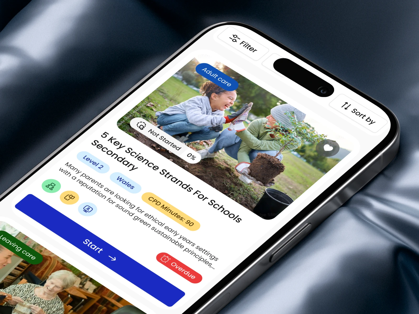
→ Every course card shows how far the person has got, what level it is and when it is due
→ Filters stay hidden until the list gets long and then they narrow it down by sector, level, country or progress
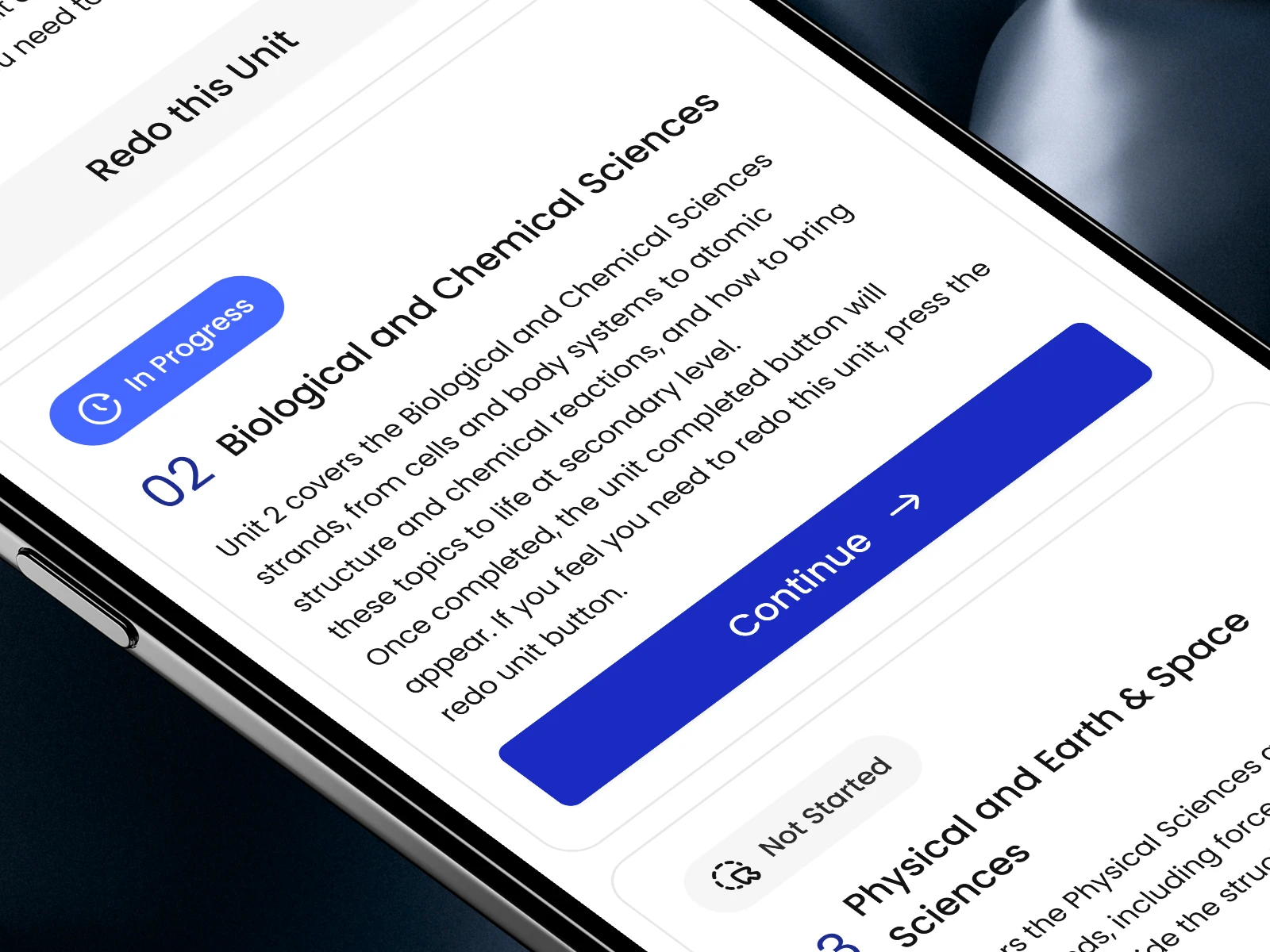
→ Each course is split into small numbered parts with a status on every one
→ One Continue button that opens exactly the part where the person stopped
→ Signing off a finished course takes one tap and the Help button is right next to it if something goes wrong
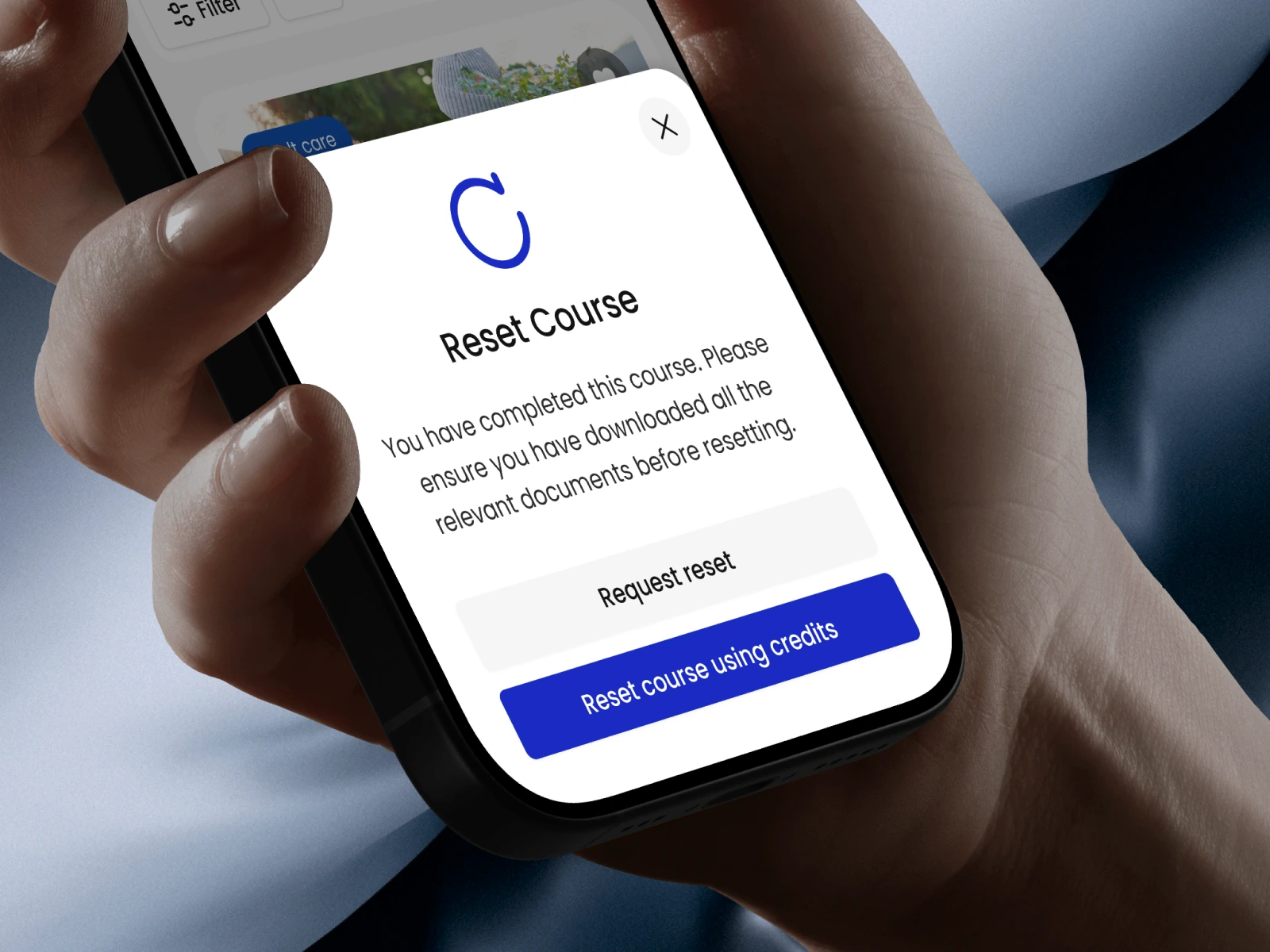
→ Starting a course over begins with a reminder to save the certificate, so nothing earned disappears
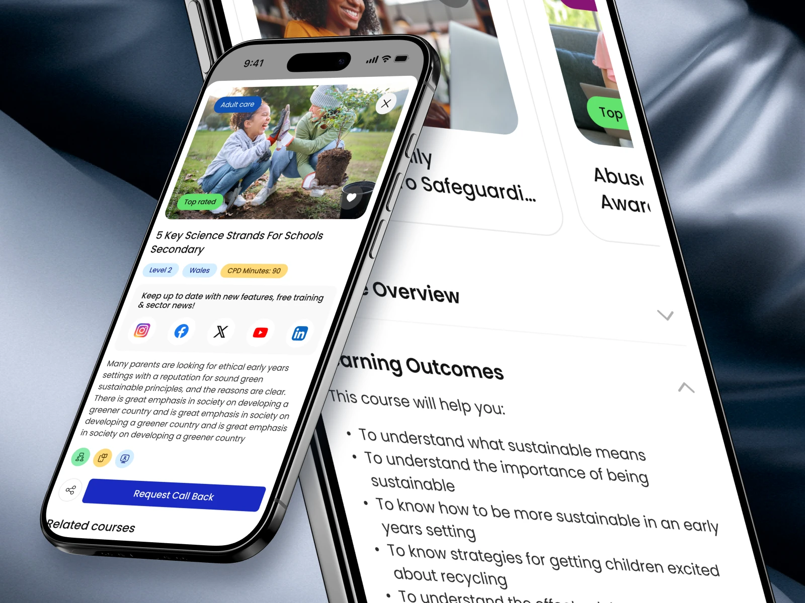
→ It all looks and works like the web version, so the user can switch devices instantly
Great design is about asking the right questions: What happens if the user leaves halfway? What if the internet cuts out? What if they tap reset by mistake?
We solve these details before handoff, saving you hours of dev meetings later.
✂️ DM us AUDIT and we'll send what it covers.
Like this project
Posted Sep 23, 2026
See how we designed a learning app that keeps users engaged. Explore the VTH case study!