🛡️ Two screens decide who stays | Login UX for B2B SaaS

Mark Barliet


🛡️ ClickGuard is a B2B SaaS platform that keeps advertising budgets on real people by blocking bots and competitor clicks across Google, Meta and Microsoft Ads.
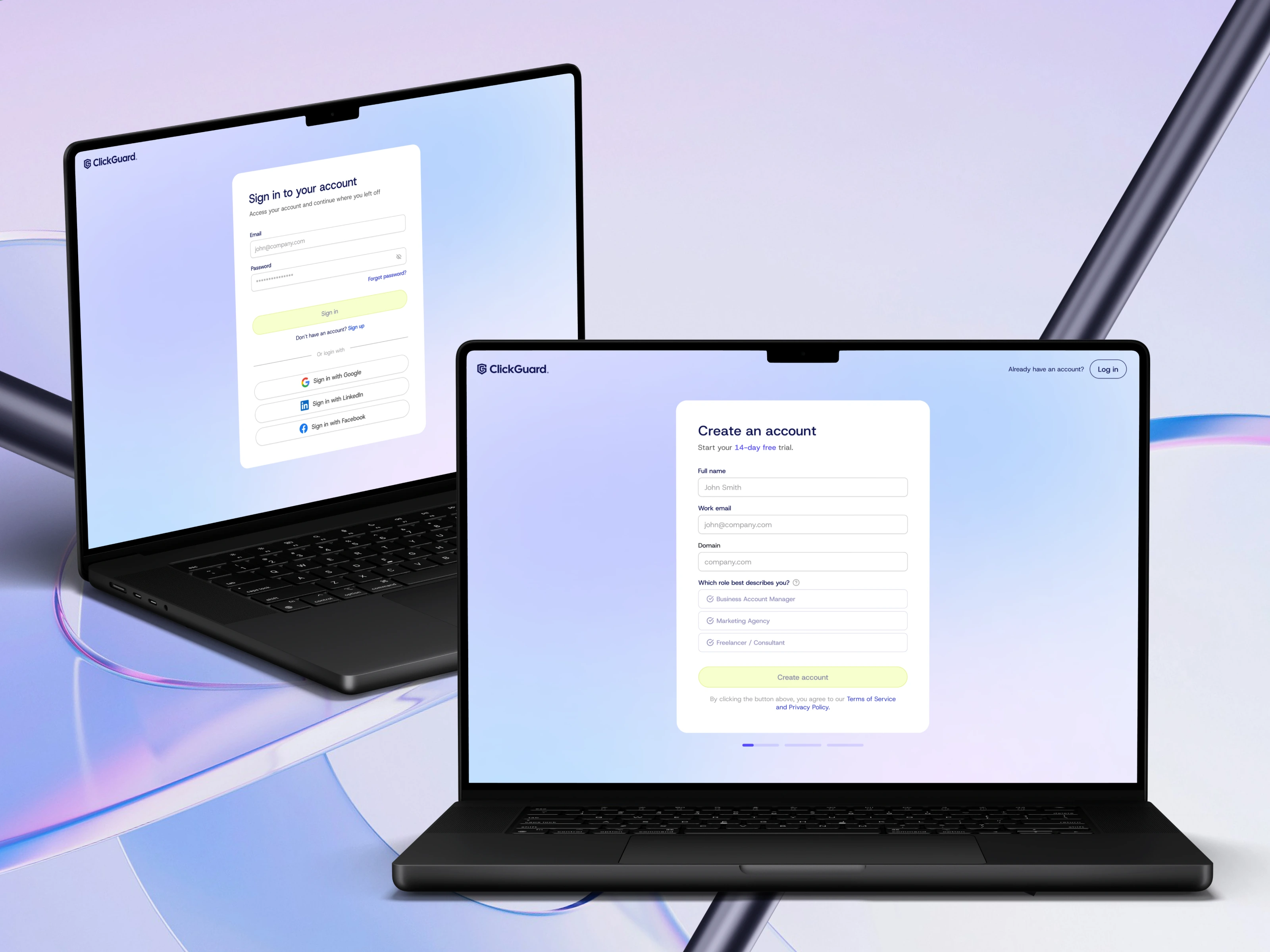
We redesigned the platform so that nothing feels technical before it needs to and these two screens are where users step in.
A short sign-up brings users faster to the moment they see money saved.
Name, work email, domain and one question about where they run ads — inside a company, at an agency or on their own.
A slider then asks about the monthly ad budget and that single number is enough to bring up a fitting plan.
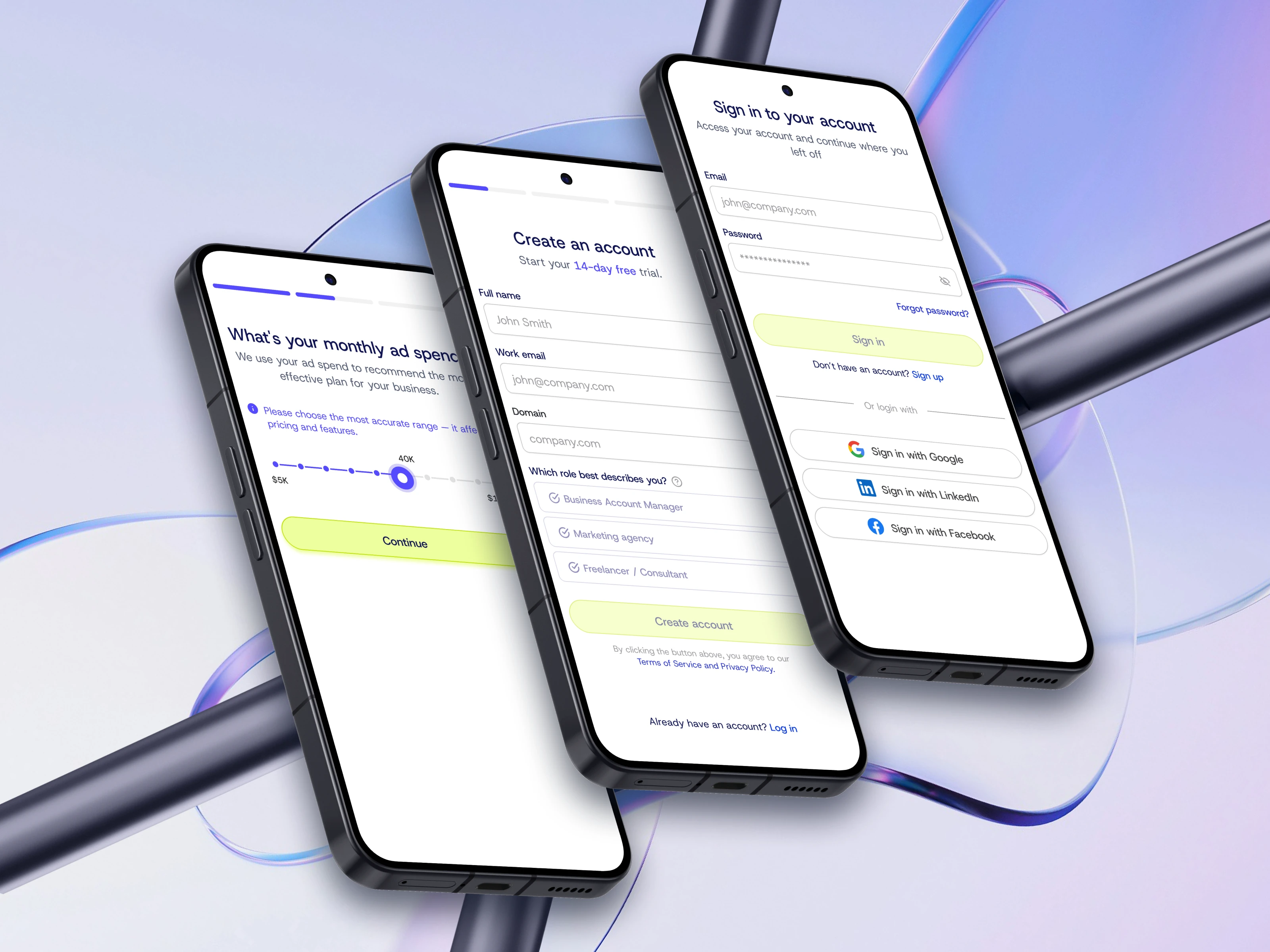
People sign up once and log in hundreds of times. Every visit is a chance to make the product easy to like.
Email and password come first, three familiar buttons skip the typing and the recovery link waits where users look for it.
The soft background leaves one bright action and that is the next step.
Users decide how they feel about a product in the first minute and that feeling is worth designing for.
Both screens left us with every state written out and a separate reviewer on our team went through the files before development started.
Starting something new? Begin with a Build-Readiness Audit 🥷🏻
Deciding what not to build is the fastest way to spend a development budget well.
The ⚡️Message button above opens a chat with us.
A design direction suited to B2B SaaS products, cybersecurity and adtech platforms, marketing analytics dashboards, subscription products and any tool where onboarding decides whether users stay.
Designed by basa.solutions for ClickGuard
Like this project
Posted Sep 8, 2026
Three taps from first visit to protected account. Sign-up, login and plan choice for an ad security SaaS, dev-ready.
Likes
13
Views
34
Clients
ClickGUARD