UI UX Redesign for a 3,000+ Course Training Platform
Mark Barliet

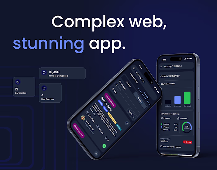
When outdated UX starts limiting growth, it’s time for a redesign. We rebuilt the VTH website around real user needs. Now, finding a course among 3,000+ options is as simple as scrolling your favorite streaming service.
The old structure lacked the essential pages and social proof needed to build trust. Many paths felt overcomplicated and repetitive, especially on mobile, where clarity is everything. To understand what needed to change, we looked closely at where people were getting stuck and what made the journey harder than it should be.
Everything now clicks into place from the very first second. We cut out extra steps so users can quickly find what they’re looking for without getting lost.
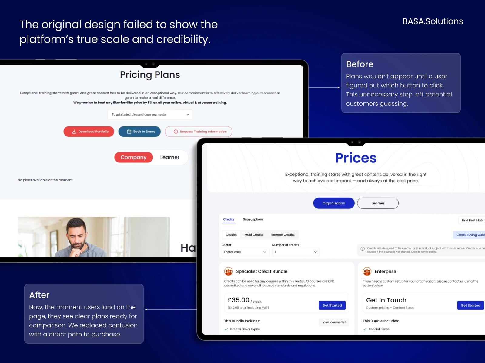
The platform was centered around predictable navigation and visible entry points, meaning learners never have to guess where they are and what to do next. We unblocked main flows like sign-up and pricing to make every interaction a no-brainer. Each step was also backed with real content, including readable plans and social proof that turn ‘maybe’ into a solid ‘yes’.
That same approach shaped the key UX upgrades across the platform.
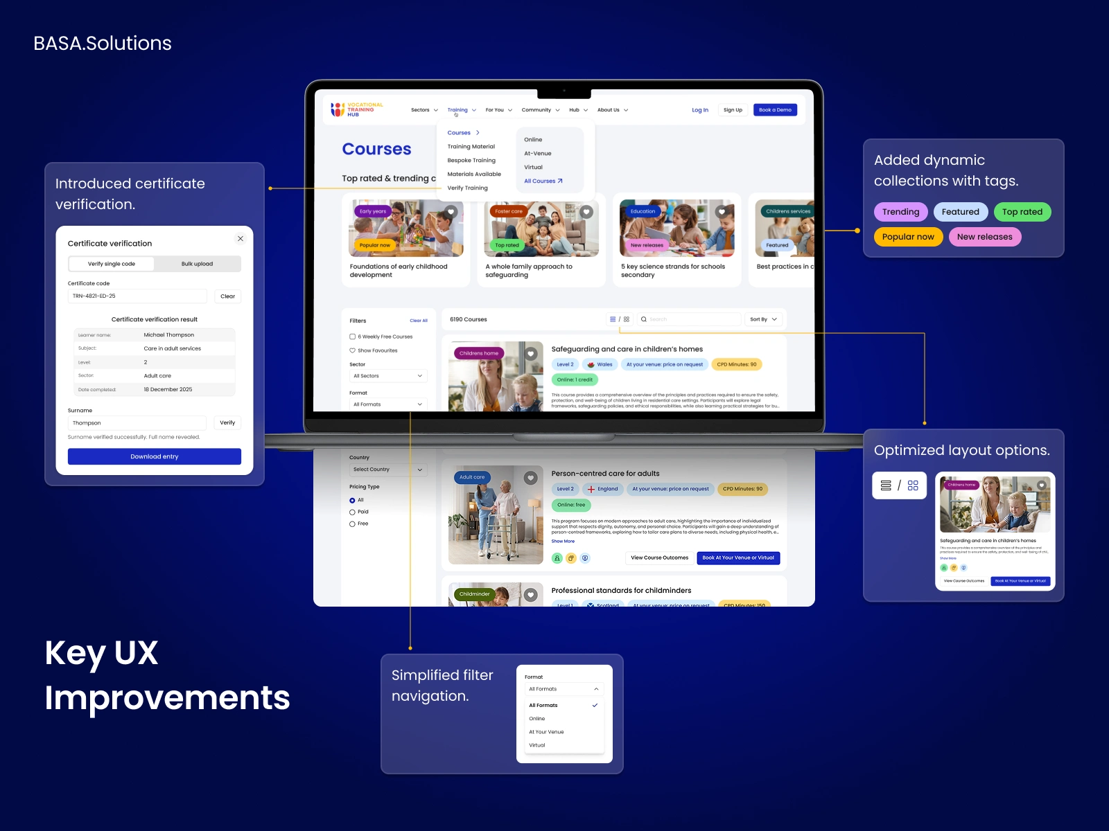
The interface no longer forces users to figure things out on their own. Instead, it guides them toward the right course, the right sector and the right decision point.
We believe good design removes effort, not adds more of it. For our clients, we build products that are a pleasure to use and feel like a natural extension of the user’s intent.
Looking to make your platform this effortless? Let’s catch up and see what we can build together.
Keywords
UX Design, UI Design, Product Design, SaaS Design, EdTech Platform, Dashboard UX, Design System, UX Research, Mobile UX, Web Redesign, User Flow, B2B SaaS, Learning Platform
Like this project
Posted Jun 25, 2026
VTH needed a digital identity to match its impact. We turned the website into a clean entry point that leads to career paths. ⚡ UX UI EdTech SaaS Redesign