SaaS Redesign: Fixing Onboarding to Stop User Churn
Mark Barliet
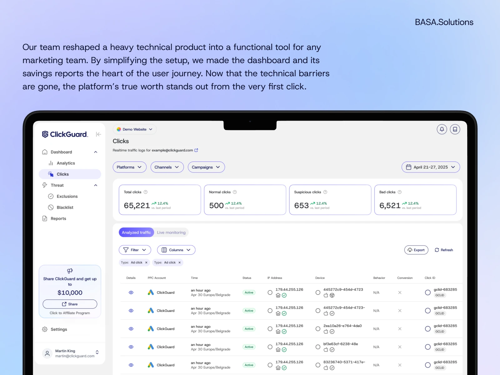
ClickGuard saves companies thousands by blocking click fraud, but the technical setup was originally a major barrier. We needed to make this complex system accessible for marketing teams, moving the focus from ‘how do I get this to work?’ to ‘how much am I saving?’
The plan was simple: clear the path and let the product speak for itself.
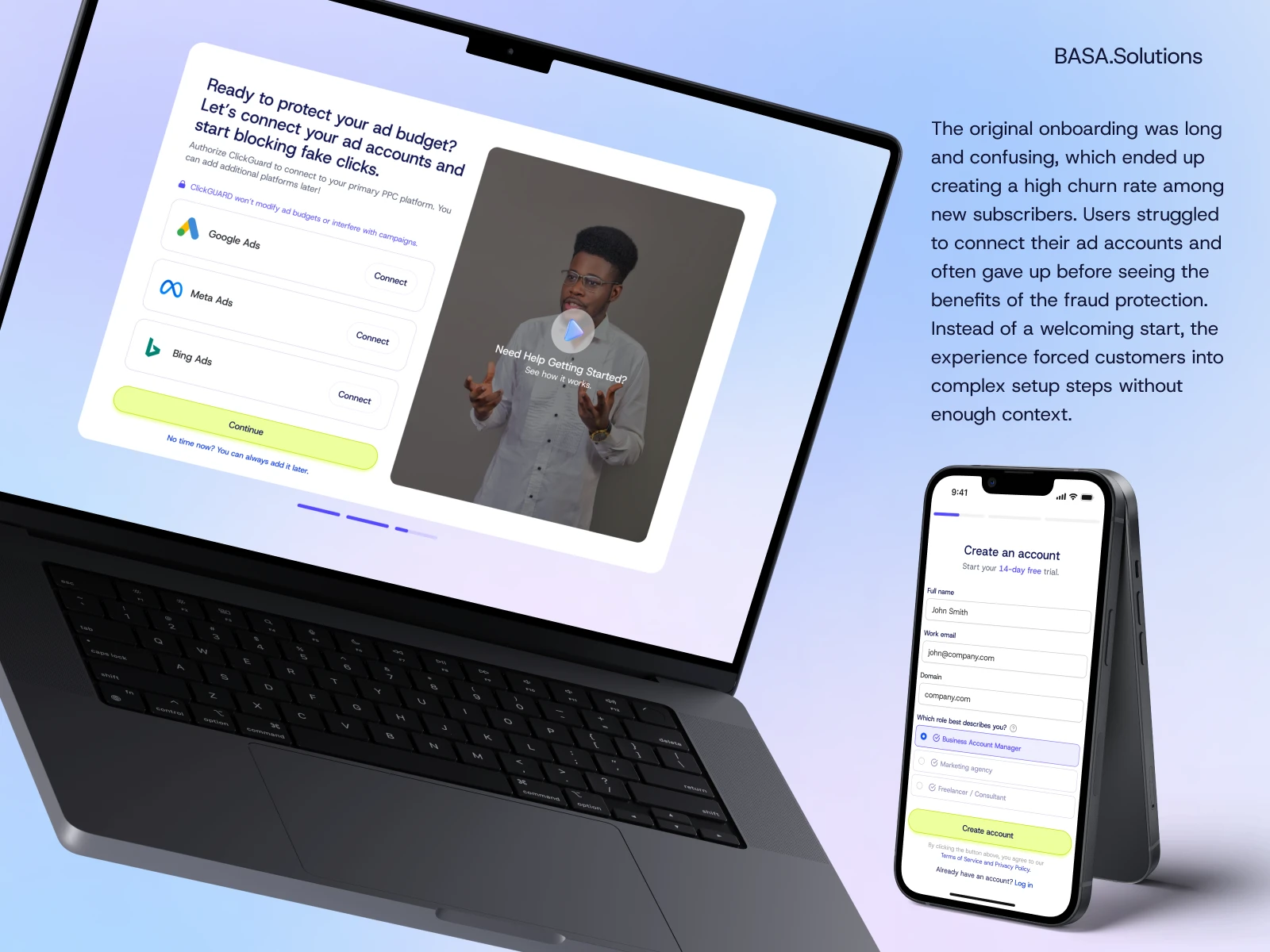
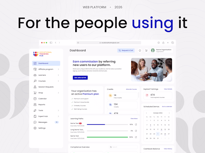
Our audit showed that users were getting stuck right at the entrance due to a messy login process and a lack of guidance. It was obvious that keeping subscribers meant completely rethinking how they get started with the platform.
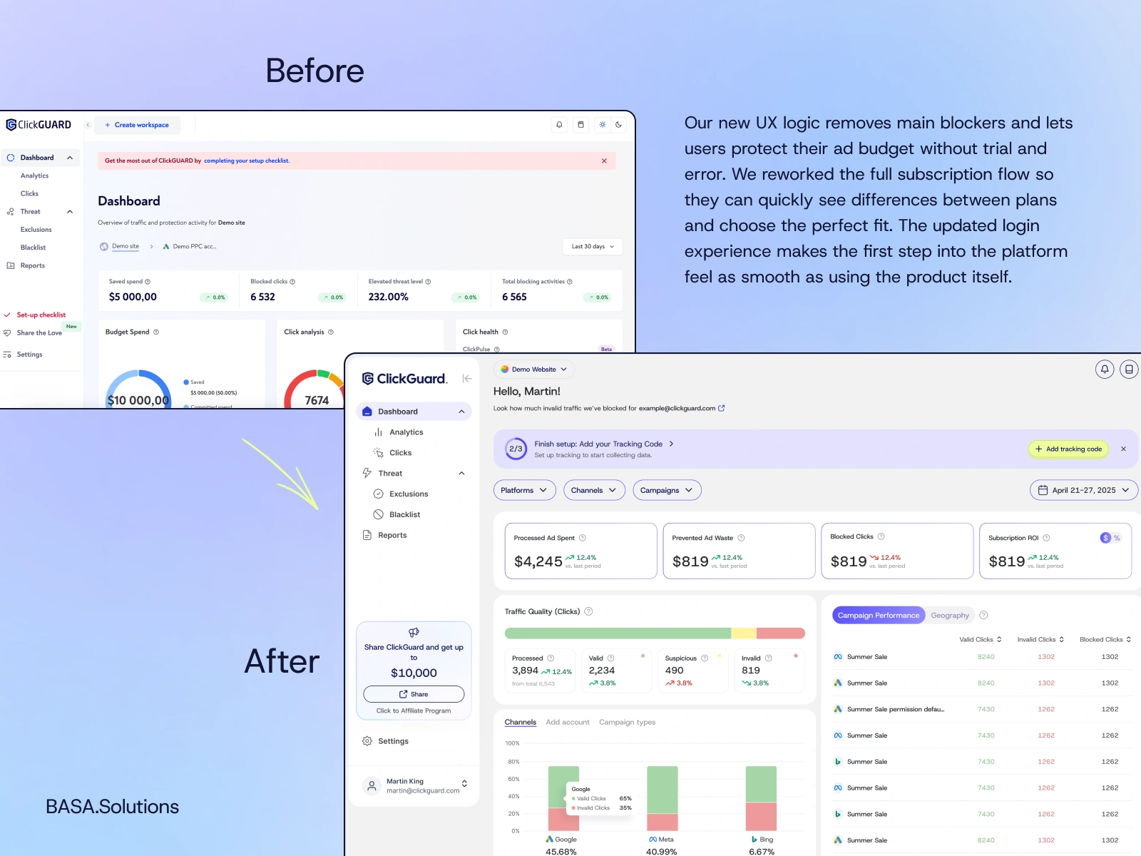
By simplifying the pricing model and making the transition to enterprise plans more personal, we took the stress out of picking the right plan. Setting the annual option as a default and cleaning up the login process created a much faster route to a protected ad account. These changes replaced the pressure of a forced choice with a flow that actually makes sense for the user.
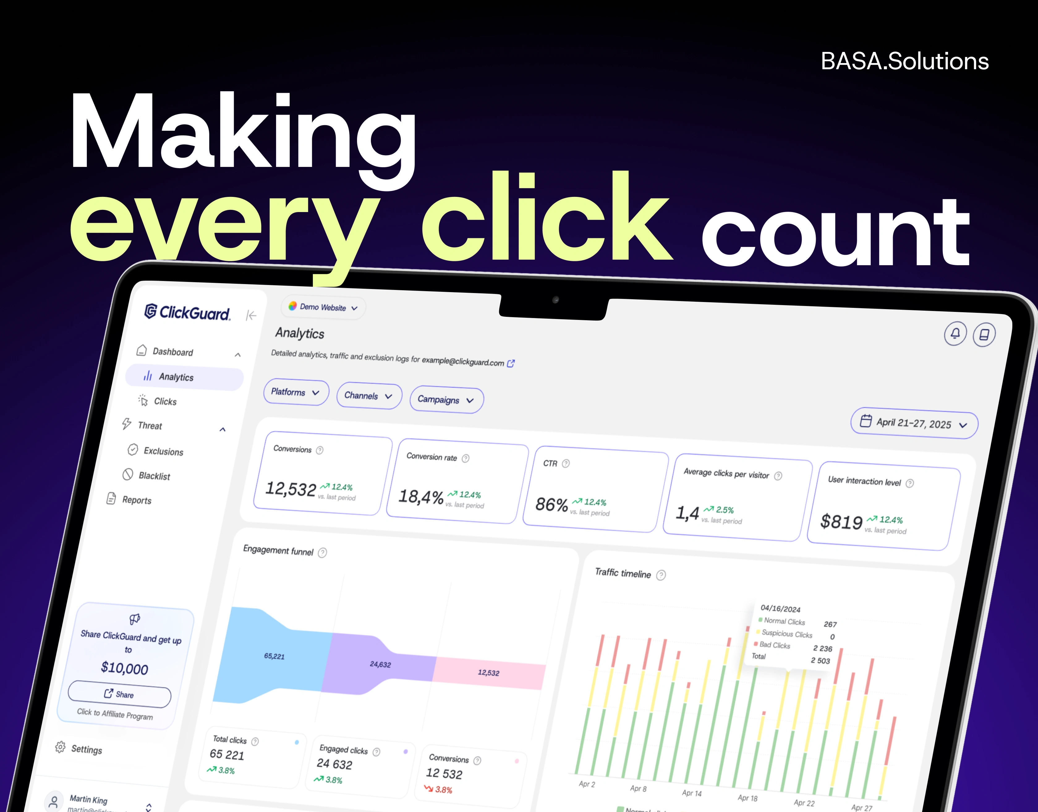
Once the structural blockers were out of the way, we moved on to the visual layer. The priority was keeping data easy to digest, without the usual corporate stiffness.
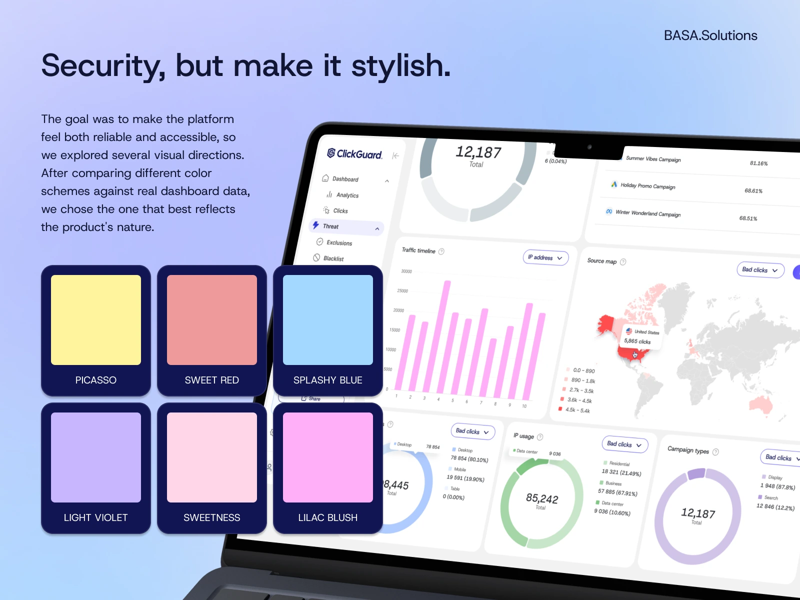
The main idea was to highlight what actually matters: instant alerts and real savings. Testing various styles against live data helped us find a look that stays easy on the eyes even after hours of work. This turned the dashboard into a workspace where complex numbers finally feel organized and simple to track.
Sometimes, the best update isn't adding more. It's revealing what’s already there. If you feel your product has more potential than it’s currently showing, let’s find a way to let it out together.
Like this project
Posted Jun 17, 2026
ClickGuard keeps your ad spend on real users, not fraud. We shaped its first impression—from login to insight—so it sets the tone for everything after.
Likes
15
Views
21
Timeline
Mar 17, 2025 - Sep 20, 2025