Casa Solana Landing Page Design
Sagar Arora
Casa Solana | Landing Page for Boutique Airbnb Stay
Project Type: UX/UI
Design
Role: UI/UX Designer
Tools Used: Figma
Website Type: Landing Page for Boutique Airbnb Stay
Overview
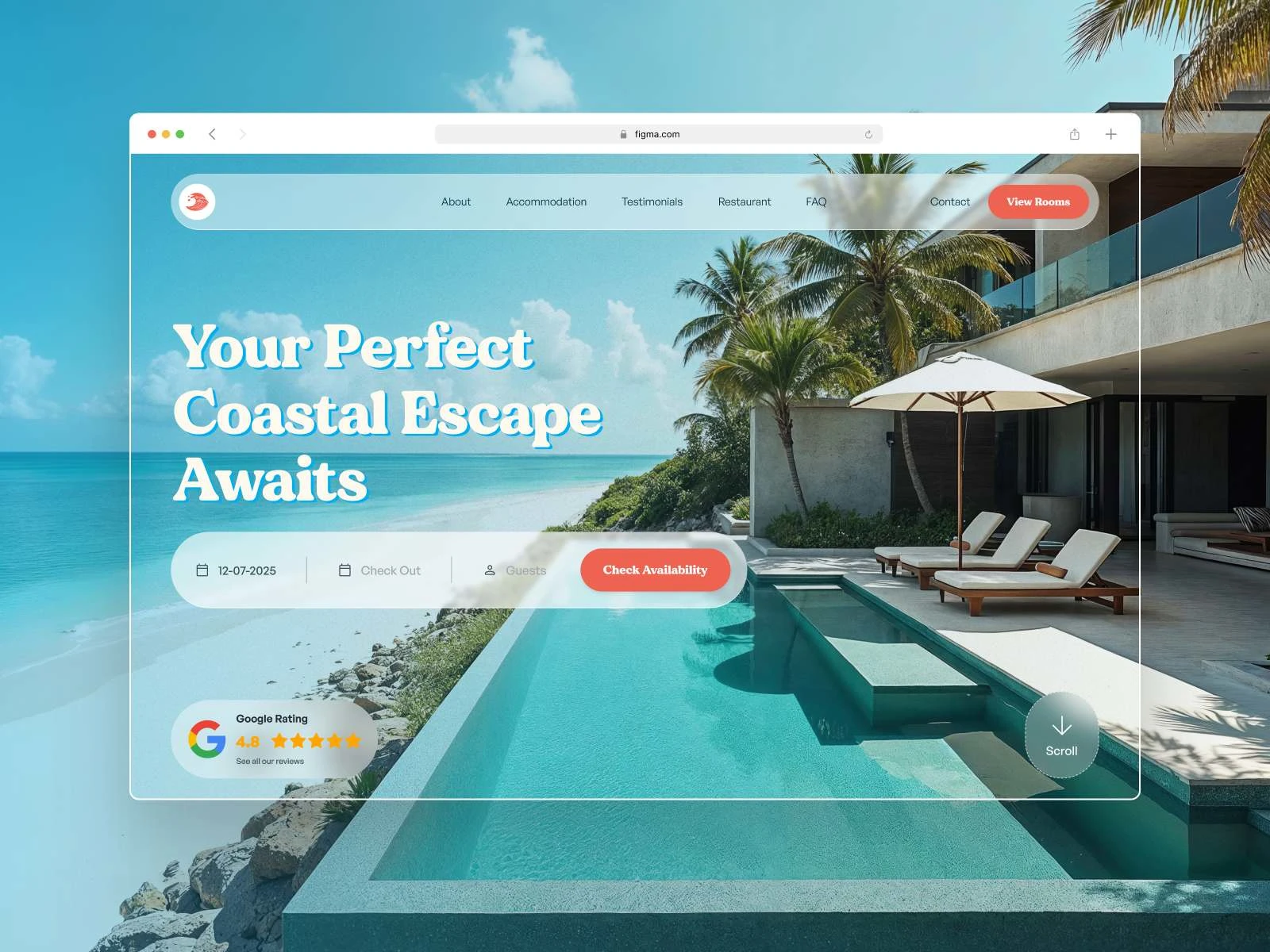
Casa Solana is a fictional boutique Airbnb property designed to offer a calm, minimalist, and emotionally engaging escape for modern travelers. This project explores how UX design can create trust, evoke emotion, and guide action—without relying on aggressive tactics.
The page is built around one core question:
“How do you make a digital space feel like a getaway before they even book?”
Goals of the Project
Build Trust Quickly: Most users decide in 5–10 seconds if a site “feels right.” The goal was to design a site that inspires confidence and calm immediately.
Showcase the Experience: The visual hierarchy and content structure needed to reflect what makes the stay different—beach proximity, cozy interiors, local food, and hidden-gem activities.
Convert Without Pressure: This is a soft-sell design. The goal wasn’t aggressive conversion but a natural, emotion-led funnel that leads to booking.
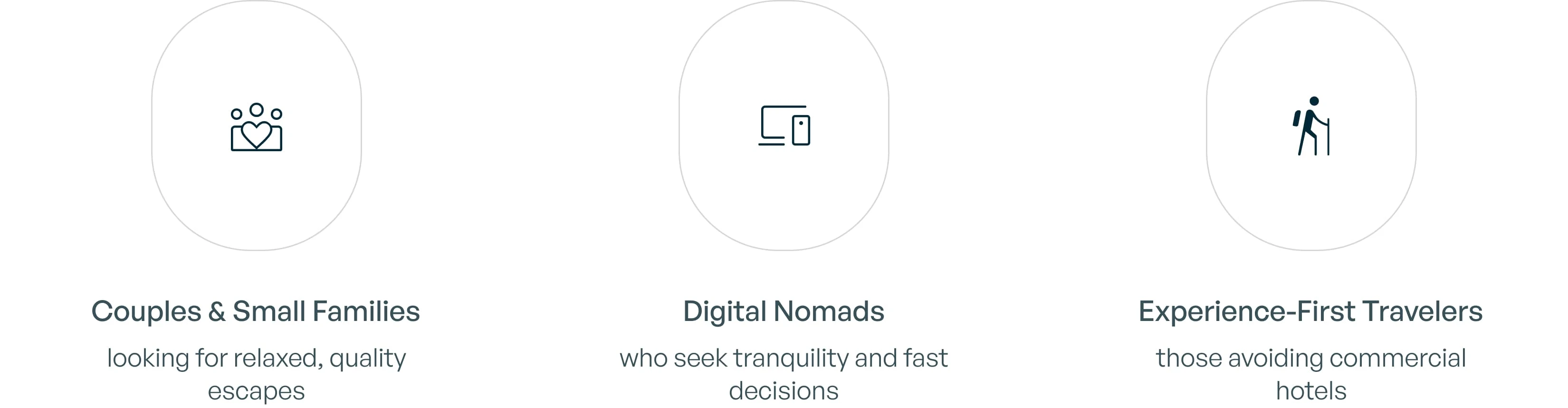
Target Audience
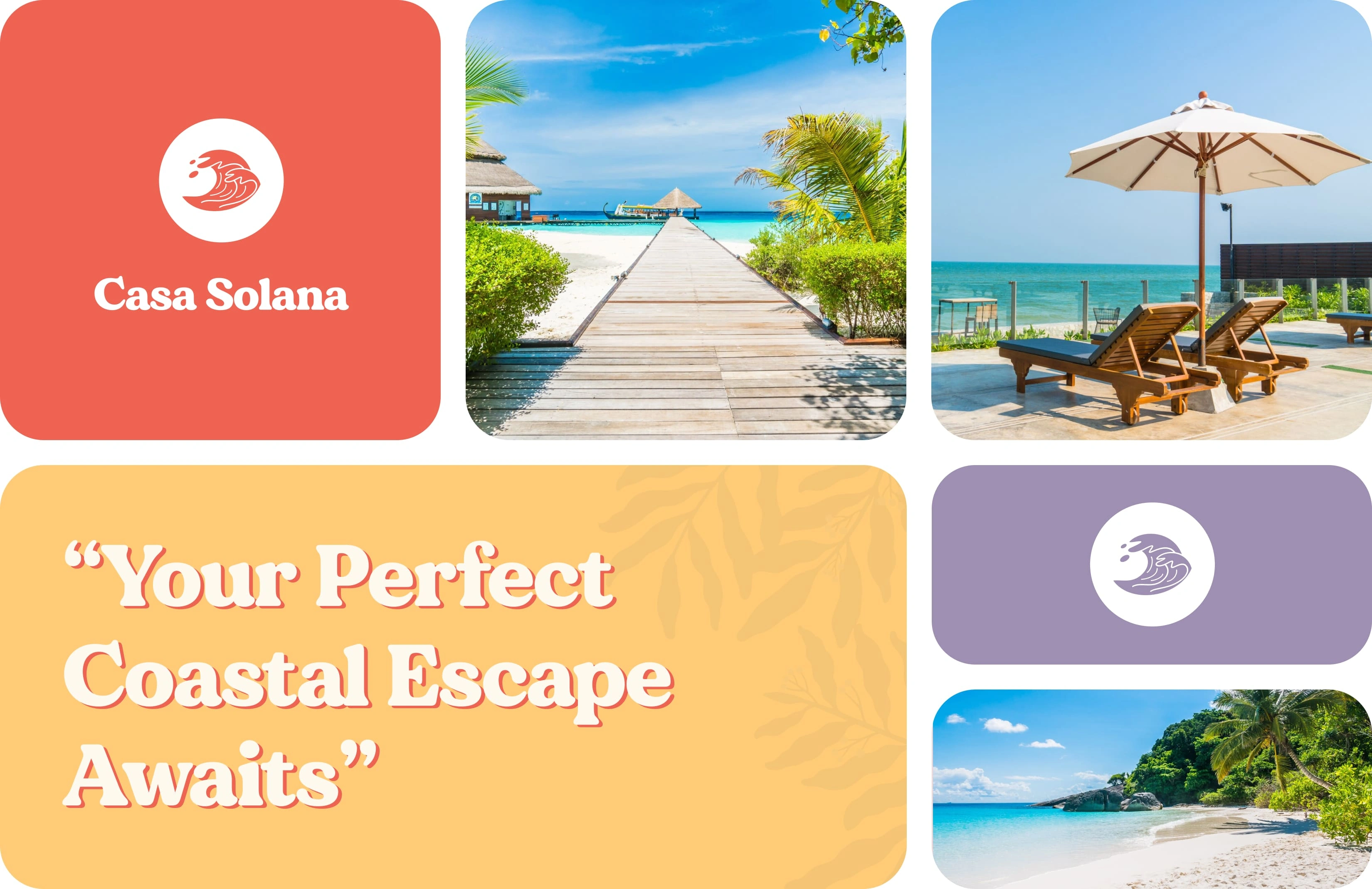
Visual Direction – Relaxed & Refined Coastal Energy
For Casa Solana, the goal was to capture a bright, welcoming coastal vibe with a subtle sense of sophistication — something that feels modern, breezy, and tailored for boutique hospitality.
Colors
A vibrant and fresh palette:
🌊 Sky Blue #00AEF0 – evokes clear beach skies
🍊 Coral Red #EE6352 – for lively call-to-actions
☀️ Creamy Beige #FEF9EF – softens the background
🌴 Warm Yellow #FFCB77 – adds warmth and friendliness
🪸 Dusty Lavender #9E8FB2 – subtle contrast with a luxe touch
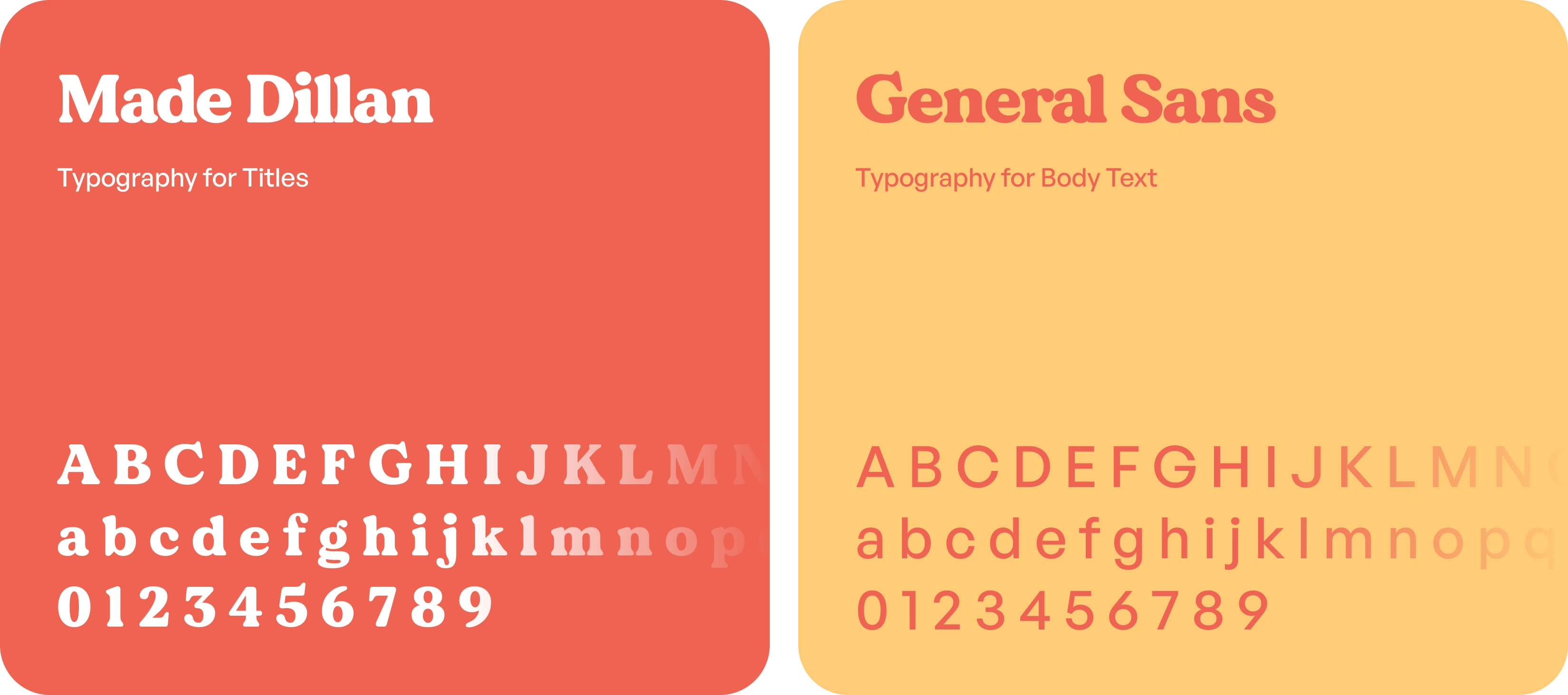
Typography
Headings: Made Dillan — elegant, serif-inspired, adds a unique editorial charm
Body: General Sans — modern, clean, and effortlessly readable
UI Style
Rounded cards, soft shadows, torn edges, and playful image masking bring in a custom, lifestyle-led feel — not too rigid, not too trendy.
The result is a layout that blends clarity with character, inviting users to imagine the calm escape that Casa Solana promises.
Landing Page Strategy – Emotion First, Then Action
The core design principle? Lead with feeling, not friction.
This landing page was crafted to emotionally resonate before pushing for bookings. It guides the user with a natural rhythm — from immersion to trust to conversion — instead of jumping straight to sales.
Key highlights
Hero Section: Large, calm imagery + clear promise (“Your perfect coastal escape awaits”)
Social Proof: Friendly, pastel-toned testimonials for warmth and authenticity
Value Props: Simple icon-led highlights like Steps from the beach, Minimalist interiors, Locally-sourced food
In-house Dining: Vibrant food imagery and lifestyle copy to add richness to the story
Booking Flow: Subtle CTAs designed to feel optional until the user is ready
The page balances clarity, storytelling, and persuasion without overwhelming — ideal for boutique stays and short-term rentals.
Mobile Experience
Casa Solana’s mobile design stays minimal and breezy — just like the stay itself.
Key highlights
Effortless Booking – CTAs are stacked clearly for quick tap access.
Skim-Friendly Layout – Info is easy to scroll and absorb.
Relaxed Spacing – Soft colors and padding keep it breathable.
Visual First – Photos stay central to the experience.
Coastal Vibes, On-the-Go – It feels like scrolling through a beach day.
Like this project
Posted May 26, 2025
Designed a landing page for Casa Solana, a boutique Airbnb stay, focusing on trust, emotion, and natural conversion.
Likes
2
Views
7