A Bold New Website for a Fast-Growing Branding Agency
Sagar Arora
A Bold New Website for a Fast-Growing Branding Agency
Industry: Marketing & Branding Agency
Role: Design, CMS Setup & Webflow Development
Tools Used: Figma
& Webflow
Year: 2024
Overview
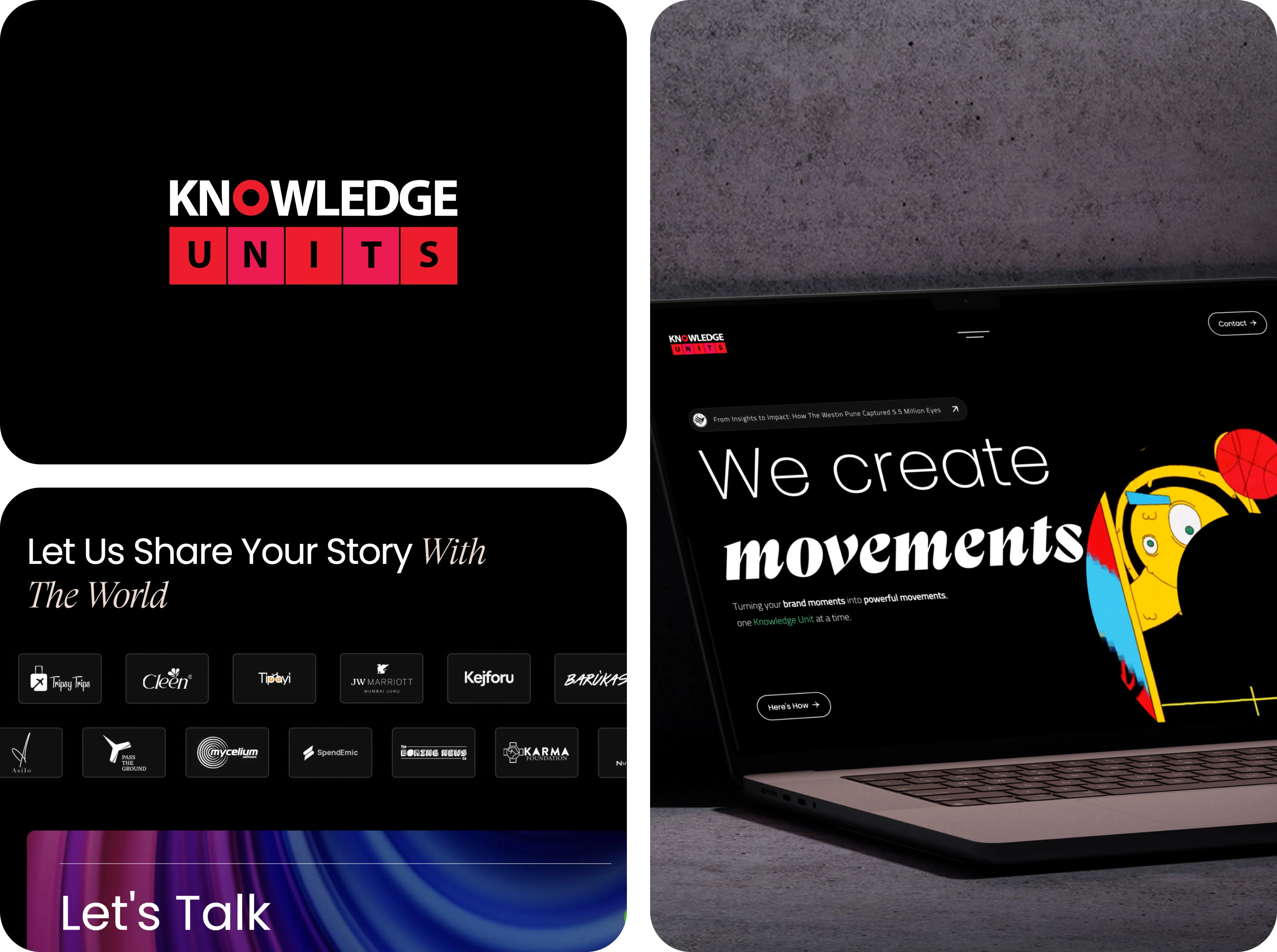
Knowledge Units is a full-service branding agency based in Pune, India. They needed a modern, interactive website that reflected their creative spirit and growing portfolio. I helped design and develop a bold, CMS-powered site that’s fast, mobile-first, and full of personality.
Goals of the Project
It had been a while since Knowledge Units last updated their portfolio, and the founders felt it no longer reflected the agency’s growth or the scale of work they had achieved over the years.
The goal of this redesign was twofold:
First, to showcase the results the agency had delivered for clients — not just what they do, but the real impact of their work.
Second, to clearly communicate the full range of services they offer, something that wasn’t highlighted effectively on the older site.
The new website needed to feel more confident, more mature, and aligned with where the agency stands today.
The Process
We followed a user-centered design process, starting with in-depth conversations with the founders to align on their goals — reflecting the agency’s growth, showcasing real client results, and clearly presenting their range of services.
During the design phase, I collaborated with a junior designer to shape the visual direction. Once the high-fidelity designs were ready, we moved into prototyping and added motion — animating key sections to get a realistic sense of how the site would feel when live.
I then handled the full Webflow development, building a fast, responsive, and visually engaging website that truly captured the creative energy of Knowledge Units.
Discovery → Research → Wireframes → Hi-fi Design → Animation → Development
Impact/Result
The new website gave Knowledge Units a much-needed upgrade — one that finally matched their creativity, credibility, and the level of work they produce. It was cleaner, bolder, and far more intentional in how it communicated the agency’s strengths.
What made this project especially meaningful for me was that I had also designed and developed their previous site. So in a way, I wasn’t just redesigning their portfolio — I was outgrowing my own past work.
It was both a challenge and a milestone — pushing me to rethink my approach, raise the bar, and turn their vision into something that felt sharp, modern, and truly reflective of who they are today. And in the process, I got to see how much I’ve evolved as a designer and developer myself.

Like this project
Posted Jul 21, 2025
Designed and developed an interactive, bold website for Knowledge Units—a creative agency—showcasing their portfolio and elevating their online presence.
Likes
2
Views
7
Timeline
Jan 1, 2024 - Dec 31, 2024