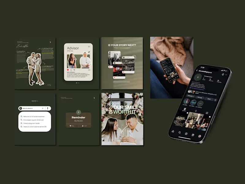
Brand Designer and Strategist 🪄

Brand Designer and Strategist 🪄

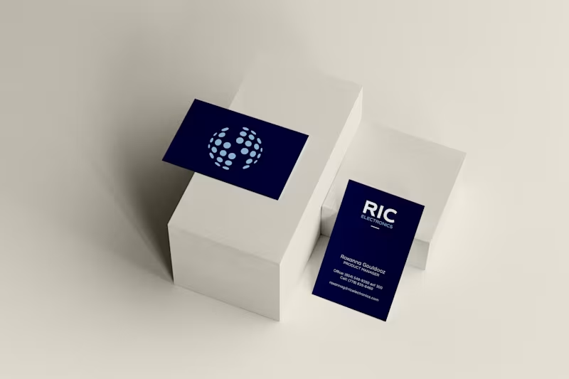
I led a brand refresh for RIC Electronics, a Canadian manufacturer specializing in power and energy solutions.
This wasn’t a total rebrand, it was a refinement. The original logo felt outdated and disconnected from the team, so the goal was to create something that still honoured their roots but reflected who they are now: sharper, stronger, and more aligned.
The result: a cleaner form, refined typography, and a mark with meaning that's built for the people who use it every day!!
24
61
2.9K


Not Just a Brand, A Legacy

Designing bold visuals for enduring brands.

Designing bold visuals for enduring brands.
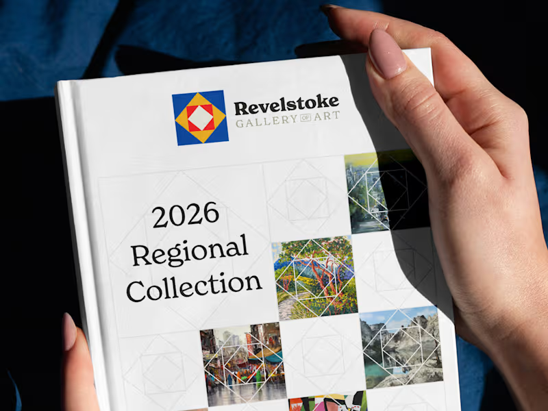

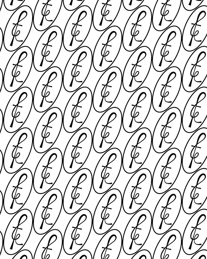
BINE: Hop Research at Langara – Logo Design
Langara University started a hop research project to learn more about the essential oils (terpenes) in hops (the stuff used to make beer)! I had the opportunity to work with them to create their logo.
The main logo contains a hop in a beaker-like container with a degree symbol, all referring to equipment and symbolism relative to their lab operations
2
2
350

I design Identity Systems and Product Design




Website Design & Build + Visual Identity for Businesses
New to Contra
Website Design & Build + Visual Identity for Businesses

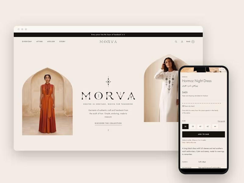
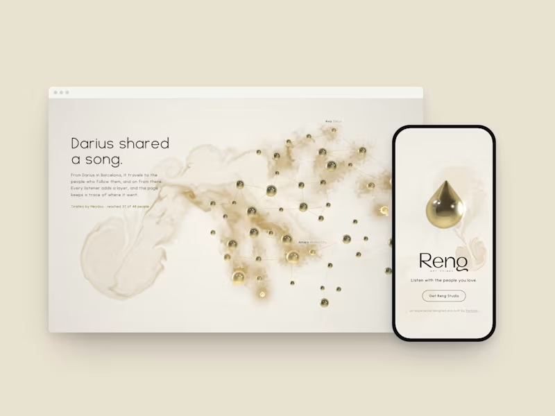

Multidisciplinary Studio Powering Conscious Change
- 1x
- Hired
- 3
- Followers
Multidisciplinary Studio Powering Conscious Change


Building Brands That Inspire
Building Brands That Inspire


Your Vision. Made Visual. 🌸