Modern Brand Identity for Axe.Software
Vlad Savruk
Axe.Software is a software development company. They needed a clean, consistent identity that feels modern, trustworthy, and easy to apply across web and social.
Role
Brand identity, logo design
Deliverables
Logo mark and wordmark, color palette, typography pairing, layout direction, social assets
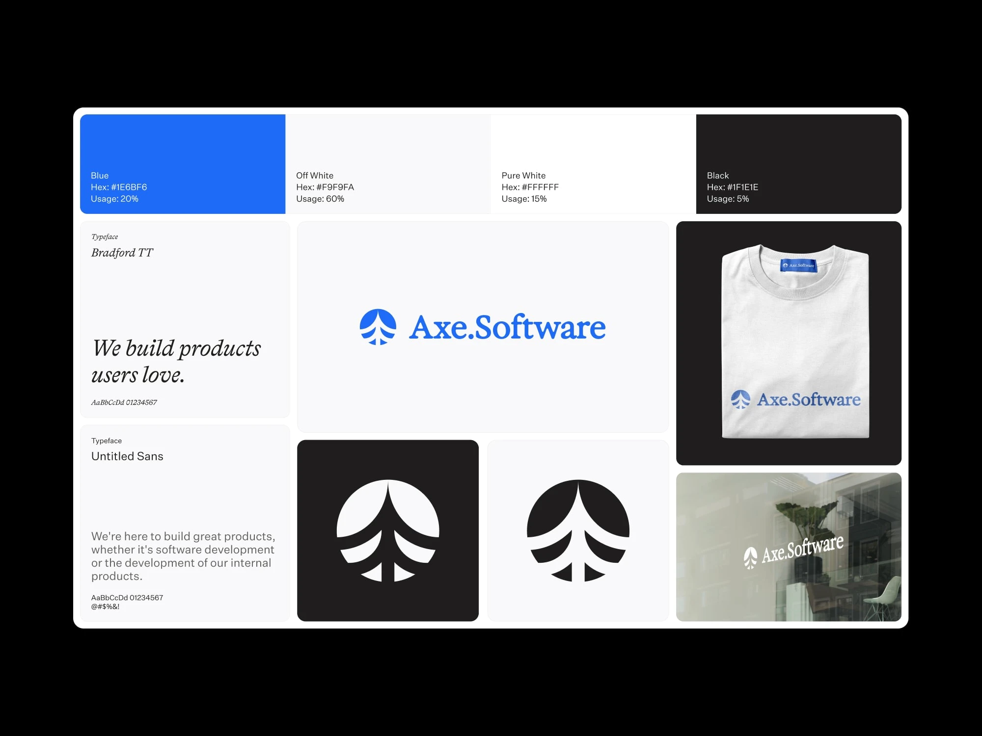
Axe.Software Identity Snapshot
Goal
Create a recognizable logo that works as an icon and a simple system for consistent brand use.
Approach
A minimal identity built around one strong signature blue, lots of off-white space, and limited black for contrast. Typography is paired to balance personality (headlines) and clarity (body/UI).
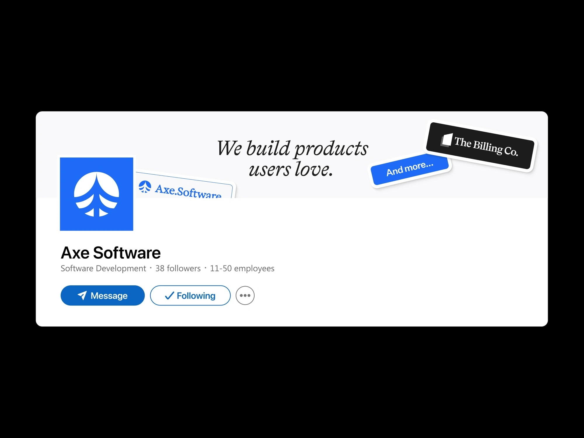
Axe.Software linkedin banner mockup
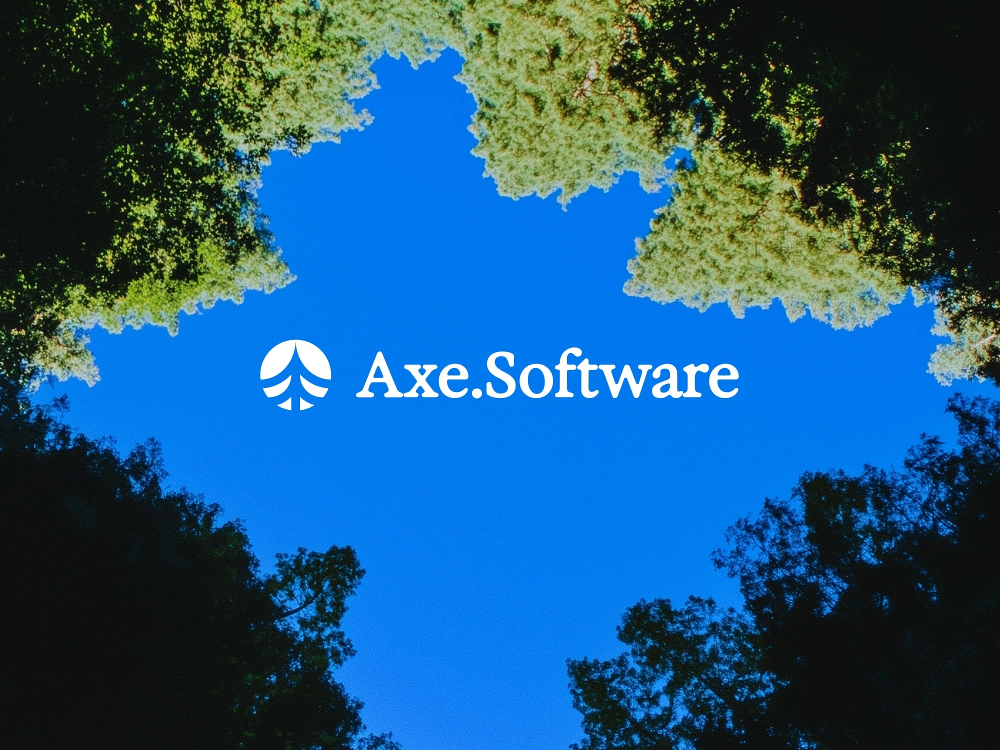
Logo
Designed to be bold, legible at small sizes, and flexible on light or dark backgrounds.
Typography and color
Two-type pairing for hierarchy and readability. Palette includes usage ratios to keep applications consistent.
Applications
Social banner and profile-ready assets to keep the brand consistent in real touchpoints.
Outcome
A compact identity system that is recognizable, scalable, and easy to maintain.
Like this project
Posted Feb 2, 2026
A minimal brand identity for a software development company, built around a distinctive mark, clear typographic hierarchy, and a simple color system.
Likes
1
Views
4
Timeline
Jan 2, 2025 - Jan 21, 2025
Clients
Baked Design