Fit Note, Product Design + Brand Identity
Vlad Savruk

Designed the end-to-end mobile experience and visual identity for a fitness companion app, combining dark, cinematic UI with a clear, structured system.
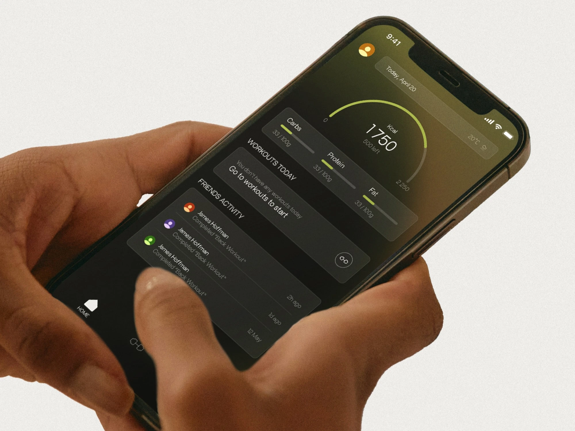
Photo of a hand holding iPhone with a FitNote app opened
Role: Product design, UI design, brand identity, logo design
Scope: App UI, navigation, key screens, visual system, logo
Tools: (Add your real tools here. If it was Figma, mention it. If not, keep it generic.)
Deliverables: UI screens, brand kit, logo, color and type system, mockups
The goal was to make the app feel focused and premium, while keeping daily actions fast: start a workout, track macros, and see progress at a glance. The interface uses clear hierarchy, soft depth, and restrained color to stay calm under frequent use.
Problem: Fitness apps often feel noisy, overly bright, or feature-heavy, which makes daily use feel like work.
Goal: Create a clean, dark-first product that feels motivating and modern, with a brand system strong enough to carry marketing visuals and future features.
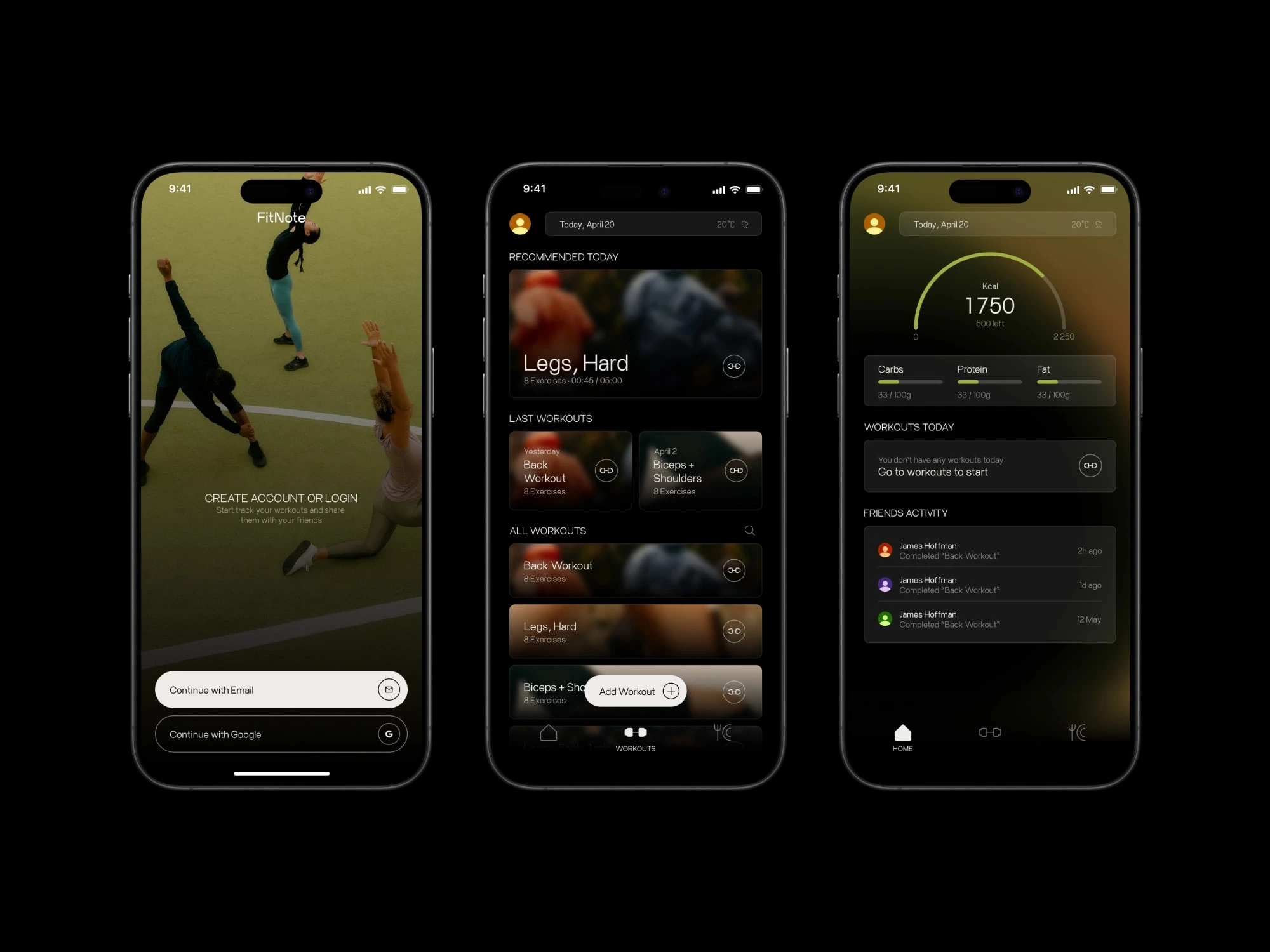
FitNote app UI screens. Login, Workouts, and Home
Brand direction
Geometric mark that scales to an app icon and small UI placements
Minimal wordmark with strong legibility
Visual tone: focused, modern, slightly cinematic
The brand is built to sit behind content, not compete with it
I built a compact design system to keep the UI consistent as the product grows. The palette uses near-black as the base, a restrained green accent for progress and highlights, and layered neutrals for depth. Type sizes are limited and intentional so screens stay calm and scannable.
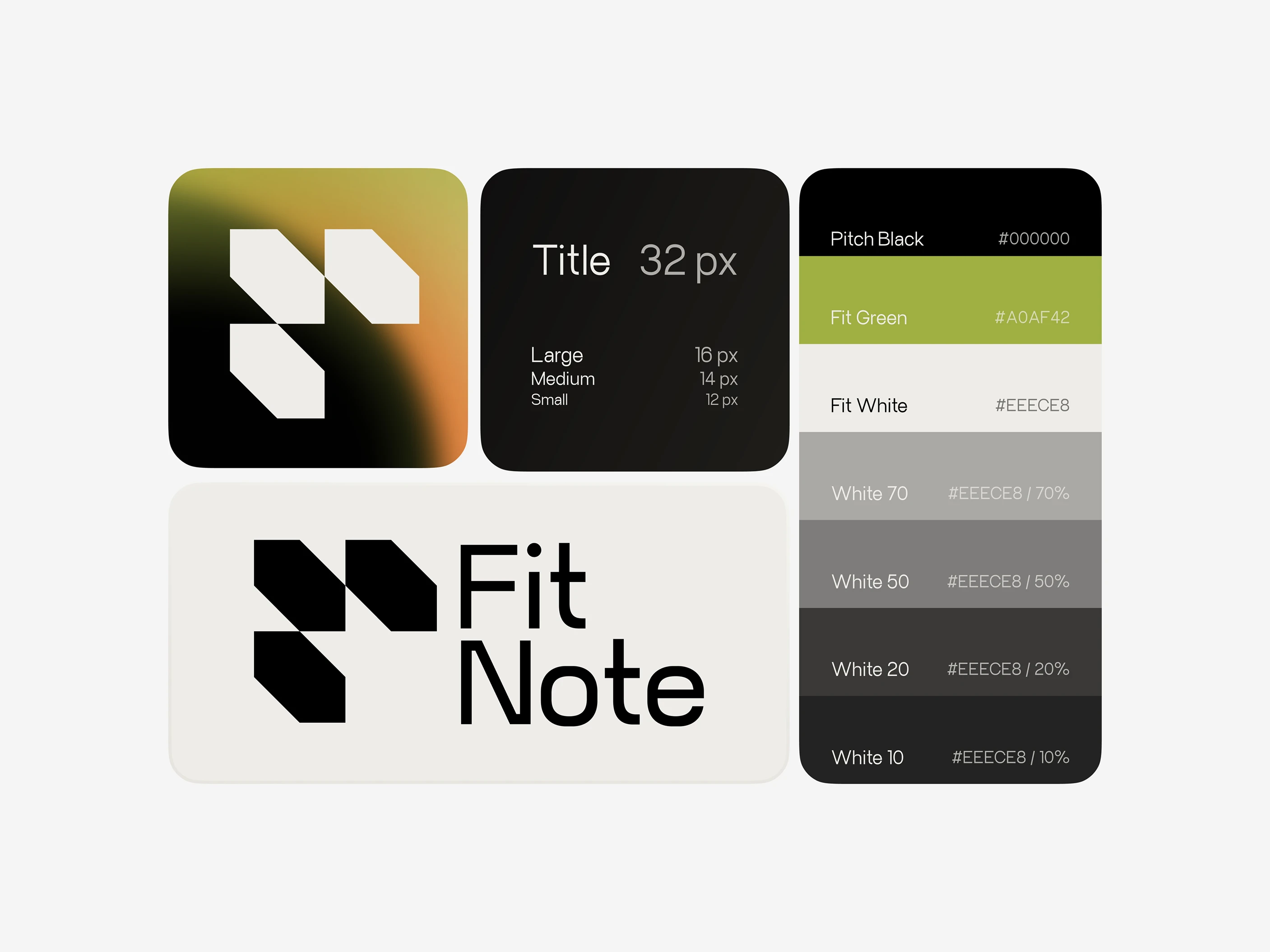
Snapshot of Fitnote Brand System
Result: A cohesive product and brand that feels premium, focused, and scalable. The UI system supports expansion into more tracking, social features, and additional dashboards without breaking consistency.
Like this project
Posted Feb 1, 2026
Designed the end-to-end mobile experience and visual identity for a fitness companion app, combining dark, cinematic UI with a clear, structured system.
Likes
1
Views
1
Timeline
Jan 1, 2025 - Jan 29, 2025