Castle, Brand Identity + Logo
Vlad Savruk
Built a bold identity system for a Bitcoin treasury platform, combining a distinctive wordmark and a vivid halftone visual language designed for fast recognition across web and social.
Role: Brand identity, logo design, visual system
Collaboration: In collaboration with Baked Design
Deliverables: Logo and wordmark, brand visuals, social templates, web applications
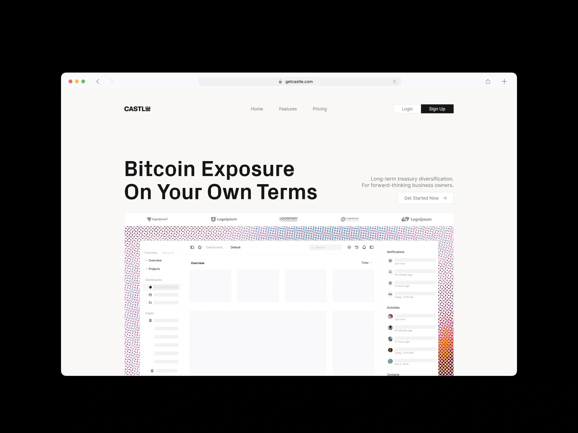
Castle website concept
Context: Castle is an automated Bitcoin treasury product for businesses. The identity had to feel credible and simple, while still being memorable in crowded feeds.
Goals:
Create a wordmark that’s unmistakable at small sizes
Build a graphic motif that can scale across web, social, and print
Keep the system flexible for future product and marketing needs
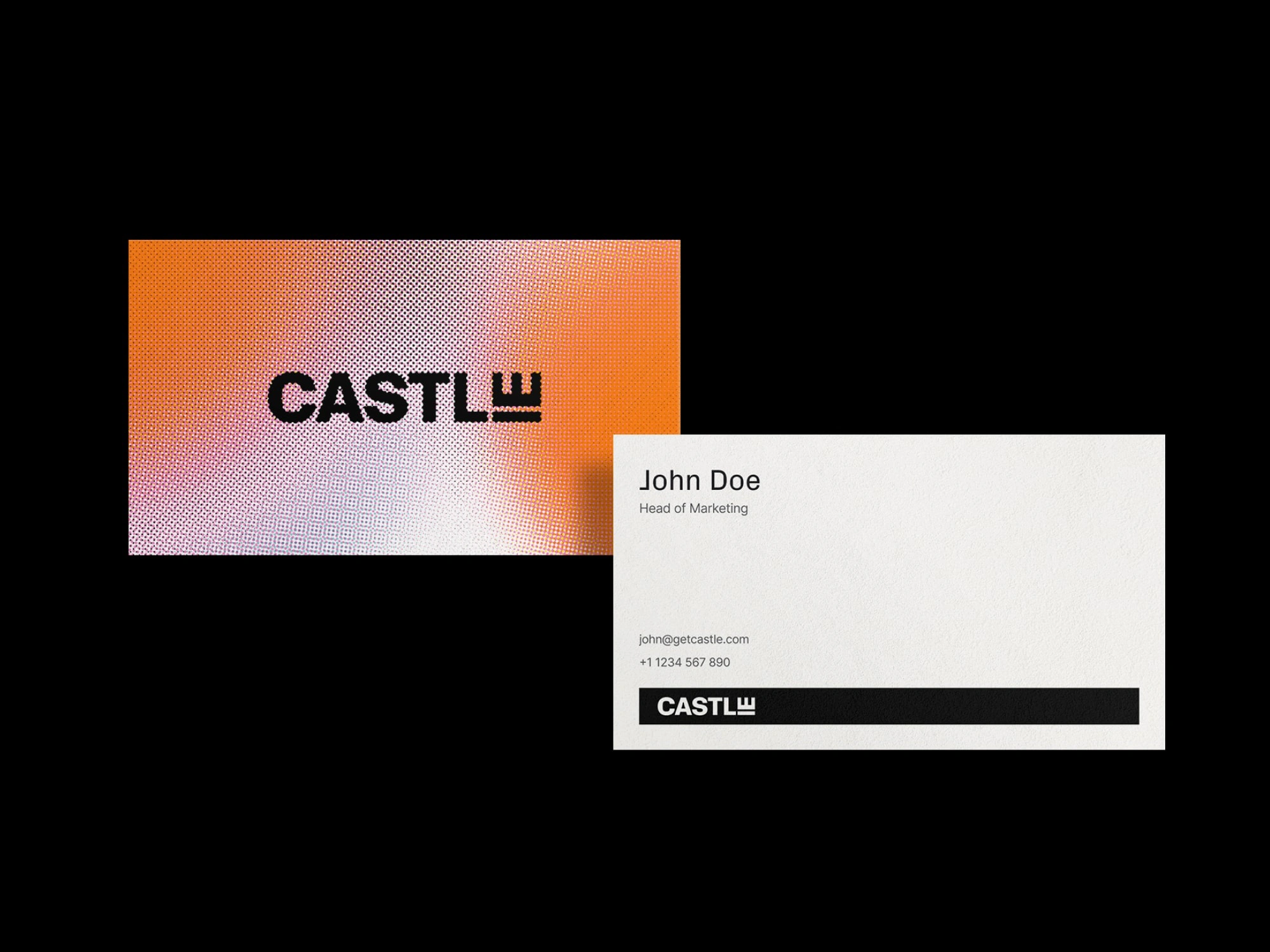
Castle Business Card concept
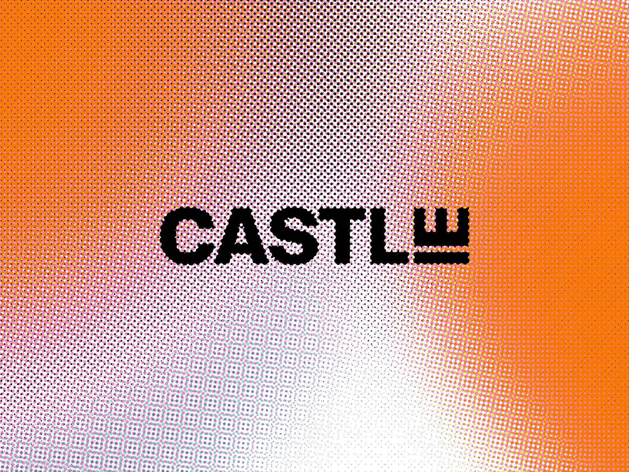
The wordmark is intentionally bold and condensed for punch and legibility. The small “castle” cue at the end adds a proprietary detail, making the mark recognizable even when used without additional context.
System components
Halftone gradient texture as the core brand motif
High-contrast typography for headlines and social copy
Simple layouts that let the texture do the work
Print collateral that stays clean while carrying the brand signature
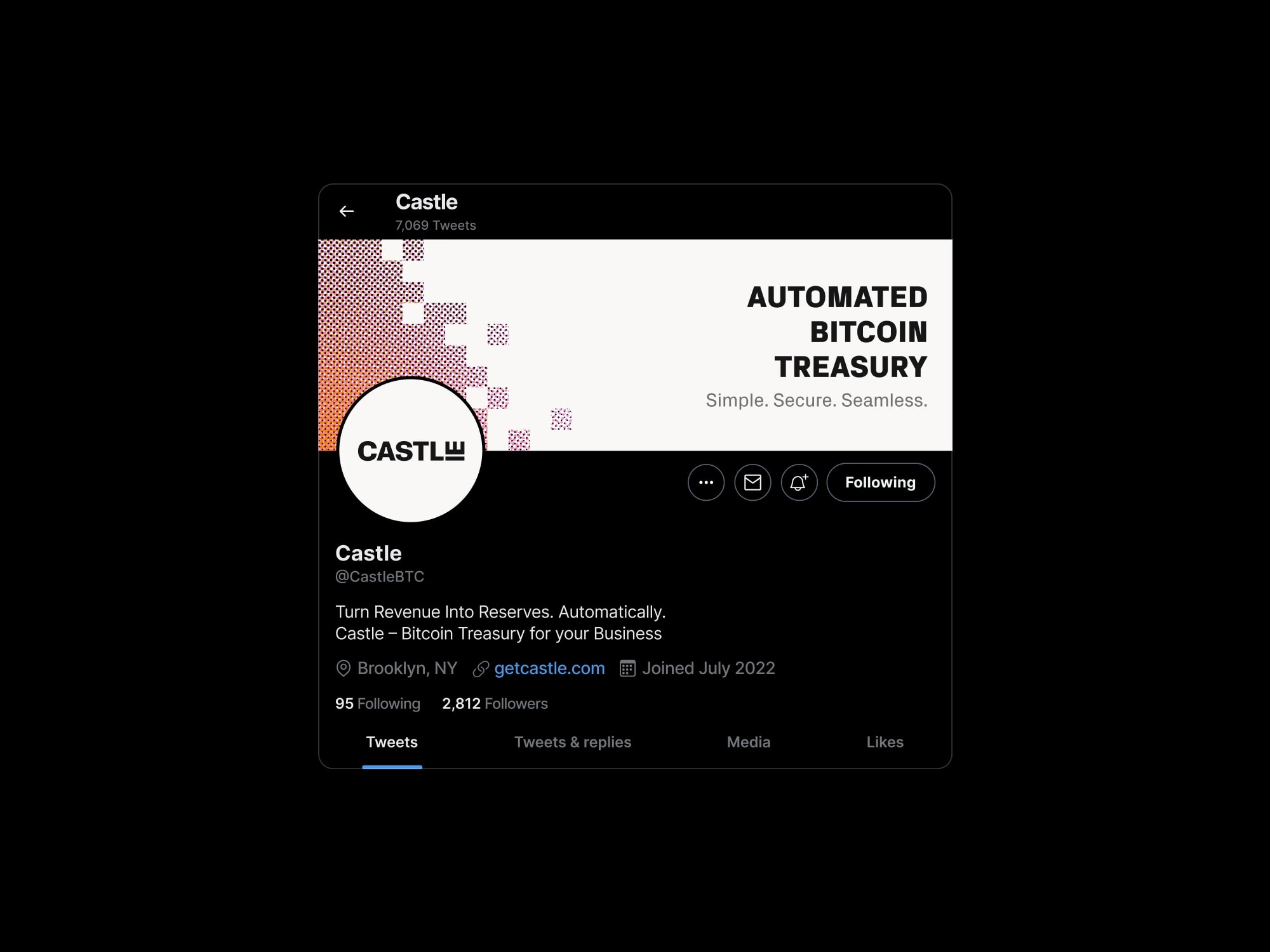
Castle twitter banner mockup
Result: A distinct, scalable identity that feels modern and credible, with a signature visual motif that makes Castle recognizable across web, social, and print.
Like this project
Posted Feb 1, 2026
Built a bold identity system for a Bitcoin treasury platform, combining a distinctive wordmark and a vivid halftone visual language.
Likes
1
Views
5
Timeline
Apr 1, 2025 - Apr 22, 2025
Clients
Baked Design