Rebel Matcha, Brand Identity + Packaging
Vlad Savruk
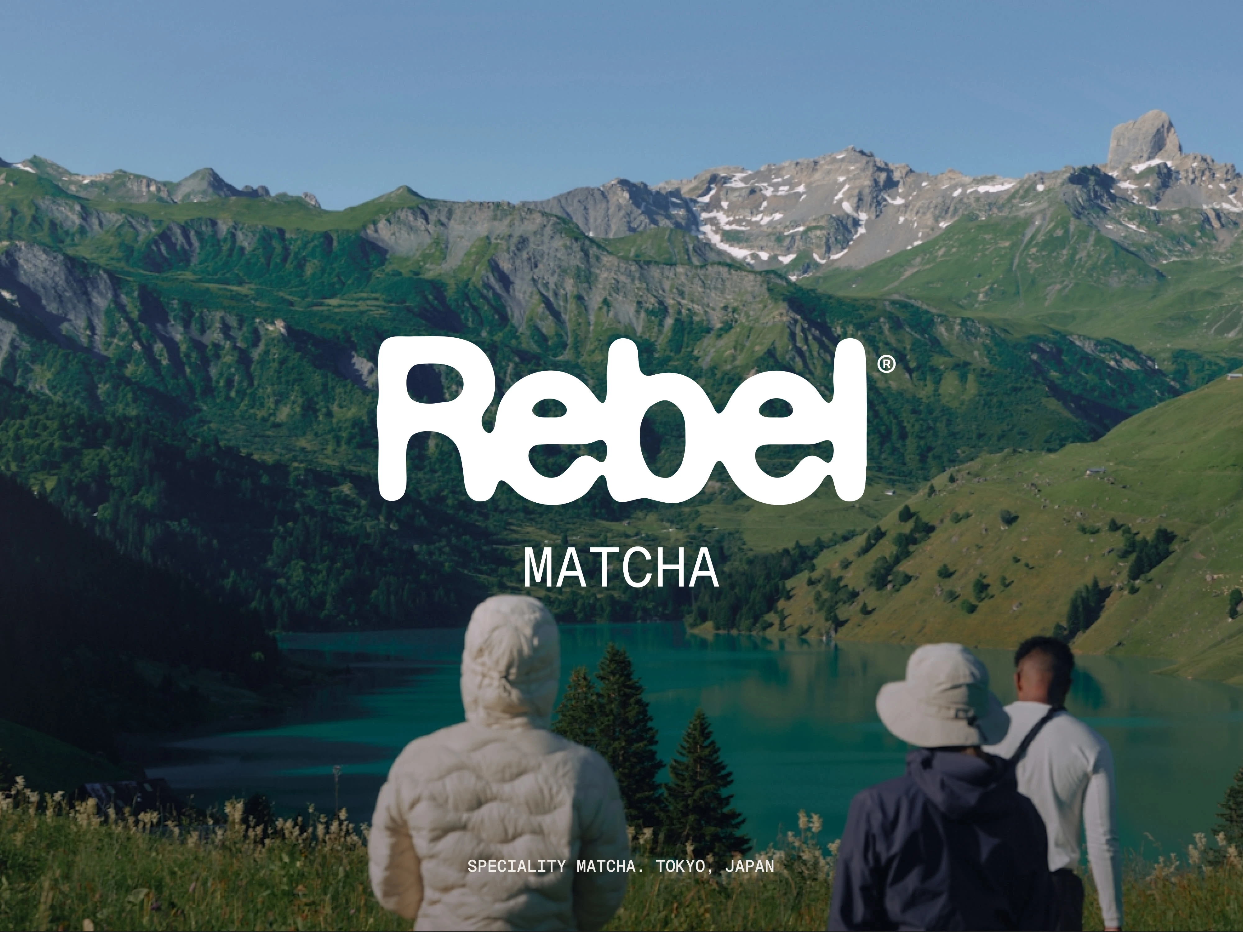
Rebel Matcha, Brand Identity + Packaging System
A bold, modern identity for a specialty matcha brand, built around strong typography, a tight color system, and photo art direction that feels fresh, outdoor, and premium.
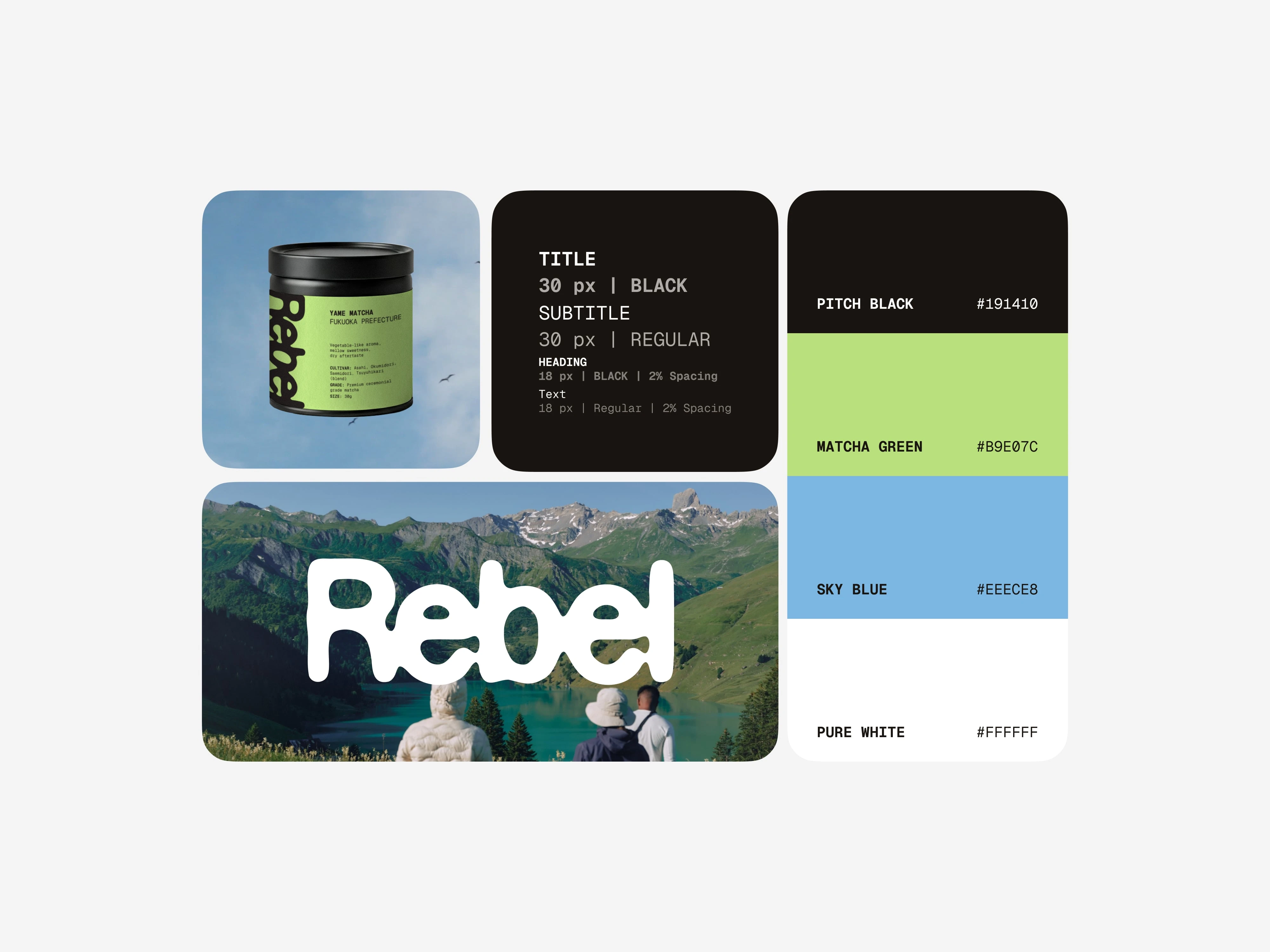
Visual System for Rebel
The identity needed to feel premium without going traditional. I designed a system that stays clean at a distance, reads fast up close, and has a strong signature through contrast, typography, and a tight color palette.
Context: Rebel Matcha needed a recognizable look that could scale across packaging, photography, and future digital touchpoints.
Goal: Build an identity that feels modern, energetic, and confident, while keeping product information highly legible on small formats.
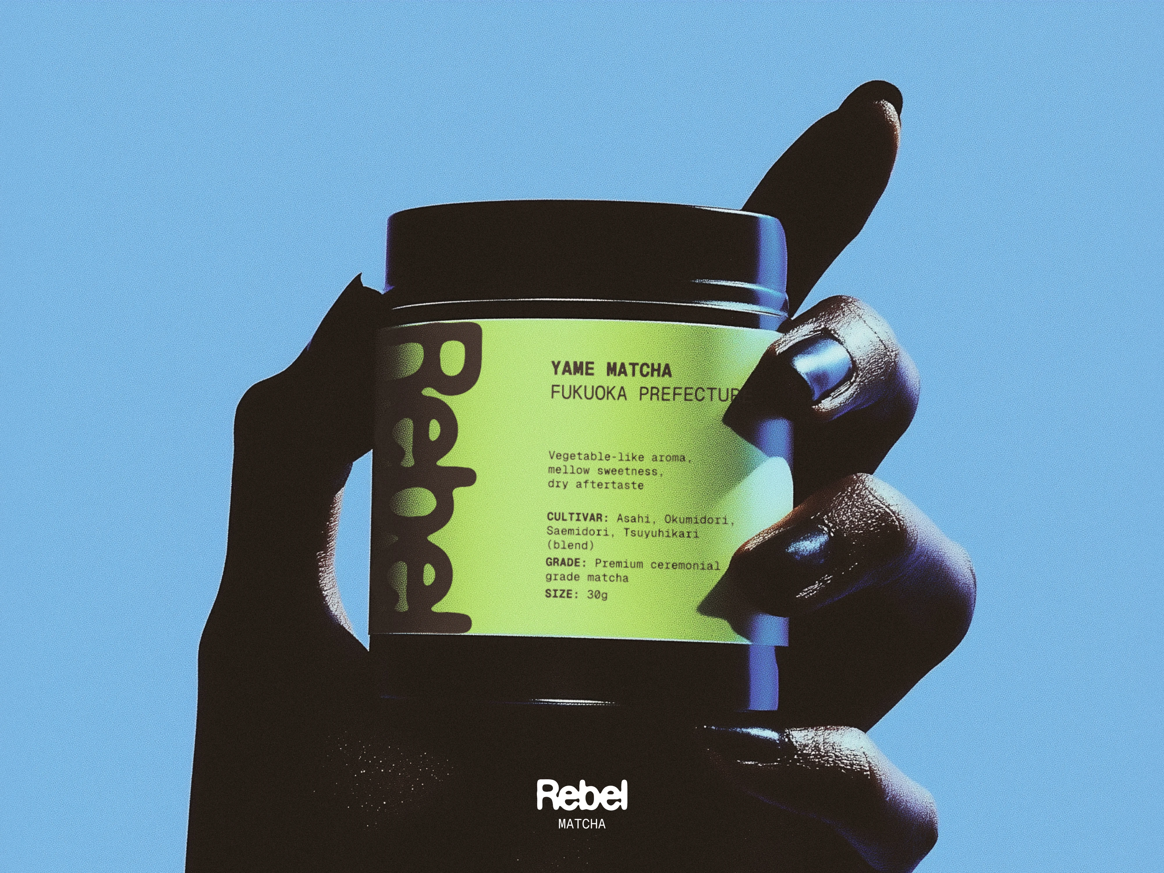
Rebel Matcha packaging in a hand
Outcome: A cohesive identity system that’s instantly recognizable and flexible across packaging and imagery.
Like this project
Posted Feb 1, 2026
A bold, modern identity and packaging system for specialty matcha, built around typography, high contrast, and photo direction that feels fresh and premium.