Comp AI, Visual Identity + Logo System
Vlad Savruk
Designed a clean, technical identity for an open-source compliance platform, built to feel trustworthy, scalable, and product-first.
Role: Visual identity, logo design, brand system foundations
Collaboration: In collaboration with Baked Design
Deliverables: Logo mark + wordmark, color and typography direction, brand guideline deck, social and web applications
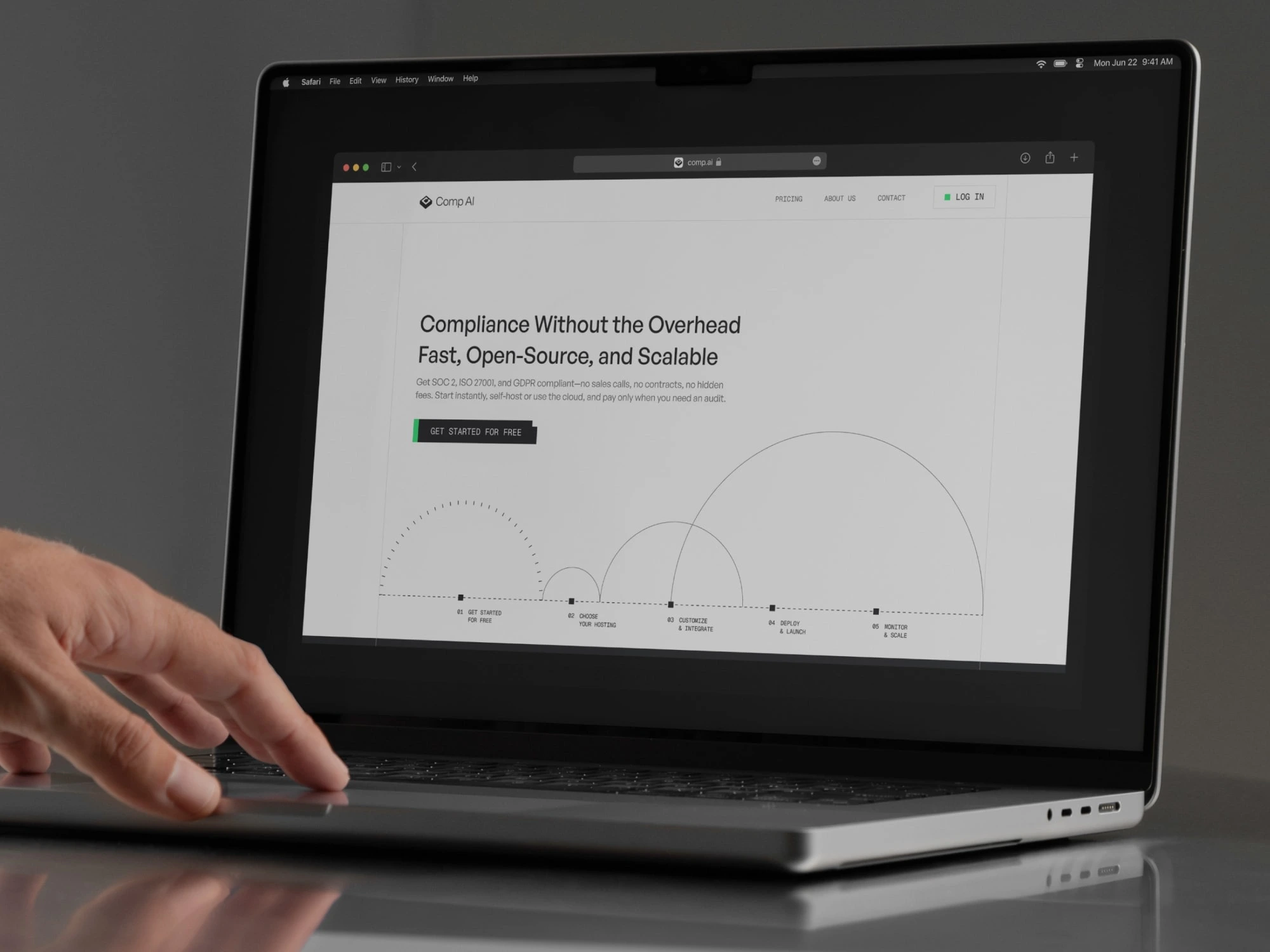
Comp AI website mockup
Comp AI needed an identity that signals reliability and clarity without feeling corporate or heavy. The system focuses on precision, structure, and restrained contrast, so the brand can sit naturally inside product UI, docs, and developer-facing surfaces.
Context: Open-source compliance tools live in a world of trust, security, and process. The identity had to feel credible to teams, while staying simple enough to scale across documentation and product UI.
Goals:
Create a mark that reads well at small sizes (favicon, app icon, GitHub, docs)
Build a visual language that supports long-form content and technical layouts
Ensure the identity works in both light and dark environments
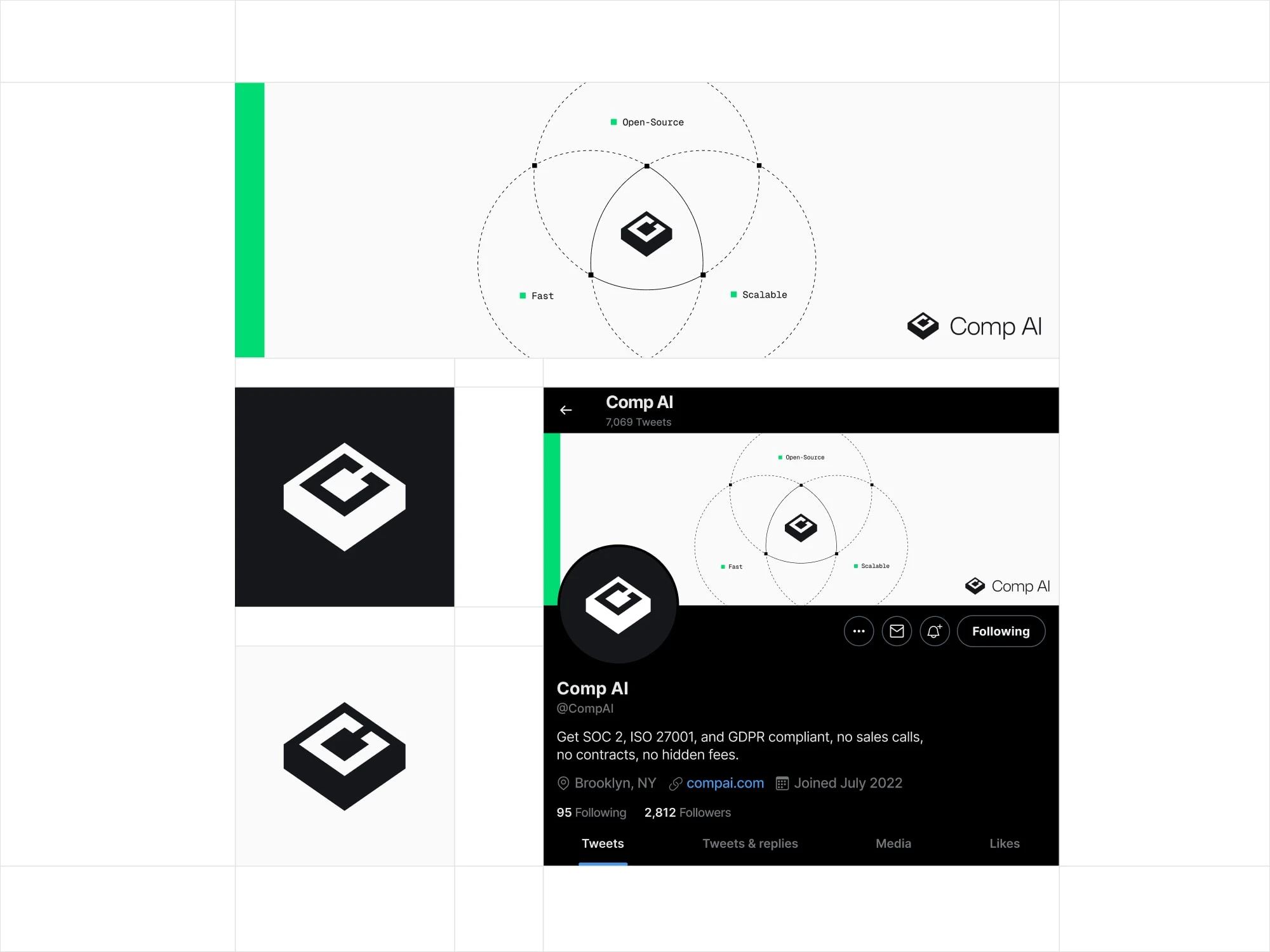
Comp AI Twitter banner and avatar
The logo combines a geometric symbol with a restrained wordmark to keep it technical and timeless. The mark is designed to be memorable at a glance, and stable in small-scale usage like icons and headers.
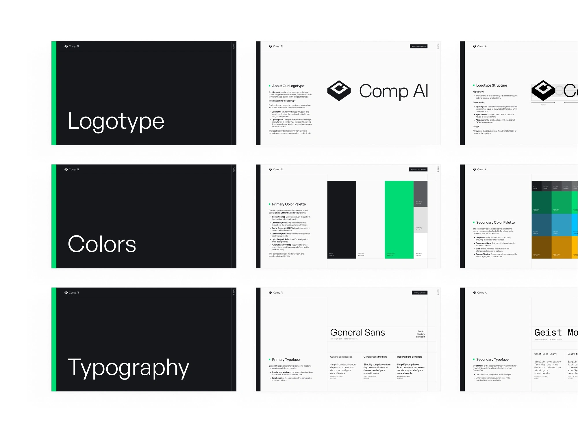
Brand guidelines montage: logotype, colors, typography slides
System components
Logotype structure and spacing rules for consistent use
Primary palette built around neutral contrast with a sharp green accent for emphasis
Type direction optimized for technical content, docs, and UI
Simple layout principles: grid, whitespace, and strong hierarchy
To ensure the brand survives real life, I designed a small set of applications: social presence, icon usage, and a visual motif that can extend into diagrams and product marketing. This makes the identity flexible without adding complexity.
Result: A minimal, credible identity that fits developer-facing products and scales across web, social, and documentation. The system is designed to be easy to apply and hard to brea
Like this project
Posted Feb 1, 2026
Designed a clean, technical identity for an open-source compliance platform, built to feel trustworthy, scalable, and product-first.
Likes
1
Views
4
Timeline
Feb 1, 2025 - Feb 28, 2025
Clients

Baked Design
Comp AI