
Revelstoke Gallery of Art (RGoA)
This is project is utilizing a rejected logo from a client project as they ended up wanting to move in a different direction, so I changed up some key details to showcase the work.
RGoA – Horizontal Logo
The Quilt Patch Logo
The focus of this logo design was to incorporate elements of art and community, so I came up with the quilt patch concept. The logo is simple and geometric with a strong typographic pairing. These simple elements allow for horizontal and vertical arrangements.
RGoA – Stacked Logo
Primary Elements
On it's own, the logo is vibrant with the three primary colours which are foundational elements to many an artistic practice. The sharp edges of the logo help to maintain a formal tone—if the edges were curved, it would begin to feel intended for a younger audience.
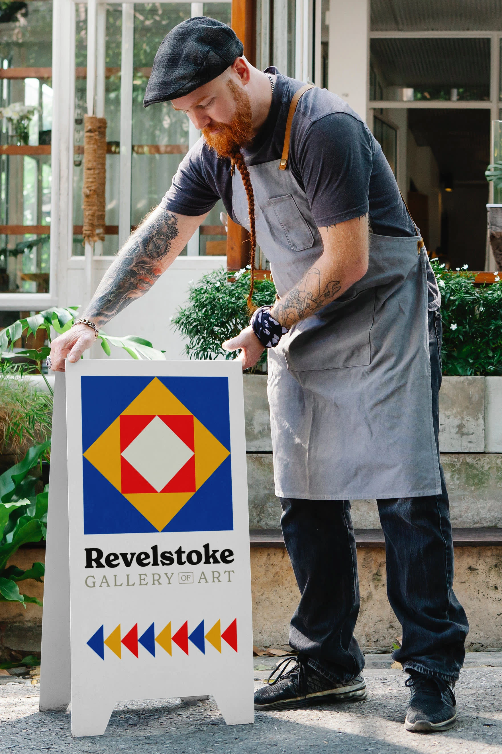
The logo itself is largely made up of triangles which is a perfect shape for expanding the brand visuals to things like posters, signage and wayfinding collateral.
RGoA Logo & Branding on Signage
The Typeface
Along with changing up key info for the sake of this project, I also changed the typeface being used so as not to be too similar. I used New Spirit Bold for "Revelstoke" and New Spirit Regular for "Gallery of Art". This friendly, retro serif is approachable with a formal edge.
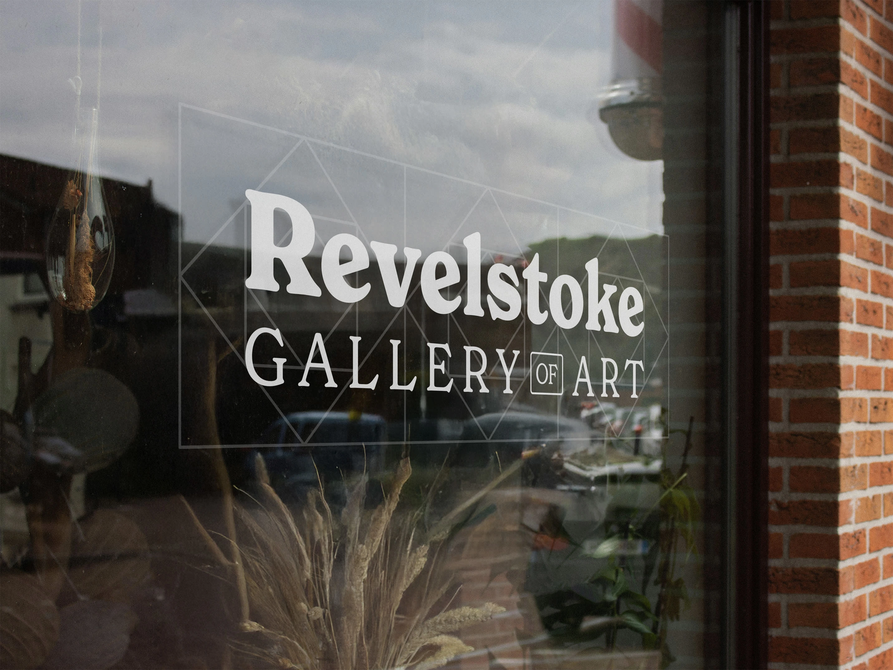
RGoA – Window Mockup
Wordmark Variant
Institutions like galleries and museums often have abbreviations, so it was fitting to make one for RGoA—it even looks good just typing it out like this!
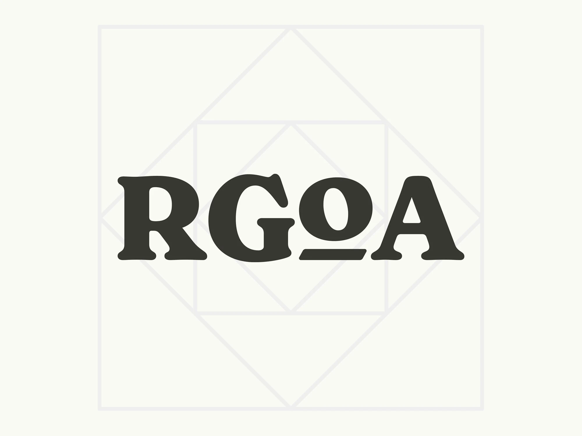
RGoA – Wordmark Variant
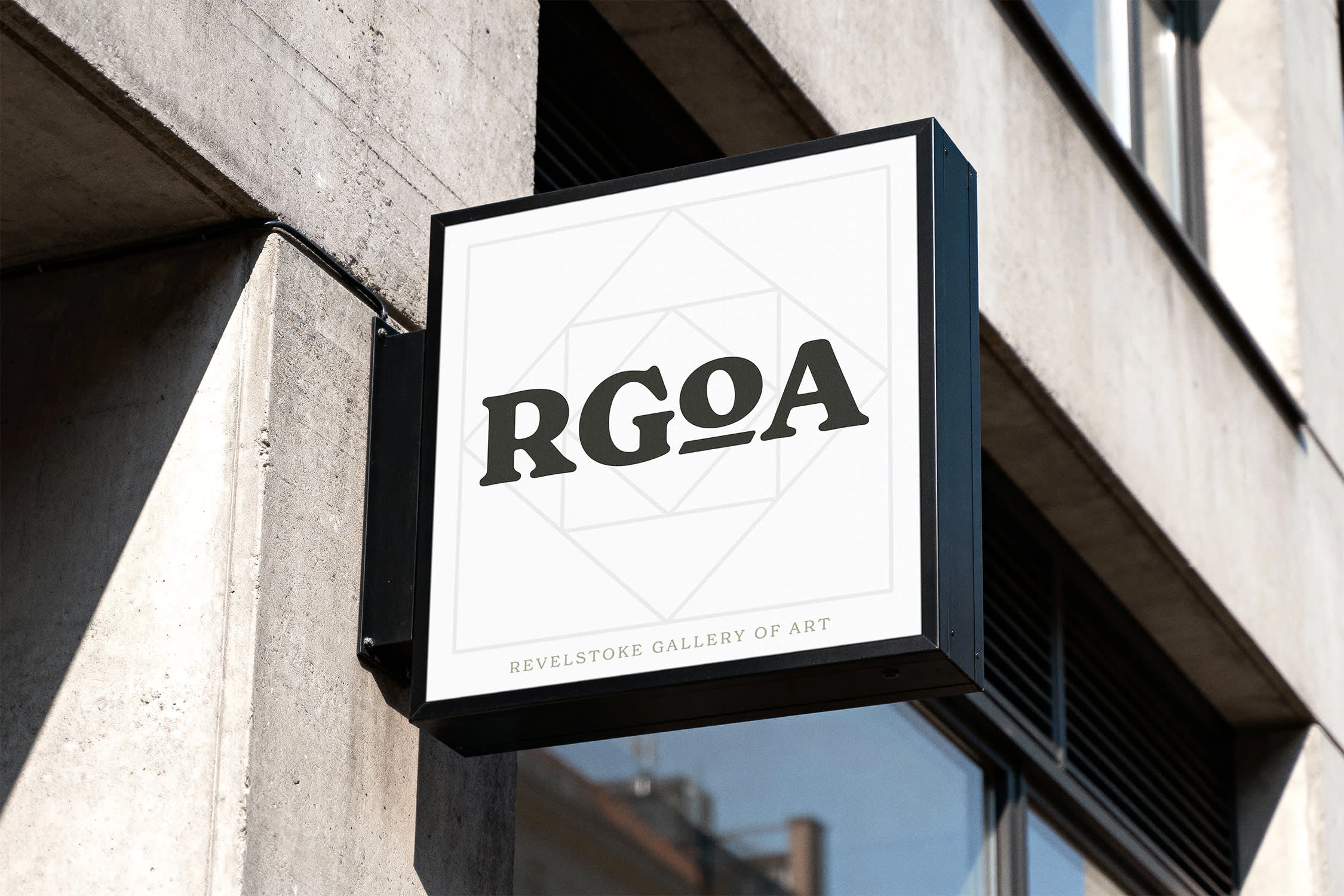
RGoA – Wordmark Mockup
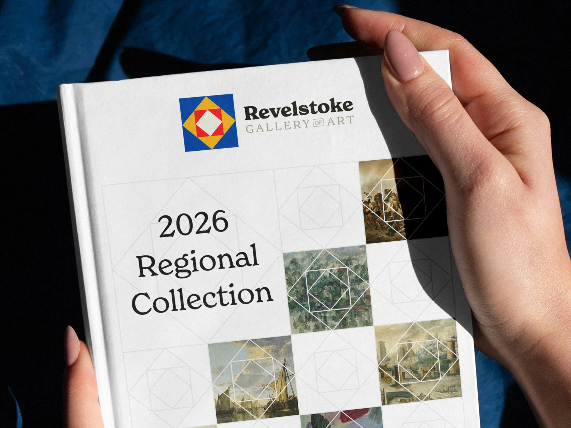
The Quilt Patch Coming into Play
The logo-turned-wireframe becomes a repeatable pattern—a quilt—that can be used to showcase a variety of works and create a brand language that puts the art first. The works shine through while the brand motif is cleverly present.
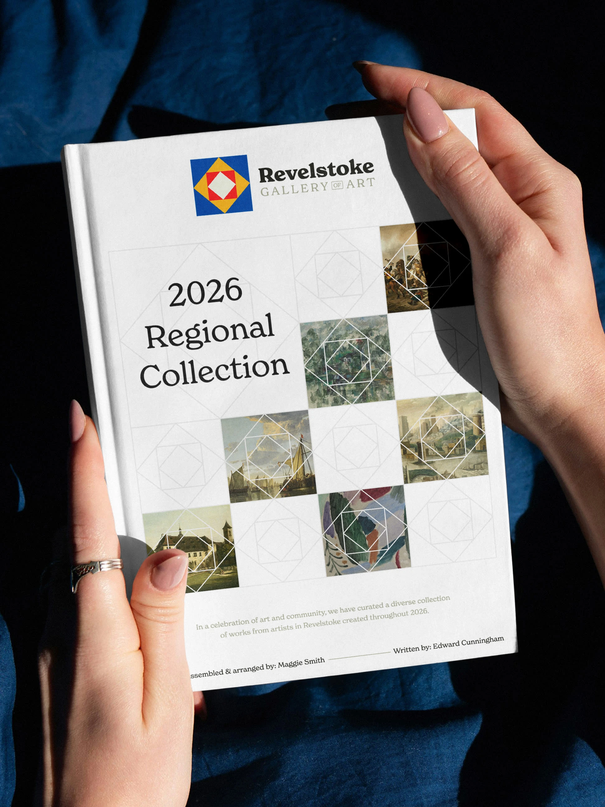
RGoA – Book Mockup
0 likes · 35 views · Mar 4, 2026
Created a vibrant, geometric logo incorporating art and community elements for RGoA.

