Lillooet Wild – Logo Design
Kyle Humber
Lillooet Wild
I had the opportunity to design the logo for Lillooet Wild, a collaborative initiative between Lillooet Brewing Co. and the Lillooet Naturalist Society to bring awareness to Lillooet's wildlife.
I also helped with branding and direction of the website (as of checking July 2025, it seems to not be live anymore and just redirects to the Lillooet Brewing Co. website 😢). Even though the project isn't live anymore, it is one of my favourite logo designs I've ever made!
The Logo
With this initiative focusing on wildlife, I took inspiration from summer camp signage for the look and feel of the logo, making sure to imbue clarity and playfulness in the design. The Logo needed to be versatile for a multitude of applications, from being printed on handouts to embroidered on merch.

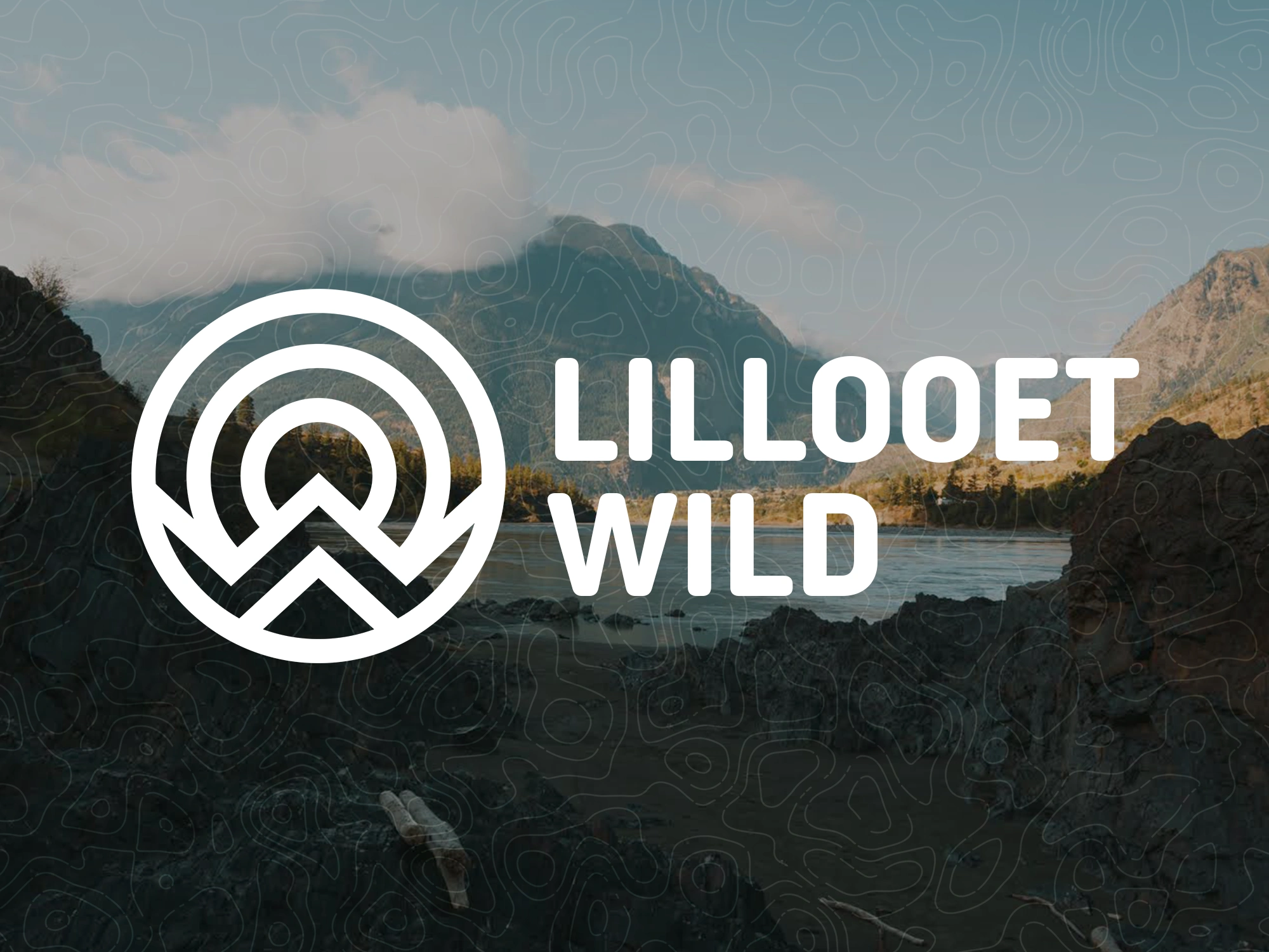
Lillooet Wild Logo – Each colour is imbued with meaning that ties the logo to the Lillooet region.
The shapes and colours of the logo are steeped with meaning representing the Lillooet region:
🔵 Outer blue ring: the Fraser River that runs through BC
🟡 The yellow ring represents the semi-arid desert region that Lillooet is a part of (yes, Canada has deserts!)
🟠 The orange ring represents the sun and the extreme heat Lillooet experiences in the summer
🟢 The green 'w' represents the mountains of the region
🟣 The purple point represents the valleys in which much of the space is farmland, growing crops that thrive in Lillooet's ecosystem that would otherwise have a hard time growing in Canada
All of these elements come together to create the Lillooet Wild logo, aptly showcasing what makes the region so special.
Like this project
Posted Feb 15, 2026
Logo design and branding imbued with meaning for a wildlife awareness collab. Designed to be distict, bold and merchable.