Breakthrough Church
Christine Cafe
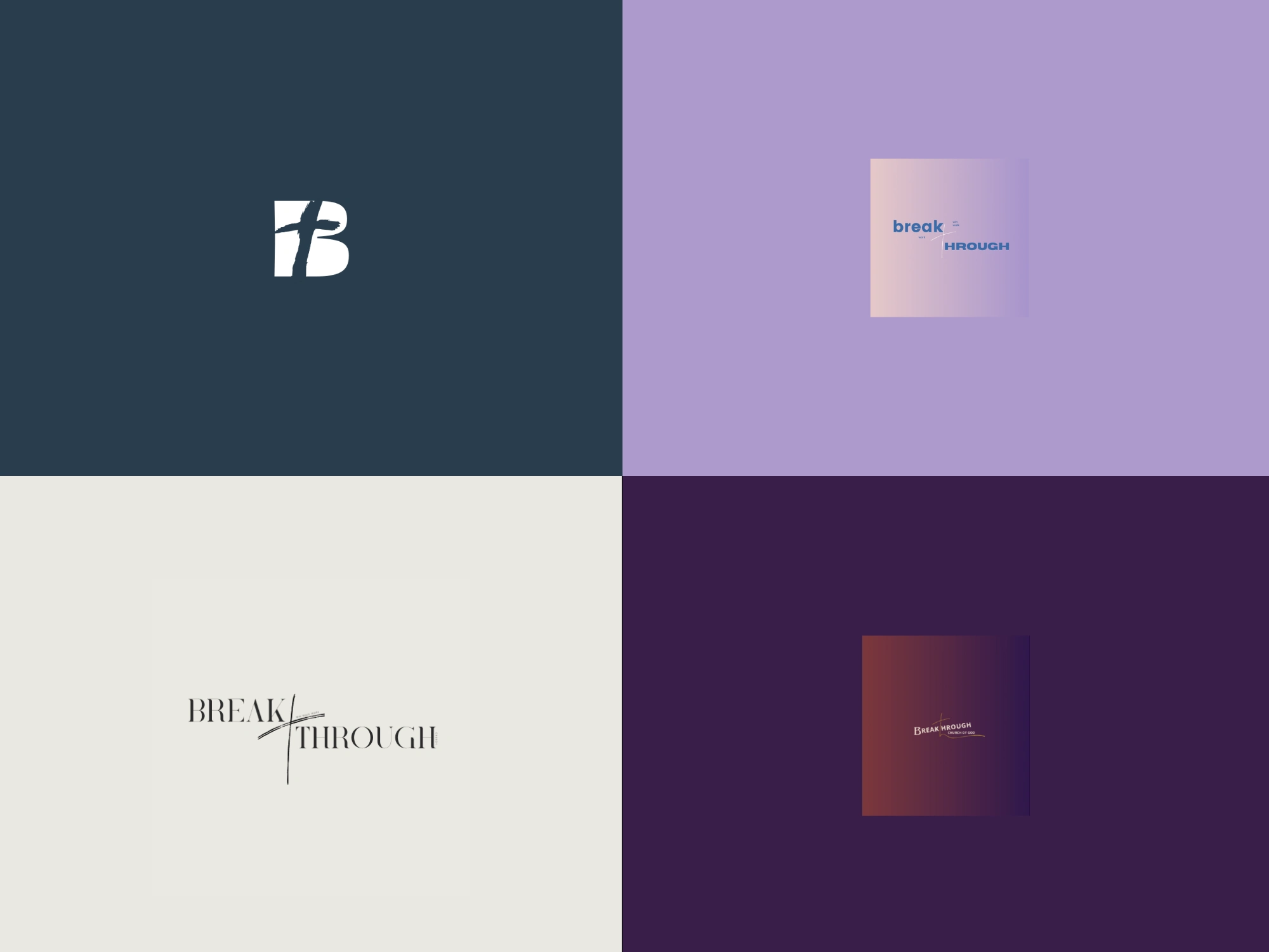
BREAKTHROUGH CHURCH
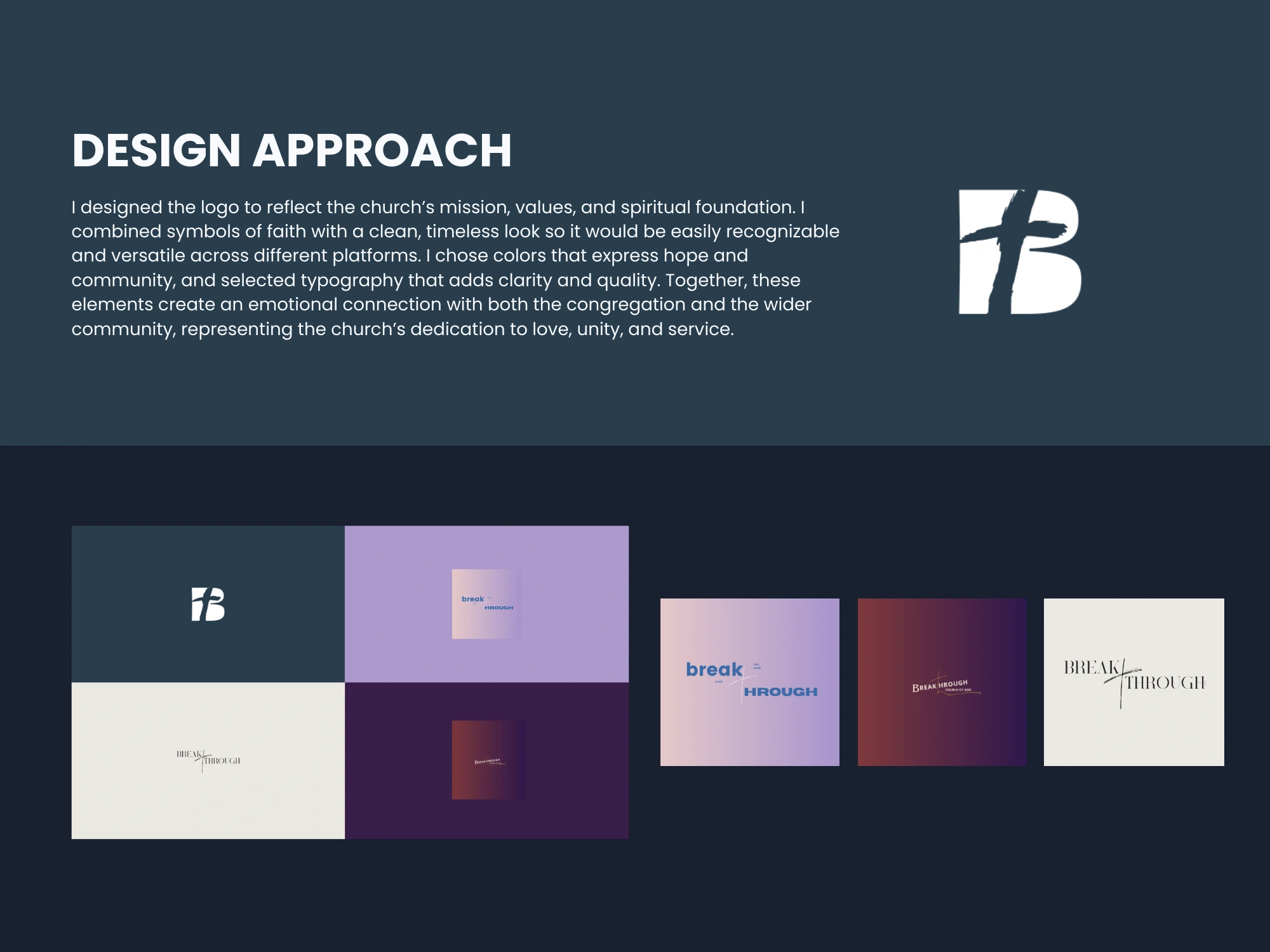
Designing the Breakthrough Church logo has been one of the greatest honours of my creative journey. This church is more than a place of worship—it is home. I grew up within these walls, surrounded by a community that shaped my faith, my character, and my heart for God. To now give back through my gift of design feels like a full-circle blessing. Every line, curve, and detail of this logo carries a piece of that story: the strength of our foundation in Christ, the hope of transformation, and the vision of breakthrough that continues to inspire generations. It is not just a logo, it is a reflection of family, faith, and the love that raised me.
The Breakthrough Church logo was created as more than just a symbol, it is a visual expression of faith, hope, and transformation. Each element carries meaning: the ''B'' design reflects the church's name, while the cross upward flow represents breakthrough in Christ. The balance of modern simplicity with timeless symbolism was chosen to ensure the logo feels approachable, yet deeply rooted in spiritual truth. Just as the church’s mission is to guide people toward God’s love and power, the logo stands as a reminder that in every season, breakthroughs are possible through faith.
Project: Logo Design
BREAKTHROUGH CHURCH
Like this project
Posted Aug 22, 2025
Designed a meaningful logo for Breakthrough Church, reflecting faith and transformation.
Likes
1
Views
15