Graphic Designer & Collaborator


Graphic Designer & Collaborator



Editorial Brand & Squarespace Website Designer
Editorial Brand & Squarespace Website Designer


For this design, I brought the Studio Kalili website to life using Squarespace's Finish Layer by layering in subtle animation across the page to turn a static layout into something that feels considered and dynamic without overwhelming the content.
The most intentional use of Finish Layer is the two-image interaction illustrating the core idea behind the studio's work: closing the gap. One image enters from the left, the other from the right, moving quickly at first and then easing as they meet in the center — fast enough to catch attention, slow enough to let the reader stay with the copy.
From there, hover states on buttons, text, and large images, plus scroll-triggered entrances, guide the eye down the page and give every interactive element a small, deliberate moment of response.
Squarespace's Finish Layer was used to add polished interactions across the website, creating a more dynamic browsing experience. Each interaction supports the overall experience while preserving the calm, editorial character of the Studio Kalili brand.
View the Website design (https://www.studiokalili.com/)
View the LinkedIn social post (https://www.linkedin.com/posts/studiokalili_squarespace-webdesign-squarespacechallenge-activity-7486227627586985984-xTF2?utm_source=share&utm_medium=member_desktop&rcm=ACoAAC0qqAIBrHjQpLqMtnXAZ6GpFg1uZwP7LTs)
15
37
2.2K


Global experience, tech brand systems & visual identity
- $50k+
- Earned
- 10x
- Hired
- 5.0
- Rating
- 91
- Followers
Global experience, tech brand systems & visual identity


Logo & Web Design Expert

Logo & Web Design Expert

Oddfeather started with a Texas farmer raising incredibly unique chickens and wanting a brand that felt as distinct as the birds themselves. We developed a quirky, memorable name paired with a clean, cheeky identity and hand-painted illustrations of the chickens. It struck the balance between artisan and approachable, giving him a visual story that could stand out at farmers markets, artisan events, and local shops. The brand gave him the personality and polish to build recognition in a category that usually feels generic.
8
36
772
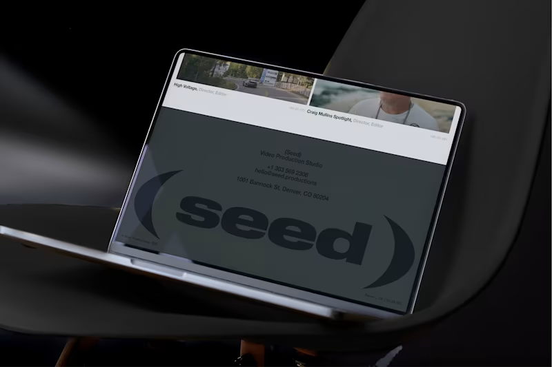
Seed came to us right as their word of mouth started doing what it does when you are actually good, the work spread fast, and the business outgrew the brand. They needed an identity that matched their momentum, with brave clarity and zero cheese, especially with a name that could easily slide into childish territory. We built a straightforward, adult, forward-looking system anchored by an abstract mark that can live in motion, which gave them room for storytelling without gimmicks. The result was a tangible brand that backs up the hype, sets the mood in every pitch, and helps close the deal.
11
25
599

Runway came to us with a deceptively hard challenge: make Botox feel fun and simple without losing trust. Most brands go sterile because they think serious equals credible. We did the opposite, building a playful but premium world, because trust is earned through great design, not a cold tone. Leaning into bright color and retro energy, we created a retro-futurist identity that nods to aviation and motion, then shaped it into a cohesive system that’s memorable, ownable, and built to scale. The result is a premium brand people remember, and a foundation they can expand without starting over.
3
462

Lawrence Koplow, an Arizona criminal defense attorney known for taking on the kinds of cases the system would rather push through, came to us wanting a brand that actually looked and sounded like the way he practices law. He needed an identity that could hold that edge while still feeling rigorous and premium. We repositioned his practice from a single-issue DUI site to Koplow Defense—a justice-forward brand built around high-stakes charges, a limited-caseload model, and a simple promise: sharp defense for serious cases. The new identity feels precise and strategically built for the moments when the state throws its full weight at someone.
3
19
478


crafting intentional brand identities & websites
crafting intentional brand identities & websites


The complete growth solution for ambitious brands.
The complete growth solution for ambitious brands.


Branding for service providers in vacation towns
Branding for service providers in vacation towns


Brand & Showit Designer | 5+ Yrs Exp | 2+ Yrs Agency Exp.
Brand & Showit Designer | 5+ Yrs Exp | 2+ Yrs Agency Exp.