Root Cause Wellness Logo Design
Overview
Root Cause Wellness is a natural medicine practitioner that utilizes traditional techniques while being open to and embracing modern technology and medical practices.
The goal for this project was to develop a logo and supporting elements that communicated both natural wellness, while feeling modern, in an attempt to appeal to folks who see value in both forms of treatment.
After understanding both my client's values and her client's concerns, it allowed me to develop a visual style that would appeal to the right people and convert & engage more of her viewers.

The Challenge
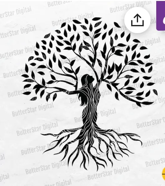
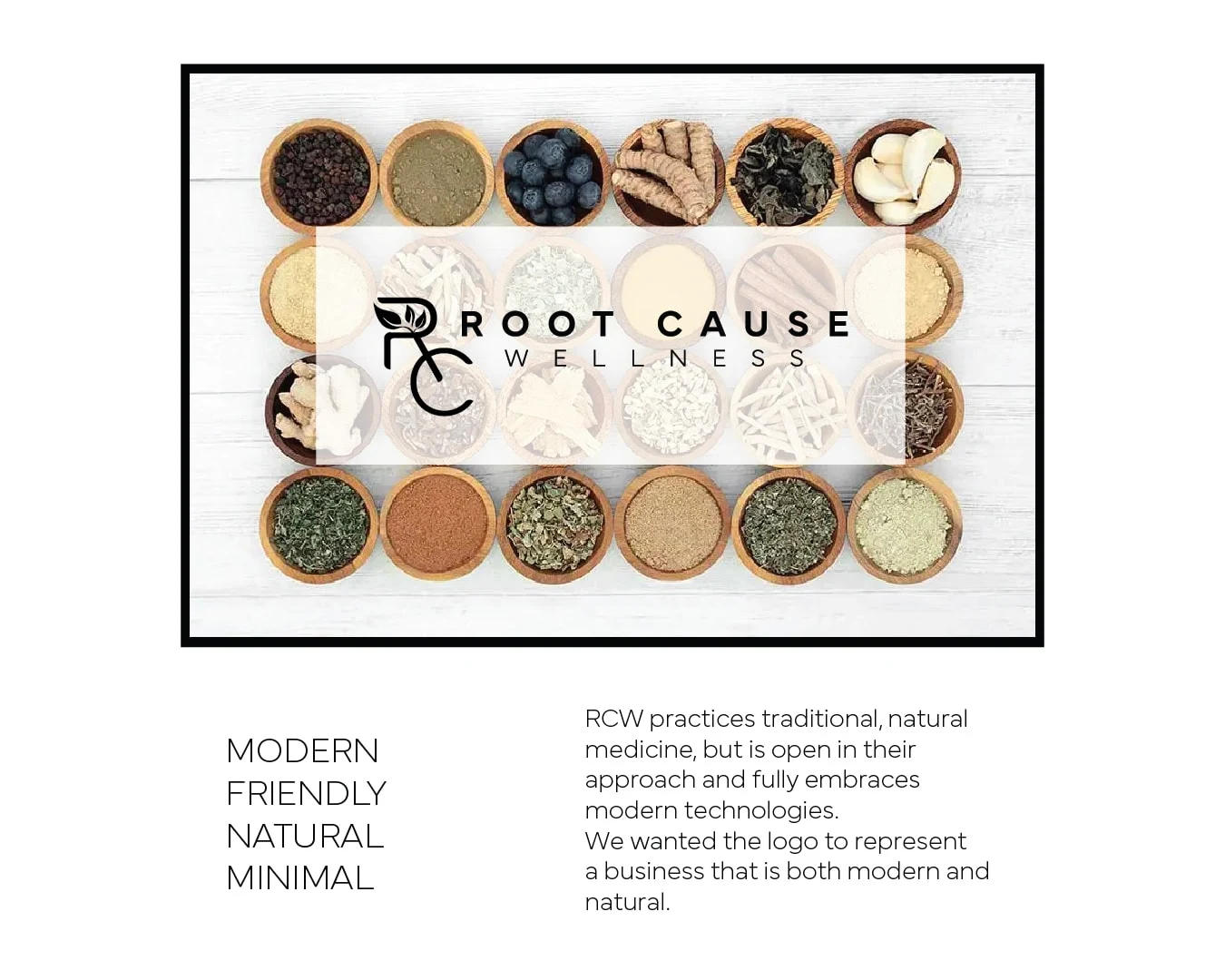
The image below is what I was given as inspiration by the client for this logo design.
I understood their direction, but felt this didn't represent the intended outcome for the client.
This image is nice, but is far too busy and detailed to be a logo. Plus, I knew she wanted the brand to have a modern and minimal vibe to it. This image, to me, does not express that.
I started to experiment with different ideas and symbols that could represent a modern and natural brand.
Ultimately landing on the "RC" logo concept that was chosen.
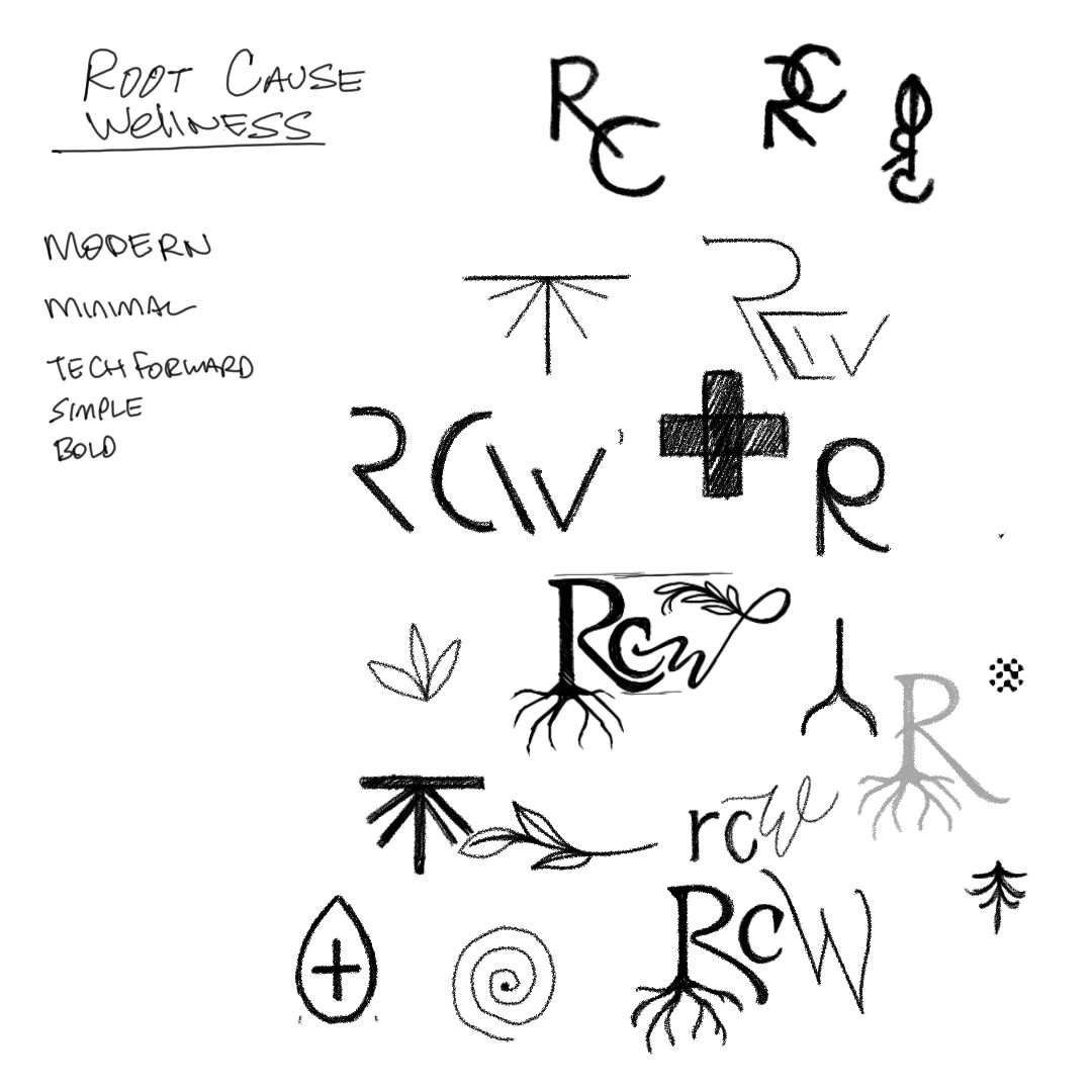
Inspiration
Keeping words like
Modern
Natural
Friendly
Minimal
in mind, I could strike a balance between new and old, modern and traditional.
Logo Family Breakdown
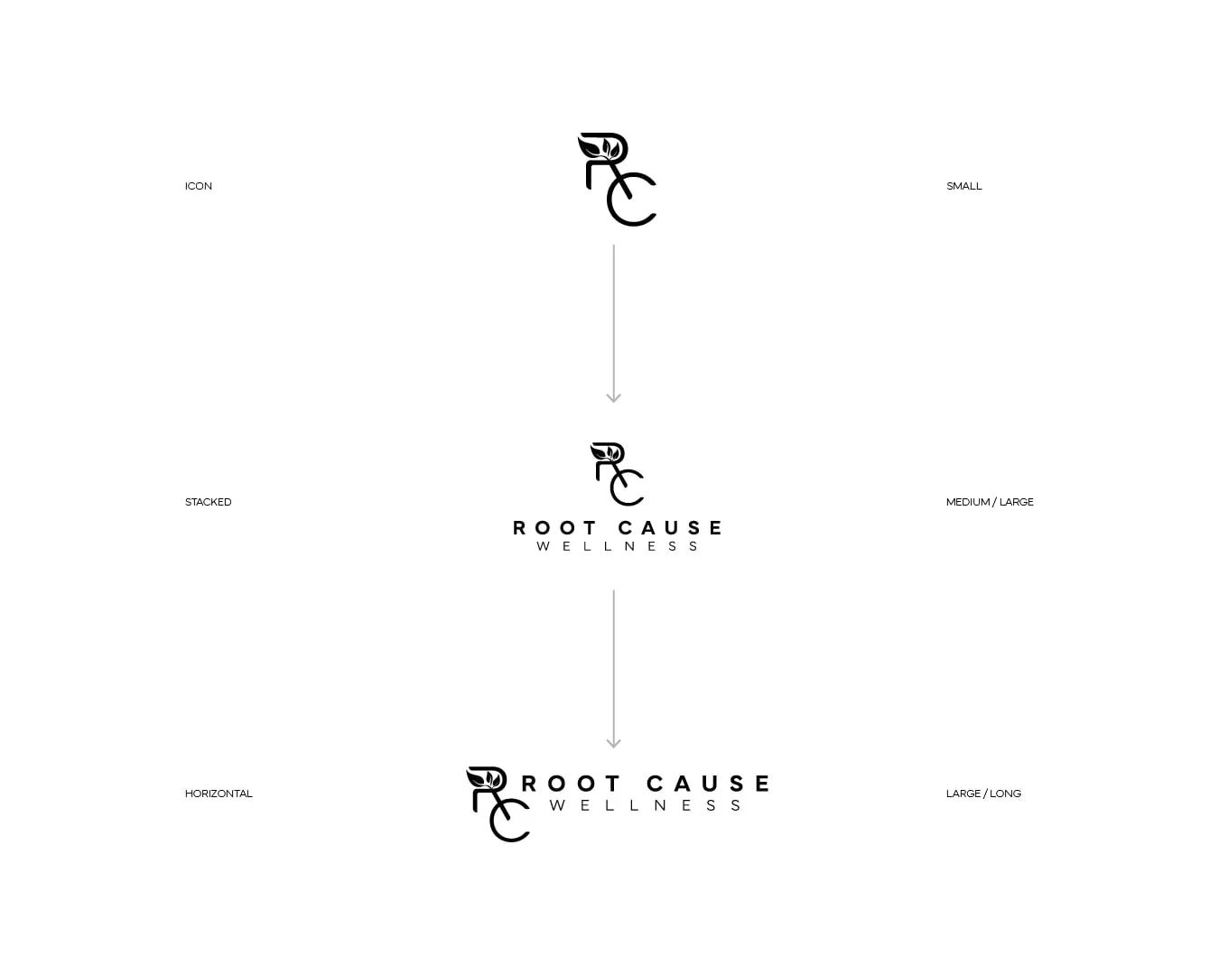
The simplicity of the RCW icon gives us lots of pairing combinations. The icon can be used on its own, or paired with text to give different display options.
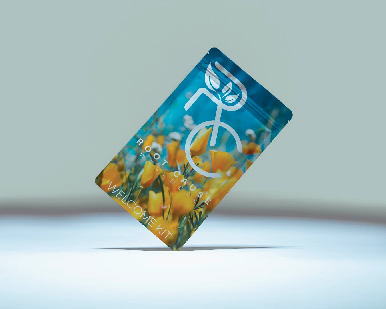
Here is an example of the logo used on packaging.
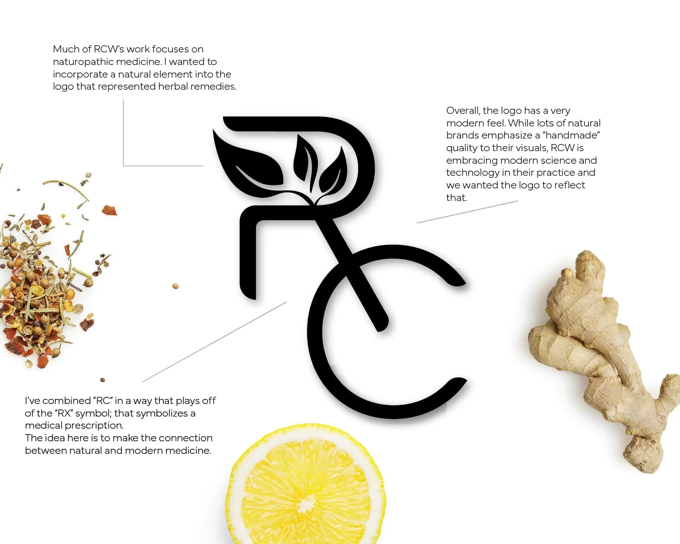
Further breakdown of the logo and design decisions.
Matt with 1110Design did an amazing job designing a logo for my business!! He took the time to think through different design concepts based on information I had given him. To my surprise, I absolutely loved a design that was completely different than the idea I had gone in with. Matt was pleasant & professional to work with. I highly recommend him!!
-Bonnie, Root Cause Wellness
Like this project
Posted Feb 23, 2023
Striking a balance between traditional and modern.

