Emerge Coffee Co. Logo Design
Matt Losapio
When three sisters from OC, California started Emerge Coffee, they wanted a logo that represented strength & positivity.
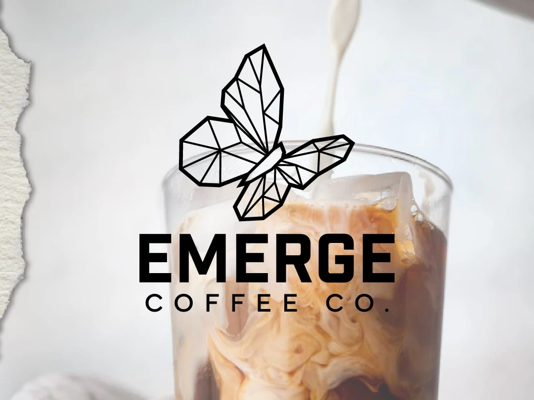
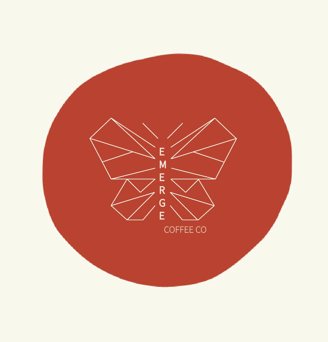
The final logo for Emerge Coffee Co.
As outlined below, you'll see how we breathed new life into their old logo; giving them a design that they can proudly use to represent their business.
The Objective :
Immediately below is their old logo. Emerge wanted to keep the geometric butterfly concept, but it needed a refresh.
The problems with this logo:
It does not scale well. The text in the center of the butterfly won't be readable once its scaled down.
The lines that make up the butterfly are too thin. In some cases this can be ok, but for this specific design, they can easily get lost once the logo is displayed on certain printed materials.
Without a high contrast background behind it, this logo is not robust enough to stand on it's own in most applications. The design itself lacks a good structure that helps the logo read well.
The Solution:
The new logo below is a much more solid and readable design overall.
How I addressed the issues:
By using heavier lines, the logo instantly becomes more scaleable - it reads better at both small and large sizes.
Showing the butterfly "in flight" and angled, as opposed to straight on and symmetrical gives the image a bit of movement and makes it more dynamic. It's meant to imply an encouraging and "ever forward" kind of message.
Taking the "Emerge" text out of the center of the butterfly (like in the old logo), allows us the scale it much more and also provides different display options like shown below. The butterfly icon can be used alone, or in combination with the logo text.
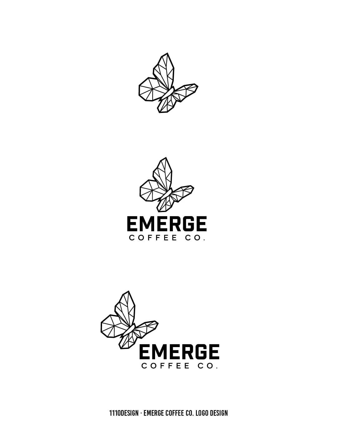
A combination of different layouts of the logo will allow for different display options.
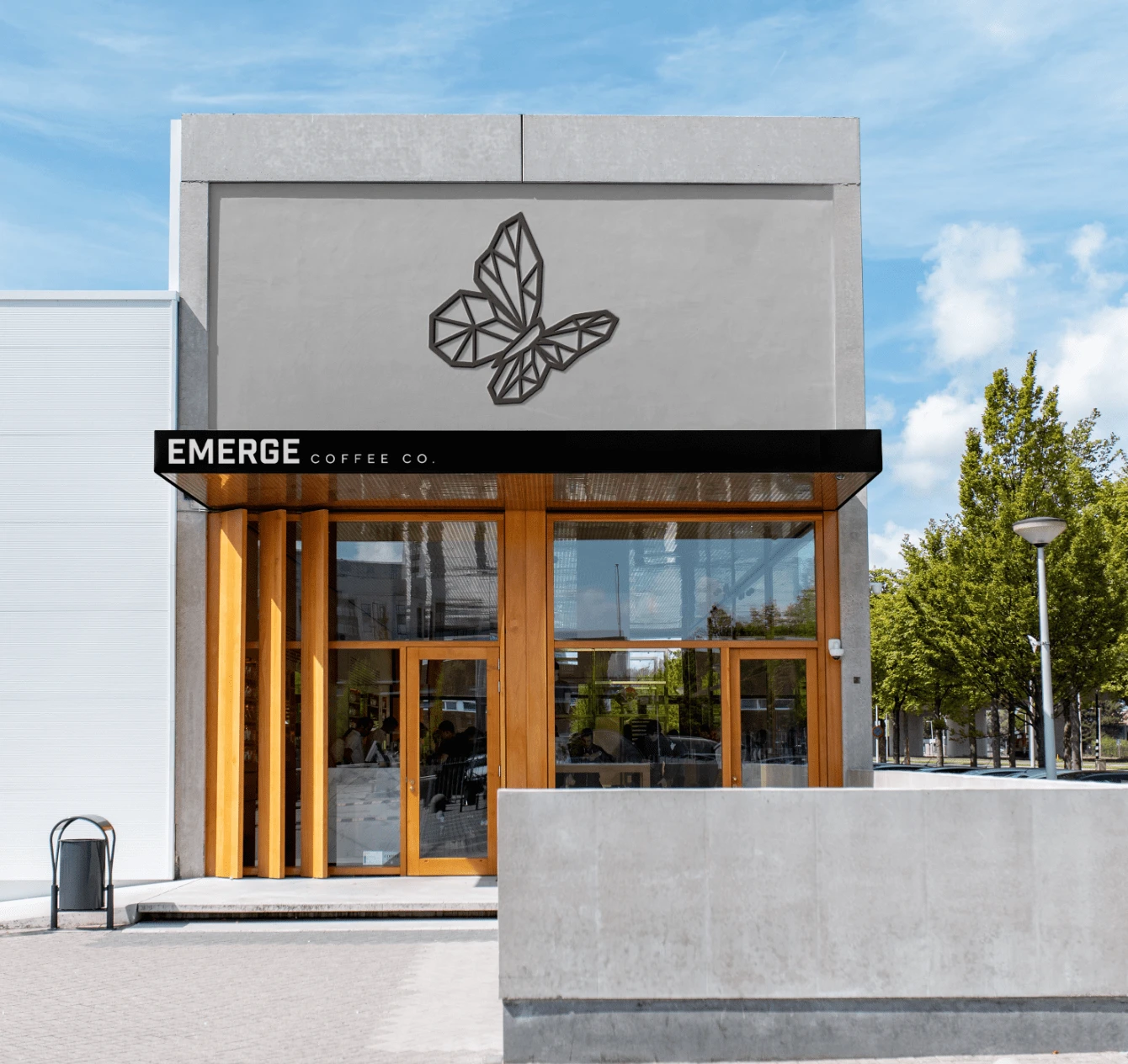
Some examples of scale are shown here. The Butterfly icon looks great printed small on a cup, or large on the side of a building.

Ensuring the logo looks great at all sizes is important for brand recognition.
The takeaway...
Ability to scale your logos is super important. Since your logo is used to represent your business, it's often displayed on many different things and you want it to look its best. From your instagram profile picture, to your packaging, clothing, website, side of a building, etc.
Ensuring your design works well at just about any size is critical. And having the option to use different variations of your logo is equally important.
Like this project
Posted Jan 13, 2023
When three sisters from OC, California started Emerge Coffee, they chose a symbol that represented strength & positivity as their logo. Here's the final design.
Likes
0
Views
231