Crafting Good Rebranding Project
Ashlyn Jackson
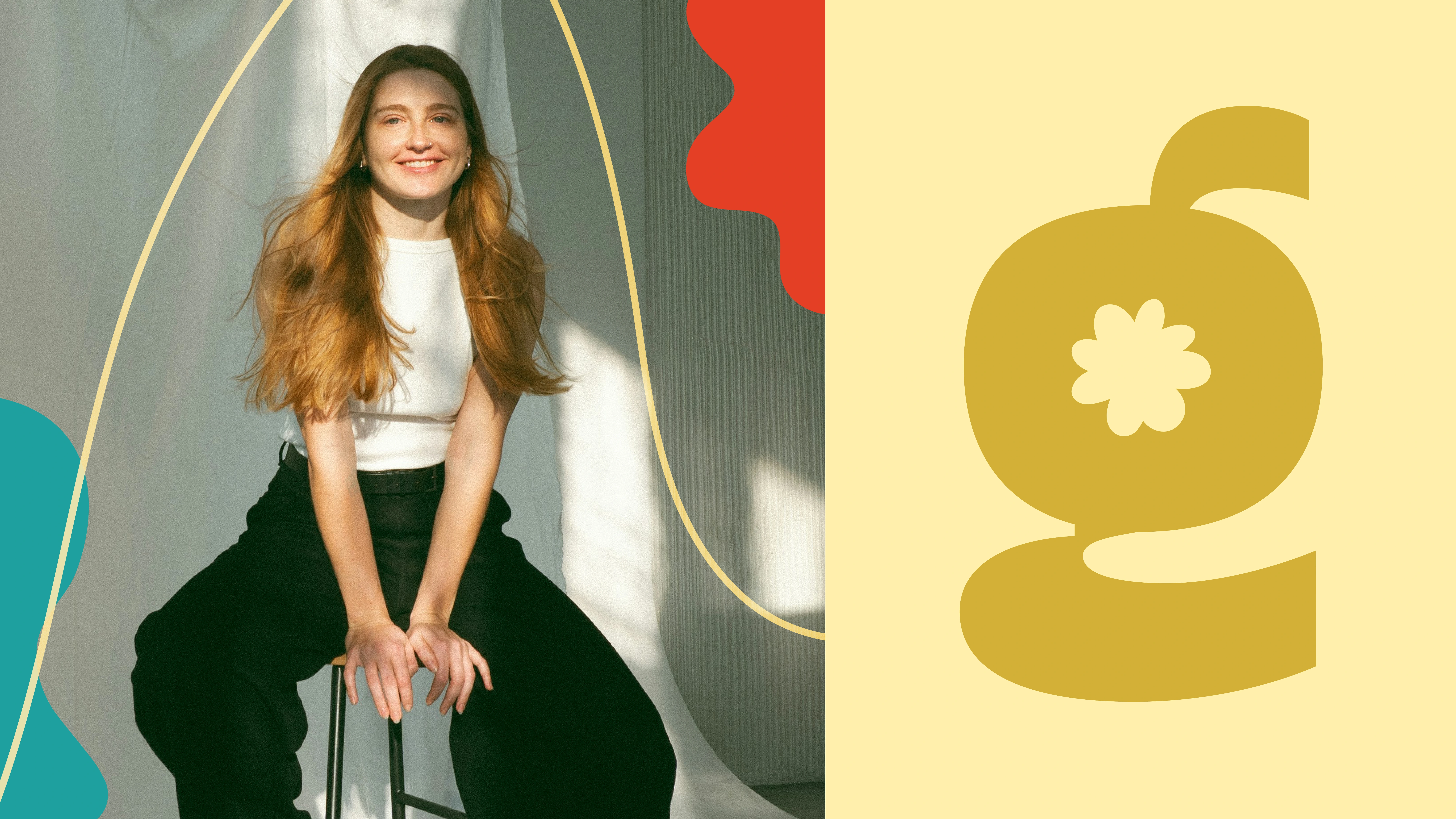
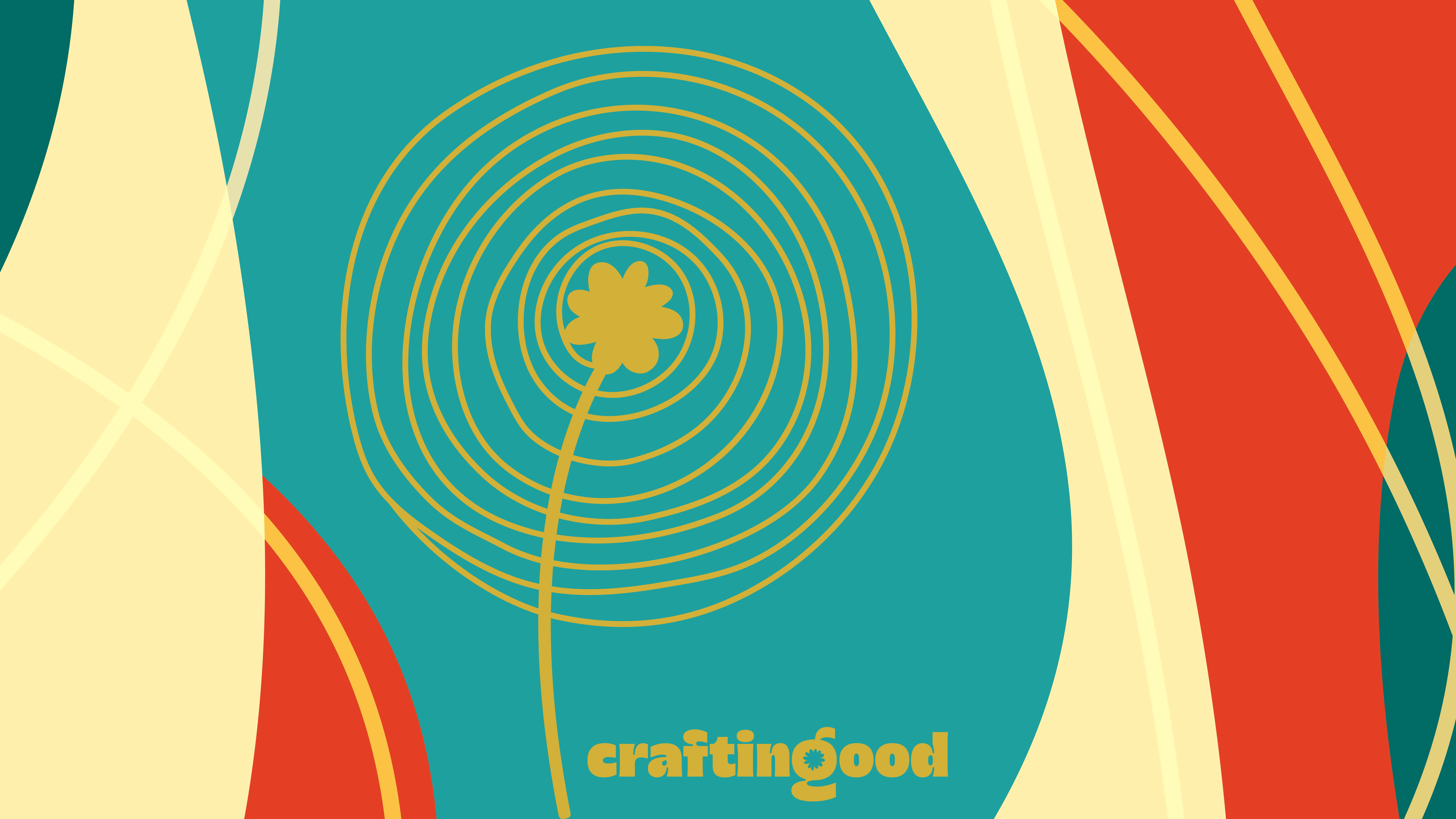
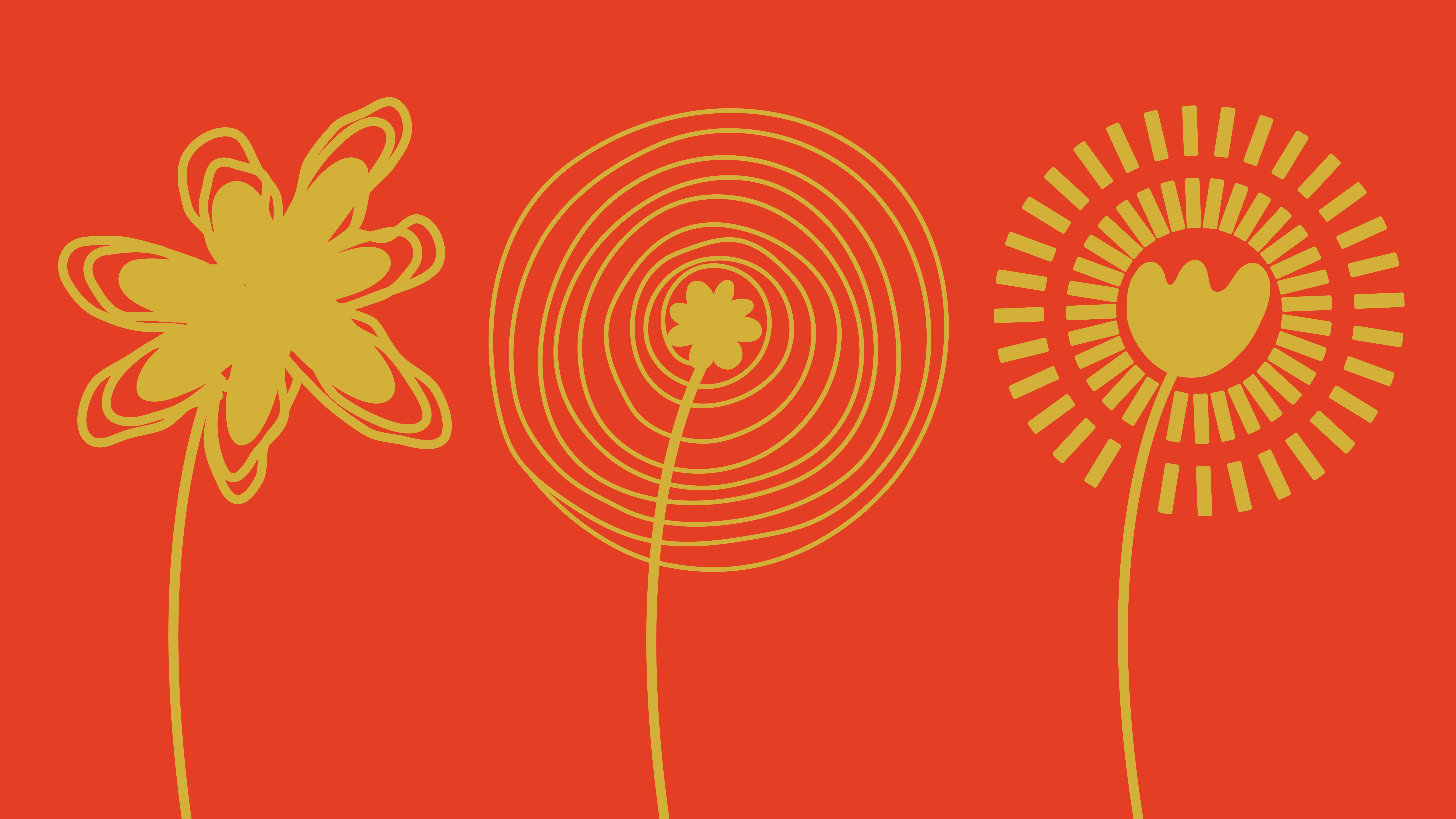
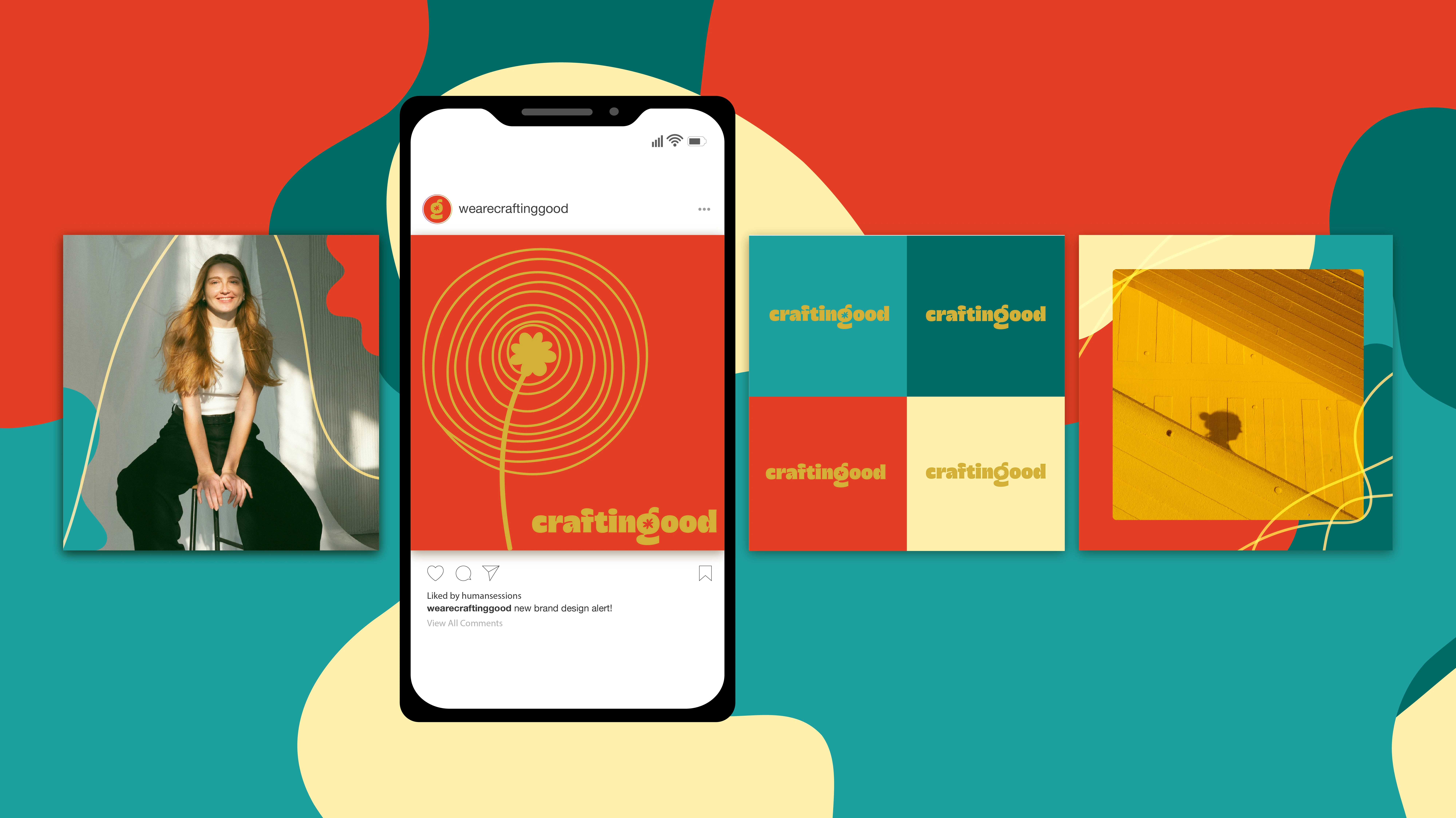
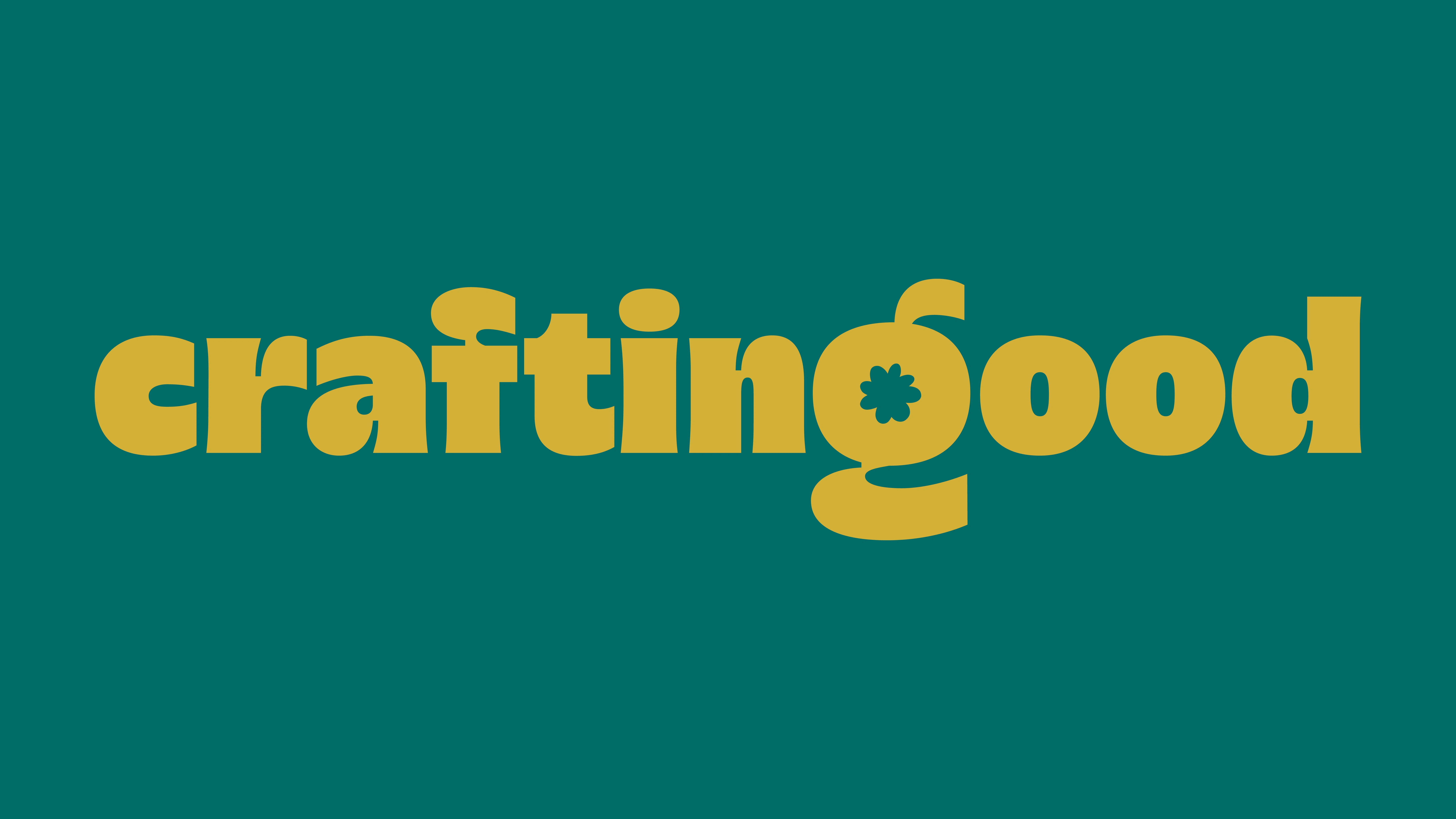
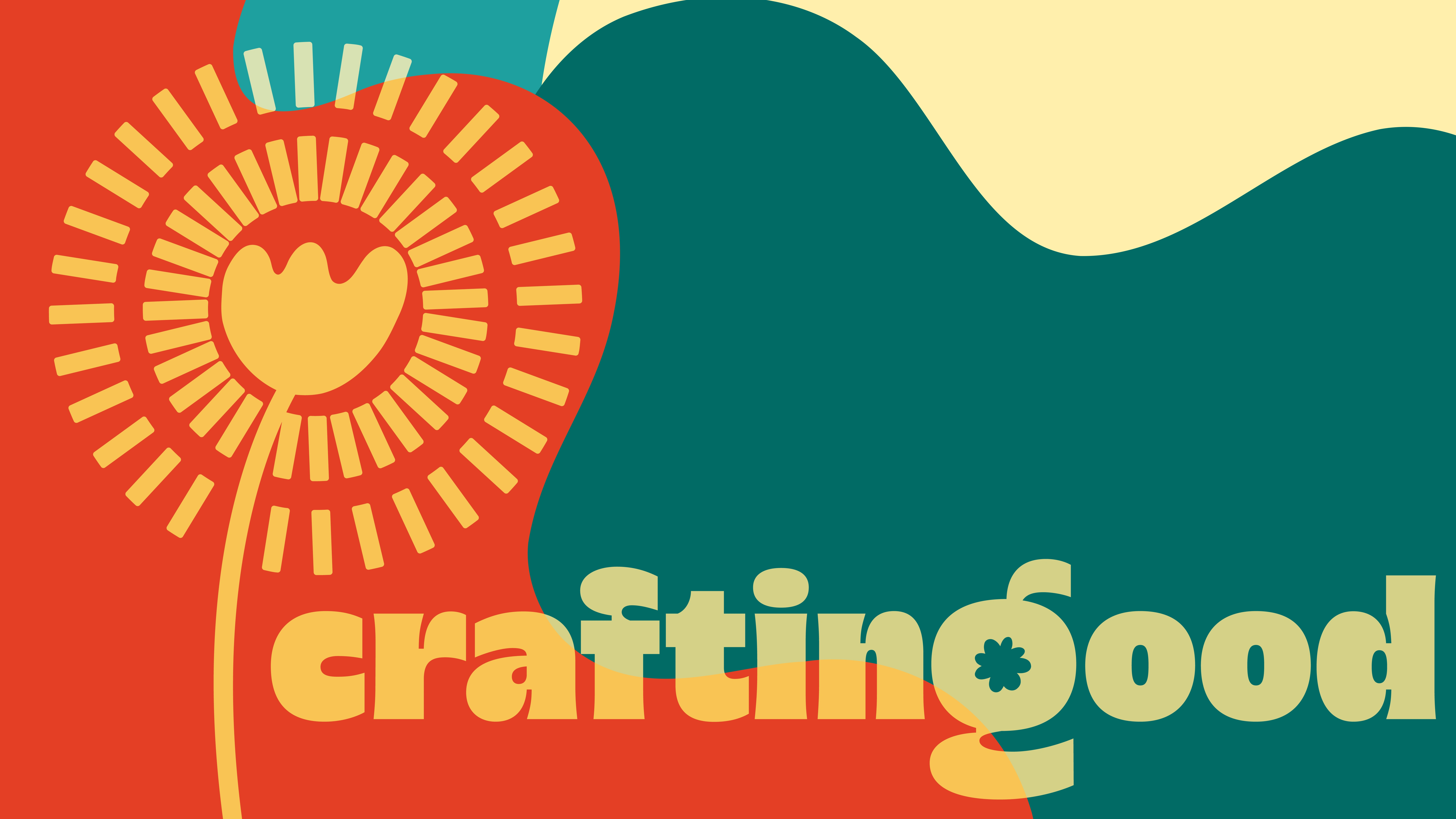
Crafting Good has recently undergone an exciting branding makeover aimed at revitalizing its image while preserving the essence of its dandelion and gold color palette. This rebranding effort is deeply rooted in three key phrases: botanical mark-making, rebel collage, and intuitive planting, each of which represents a distinct aspect of the brand's identity and philosophy.
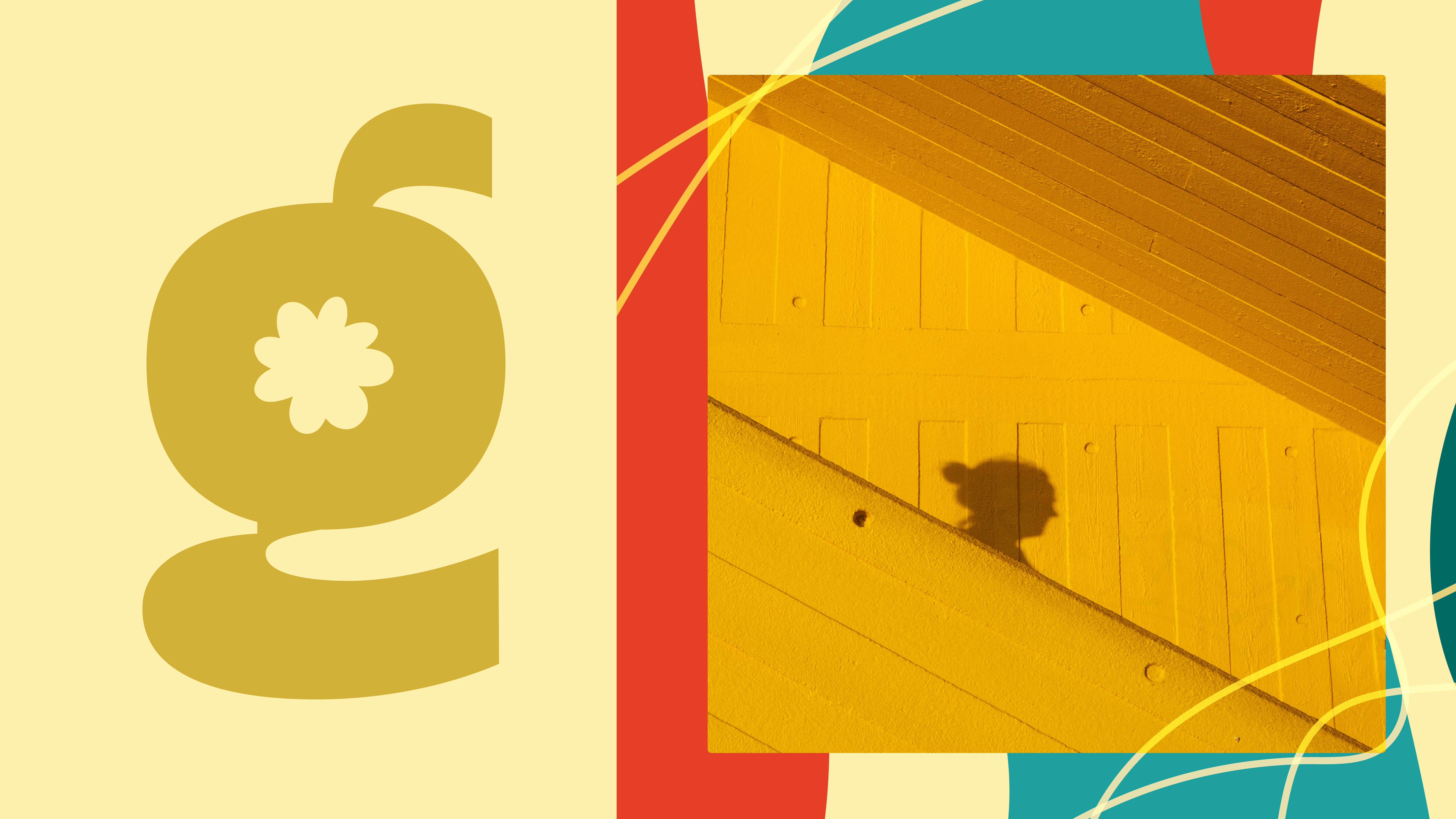
The collage elements of the new design feature a variety of hand-drawn shapes that are thoughtfully arranged to create a dynamic and playful visual composition. This approach not only adds a whimsical touch but also emphasizes the handcrafted nature of the brand. The dandelion motifs have been designed with a focus on a more artisanal, mark-making style, reflecting a sense of authenticity and connection to nature. The logo itself is crafted with a warm and inviting font that embodies the brand's approachable spirit. This font is enhanced by a unique organic cutout in the letter 'g,' which adds a subtle yet eye-catching flair, further reinforcing the brand's playful and creative essence.
This careful attention to detail in both the typography and overall design contributes to a cohesive and engaging brand identity that resonates with its audience.
Like this project
Posted Jul 9, 2025
Brand refresh for Crafting Good. Blending elements from the original branding with the client's new vision in order to create something new yet familiar.
Likes
5
Views
110
Timeline
Jun 1, 2025 - Jul 1, 2025