Pond Duck Zine: A Font Showcase
Ashlyn Jackson
Pond Duck Zine!
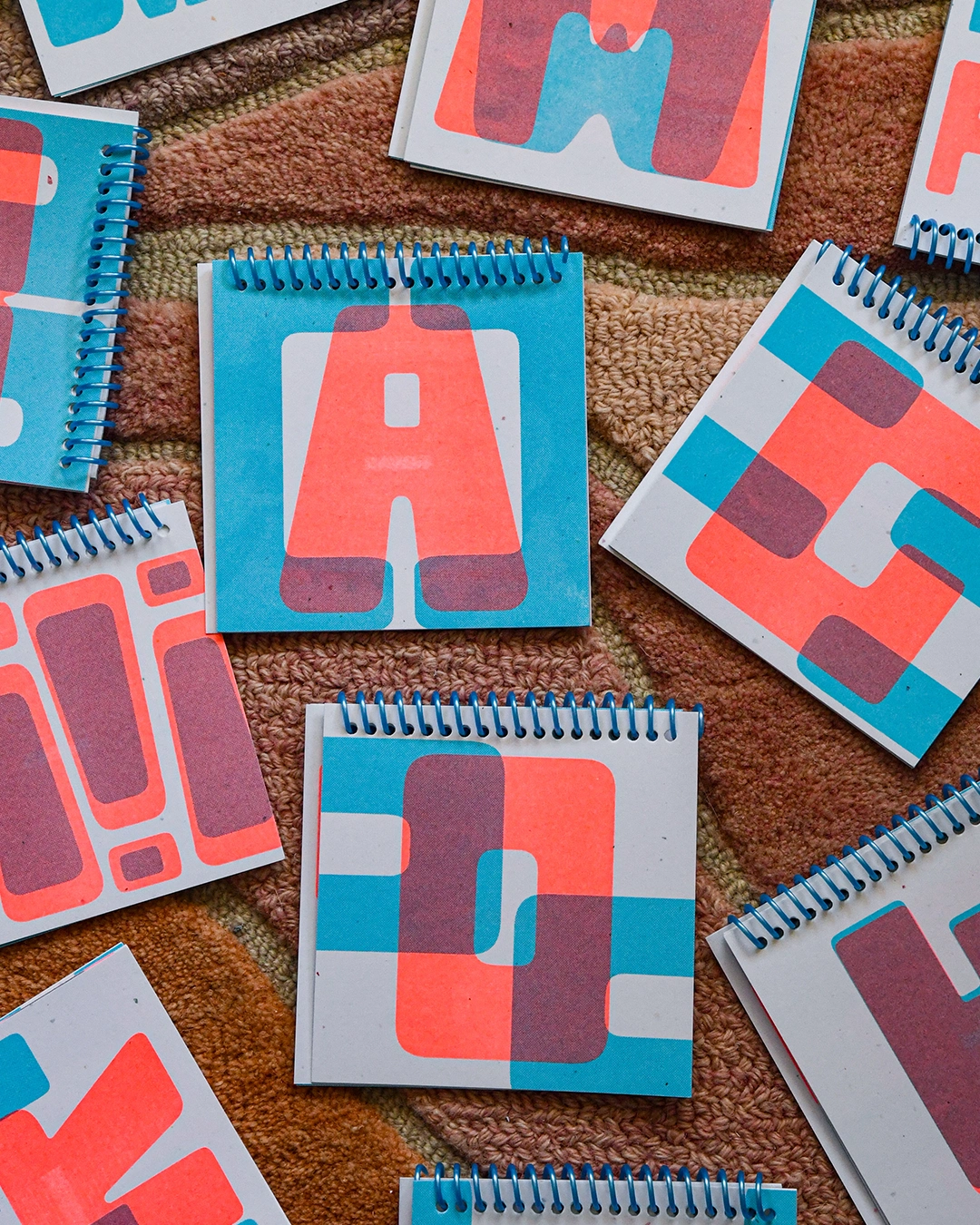
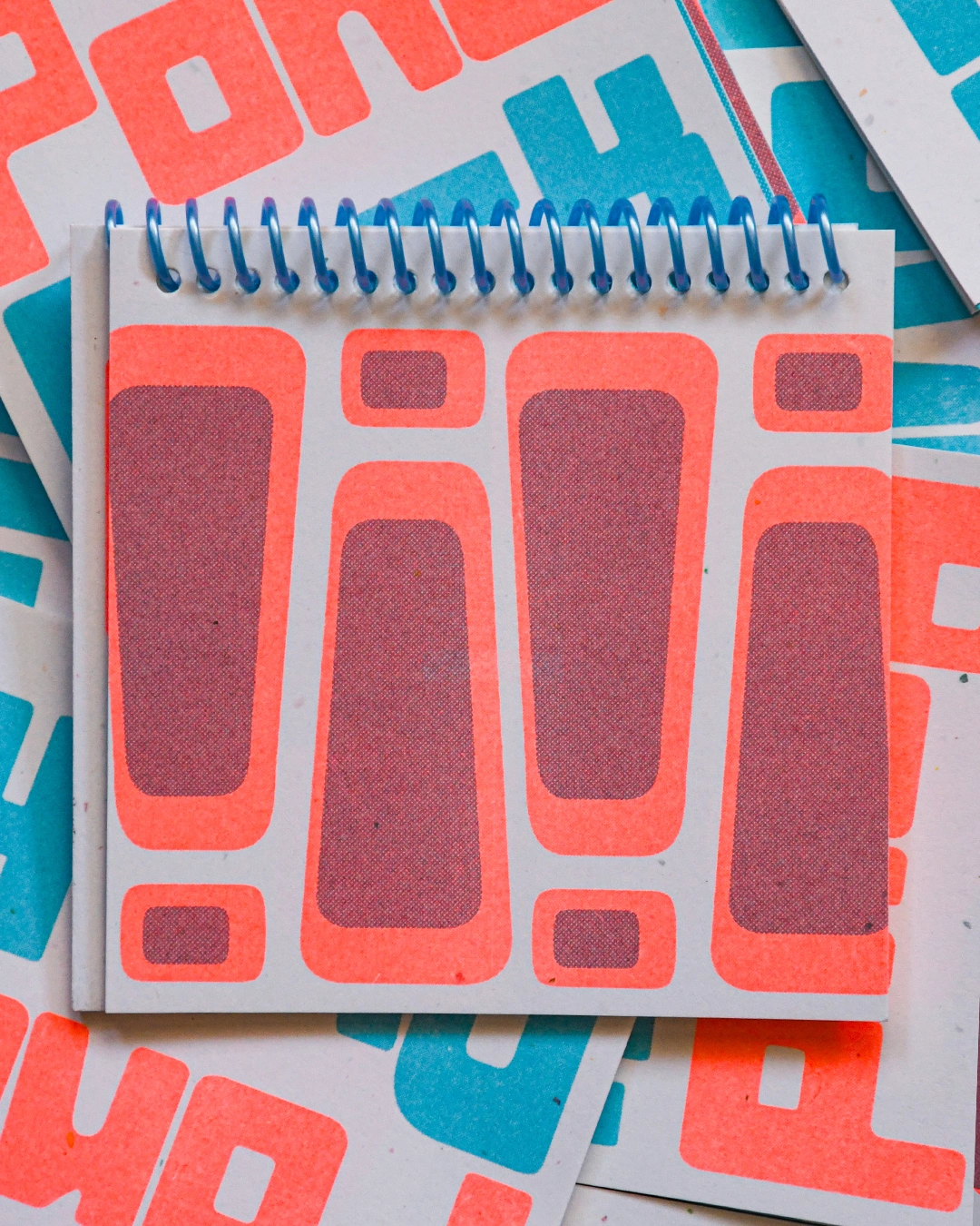
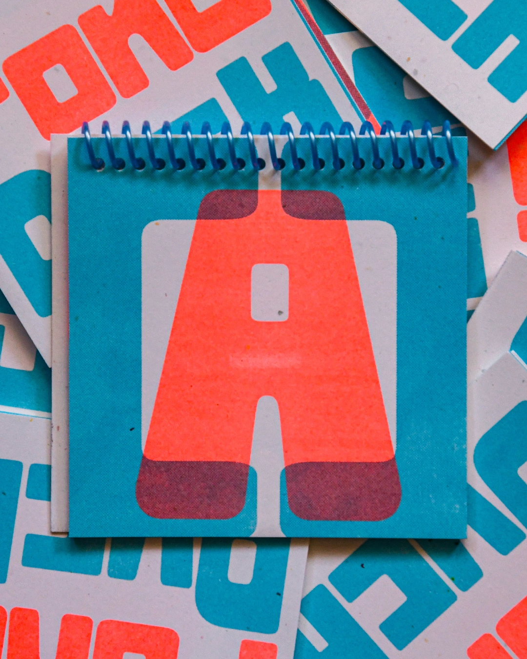
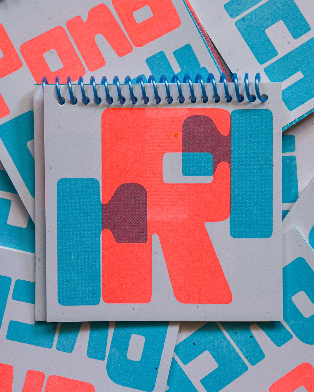
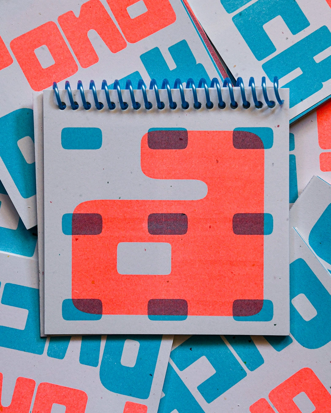
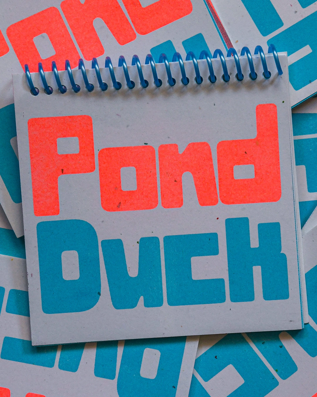
This letterform zine is a showcase of my work in constructing my font called Pond Duck. The title is highlighting the unique way I worked to construct the font itself. I worked in a backwards way of following the shapes, and hence the name, Pond Duck. This zine was risograph printed with a fluorescent orange and aqua color combination and spiral bound. The playfulness of the letters is reminiscent of the bold and funky letters I am gravitated towards in my own work, so why not make my own font I can use over and over again!
Like this project
Posted Jul 8, 2025
A risograph-printed zine showcasing the font Duckpond, which I created from scratch, is my type design class project.
Likes
6
Views
66
Timeline
Jun 15, 2025 - Jul 26, 2025