Results that are similar to your search
Similar results

Framer Development • UX/Product Design • Design Systems
- $1k+
- Earned
- 2x
- Hired
- 38
- Followers
Framer Development • UX/Product Design • Design Systems


Proofreader with translation experience (8 years)
- $1k+
- Earned
- 1x
- Hired
- 5.0
- Rating
- 7
- Followers
Proofreader with translation experience (8 years)


Designing user-centered interfaces with real impact


B2B Product Designer & Digital Systems Partner


B2B Product Designer & Digital Systems Partner


Quality Web & Product Design 🚀

Quality Web & Product Design 🚀



Top Framer Expert & Product Designer for Startups
Top Framer Expert & Product Designer for Startups


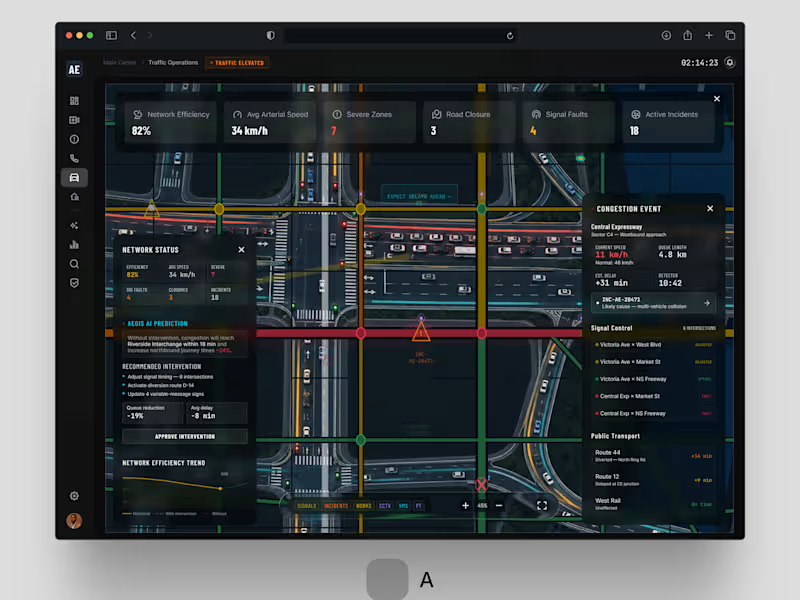
One problem. Two design directions. Which would you choose?
For AEGIS / 001.05 . Traffic Operations, we explored two approaches to the same challenge: helping city operators understand congestion, incidents and network-wide disruptions without overwhelming them with information.
Both solve the same operational problem. Different approaches to hierarchy and interaction.
If you were behind the control desk . Option A or Option B?
#smartcities #enterpriseux #productdesign #digitaltransformation #jemirae
8
5
918


AI & SaaS launch sites + design systems in Framer & Webflow
AI & SaaS launch sites + design systems in Framer & Webflow




8+ yrs | Product Designer · Framer & Webflow | SaaS
8+ yrs | Product Designer · Framer & Webflow | SaaS

So I designed Fundflex - one clean dashboard where your entire financial world finally makes sense. 🧡
→ Balances & currency breakdown at a glance
→ Monthly volume with clear trends
→ Instant currency conversion, live rates
→ Built-in AI - just ask anything about your money
Less searching. More insight. Smarter decisions.
What would you add?
30
25
2.5K

Every great website starts with one question:
How do we make users feel something in the first few seconds?
That idea guided every decision while designing this homepage website from the layout and whitespace to the interactions and overall flow.
Great UI isn't just about looking good. It's about creating an experience that feels effortless and keeps users exploring.
Here's a glimpse of the homepage. I'd love to hear your thoughts! 🚀
What grabs your attention first when you land on a website visuals, content, or the overall experience?
#UXDesign #UIDesign #WebsiteDesign #WebDesign #DesignInspiration
2
7
1.9K

Most websites look good.
Few make people stop, trust, and take action.
This landing page was designed with one goal: clarity over complexity.
Every section has a purpose:
- Clear visual hierarchy
- Generous whitespace
- Clean, modern UI
- Scalable components
Good design isn't about adding more,it's about removing what doesn't help users.
I'd love to hear your thoughts:
What part of a landing page has the biggest impact on conversions?
If you'd like, I can also make it more viral, designer-focused, or client-attracting.
30
63
5.9K
