Timbeter Help Page - UI Case Study
Hazuki Okemoto

Project description:
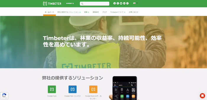
This is a case-study of a help page of Timbeter which I used to worked for.
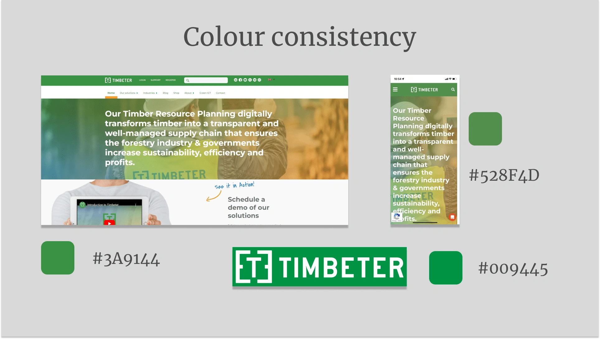
1. Colour consistency
I noticed that there were different green for the mobile web, the desktop web and the logo for press. In my prototype, I used the green from the logo.
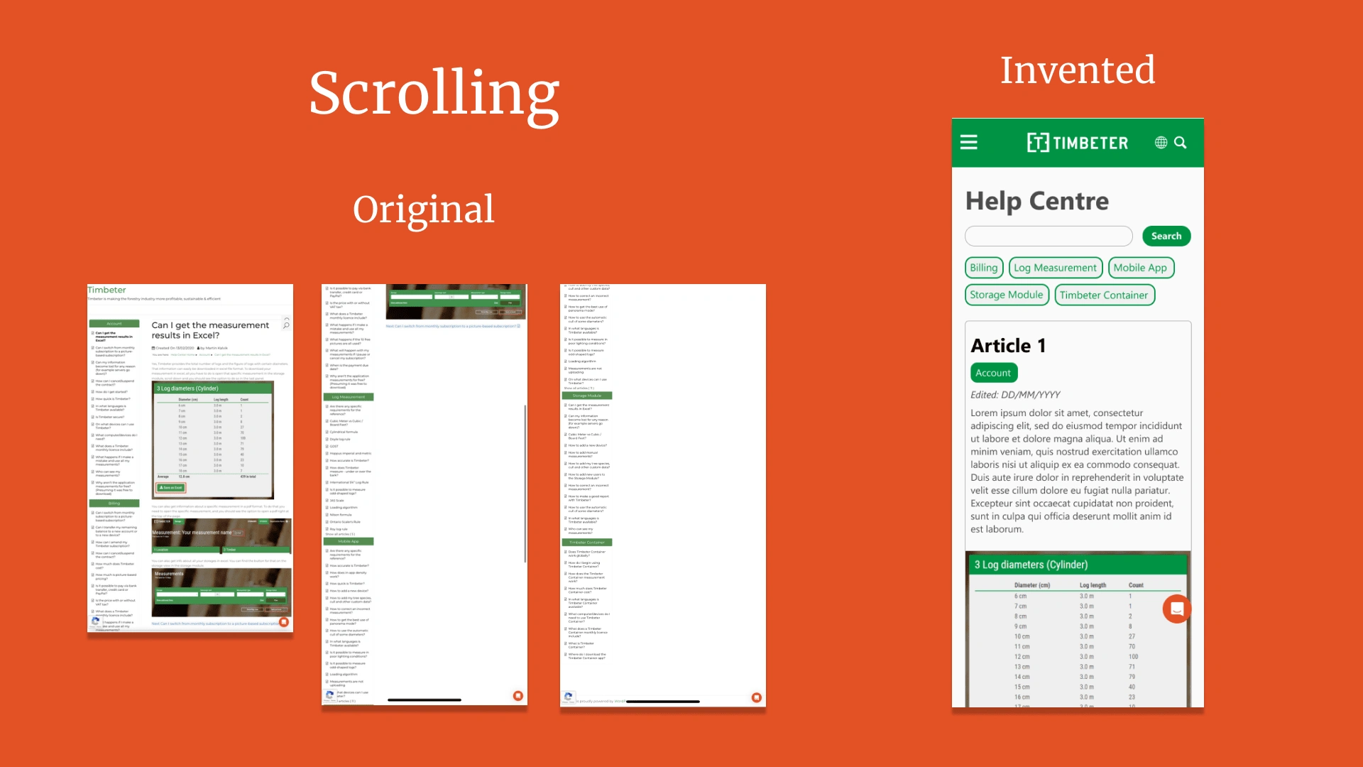
2. Scrolling
The original website had a HTML list with the name of the categories. I made it more easily acceissible by locating the category tag under the search bar.
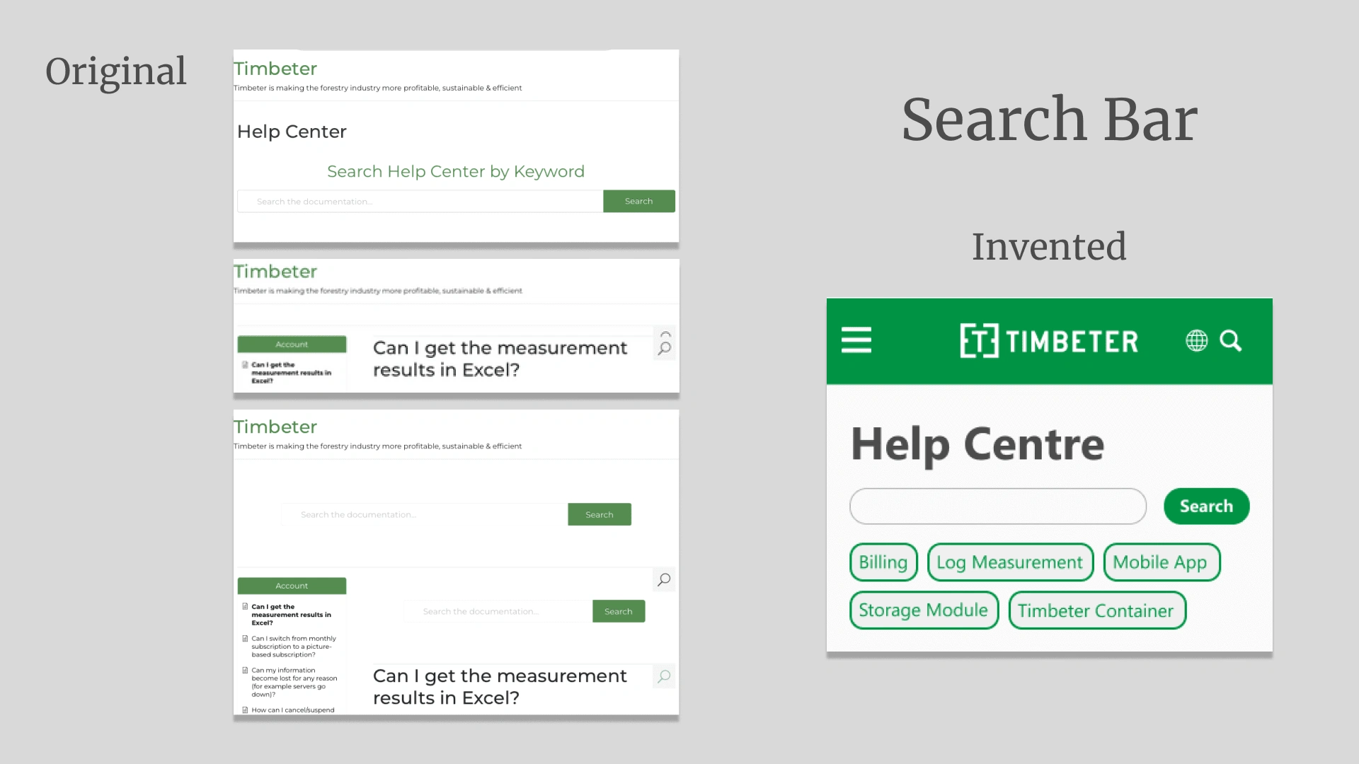
3. Search bar
For some reason, the original website had two search bar, one of which did not work.
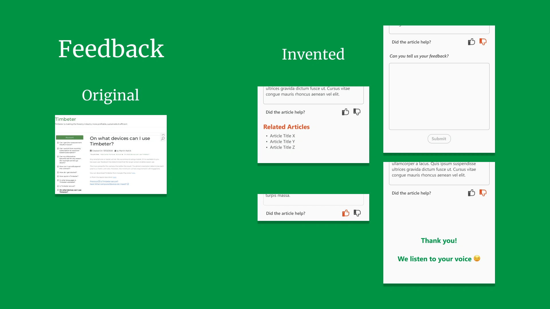
4. Feedback
I added a feedback option as neither an SEO specialist nor a expert content writer made each hep articles, so if a user can give feedback, their expalantion in the article will be more user-friendly to understand how the app works.
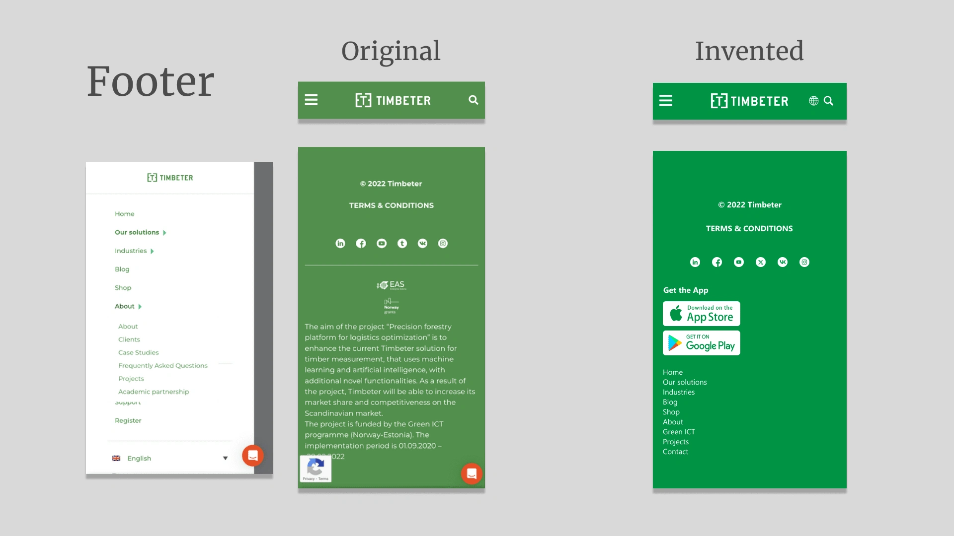
5. Footer
The original one had how legitimate their product is by showing a project on the footer, however, they have a separate project page, hence I removed it from my design and made it more navigating to the app download.
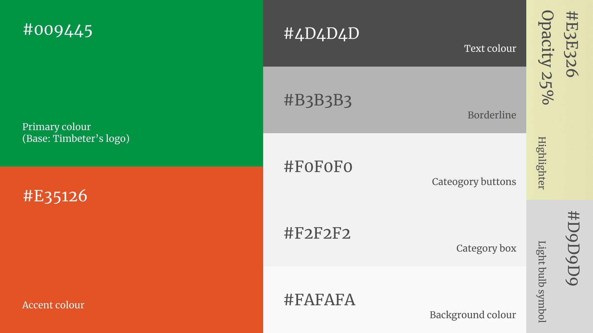
6. Colour palette
It shows all the colours I used in my design.
Like this project
Posted Jun 6, 2024
A case-study of a help page of Timbeter which I used to worked for.
Likes
0
Views
24