

Full Stack Mobile & Web | UI/UX Product Engineer | Devops
- $25k+
- Earned
- 7x
- Hired
- 5.0
- Rating
- 188
- Followers
Full Stack Mobile & Web | UI/UX Product Engineer | Devops





Senior Product Designer

I started with this question: Can AI better serve the needs of artists and makers in a meaningful way?
I'm a self-taught embroidery artist, and when i was learning, i would spend days on just planning my design before piercing needle through cloth. Print, trace, transfer, erase, redraw, repeat - my hands were itchinggg to get started, but mistakes at this stage were costly!
This was the spark to build Stitch Studio, an AI-assisted composition tool built entirely in Figma Make with the help of Claude (https://www.linkedin.com/company/claude/) Opus4.6 to help beginners and the like get to making, faster. I tried to automate the tedious parts and let the actual making remain with the artist.
Let me know if you give it a try! 😊
5
8
451


Framer Expert Marketing Sites & Landing Pages

Framer Expert Marketing Sites & Landing Pages


Marketing by Emilie Lebel


View more →

Modern websites for brands who care about performance
- 1x
- Hired
- 13
- Followers
Modern websites for brands who care about performance

Product Designer for AI & Digital Products
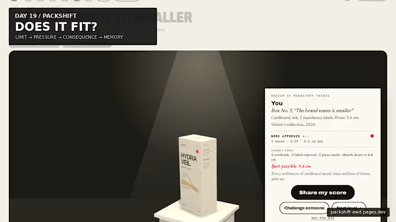
Packaging looks like graphic design. But every word takes physical space.
For Day 19, I built PACKSHIFT an interactive packaging experience where claims, languages, warnings and data become pressure on a finite surface.
It starts with the real 56 mm width of the carton.
Then you try to make everything fit.
Make the box smaller and the pressure becomes physical:
56 mm → pressure → CRACK → recovery → museum
The final package doesn’t just show the solution — it remembers the negotiation that produced it.
Underneath the public game is a deeper spatial compiler built with Blender + Three.js / React Three Fiber, where the same package can open, decompose, expose its dieline, redistribute information and refold.
Packaging is not a file. It is a compiled surface.
Full case study ↓
https://contra.com/p/3WBccUlM-packshift-packaging-is-a-compiled-surface
Live experience ↓
https://packshift-awd.pages.dev/
GitHub ↓
https://github.com/Faadil1/PACKSHIFT
Would love to know which moment lands most for you: Actual Size, the Hydraulic Press, or the Museum?
1
115
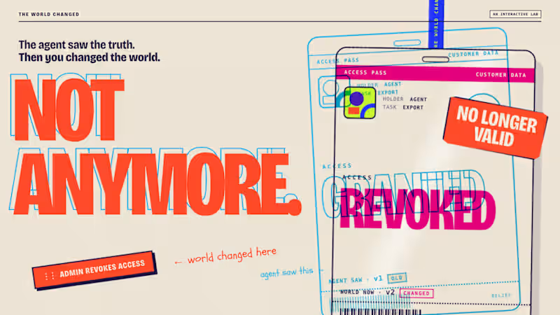
The agent saw the truth. Then I changed the world.
Just published THE WORLD CHANGED, an interactive AI agent lab where you change reality after an agent has observed it, then see whether it notices before it acts.
The core interaction is simple:
LOOK → PULL THE GAP → CHANGE THE WORLD → ACT
From there it expands into multiple worlds, a timed challenge, replayable receipts, checked vs. unchecked outcomes, and a genuine recorded Claude Opus 5.5 run.
I wanted the idea to feel physical rather than technical, so the whole visual system is built from passes, tickets, stamps, paper and print misregistration.
Would love feedback on the interaction and art direction.
🔗 https://contra.com/p/FXvqOAEA-the-world-changed-an-interactive-ai-agent-lab
1
104
Contra Community Post
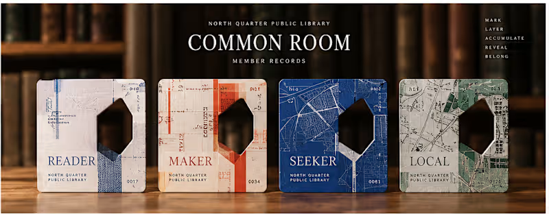
Day 17/30: COMMON ROOM
What if a library card could reveal belonging instead of simply proving access?
I built COMMON ROOM, a speculative membership system for the fictional North Quarter Public Library.
Instead of asking members to choose an identity or complete a personality quiz, the system lets their actual behavior inside the library leave the evidence.
Read in the Stacks → leave a margin.
Make in the Workshop → leave a registration mark.
Follow a question through the Index → leave a reference path.
Explore the Quarter → leave a civic trace.
Those traces gradually build a unique Member Record.
The card remembers in layers. Its physical Accession Aperture later becomes a lens into hidden library memory, and completed cards can optionally become part of a Living Collection that begins to reveal the shape of the neighborhood itself.
The project eventually became a system about:
BEHAVIOR → EVIDENCE → OBJECT → MEMORY → COMMUNITY
And the line that defined the whole thing:
You don’t receive a card. You accumulate one.
I also built the launch film around the same visual logic instead of doing a traditional product walkthrough using the card’s traces, layers and aperture as the motion language.
Would love feedback on one thing in particular:
Does the relationship between behavior, the physical card, and belonging read clearly without needing the concept explained first?
Day 17 of my 30 Days of Real Business Problems challenge.
#ProductDesign #InteractionDesign #CreativeDevelopment #DesignEngineering #MotionDesign #CreativeCoding #ThreeJS #Remotion
3
5
357


Architectural Designer | Arkis Studio Founder
- 1x
- Hired
- 5.0
- Rating
- 5
- Followers
Architectural Designer | Arkis Studio Founder



View more →

Web designer | cinematic SaaS pages that convert


Founders are dealing with enough chaos already, so I designed an AI landing page that feels like a literal deep breath.
For Klyro, I wanted to step away from the usual heavy tech look and create pure digital clarity. I paired soft gradients with clean typography to design a landing page that is actually calm and premium.
It really proves that modern AI tools can lean into a quiet luxury aesthetic and still look incredibly powerful.
11
7
1.2K

