Built with Framer
Slow House Boutique Hotel Landing Page Design
Christopher Milne
Slow House — Case Study
Project Overview
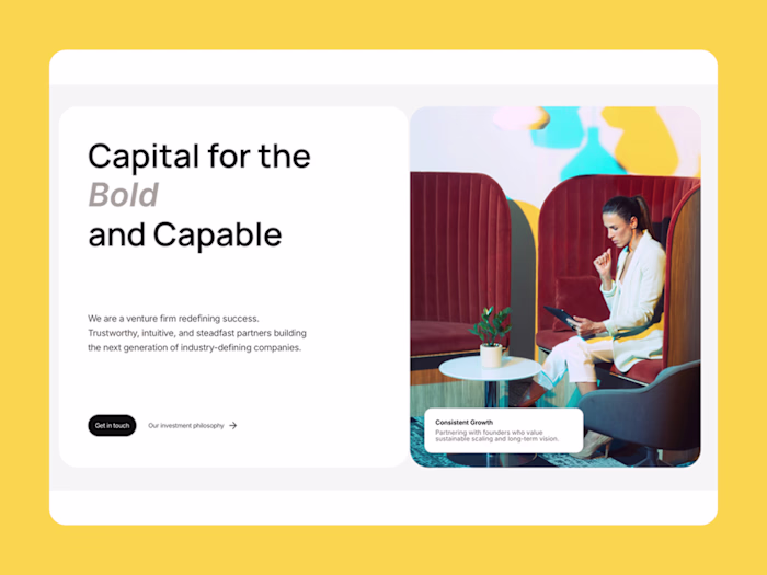
Client: Slow House (Concept Project)
Type: Boutique Hotel Landing Page
Platform: Framer
Role: Design & Development
The Brief
Design and build a landing page for a boutique hotel brand built around intentional rest. The digital presence needed to feel warm, editorial, and unhurried—an invitation to slow down before you've even arrived.
The Challenge
Hospitality sites typically fall into two camps: corporate chains with sterile stock photography, or boutique properties that try too hard with trendy effects. Slow House needed to feel genuinely luxurious without pretension—the visual equivalent of linen sheets and late checkout.
Key requirements:
Communicate "luxury through restraint" rather than excess
Editorial, magazine-quality presentation
Warm and inviting without feeling generic
Drive bookings while maintaining unhurried energy
The Approach
Conceptual Foundation
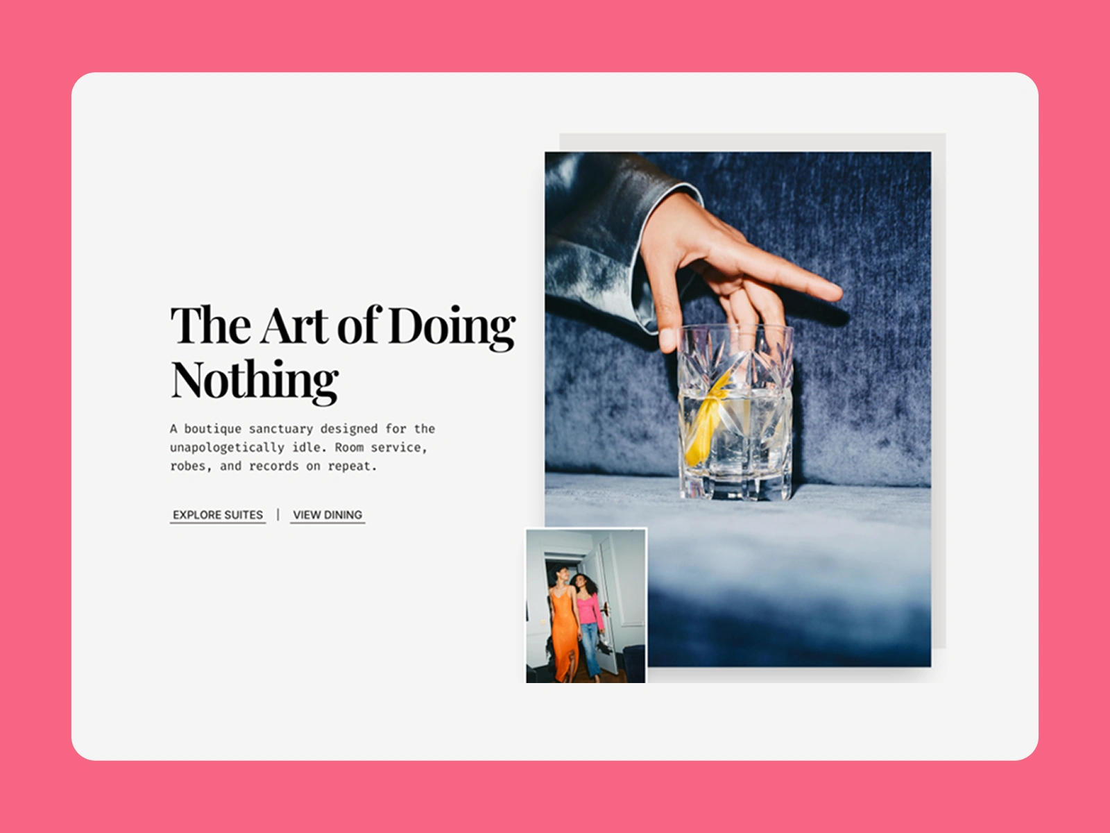
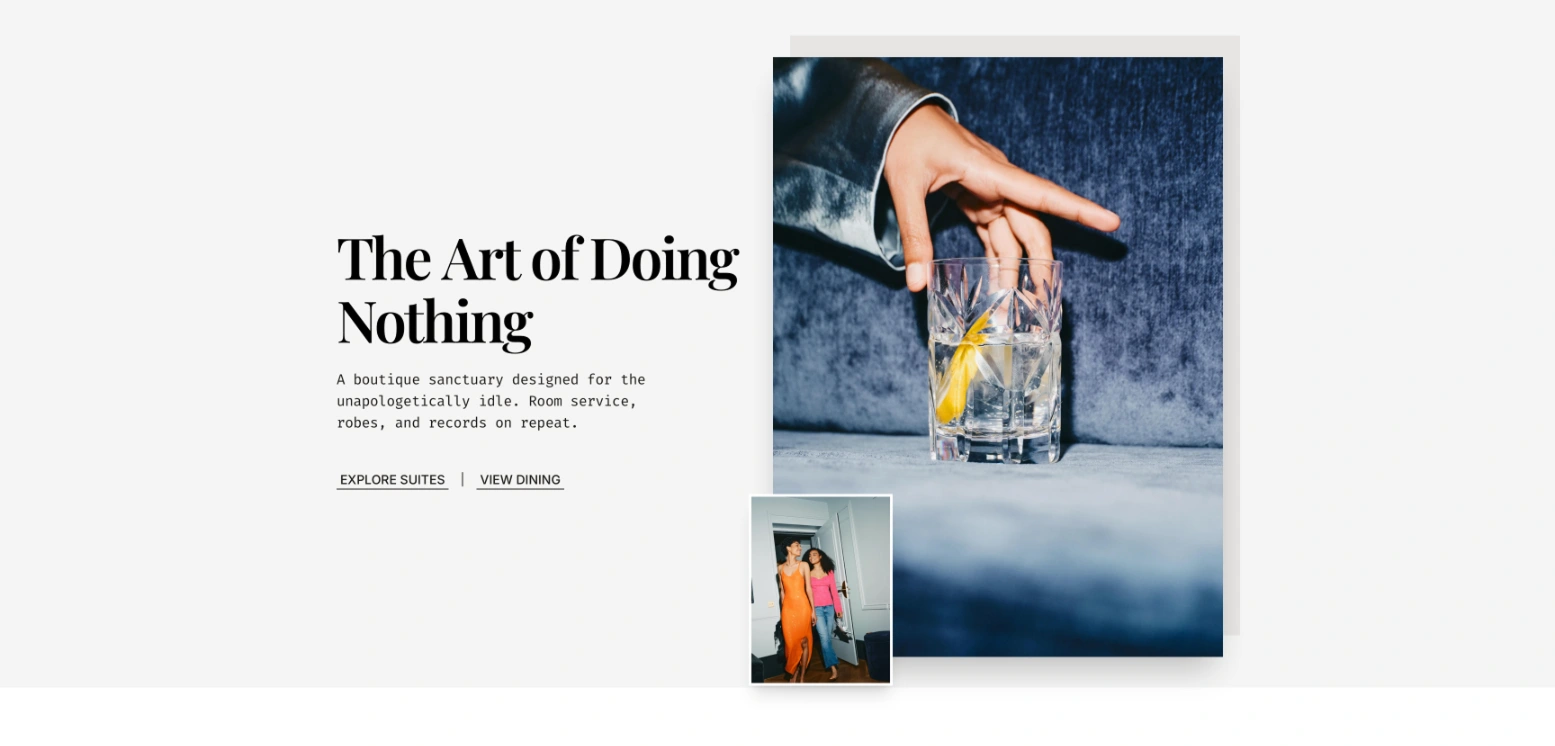
The brand centers on one idea: "The Art of Doing Nothing."
This isn't lazy—it's intentional. The design language reflects this through deliberate restraint: warm cream instead of stark white, square-edged photography instead of rounded containers, and typography that reads like a lifestyle magazine rather than a booking engine.
Visual Direction
Background: Warm cream (
#F5F5F4) — inviting, not clinical
Accent: Aged amber (#B45309) — warmth, golden hour energy
Dark section: Nearly black (#040404 ) — evening sophistication
Typography: Playfair Display + Fira Code pairing
Images: Square edges, editorial clusters, lifestyle momentsType Pairing Rationale
Playfair Display for headlines brings classic editorial warmth—it reads like a travel magazine feature. Fira Code (monospace) for body and UI elements adds an unexpected design-forward edge. The contrast between romantic serif and technical monospace creates tension that feels curated, not accidental.
Design Decisions
The Hero Layout
The asymmetric image cluster deliberately breaks the grid. Three images of varying sizes create visual interest without chaos—like photos pinned to a mood board. The main image (cocktail pour) anchors the composition while smaller lifestyle moments add context.
This isn't a hero banner. It's an invitation.
Editorial Typography Treatment
"The Art of Doing Nothing" splits across lines with "Doing" in italic Playfair. This emphasis isn't decorative—it signals what the brand values. Not the art, not nothing, but the doing of it. Rest as active choice.
Square-Edged Photography
No border radius on images. This is intentional: rounded corners feel friendly and approachable. Slow House is warm, yes, but also confident and editorial. Square edges reference print magazines and gallery presentations.
Hero Section
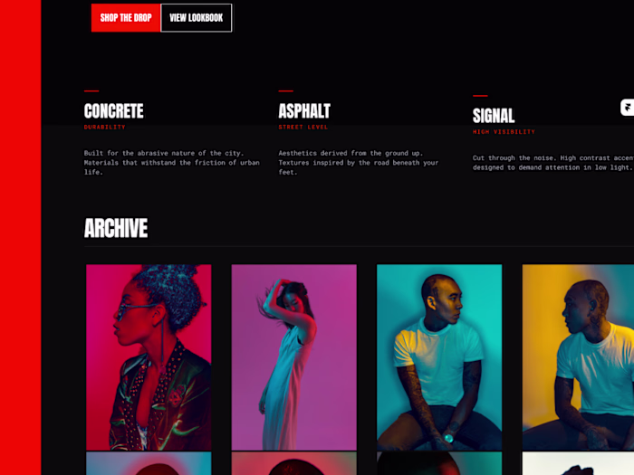
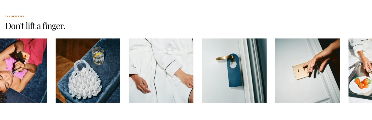
The Lifestyle Ticker
The "Don't lift a finger" section uses a slow-moving marquee. Speed matters here—fast scrolling would contradict the brand message. The leisurely pace invites browsing rather than demanding attention.
Experiences Section
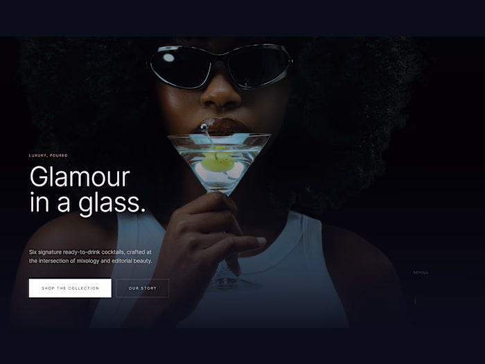
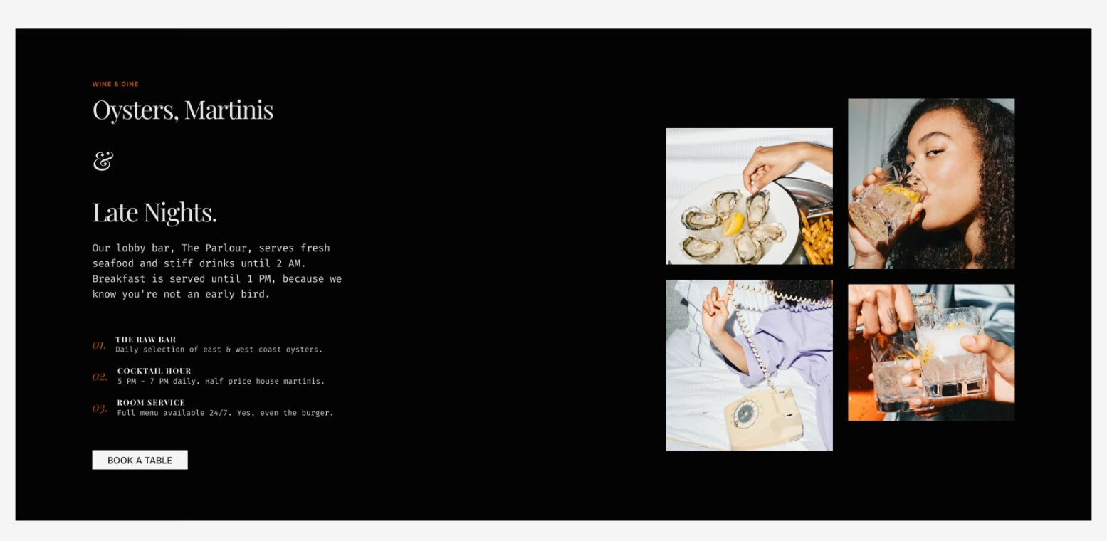
Wine & Dine Dark Section
The deep teal section breaks the warm cream palette without jarring. It signals a shift in energy: daytime relaxation to evening sophistication. The numbered features (01. THE RAW BAR, 02. COCKTAIL HOUR, 03. ROOM SERVICE) use amber for numbers, creating visual hierarchy while maintaining brand consistency.
Dining Section
Room Cards Without Containers
The accommodation cards have no background boxes—just image, title, price, description. This editorial approach trusts the photography and whitespace to do the work. Less UI, more content.
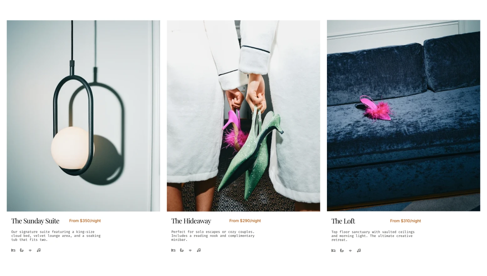
Accommodations Section
Technical Implementation
Built in Framer with:
Native Marquee component for lifestyle gallery (slow speed, pause on hover)
Image hover states with subtle scale (1.1) and overflow hidden
Full responsive design across three breakpoints
Semantic HTML structure throughout
Results
A landing page that:
Establishes brand personality immediately
Feels luxurious through restraint, not excess
Showcases rooms and dining without hard-selling
Works across desktop, tablet, and mobile
Maintains editorial quality at every breakpoint
Services Demonstrated
Brand landing page design
Framer development
Editorial layout design
Hospitality/lifestyle UI
Responsive implementation
Typography pairing
Project Details
Tools: Framer, Figma
Typography: Playfair Display, Fira Code
Live Site
Like this project
Posted Feb 2, 2026
Landing page for a boutique hotel brand. Draws from print editorial inspiration. Built in Framer and responsive across desktop, tablet, and mobile.
Likes
0
Views
45
Timeline
Jan 29, 2026 - Feb 2, 2026