Nocturne: Implementing Dark Mode in Figma
Christopher Milne
Nocturne: Implementing Dark Mode in Figma
Overview
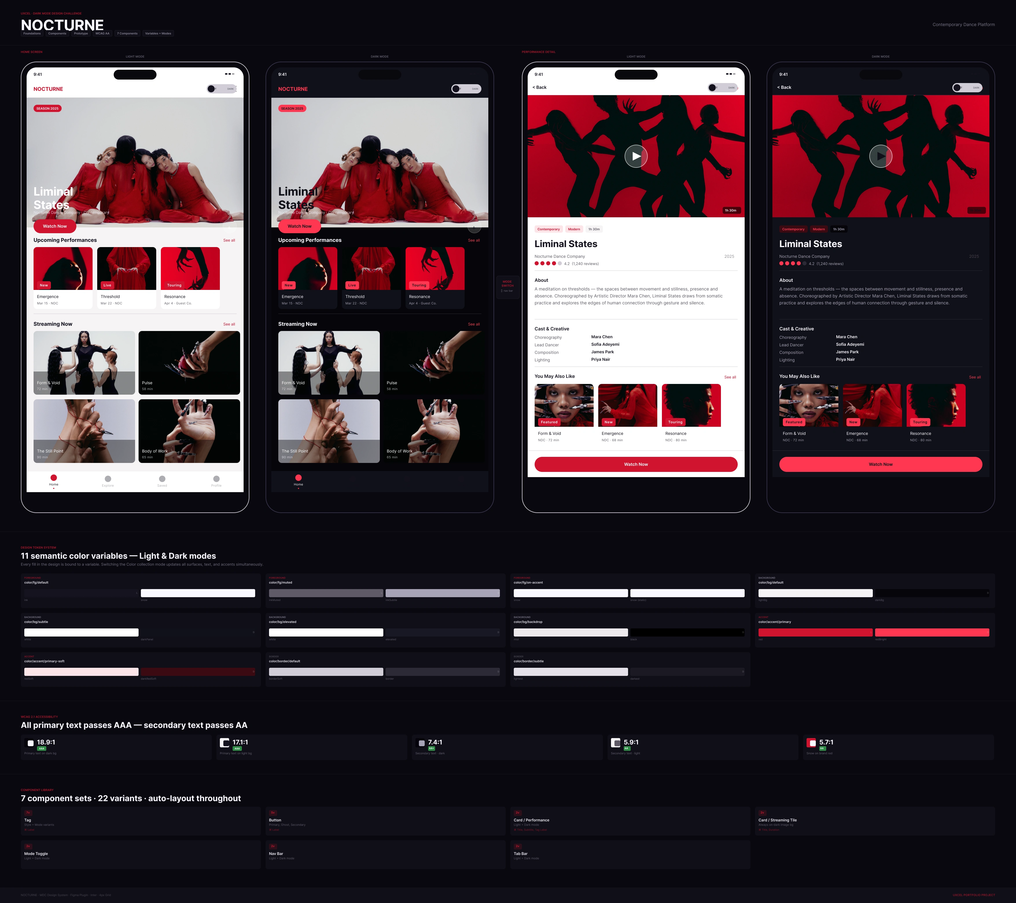
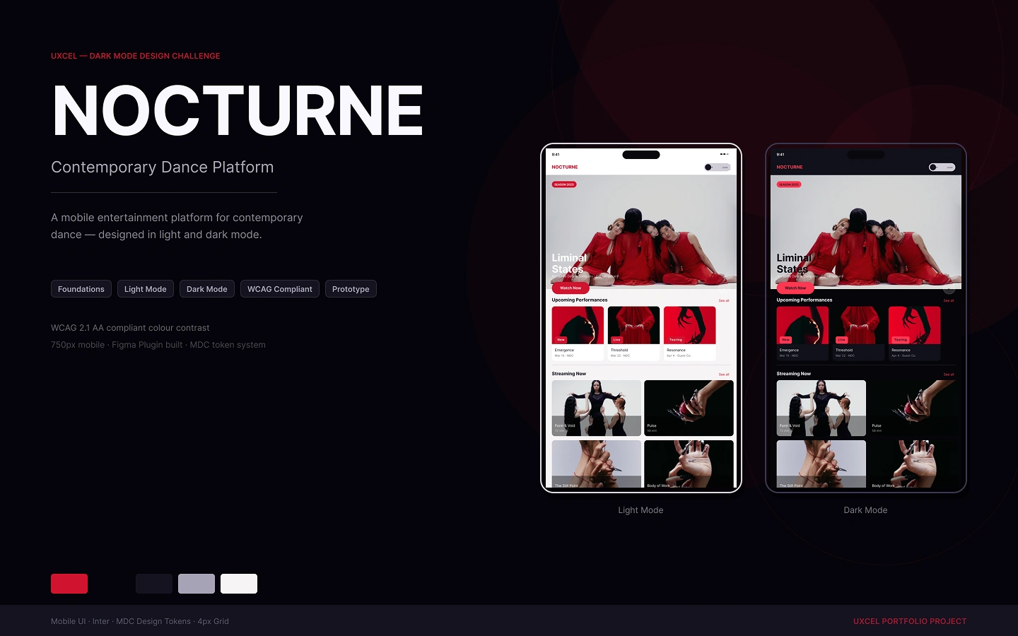
Nocturne is a contemporary dance streaming platform. The challenge: design a complete dark mode system too demonstrate variant and mode capabilities. A token-driven, variable-powered mode switching system built entirely in Figma.
Prototypes:
The Approach
This system uses Figma's variable collection with Light and Dark modes as the single source of truth rather than swapping screens or components.
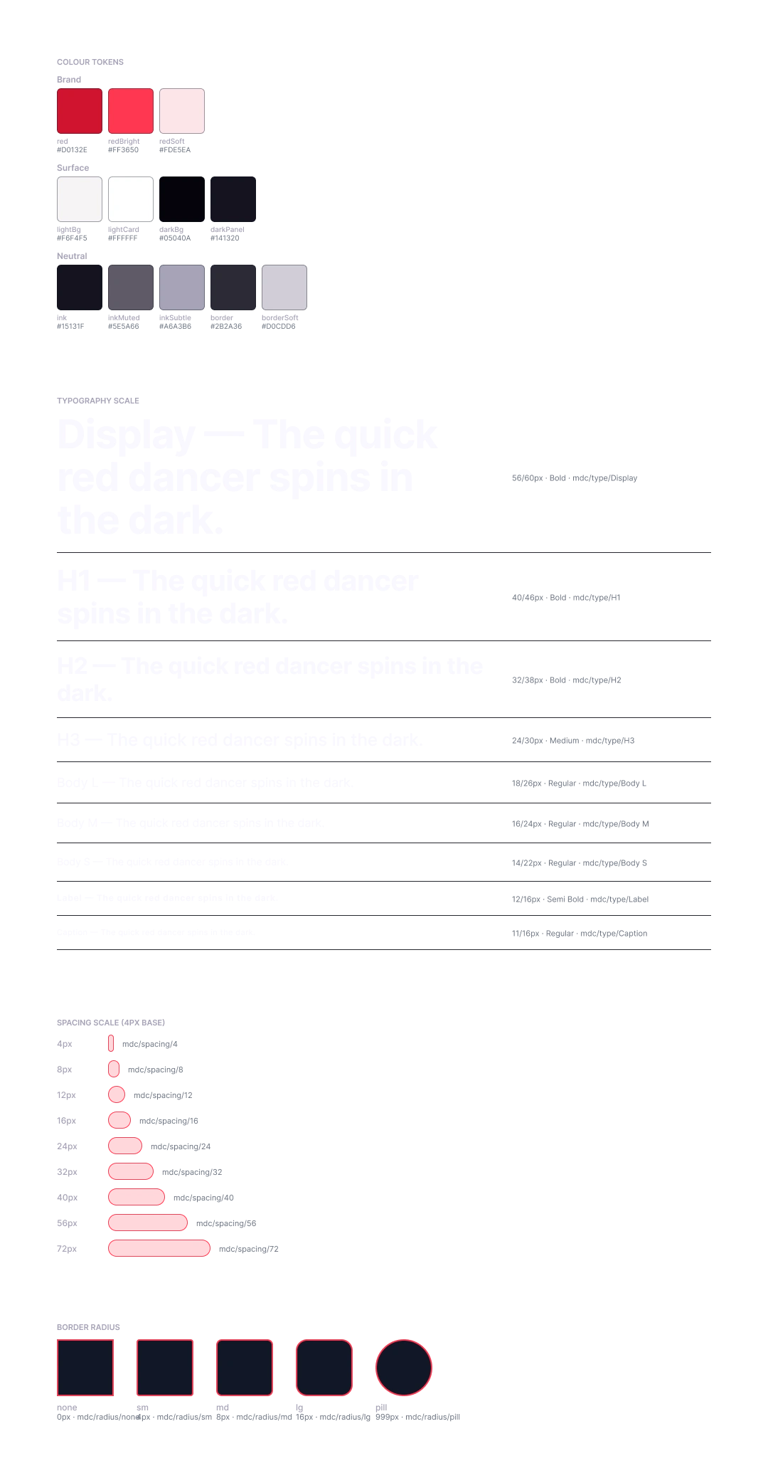
Token Architecture
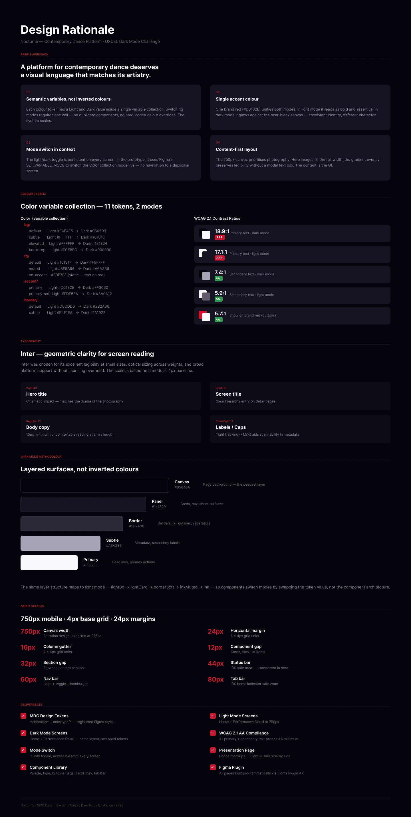
11 semantic colour variables across 4 categories, each carrying both a Light and Dark value.
Token Light Dark
color/bg/default #F6F4F5 #060509
color/bg/subtle #FFFFFF #101018
color/fg/default #15131F #F9F7FF
color/fg/muted #5E5A66 #A6A3B6
color/fg/on-accent #F9F7FF #F9F7FF
color/accent/primary #D0132E #FF3650
color/accent/primary-soft #FDE5EA #3A0A12
color/border/default #D0CDD6 #2B2A36
color/border/subtle #E4E1EA #1A1922
Every component fill is bound to a variable. Switching the collection mode updates the entire UI in one action.
Component Library
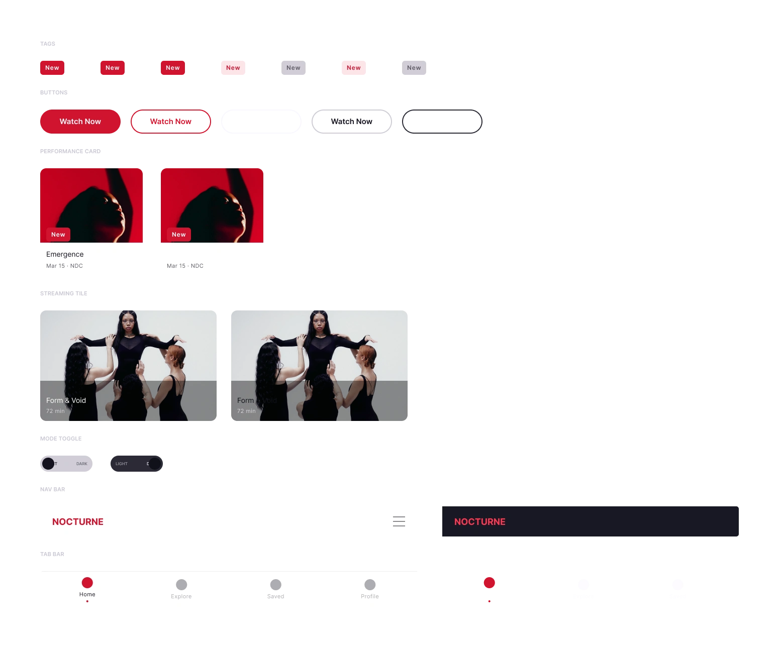
7 component sets built with full auto-layout, component properties, and descriptions:
Tag — status pill, 2 variants
Button — primary CTA, Light/Dark
Card / Performance — 204px content card with image, title, subtitle, tag
Card / Streaming Tile — horizontal tile format with duration
Mode Toggle — 104×32 pill, LIGHT/DARK labels, animated knob
Nav Bar — 750×60, logo + hamburger, Light/Dark
Tab Bar — 4-tab bottom navigation
Each component exposes TEXT properties for content overrides without detaching instances.
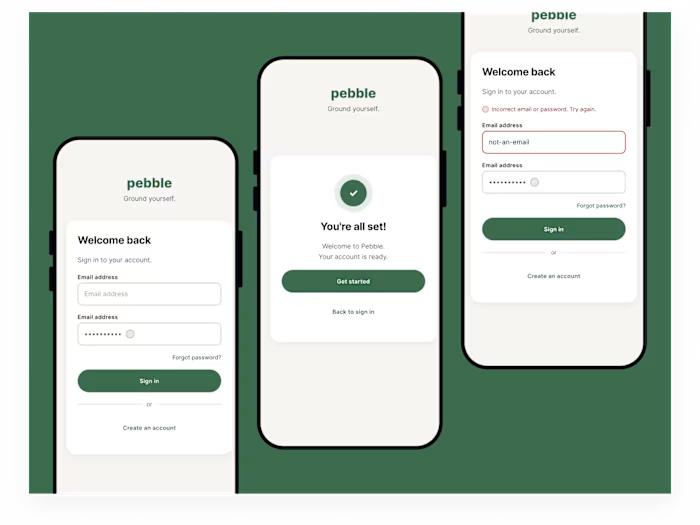
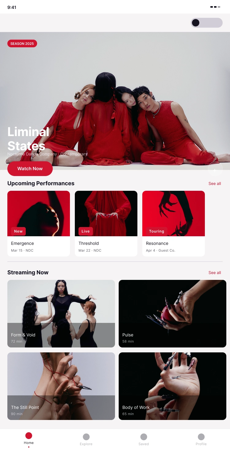
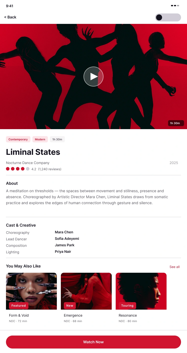
Prototype
Two standalone prototype flows — Home and Performance Detail — each demonstrating live mode switching.
CHANGE_TO swaps the Mode Toggle variant (knob animates via Smart Animate)
SET_VARIABLE_MODE switches the Color collection from Light → Dark across the entire frame
The toggle is placed as a direct child of each screen frame so the variable mode change scopes correctly to the parent frame.
Both screens start in Light mode; the prototype manages state at runtime.
WCAG Compliance
Pair Ratio Level
Primary text on dark bg 18.9:1 AAA
Primary text on light bg 17.1:1 AAA
Secondary text on dark bg 7.4:1 AA
Secondary text on light bg 5.9:1 AA
Snow on brand red 5.7:1 AA
Key Decisions
Semantic Naming Over Descriptive Naming
Tokens are named for their role (color/fg/default), not their value (inkColour). This means the same token name works in both modes — no renaming, no exceptions.
on-accent as a Static Token
Snow (#F9F7FF) appears on both dark backgrounds and red buttons. Rather than resolving it contextually, it's registered as color/fg/on-accent with the same value in both modes — honest about what it is.
Surface Depth Through Elevation, Not Lightness
The dark palette uses a four-stop elevation system (default → subtle → elevated → backdrop) that creates hierarchy without relying on opacity hacks or grey approximations.
One Toggle, Every Screen
The mode switch lives in the persistent nav area on every screen.
Deliverables
Foundations page: 14 paint styles, 9 text styles
Components page — 7 component sets
Screens page: 2 prototype-ready frames
Rationale page: design decisions documented
Presentation page: token system, WCAG documentation, component inventory
Cover: 1440×900 with Light/Dark phone mockups
Like this project
Posted Mar 8, 2026
A complete dark mode system demonstrating Figma's variable and mode capabilities. Token-driven, variable-powered mode switching built entirely in Figma.
Likes
0
Views
9