Built with Framer
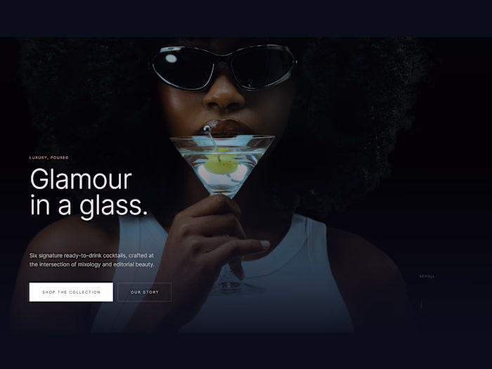
Neon Noir Urban Industrial E-Commerce Experience
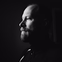
Christopher Milne
Project Overview
Client: Neon Noir (Concept Project)
Type: Brand Landing Page Design & Development
Platform: Framer
Role: Design & Development
The Brief
Design and develop a landing page for a streetwear brand rooted in urban nightlife culture. The goal: a digital presence that feels raw, rebellious, and unapologetically bold—mirroring the grit and energy of city streets.
The Challenge
Streetwear websites often fall into two traps:
Over-designed chaos: Too many effects, losing authenticity.
Sterile minimalism: Too clean, lacking energy.
Neon Noir needed to strike a balance—dangerous yet premium, like a late-night city walk.
Key Requirements:
Capture urban nightlife energy without clichés.
Feel premium despite a raw aesthetic.
Showcase product photography as the hero.
Balance lookbook browsing with conversion-focused design.
The Approach
Visual Direction
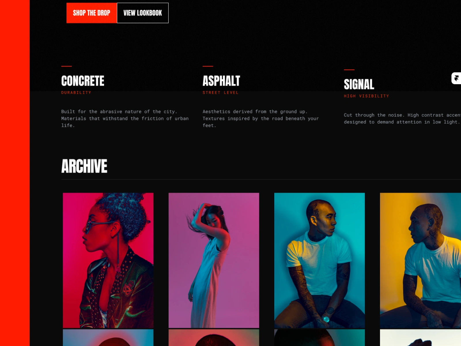
The design is anchored in three material concepts that embody the brand’s urban identity:
Concrete — Durability. Built to withstand the city’s abrasiveness.
Asphalt — Street-level. Aesthetics grounded in the urban environment.
Signal — High visibility. Cutting through the noise.
These concepts drive every design decision, from color to typography.
Design Language
ElementApproachBackgroundPure black (
#000000) — uncompromising darkness.AccentSignal red (#FF3B30) — bold, dangerous, visible.TypographyCondensed industrial display + monospace body.ImagesHigh-contrast portraits with colored lighting gels.LayoutSharp edges, brutalist influence — no softness.Key Sections
Hero — "Street Level Rebel" headline with bold typography, single hero image, and dual CTAs.
Brand Pillars — A three-column manifesto highlighting Concrete, Asphalt, and Signal.
Archive — Editorial photo grid with dramatic portraits.
Footer — Minimal, functional, and branded.
Design Decisions
Typography
The stacked, condensed headline creates vertical impact.
Color Restraint
Limited to black and orange, the palette forces the photography to take centre stage, keeping the design focused and bold.
Photography Grid
The archive grid uses varying image heights to create rhythm without chaos.
Sharp Edges
Every element features sharp edges—rounded corners feel too friendly for Neon Noir’s rebellious identity.
Technical Implementation
Built in Framer with:
Scroll-triggered fade animations.
Hover states with subtle scale and overlay effects.
Fully responsive across all breakpoints.
Dark theme throughout (no light mode).
Results
A landing page that:
Instantly establishes brand identity.
Feels both premium and underground.
Showcases photography without competing with it.
Delivers visual impact across desktop, tablet, and mobile.
Live site
Services Demonstrated
Brand landing page design
Framer development
Dark theme UI design
Editorial grid layouts
Responsive implementation
Project Details
Tools: Framer, Figma
Typography: Industrial condensed display + monospace
Like this project
Posted Dec 8, 2025
Dark, brutalist landing page for a streetwear brand. High-contrast typography, editorial photo grid, fully responsive. Built in Framer.