Brand Creation and Web Design for Jared Jones Financial
Overview: Jared Jones, a new mortgage agent wanted a professional and memorable brand identity to kickstart his career.
Solution: I collaborated with Jared to design a cohesive brand identity, including business cards and a phased website launch. The branding elements were crafted to reflect Jared’s expertise and approachable personality.
The logo
I collaborated with Jared to bring his vision for a logo to life. Jared wanted to incorporate blue colors and square shapes into his brand identity, reflecting trust and reliability.
After exploring several concepts, we chose a professional-looking serif font for his name and paired it with a modern sans serif font for the word "Financial". This combination ensures that his brand feels both established and contemporary. For the horizontal version of his logo, I added lines on both sides to enhance the design's balance and unity. We also optimized the logos for dark backgrounds, making them versatile for different uses and placements.

Logo design
The business cards
I designed business cards that complement Jared Jones Financial's professional and trustworthy image. We selected high-quality paper to give the cards a luxurious feel. We added a raised spot gloss on specific areas to subtly highlight important details, enhancing the card's tactile and visual appeal.
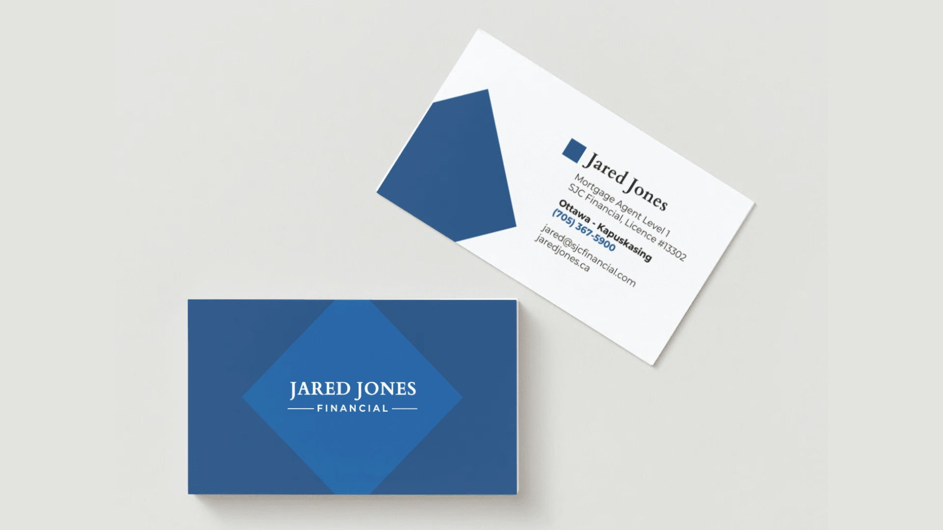
Business cards mockup before printing
The website (phase 1)
To help Jared get started as a new mortgage agent as soon as possible, I created a simple website, consistent with his new brand, that contains all the essential information a potential client might look for. I incorporated strategic marketing while building the website to consider how different potential clients might be at different stages of the mortgage buying process (i.e. some are simply browsing while others are actively looking for a mortgage).
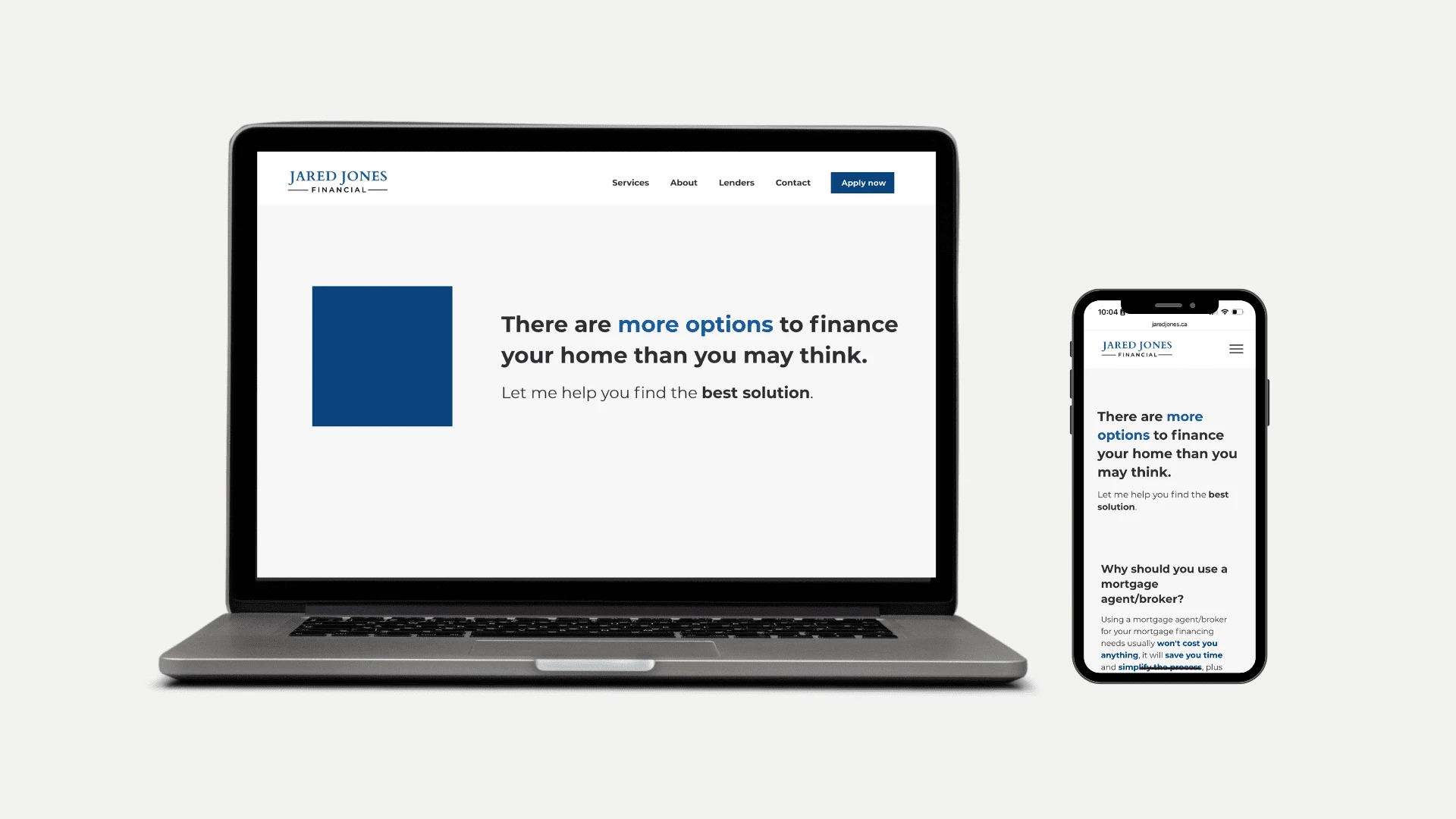
Responsive website design optimized for desktop and mobile
Phase 1 demo
The website (phase 2)
I am currently working with Jared Jones to create a more complex version of his website. The estimated project delivery is by the end of September 2024. By splitting the website development in two phases, I ensured that Jared had a functional website to begin closing deals as soon as possible. The second phase of the website will bring his full vision to reality.
To maintain client confidentiality, I will not disclose the details behind this second phase at this time.
You can view phase 1 of the Jared Jones Financial website here: https://www.jaredjones.ca/
Like this project
Posted Apr 26, 2024
I worked with Jared Jones, a new mortgage agent, to create a brand identity, business cards, and a phased website launch to kickstart his career.

