
0→1 Product Designer & No-Code Builder


0→1 Product Designer & No-Code Builder



Unique UI/UX Solutions for Digital Success
Unique UI/UX Solutions for Digital Success


View more →

Product Designer | Web3, Fintech & DeFi | Framer & Webflow
- 5.0
- Rating
- 8
- Followers
Product Designer | Web3, Fintech & DeFi | Framer & Webflow


Most fintech apps show how much you’ve saved.
They don’t show what it’s costing you.
Saving for travel can delay debt payoff.
So I explored a better approach: A goal-based savings experience where multiple goals compete for the same income, and users can see the trade-offs clearly.
I used AI across my workflow:
Perplexity to ground the scenario
ChatGPT to refine flows and edge cases
Figma Make to shape early directions
Cursor to prototype the interaction locally.
Then I designed the experience in Figma, focusing on clarity and decision-making.
Key ideas:
• Multiple goals with clear priorities
• A trade-off slider showing how timelines shift
• Scroll interactions that reveal goals progressively
Still refining, but the goal is simple: Help users make smarter financial decisions, not just track savings.
4
179

I designed a B2B Energy Management Dashboard for factory operations teams.
The goal was simple: help managers identify where energy is wasted across multiple sites and machines, and decide what to fix within seconds.
The solution focuses on prioritised alerts, clear multi-site KPIs, layered data exploration, and actionable recommendations that turn complex energy data into operational decisions.
#UXDesign #ProductDesign #DashboardDesign
6
1
199

Project: B2B SaaS Onboarding Redesign
Context: 14 day trial, multi user analytics and CRM product
Challenge
Teams signed up but never activated. Admins felt overwhelmed by configuration. Workspaces expired without integrations.
Approach
I defined the core aha moment as “see your own revenue or pipeline data inside a live dashboard”.
Everything in onboarding was designed to drive that outcome.
• Welcome screen asks for user goal, not company details
• Personalised checklist based on role and objective
• Sample data to demonstrate value before setup
• Linear, skippable setup with clear progress and time expectations
• Post integration prompt to invite teammates and drive adoption
Result: A guided experience that reduces cognitive load, clarifies what done means, and aligns the entire setup around first value, not feature exposure
3
141

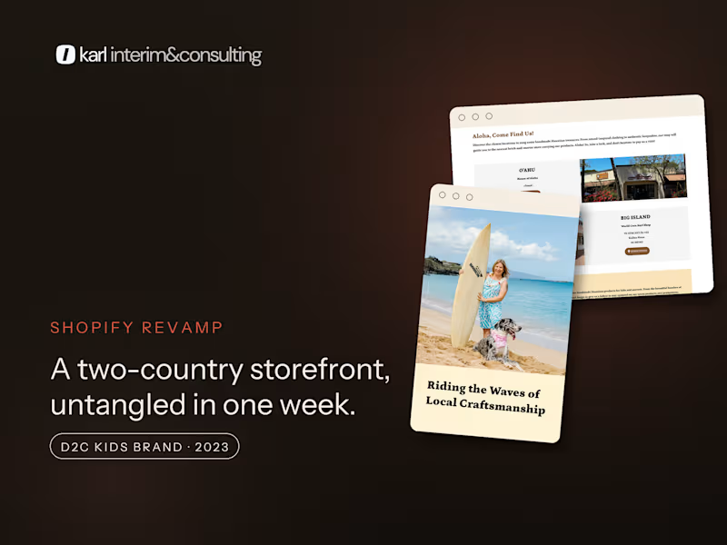
Shopify freelancer for D2C and B2B brands, fixed prices
- 2x
- Hired
- 5.0
- Rating
- 12
- Followers
Shopify freelancer for D2C and B2B brands, fixed prices


Senior Product Designer | AI & Enterprise SaaS
- $1k+
- Earned
- 3x
- Hired
- 5.0
- Rating
- 6
- Followers
Senior Product Designer | AI & Enterprise SaaS


Award Winning Digital Art Director & Designer ✺ FWA Jury
- $1k+
- Earned
- 1x
- Hired
- 2
- Followers
Award Winning Digital Art Director & Designer ✺ FWA Jury


Product design and front-end development 🚀
Product design and front-end development 🚀


Digital artist

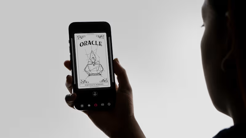
🎵 Play Musical Notes with Hand Gestures (Sound ON!)
Check out the project:
👉 Builder.io (http://Builder.io) Entry (https://ac5a8ddd509a437b98432c8b81f0f2a6-main.projects.builder.my/) (Mouse & Touch experience — don't forget to click the pads!)
🚀 Live Demo on Vercel (https://squashplay.vercel.app/studio) (Full Camera + Audio experience)
Hi! 👋 I’m Kirill from Berlin. Video processing seemed hard, so I asked AI to help, and built this in just two prompts! It generated the functional prototype, letting me focus on the design.
How: 100% local (MediaPipe + Web Audio). Zero latency & privacy.
Note: Builder.io (http://Builder.io) iframes block cameras. Use the Vercel link for the full experience!
3
39
490

I want to share one of my absolute favorite projects that, unfortunately, has been put on hold for a while.
This was created for Vlad, a talented architect from Kazakhstan. At some point, he had a great idea: to combine the sale of his original photography with functional, ready-made interior solutions.
We went through two design iterations and really pushed the boundaries of Wix Studio to capture the exact vibe we wanted, all while keeping the backend completely effortless for him to manage. Plus, it’s the first project where everything is exactly how I love it: just bold typography and two colors.
Why is this project so special to me? The fluid grid. I’ve never spent so much time perfecting a responsive layout. It was crucial that everything renders flawlessly — whether it’s being viewed on an iPad Pro in any orientation or on those heavy-duty Windows laptops that architects use to run AutoCAD on the go.
I’d love to hear your stories! Share your favorite projects that unfortunately never saw the light of day down in the comments (well, except for the ones under NDA, of course 😄👇).
1
1
95

