
Brand & Webflow Sites for Health Practitioners
- $•••••
- Earned
- 13x
- Hired
- 5.0
- Rating
- 323
- Followers
Brand & Webflow Sites for Health Practitioners
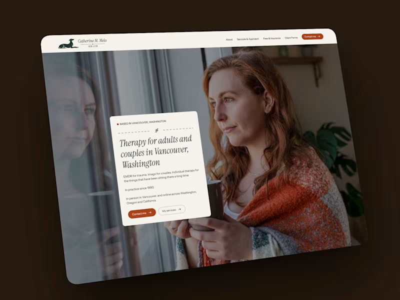

Behind every website is a series of intentional decisions.
The Central Valley Art website wasn't designed to impress.
It was designed to disappear.
Not literally—but in the sense that the interface steps back and lets the artwork, films, and stories become the focus.
Some of the design decisions behind the project included:
✅ Creating an editorial-inspired layout that guides visitors naturally through exhibitions, films, and artist stories.
✅ Using generous whitespace so each piece of artwork has room to breathe.
✅ Designing navigation that encourages curiosity and exploration instead of rushing visitors toward a single destination.
✅ Developing everything in Webflow so the team can confidently manage the site long after launch.
Great design isn't only about aesthetics.
It's about creating an experience that reflects the purpose of the organization.
That's the kind of work I enjoy most.
Visit the site here: https://www.centralvalleyart.com/
0
530

ICTIM Brand Refresh — From Generic to Clinical
The Irish College of Traditional and Integrative Medicine needed its visual identity to match the institution it actually is. Academically rigorous, clinically grounded, and accredited. The original palette of navy and amber gold read as informal and inconsistent with the repositioning the brand needed.
The new palette centres on Ultramarine as the primary brand colour, with Dark Cyan as a secondary accent. Both colours signal precision and credibility to a healthcare professional audience, replacing the warmer, more casual tones of the original site. Inter was selected as the sole typeface across the site, PDFs, and all brand materials for its legibility and clinical neutrality.
A brand guide should be documented covering colour usage, typography, voice and tone, and UI components, giving the institution a single reference point for every future decision.
6
792


Senior product and web design for startups

Senior product and web design for startups


AI Design Builder | UX Director | Product Strategist
- $10k+
- Earned
- 2x
- Hired
- 30
- Followers
AI Design Builder | UX Director | Product Strategist


Across the site I introduced ways for users to engage in new and different ways. One method was the simple addition of voting could
1. provide a means for users to send feedback about content
2. immediately engage users who were positively affected by the content, and were likely to convert to financial supporter
3. allow detractors a way to give feedback while establishing connection.
Engagement was steady at 12% of users voting (depending on content). 75% of detractors completed the short survey. 32% of supporters converted to donors (both first-time and repeat)
2
362

Presentation & Visual Designer

New Project: Multi-Page Contact Form for CarClub.Life (http://CarClub.Life)
I recently worked with CarClub.Life (http://CarClub.Life) on Wix to design and build a custom multi-page contact form that streamlines how users connect with the brand. The form enhances usability with a clean, step-by-step flow — making it easier for car enthusiasts to submit their details without friction.
From front-end design to form logic and responsiveness, this project was all about creating a smooth, modern experience that fits perfectly within the CarClub.Life (http://CarClub.Life) aesthetic.
0
395

Gridwise Landing Page Mockup (Figma UI Design)
A high-fidelity Figma mockup for Gridwise — a platform that helps gig and hourly workers track earnings and find better-paying jobs.
This concept focuses on a clean, conversion-driven layout that highlights key features, user testimonials, and CTAs with modern visuals and clear hierarchy.
Tools: Figma, Auto Layout, Components
Ready for final web implementation with a responsive, marketing-focused design.
4
366


Course Developer, Web, Logo and Brand Strategist, Life Coach

Course Developer, Web, Logo and Brand Strategist, Life Coach


A digital design partner with focus on top-notch websites
A digital design partner with focus on top-notch websites


Graphic Design | UX/UI Design | Web & App Development
- 5.0
- Rating
- 29
- Followers
Graphic Design | UX/UI Design | Web & App Development


Holistic Web Design & SEO for Online Success
Holistic Web Design & SEO for Online Success


View more →