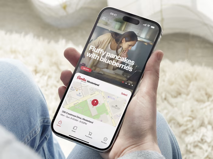
Swapify - Mobile App Design
Yauheni Barkouski
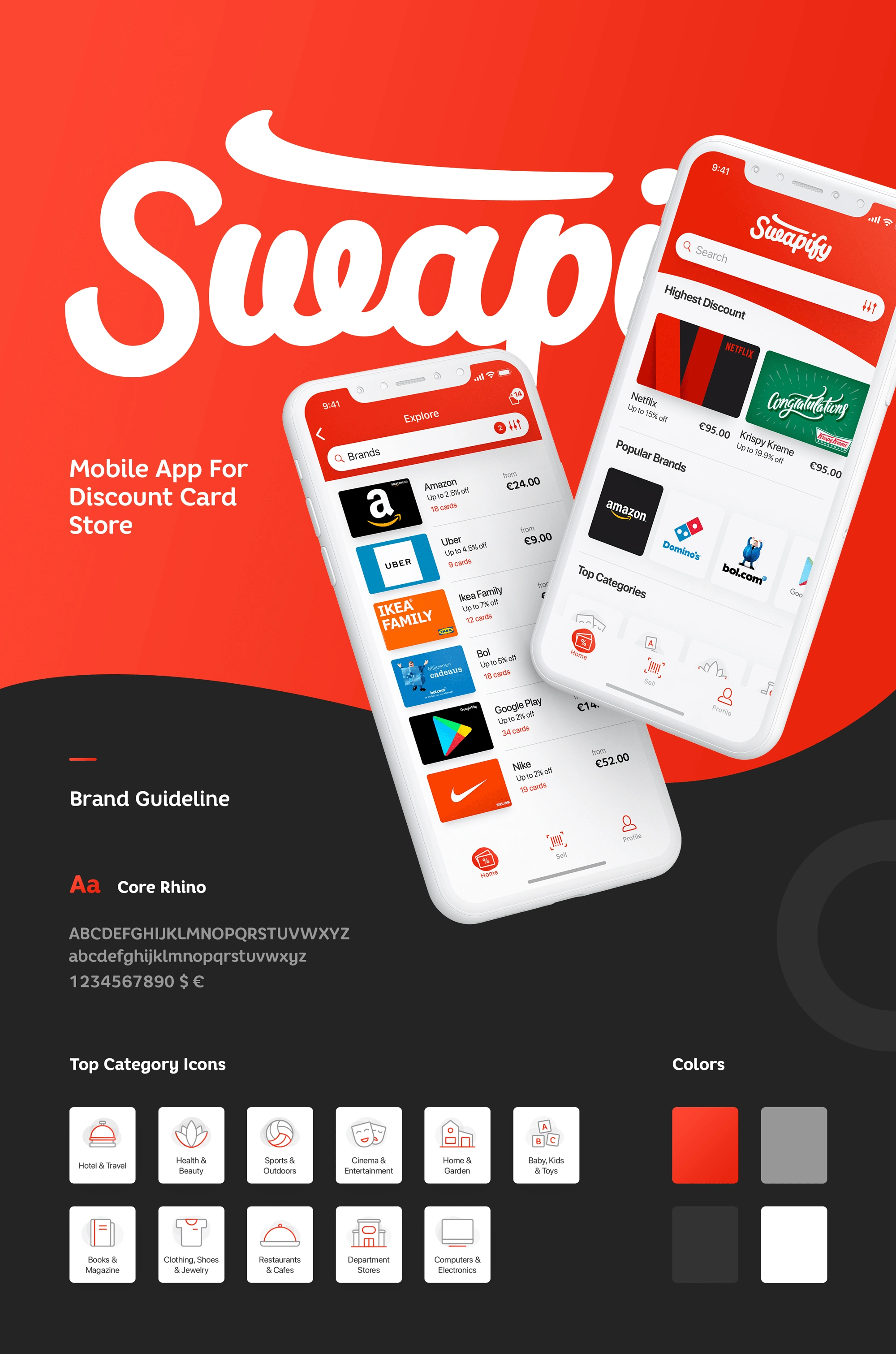
Swapify: Mobile App Design for Discount Gift Card Store
Project Overview
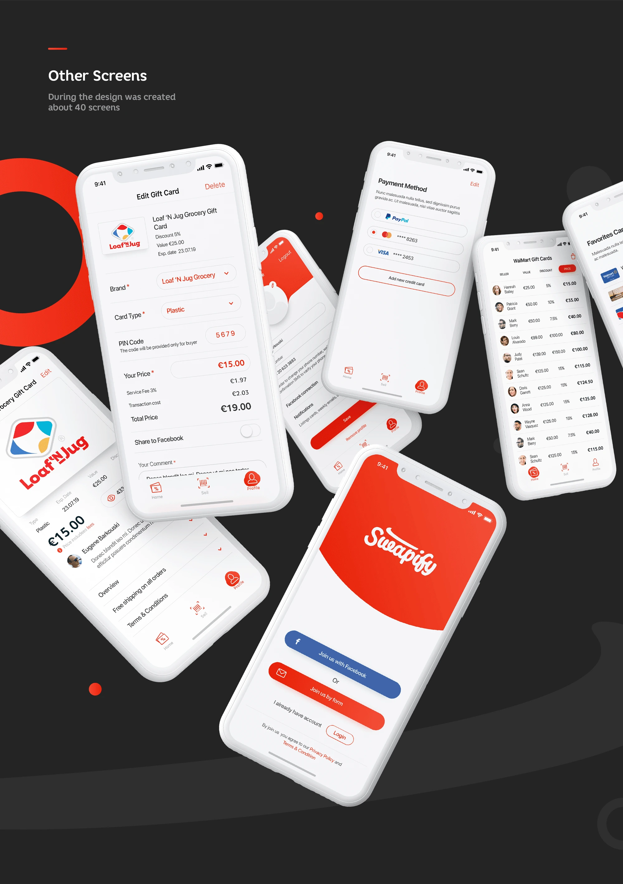
Swapify is a mobile app that simplifies buying and selling discounted gift cards, offering a seamless experience for users. As the lead designer, I crafted over 40 screens, focusing on intuitive UI/UX and a bold red-white aesthetic, as defined in the brand guidelines, to ensure a cohesive and engaging platform.
Tools Used
To bring Swapify to life, I relied on a combination of design and prototyping tools:
✅ Figma: For creating wireframes, high-fidelity designs, and interactive prototypes.
✅ Adobe Illustrator: For designing custom icons and refining the Swapify logo.
✅ Notion: To organize project timelines, user flows, and feedback from stakeholders.
✅ Coolors: For generating and fine-tuning the app’s color palette.
✅ Google Fonts: To select the typography (Core Rhino) that aligns with the brand’s modern aesthetic.
The Process
Step 1: Research & Discovery
I started by researching the gift card market and studying competitors to identify gaps and opportunities. I conducted user interviews to understand pain points in the buying and selling process—users wanted a quick way to sell unused gift cards and a reliable platform to purchase discounted ones. Key insights included the need for barcode scanning for easy card entry and clear pricing transparency.
Step 2: Wireframing & User Flows
Using Figma, I mapped out the core user flows:
Selling a Gift Card: Scanning or manually entering a card, setting a price, and listing it.
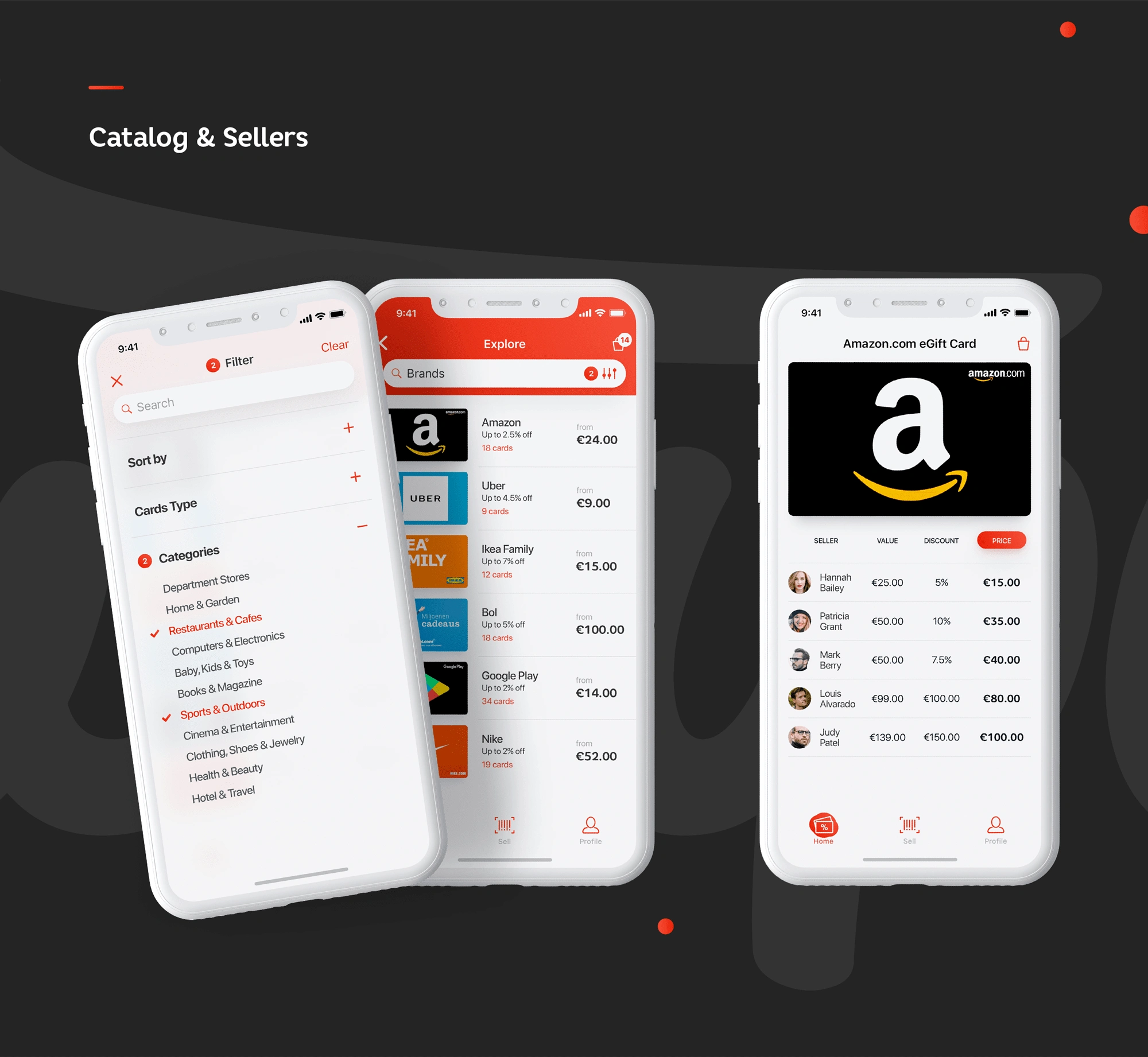
Browsing & Buying: Filtering by category, exploring brands, and checking seller profiles.
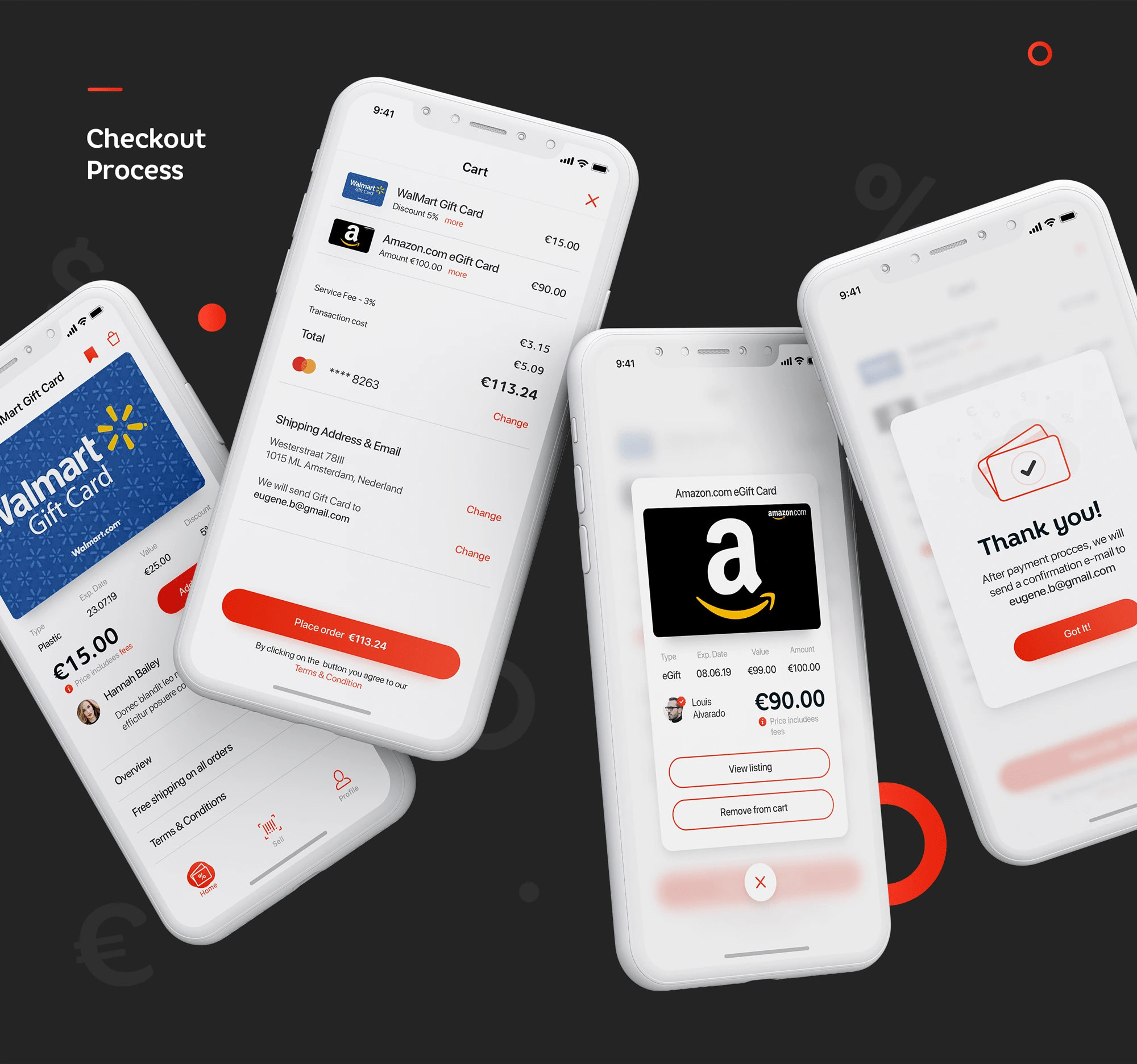
Checkout: Adding items to the cart, entering shipping details, and completing payment.
I created low-fidelity wireframes to validate the structure with stakeholders before moving to high-fidelity designs.
Step 3: Visual Design & Branding
The Swapify brand needed to feel modern, trustworthy, and approachable. I chose a vibrant red as the primary color to evoke energy and excitement, paired with neutral grays and whites for a clean look. The typography, Core Rhino, was selected for its bold yet friendly style. I also designed a set of category icons to enhance navigation, ensuring they were simple and recognizable.
Step 4: High-Fidelity Prototyping
I translated the wireframes into high-fidelity screens in Figma, focusing on:
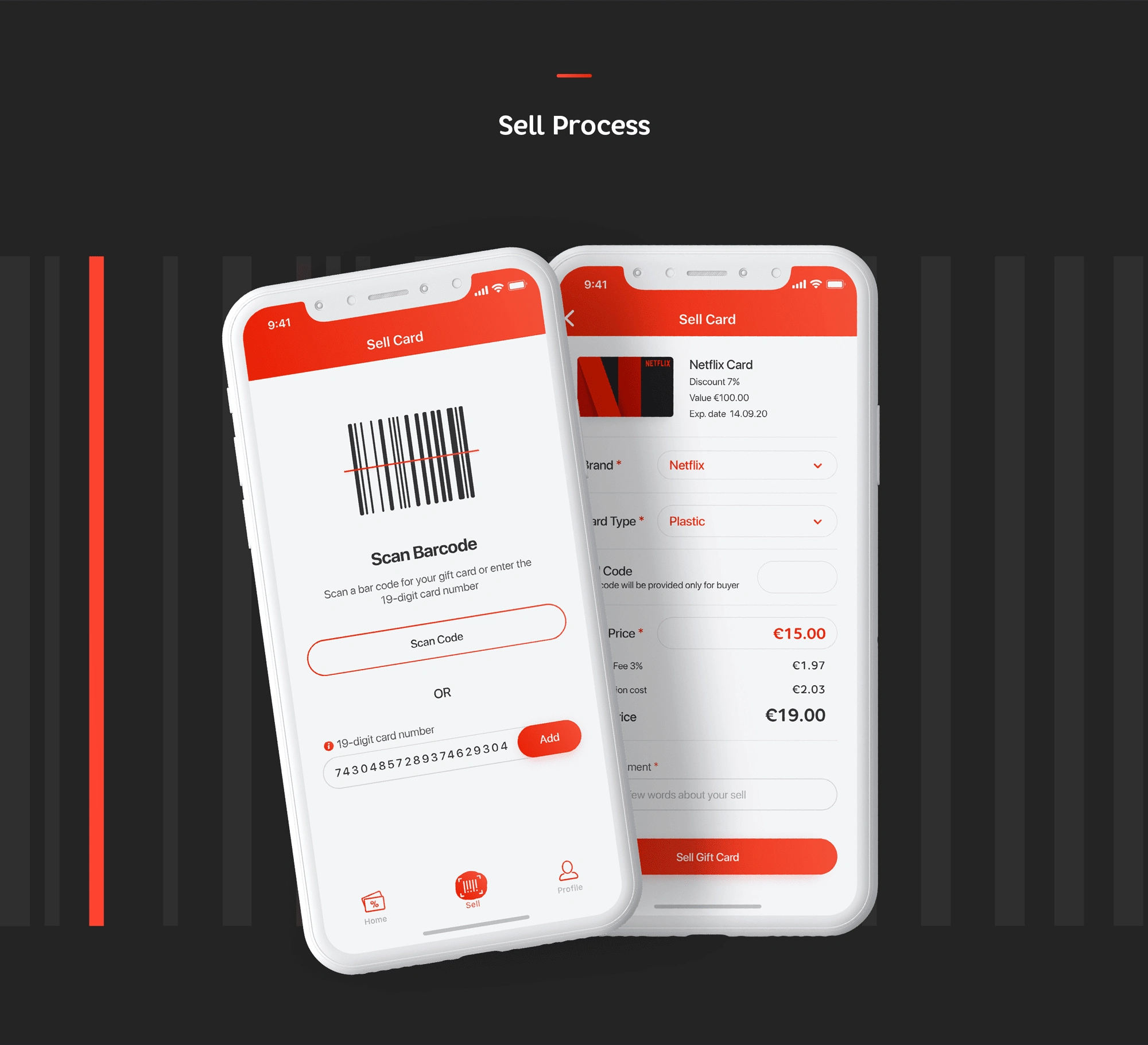
Sell Process: A clean interface for scanning barcodes or manually entering card details, with real-time pricing suggestions (e.g., €19.00 for a €100 Netflix card after a 3% fee).
Catalog & Sellers: A filterable catalog with categories like "Department Stores" and "Computers & Electronics," alongside a seller leaderboard to build trust.
Checkout Process: A seamless flow with clear breakdowns of fees, shipping details, and payment options.
I created an interactive prototype to simulate the user journey, which was tested with a small group of users to gather feedback.
Challenges
Balancing Simplicity with Functionality: Users needed a quick way to sell cards, but the app also had to display detailed pricing breakdowns (e.g., service fees, discounts).
Trust and Transparency: Buyers were hesitant to purchase from individual sellers without knowing their credibility.
Visual Consistency: With over 40 screens, maintaining a cohesive design language across all flows was a challenge.
Solutions
Simplified Selling Interface: I designed a dual-option interface for selling—users could either scan a barcode or manually enter a 19-digit card number. Pricing suggestions were automated, showing the service fee and final payout clearly.
Seller Profiles & Ratings: To build trust, I added a "Sellers" section with profile pictures, ratings, and transaction history (e.g., Hannah Bailey selling a €25 card for €15).
Design System: I created a design system in Figma with reusable components (buttons, cards, icons) and a color palette (red, gray, white, black) to ensure consistency across all screens.
Final Thoughts
Designing Swapify was a rewarding experience that pushed me to balance user needs with business goals. The app’s clean design, intuitive navigation, and transparent pricing make it a go-to platform for gift card trading. I’m particularly proud of the barcode scanning feature, which simplifies the selling process, and the category icons that enhance the browsing experience. If I were to iterate further, I’d explore adding a rewards system to encourage repeat usage and integrate more payment options for global accessibility.
Swapify is now a fully functional prototype, ready for development. This project taught me the importance of user testing early and often, as well as the value of a strong design system in maintaining consistency across a large app.
Ready to elevate your brand’s website or app?
Reach out to us at rockmuse.co or send us a message at hello@rockmuse.co
Let’s create something meaningful together!
Like this project
Posted Apr 17, 2025
Mobile app for discount gift card store. This is an application that helps users buy and sell discount cards and giftcards of various popular brands.
Likes
32
Views
241
Timeline
Dec 3, 2023 - Mar 1, 2024