IIoT Web App Design for Sierra Monitor Corporation
Yauheni Barkouski
Sierra Monitor Corporation: IIoT Web App Design
I led the design of a responsive industrial IoT (IIoT) web application that enables real-time monitoring and control of sensor-based devices across industrial environments. The platform was built for engineers and plant managers who need actionable insights at a glance — even in fast-paced, high-pressure situations.
Project Goals
Make complex sensor data easy to read and interact with.
Improve usability across desktop, tablet, and mobile views.
Create a modern UI aligned with Sierra Monitor’s brand and user needs.
Design Approach
To tackle this challenge, I focused on clarity, data visualization, and modular layout flexibility. The product required seamless interaction with multiple devices, so responsiveness and intuitive workflows were key priorities.
What I did:
Conducted quick UX research to understand engineer workflows.
Designed dashboard architecture around customizable widgets.
Created scalable components in Figma for efficient dev handoff.
Built a clean, minimal interface to reduce cognitive load.
Challenges & Solutions
One major challenge was balancing dense technical data with simplicity. I solved this by using hierarchy, color coding, and micro-interactions to keep the interface lightweight while still informative.
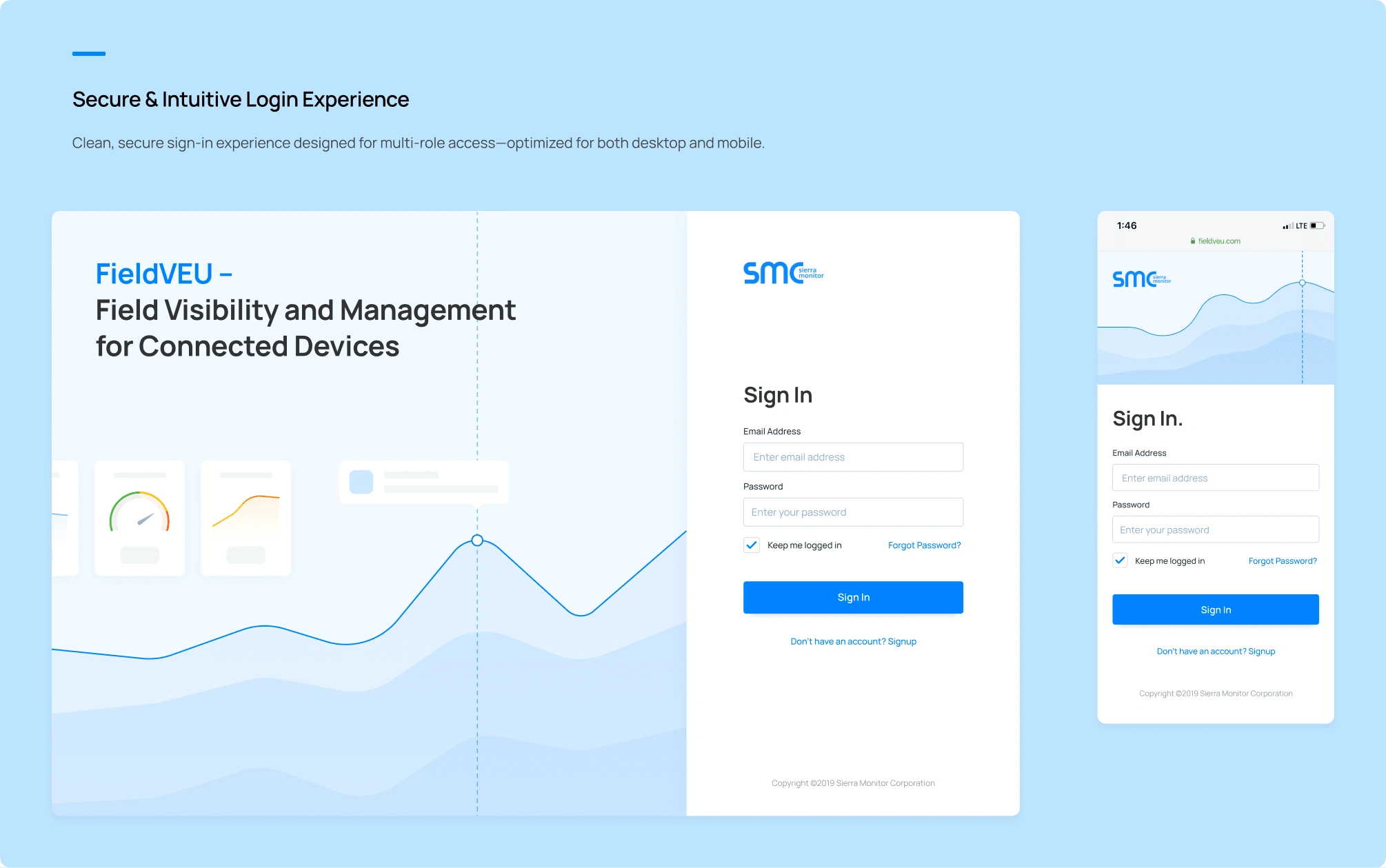
Another challenge was optimizing cross-device usability. I used a mobile-first grid system and tested interactive prototypes to ensure a seamless experience across screen sizes.
Key Features Designed
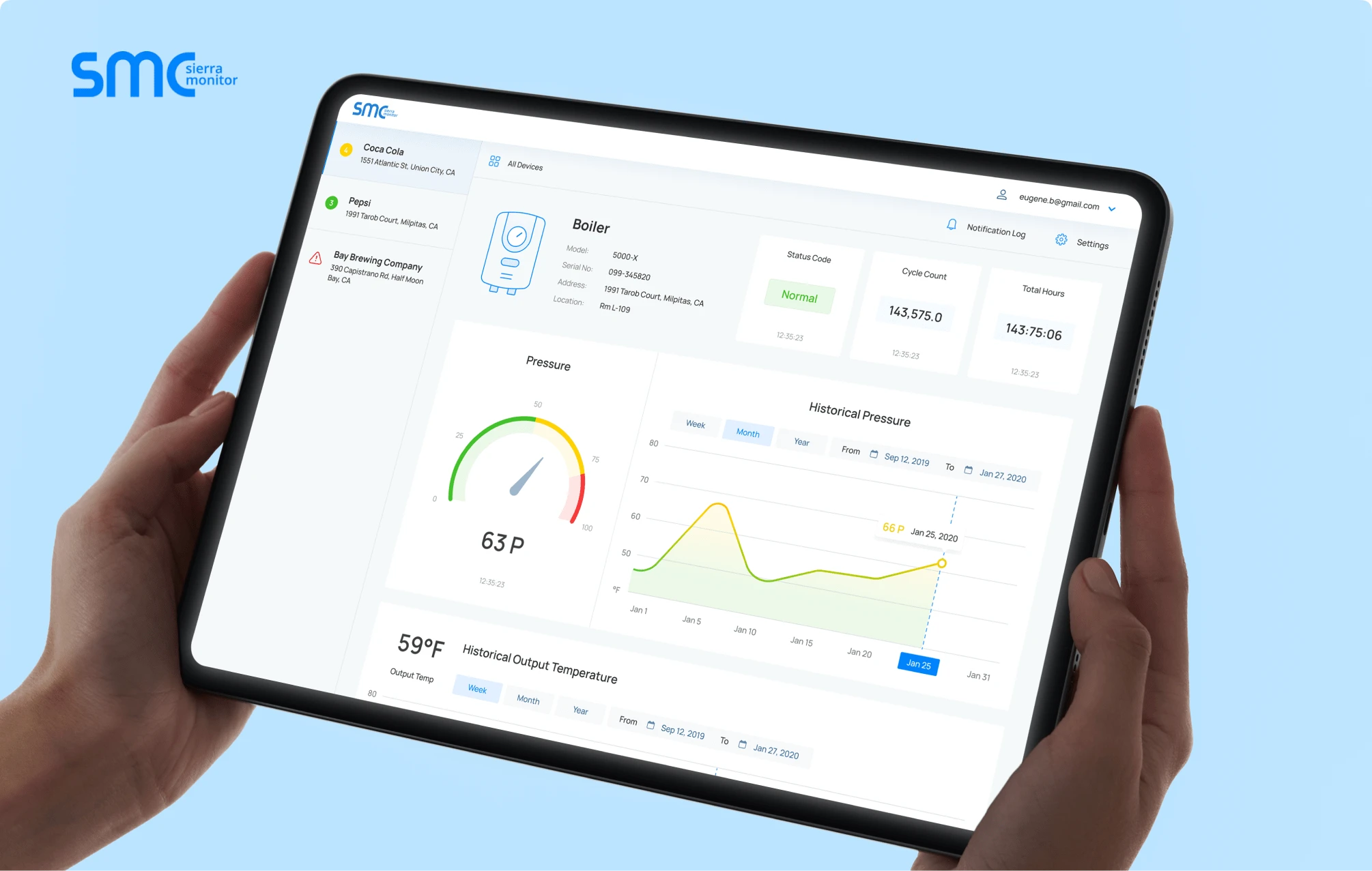
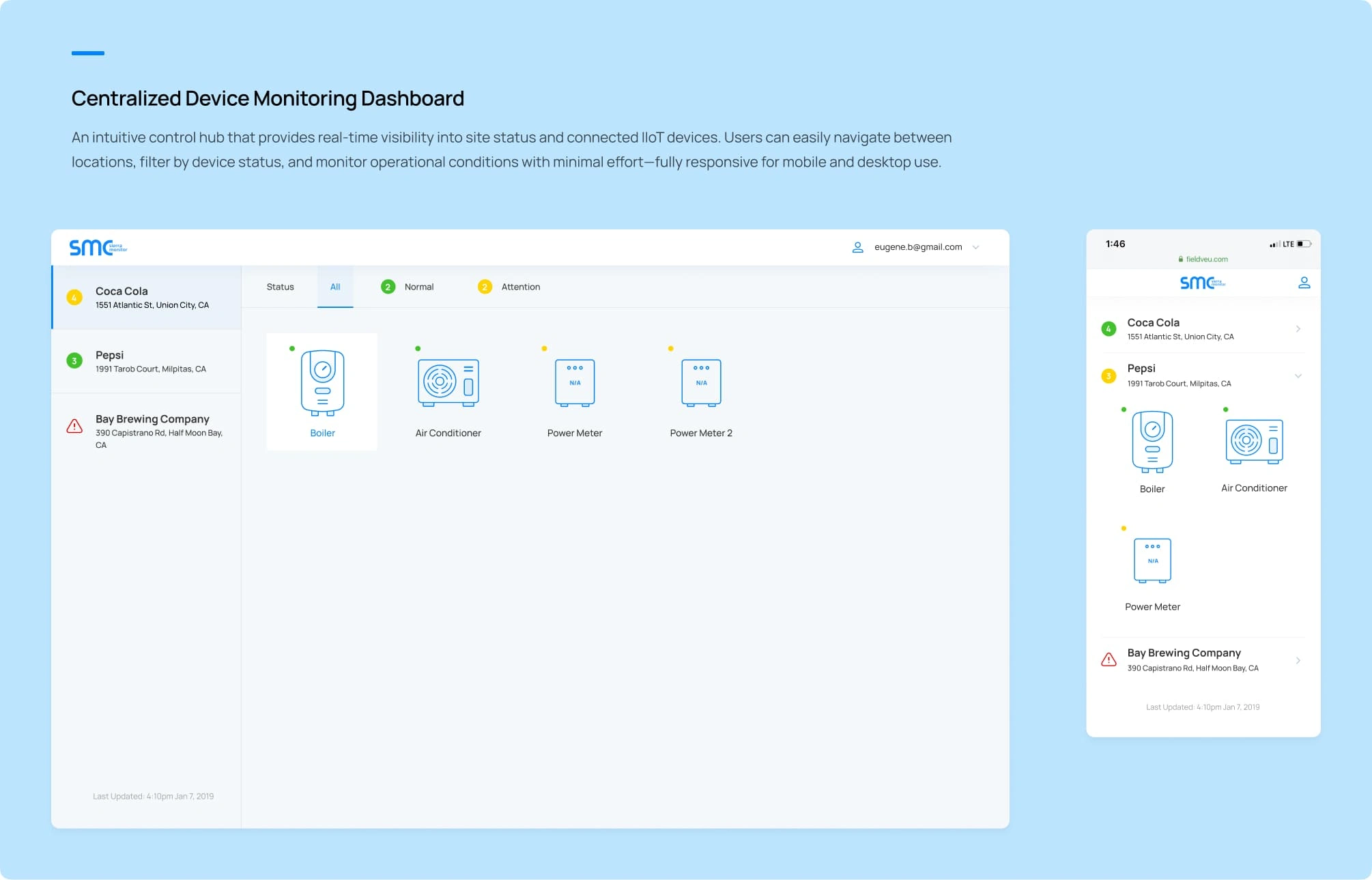
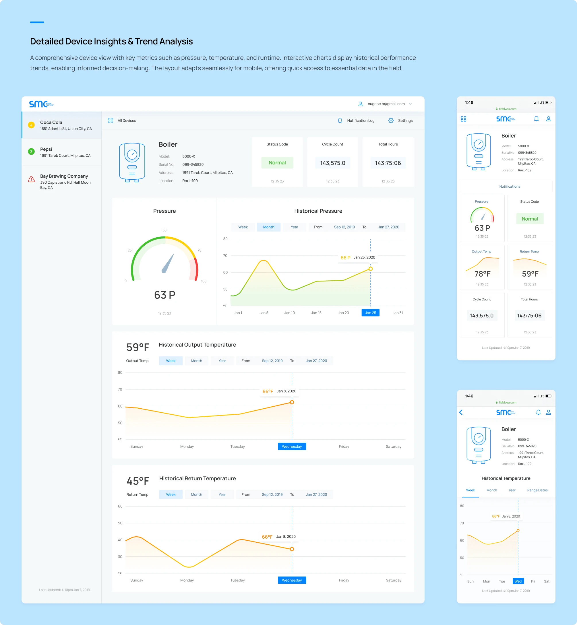
Modular dashboards with editable cards/widgets
Visual indicators for pressure, temperature, and device status
Table views with filtering/sorting for large data sets
Mobile-friendly views for quick device access on-site
Outcome
The redesign improved the overall user experience significantly. The dashboard became easier to navigate, data readability improved, and the client reported faster onboarding and higher adoption by new users.
Tools Used
Figma, Adobe Illustrator, and structured design tokens for development handoff.
Design system built for scalability and future feature growth.
Client Testimonial
“This redesign transformed how our teams monitor devices. It’s fast, clear, and looks amazing. The handoff to devs was smooth and efficient.”
— Sierra Monitor Product Manager
Ready to elevate your brand’s website or app?
Reach out to us at rockmuse.co or send us a message at hello@rockmuse.co
Let’s create something meaningful together!
Like this project
Posted May 2, 2025
Designed a responsive IIoT dashboard web app to monitor industrial sensors in real time. Focused on UX, data clarity, and multi-device usability.
Likes
1
Views
45
Timeline
Feb 22, 2024 - Mar 27, 2025
Clients
Sierra Monitor