Brand and Website Development for Catherine Melo, LCSW

Bernice Ebenezer
Verified


Case Study: A brand and website for Catherine Melo, LCSW
Live site: https://www.catherinemelo.com/
The starting point
Catherine is a clinical social worker in Vancouver, Washington with 35 years in practice. She came to me through a referral, with a problem a lot of established therapists quietly share- her caseload had dropped. Psychology Today, once her steady source of referrals, had slowed to almost nothing, and she had no website to catch the people who Googled her after hearing her name.
She also said something that shaped the entire project- every therapist website she had looked at felt the same to her, and she wanted hers to feel different. She just didn't have the design vocabulary to say how.
The challenge
Three things made this more than a standard build. Her market is saturated and visually identical, all soft sage palettes, script fonts, and stock photos of cupped hands. She had no existing brand, no logo, no professional photos. And she told me openly that she gets overwhelmed easily, which meant the process itself had to be designed around her, not just the website.
The strategy
I started with positioning, not pixels. Digging into what made Catherine distinct, three things stood out- 35 years of experience almost no competitor could match, a rare combination of EMDR trauma work and Imago couples therapy, and a philosophy she had mentioned offhand, that her clients "graduate." In a field built on open-ended therapy, a practitioner whose clients finish and move on was a genuinely different promise.
That became the organizing idea:
Finish the work.
Not a tagline, but a thread running through the design and copy, signaling resolution and competence where competitors signaled endless comfort.
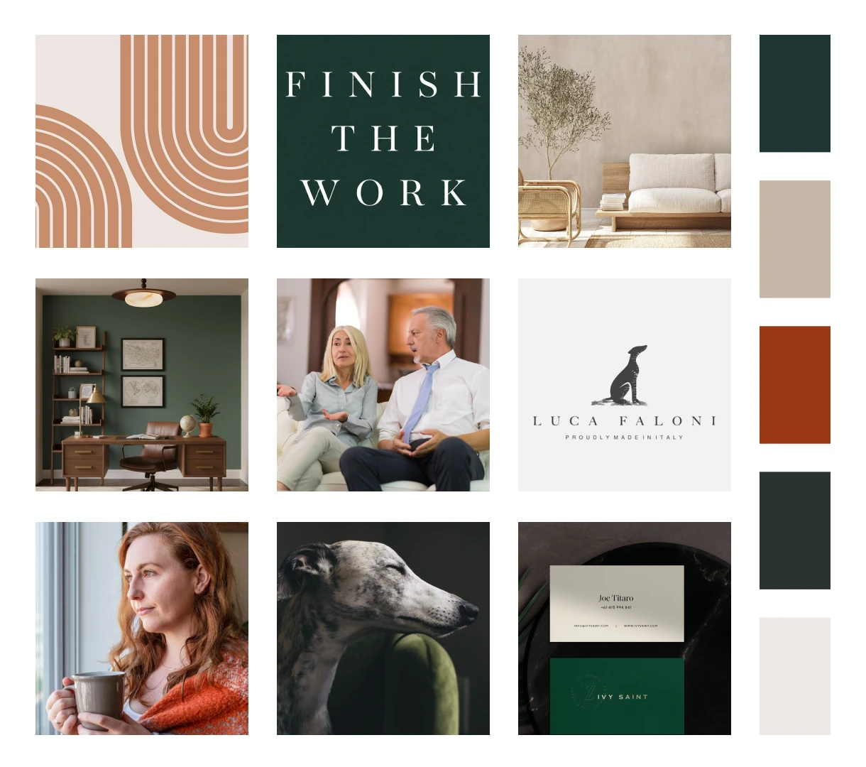
Mood board
The brand
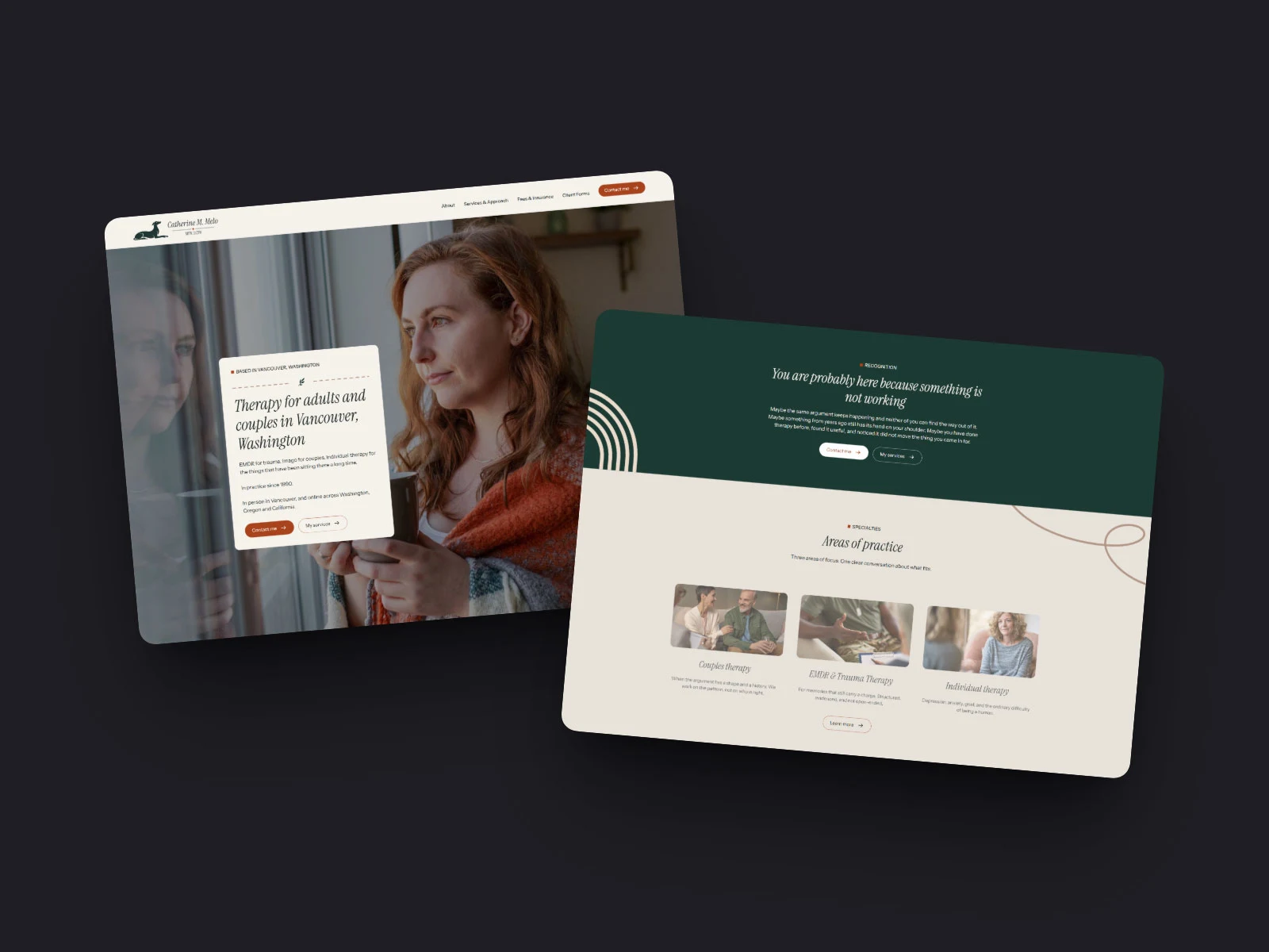
I built two creative directions and let Catherine react rather than invent. We landed on a palette of deep forest green and rust, warm and grounded rather than clinical, and an editorial, high-contrast serif that reads more like a well-made book than a therapy brochure.
The logo
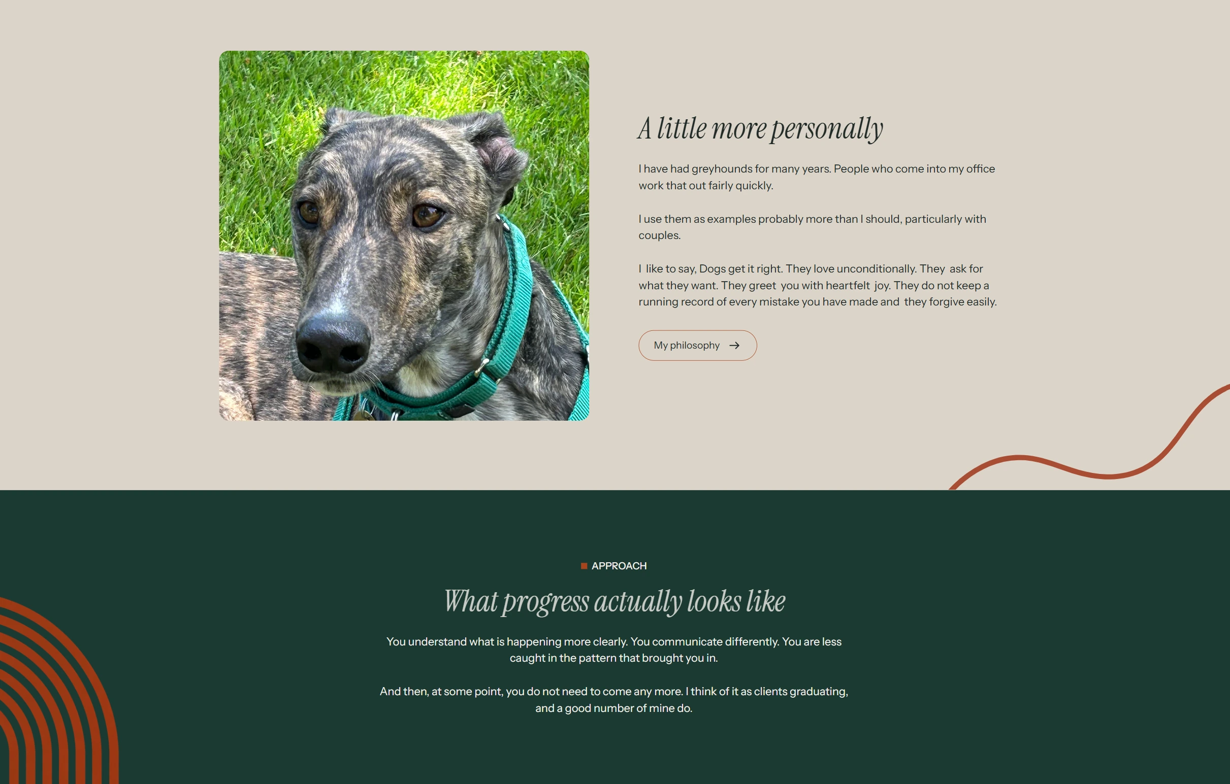
The greyhound gave us the mark, but the execution is where it earned its place. Catherine had kept greyhounds for years and used them as examples with her couples, yet almost apologized for mentioning them. A dog on a therapist's site risks reading as sentimental, so the goal was the opposite: elegant, restrained, unmistakably professional.
I explored several directions, a resting silhouette, an abstract two-curve form, and the one we landed on: a curled greyhound that forms the letter "C," tying the animal directly to Catherine's name. One mark doing two jobs, personal and typographic at once.
Alongside it I built a complete identity system rather than a single logo: a primary wordmark in the editorial serif, horizontal and stacked lockups, reversed versions for dark backgrounds, and a simplified icon that works down to a favicon, the one place Catherine's full name could never fit. The result is a brand flexible enough to live everywhere from a business card to a browser tab, and distinctive enough that no competitor can imitate it.

Catherine's Logo
The website
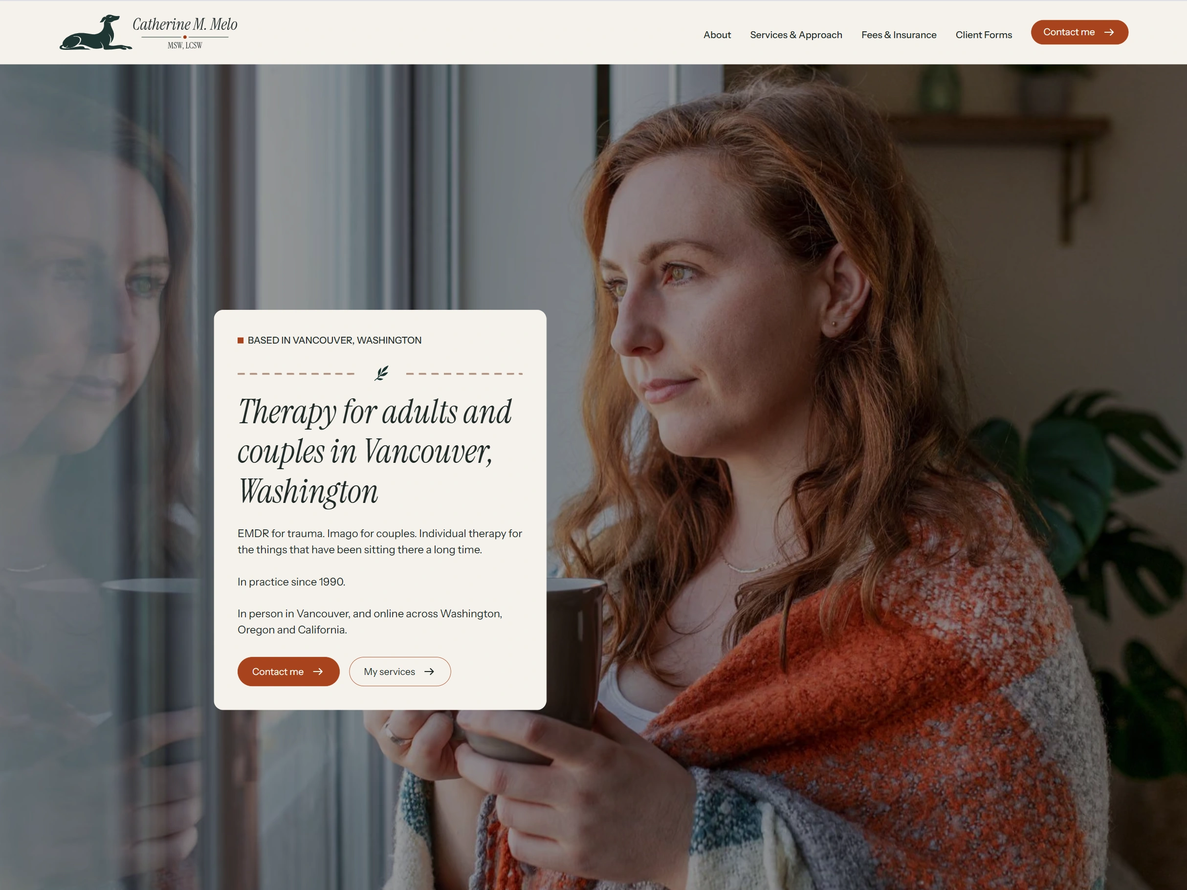
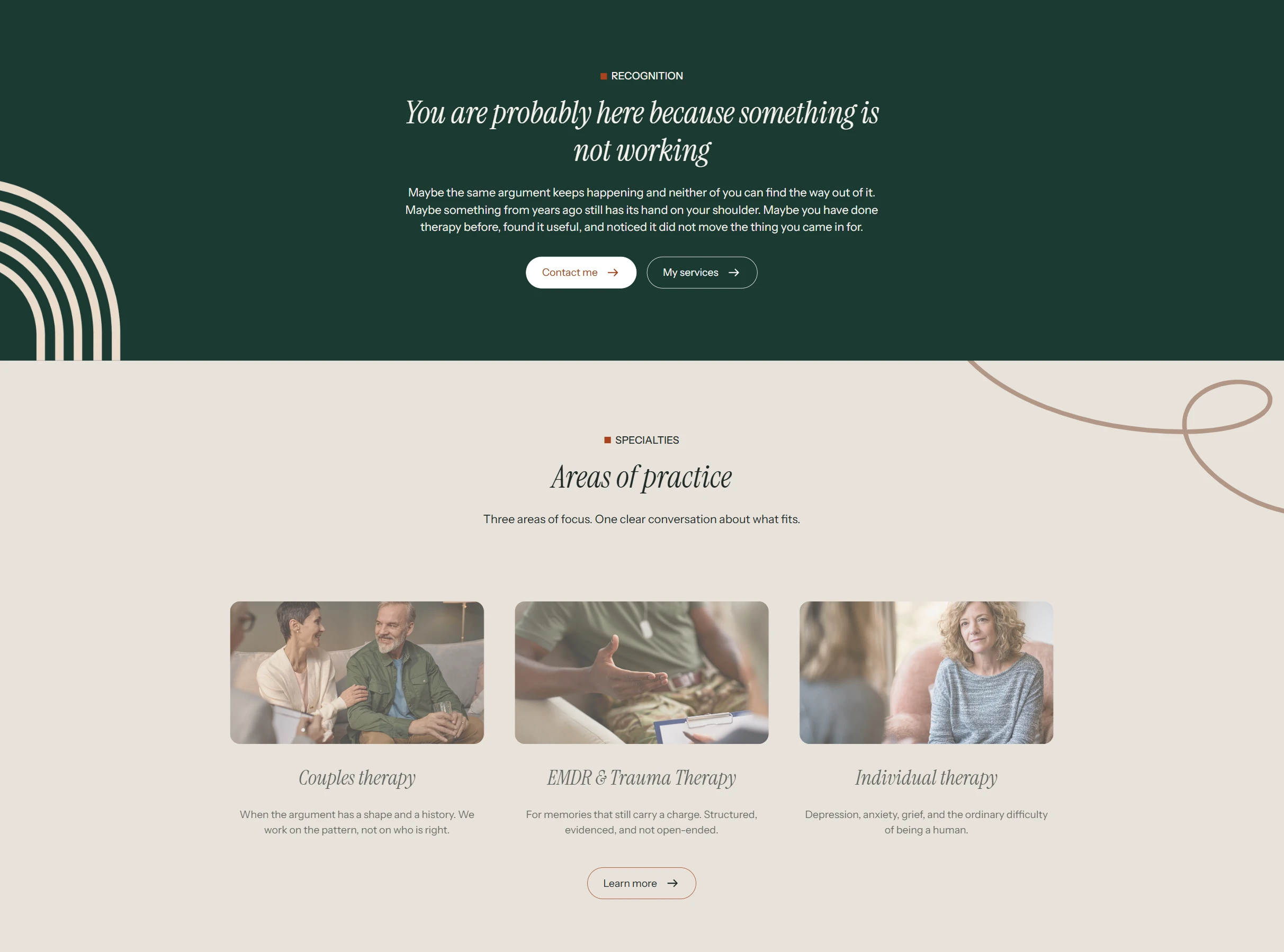
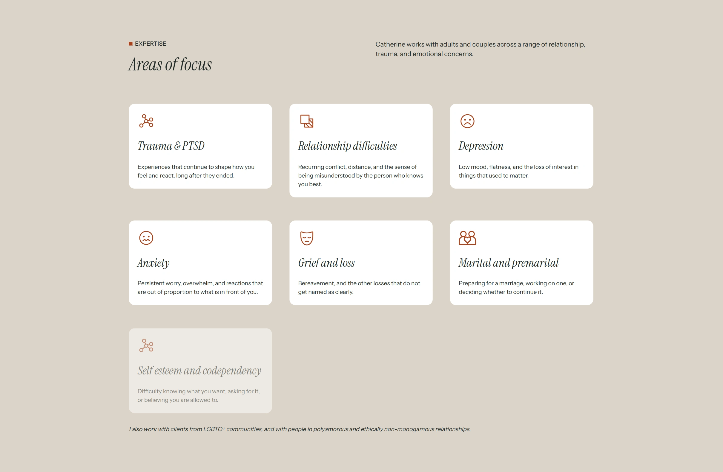
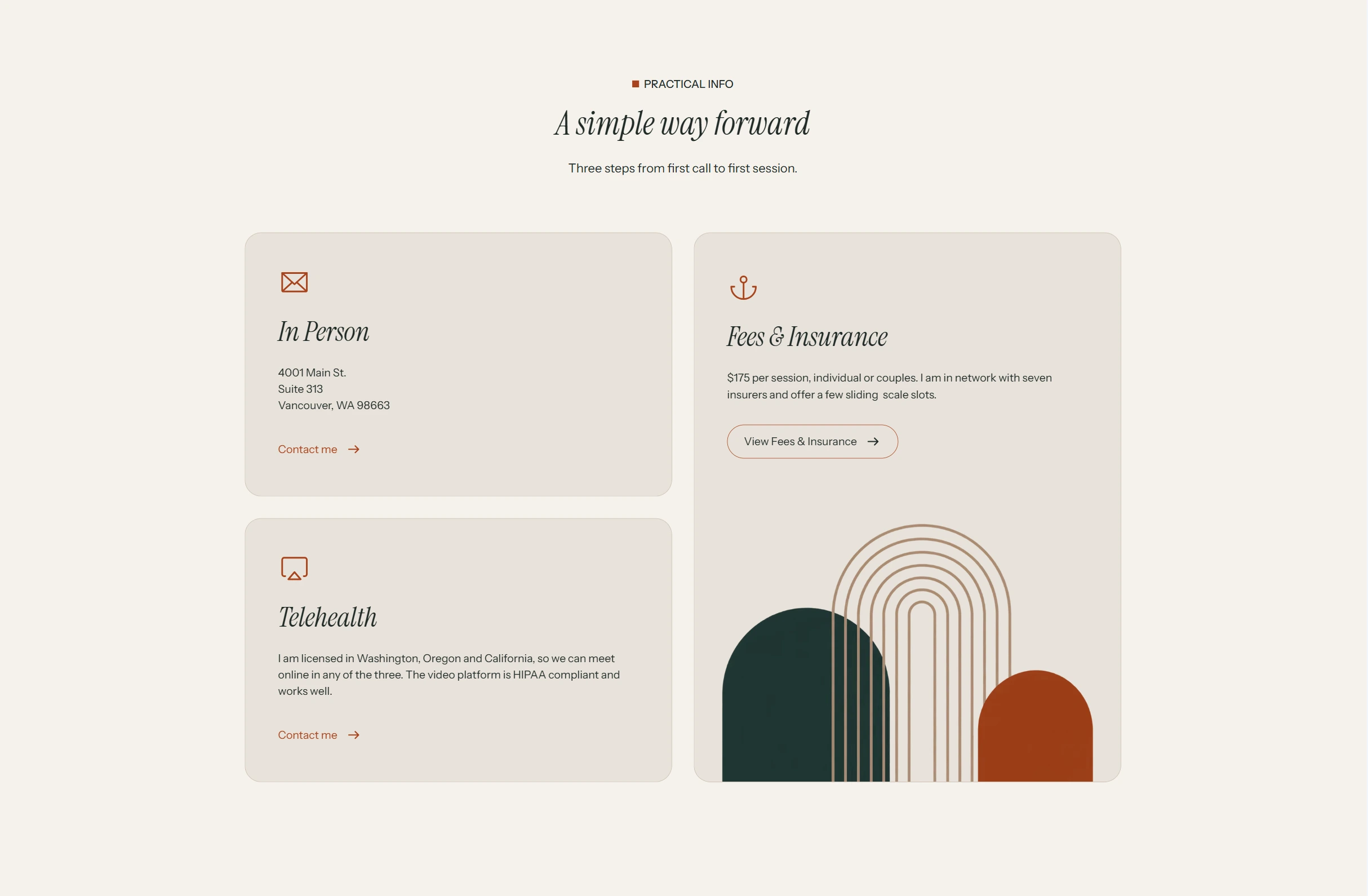
Six pages built in Webflow- a home page that speaks directly to people who've tried therapy before, a services page explaining EMDR and Imago in plain language, transparent fees, and a warm, direct About page written in her own voice, greyhounds and all. The copy deliberately avoids the wellness clichés she was tired of, and it's built around the search terms her ideal clients actually use, including EMDR and Imago, a term almost no one in her market targets.
Everything was set up for discovery- location-targeted SEO across her three licensed states, analytics so she can finally see where clients come from, and a compliant privacy and HIPAA setup appropriate to a healthcare practice.
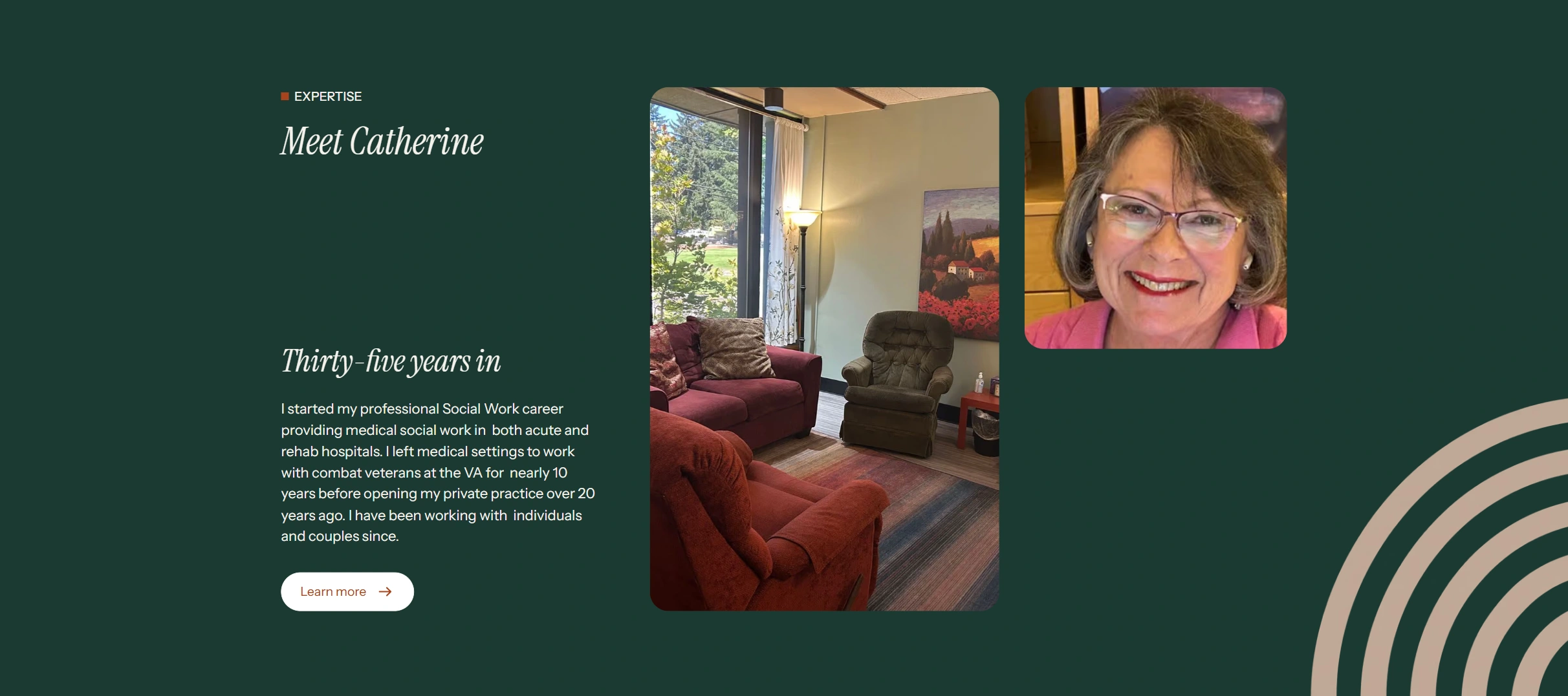
Designing for the client, not just the user
Because Catherine gets overwhelmed, I changed how I ran the project. One decision at a time. Drafts to react to instead of blank pages. Short guided calls where I drove and she watched. When she froze on choices, I made a recommendation rather than handing her a menu. The result was a client who stayed engaged through a full brand-and-build process she had previously found too daunting to start.
The result
A brand and website that look nothing like the therapy sites Catherine was tired of, built around a real strategic difference rather than decoration, in a voice that's unmistakably hers.
She described it simply-
"You have totally gotten me."
Like this project
Posted Oct 6, 2026
Brand identity & Webflow website for a therapist in Vancouver, WA. Strategy, custom logo design, copywriting & local SEO that helped her stand out & get found.
Likes
0
Views
2
Timeline
Aug 26, 2026 - Oct 5, 2026