
max
Bernice Ebenezer
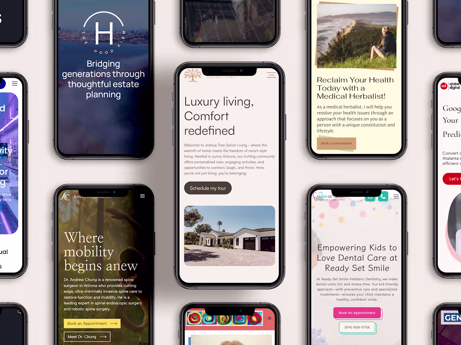
Webflow Websites Built for Growth & Conversions
- $25k+
- Earned
- 11x
- Hired
- 5.00
- Rating
- 240
- Followers
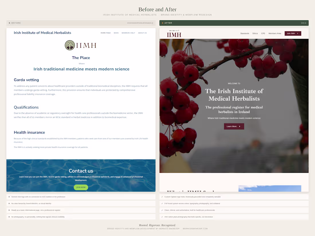
Brand Strategy, Logo and Webflow Website Development for IIMH
1
7
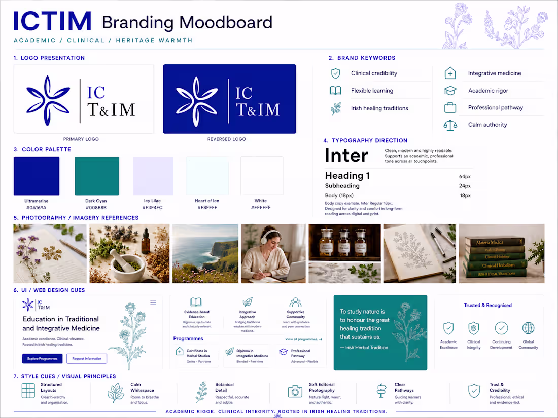
ICTIM Brand Refresh — From Generic to Clinical
The Irish College of Traditional and Integrative Medicine needed its visual identity to match the institution it actually is. Academically rigorous, clinically grounded, and accredited. The original palette of navy and amber gold read as informal and inconsistent with the repositioning the brand needed.
The new palette centres on Ultramarine as the primary brand colour, with Dark Cyan as a secondary accent. Both colours signal precision and credibility to a healthcare professional audience, replacing the warmer, more casual tones of the original site. Inter was selected as the sole typeface across the site, PDFs, and all brand materials for its legibility and clinical neutrality.
A brand guide should be documented covering colour usage, typography, voice and tone, and UI components, giving the institution a single reference point for every future decision.
6
245
The IIMH is the professional register for qualified medical herbalists in Ireland. A small organisation, but one with serious credentials and a story worth telling visually.
The brief was clear from the start. Clinical authority first. Irish identity second. Nothing that reads as wellness, herbal tea, or alternative therapy.
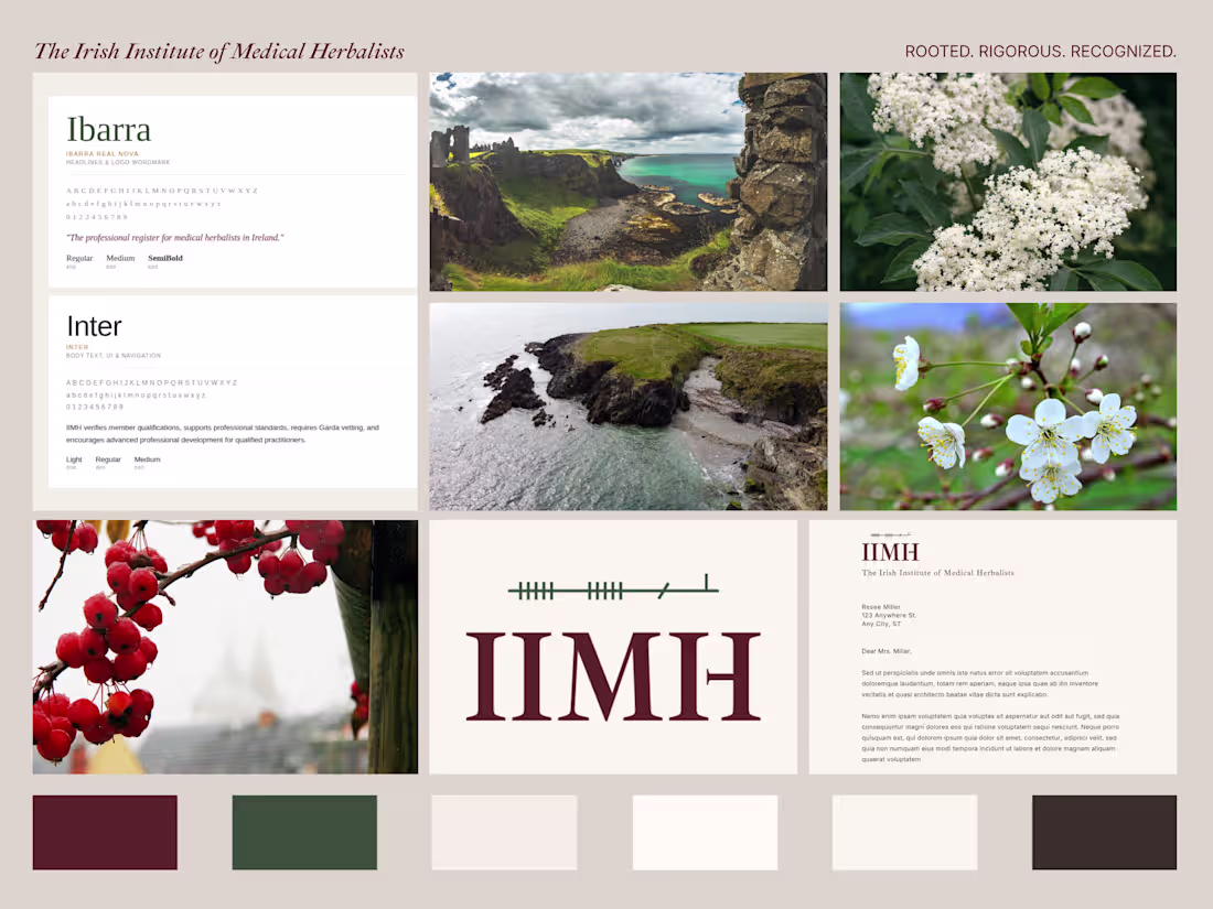
The logo draws on Ogham, the ancient Irish tree script. Written horizontally as it appeared in Irish manuscripts rather than carved vertically on stone. It sits quietly above the IIMH wordmark.
The brand is built to live across a professional register site, membership certificates, a Code of Ethics document, and formal correspondence. Every decision made with one question in mind:
Would a GP take this seriously?
The answer is YES.
3
9
382

A complex Webflow build for a Clinical and Education Website
3
21

White-Label Webflow Partnership for Agency
2
6
A Scalable Webflow CMS Website for a Boutique Real Estate Firm
1
13
A Scalable Editorial CMS in Webflow for an Evolving Art Practice
1
13
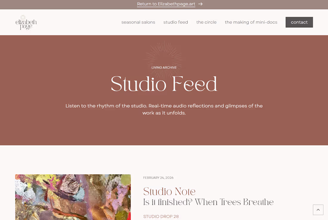
Digital Archive Webflow Development for an Artist
1
11
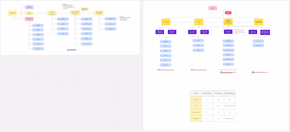
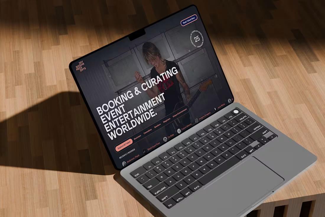
Organization chart design - flow and matrix map for JSP
1
553
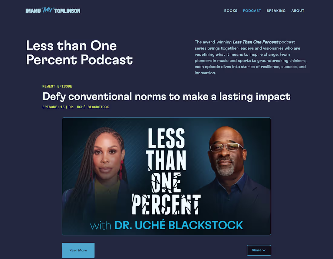
Scalable Podcast CMS Development for Vituity
0
12
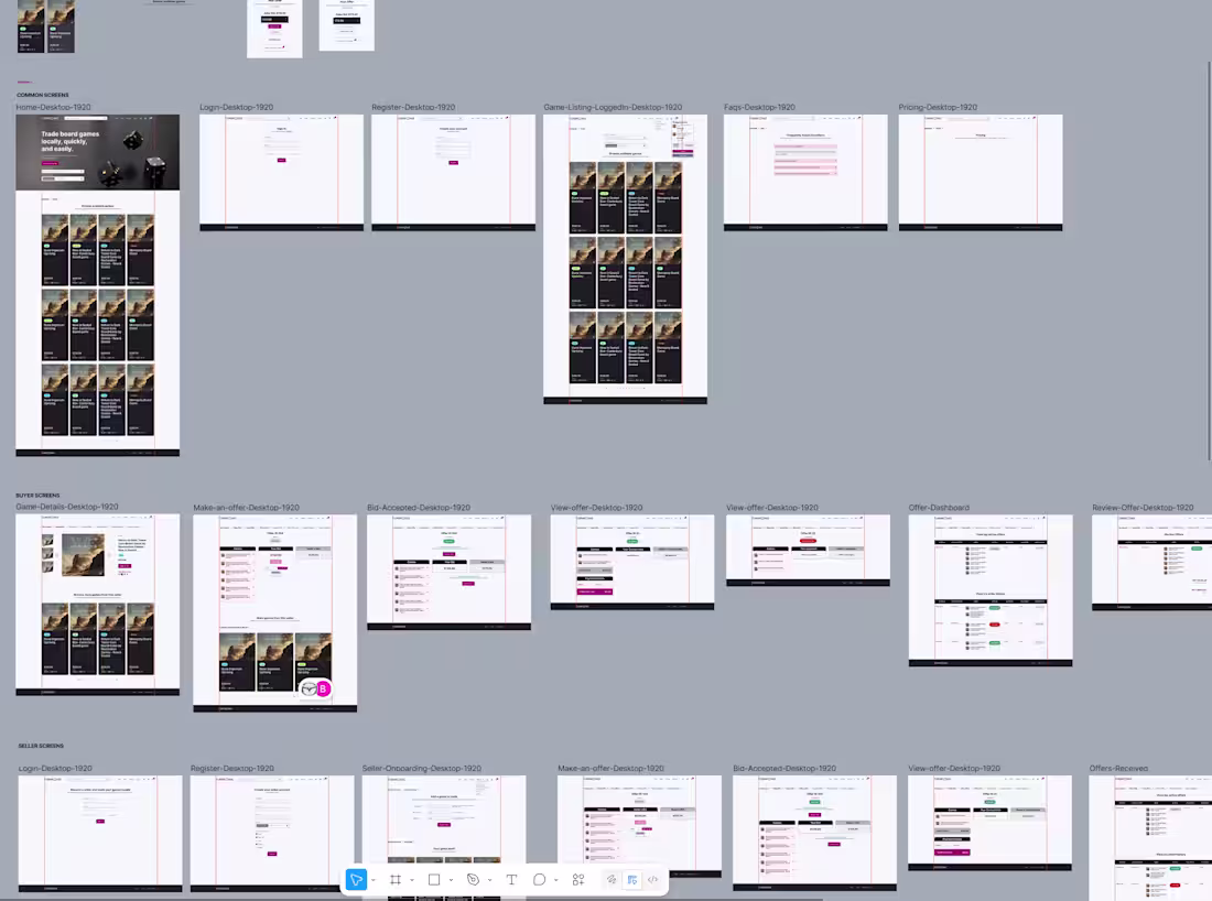
UI/UX Design for Turnip Cake
0
10
Webflow Website Maintenance for JSP Events | SEO Optimization
0
13
Designed a high-converting EU Funding landing page for Climate Finance Solutions using Webflow. Optimized layout, EU-focused visuals, and clear CTA flow to improve credibility and user engagement.
5
5
641
Logo+Webflow website design for GenChip - Semiconductor company
1
12
Webflow CMS & Case Study Card Redesign for JSP Events
3
17
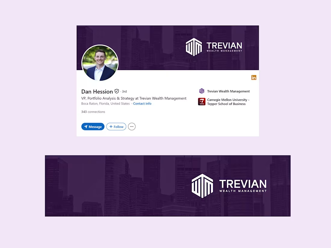
Created a clean, cohesive LinkedIn banner design for Trevian Wealth Management to align their team profiles under a unified brand identity. The design features the white horizontal logo from their website, balanced placement for optimal visibility across devices, and a minimal aesthetic inspired by their web palette.
The goal was to maintain consistency, professionalism, and brand recognition across all team member profiles.
3
706
I’m redesigning the case study cards and individual pages for JSP Events to create a more immersive, on-brand experience improving image presentation, layout consistency, and overall storytelling.
1
5
663
1
6
42
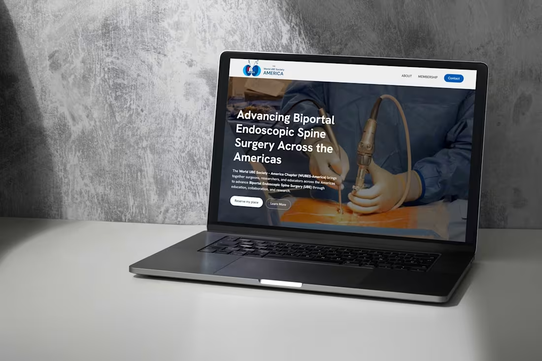
World UBE Society – America Chapter Website Design
0
16
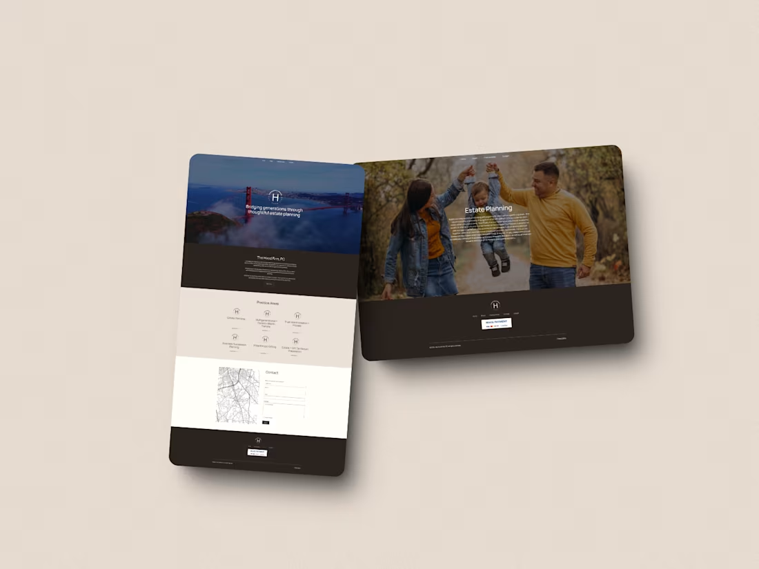
Website for The Hood Firm with modern branding
0
18
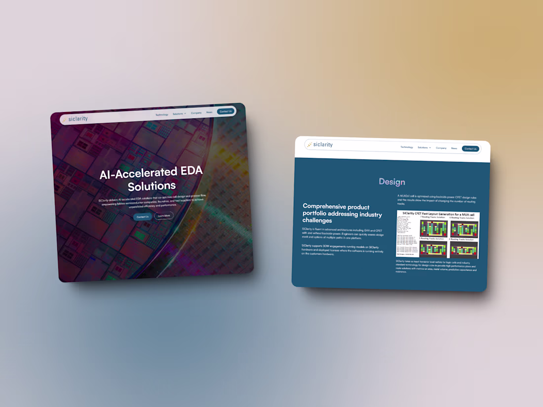
Website Design for SiClarity - AI-accelerated EDA software
0
10

Lavorro, a leader in Silicon Smart Manufacturing solutions
0
16
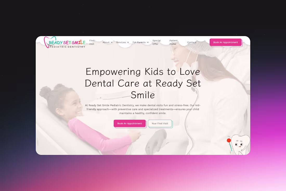
Ready, Set, Smile - a Kid-Friendly Dental Website Experience
0
15
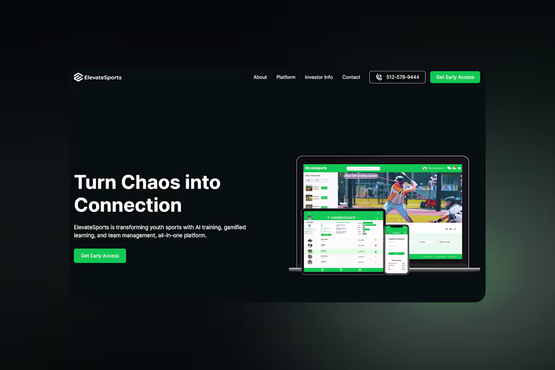
Elevate Sports - turn chaos into connection
0
13
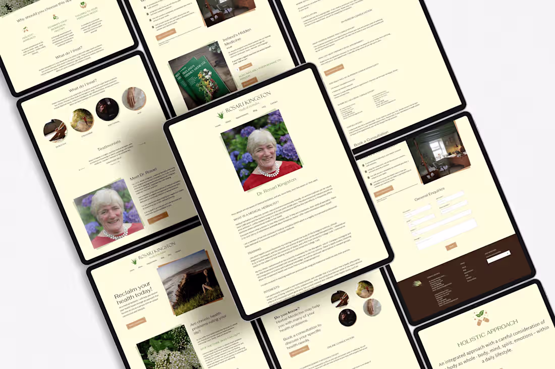
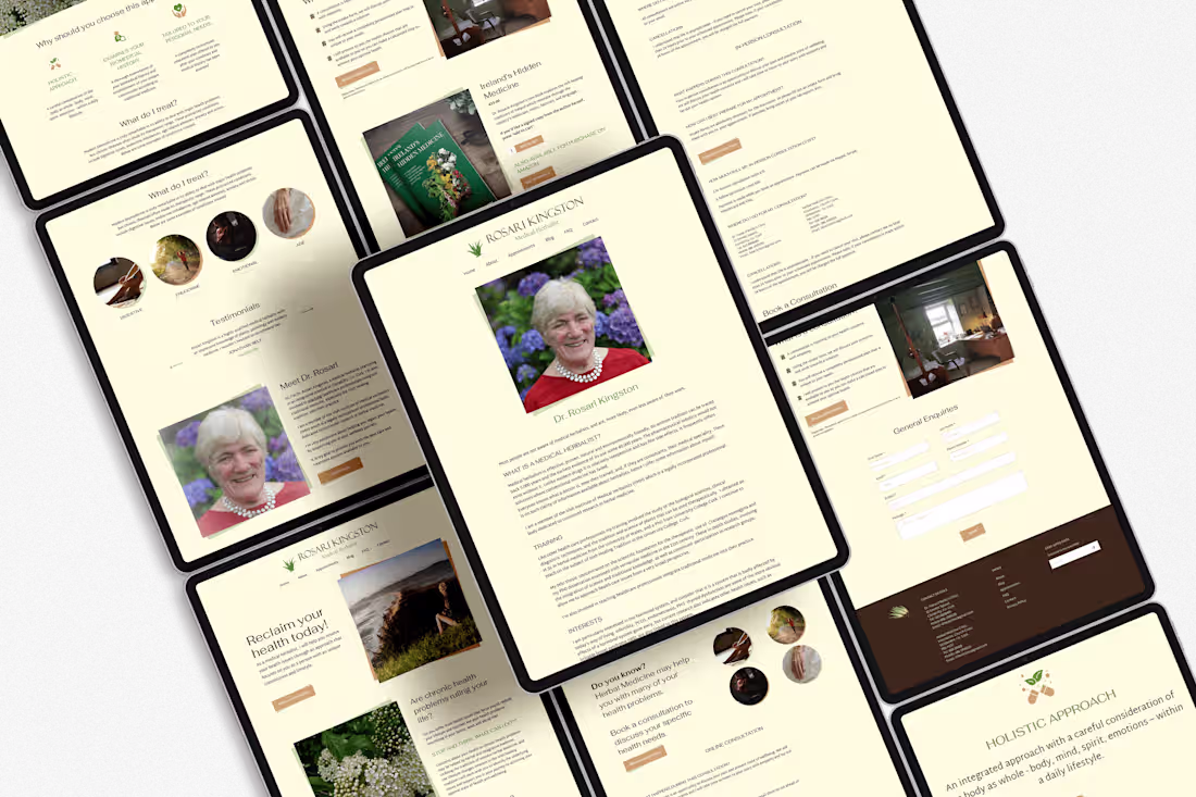
Managing Dr. Rosari Kingston's website
0
35
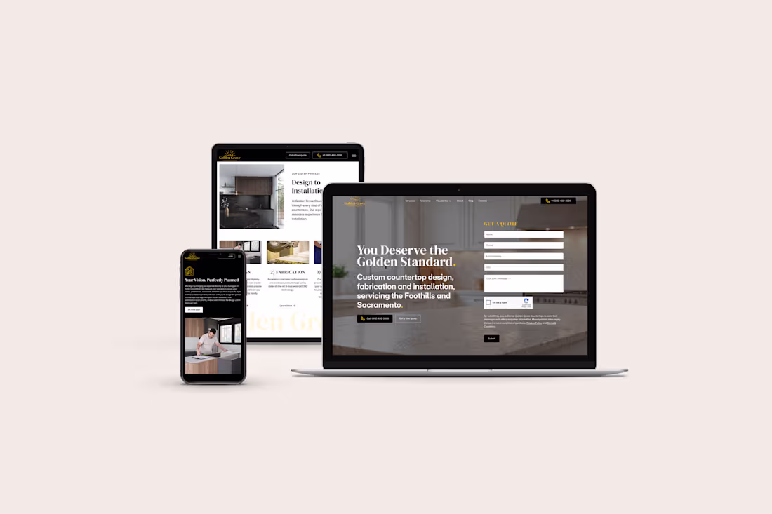
Golden Grove Countertops(in partnership with ABV)
0
20
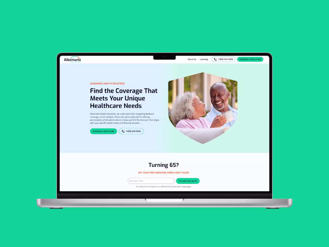
Website design for an insurance company
0
40
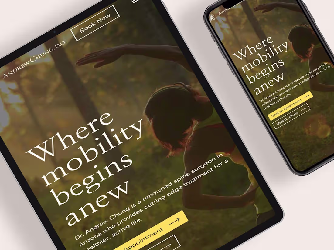
Web Design and Webflow Development for a Spine Surgeon
0
36
Brand Design, Web Design and Webflow Development for a Herbalist
0
35
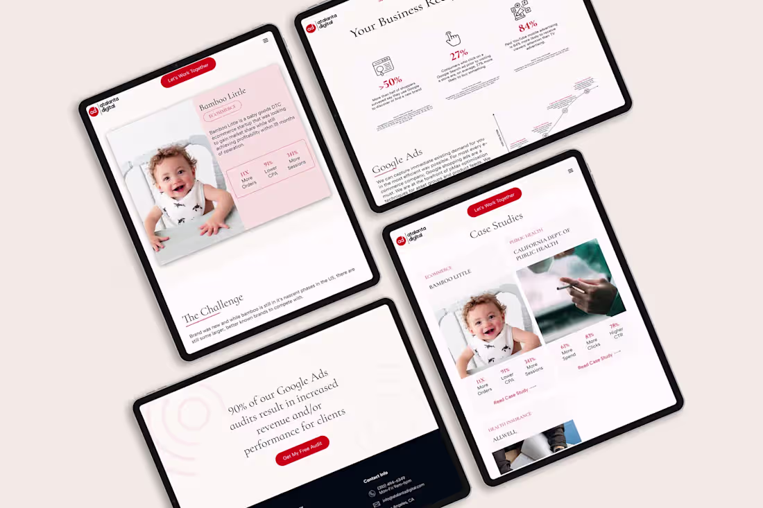
A website design for Atalanta Digital
0
30
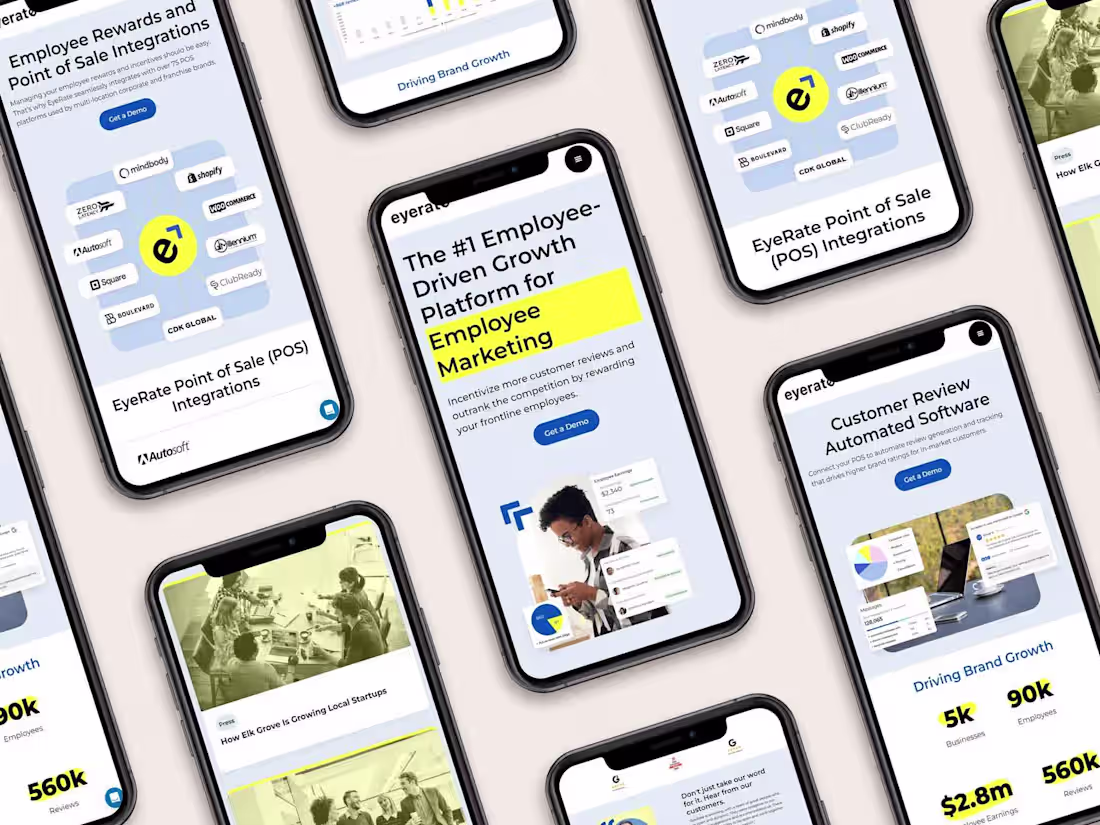
A website for a B2B SAAS Business - Startedge(formerly Eyerate)
0
24
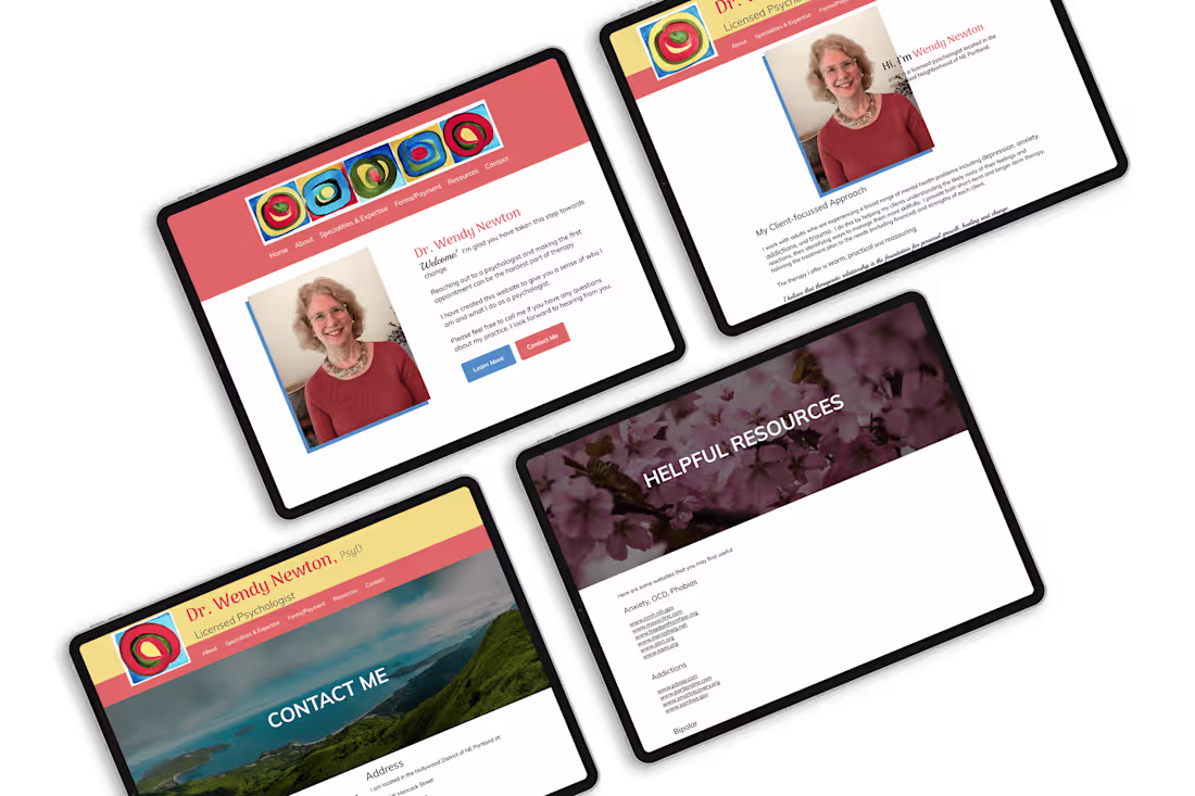
A website refresh for a psychologist, Dr. Wendy Newton
0
27