The network for creativity
Join 1.25M professional creatives like you
Connect with clients, get discovered, and run your business 100% commission-free
Creatives on Contra have earned over $150M and we are just getting started
Back to feedPost

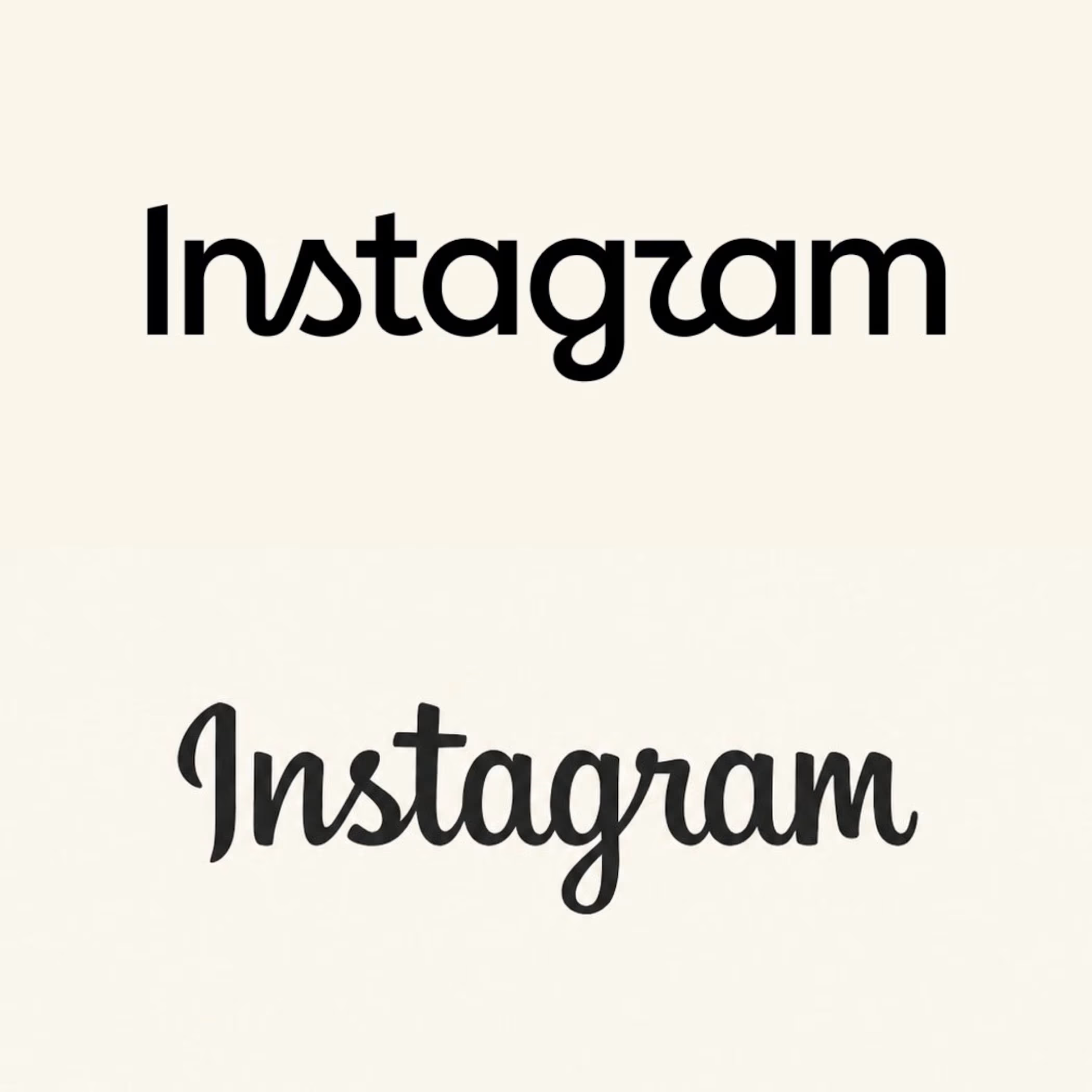
Another brand with a bold re-design.
Is this real?
What do you think?

I actually like the new one.
I can't help but read instagzam haha


I dont use instagram, did that actually happened ?
Apparently it will!

I like it! the new one looks good!

it's kinda growing on me 😅 😭
I was sooo used to the older one!
this one is giving me greek theta symbol vibes lol
Trueeee

usually hate these, but i actually prefer the new, i think!

This looks good, actually, but is that a ‘z’ or an ‘r’?😅
😂


I agree

Saw many people hating on the new logo but honestly, it looks great. The minimal design is very unique and clean
I do think that they tried to keep the original identity, which I like. They haven't fallen to a standard sans serif word mark. However, the older one was already strong imo, so why change it?
I have no idea either why they changed it lol , it does look good tho

The new one is good, but I prefer the old one -- more vivid, alive, and a little cute in my opinion.
I agree with this!

Nice work
Honestly, I wish I had a client as big as Instagram! Haha

Brave call, given how much equity was tied up in the old logo.
Still, a clear step up in legibility, and by keeping the signature forms of the 's', 'g' and 'r', the wordmark holds its personality and nods to the original at the same time.
Yeeees, with this I agree! I love that they kept nods to the cursive type

I believe "r" can be much more better for easy read!!! Rest it's cool one.
Saaaaame

Huge upgrade in my opinion.

looks amazing

the new wordmark is nice, we just gonna get use to it, reimagined for the Genz

Nice


Interesting to see a redesign receive this much positive feedback. Rebrands usually face more resistance, especially when the original identity has so much recognition.


Love an old version :))

Maybe it is something to do with being resistant to change, but this new logo for Instagram is not it for me. I will say, I did not enjoy the old one either. This brand could be doing something way more fun and engaging, but the fonts always disappoint me.

I think it's nice

Old one is better the new one is meh...

It's unique


I like NOTHING about what has become of Instagram lol
The network for creativity
Join 1.25M professional creatives like you
Connect with clients, get discovered, and run your business 100% commission-free
Creatives on Contra have earned over $150M and we are just getting started

Challenges
View all


Related posts

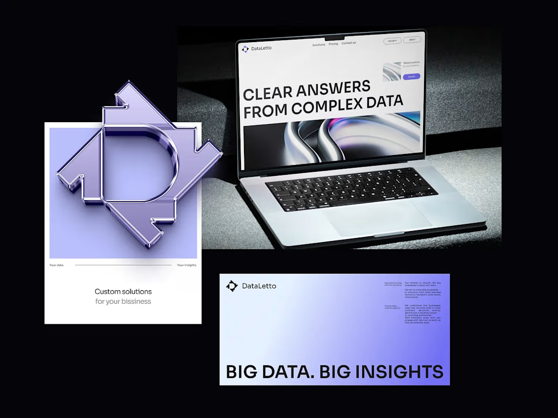

Outstanding 😊


“Or similar” leaves a lot to the imagination.
A few billboard designs I made for Sync as part of the rebrand. The campaign centres on a simple promise: the car you see is the car you drive.
I kept that message big and direct, with the cars up close and enough pink to make you look twice.

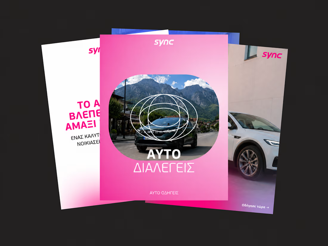
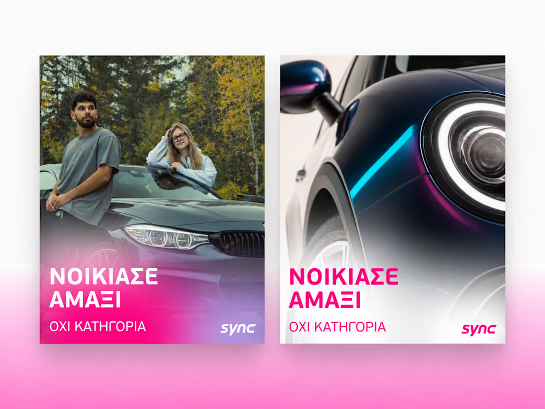
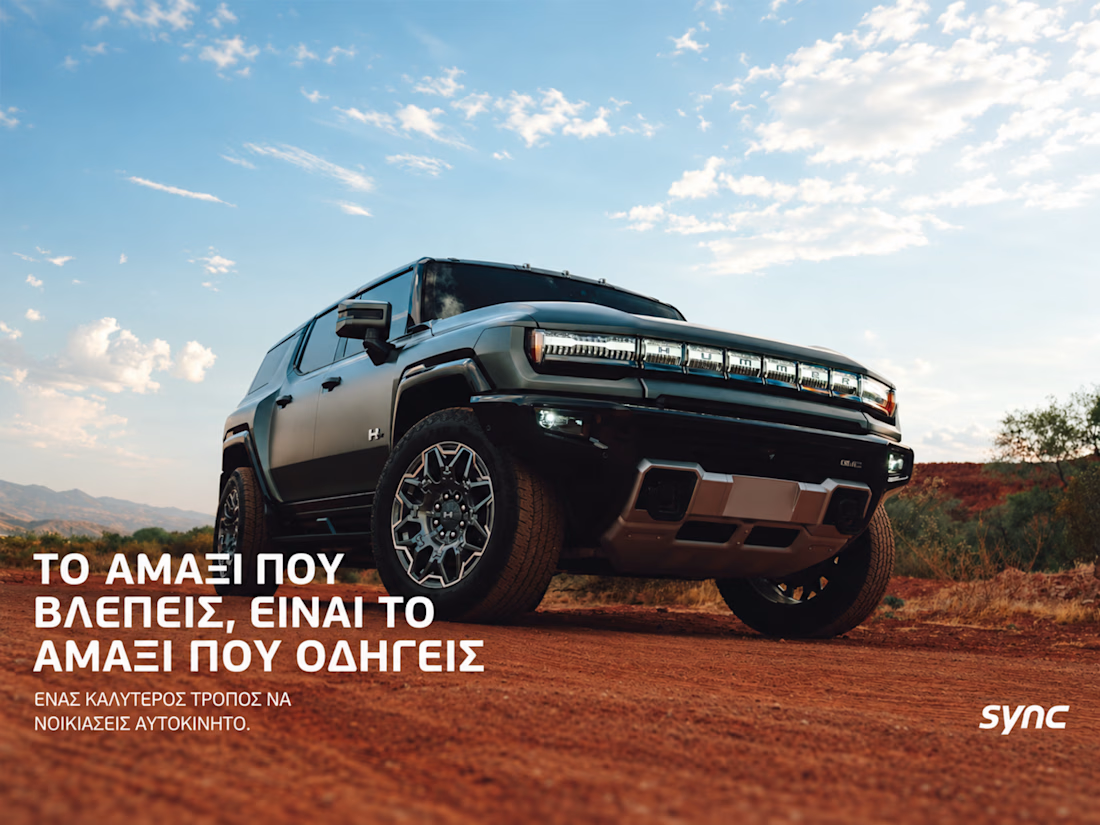
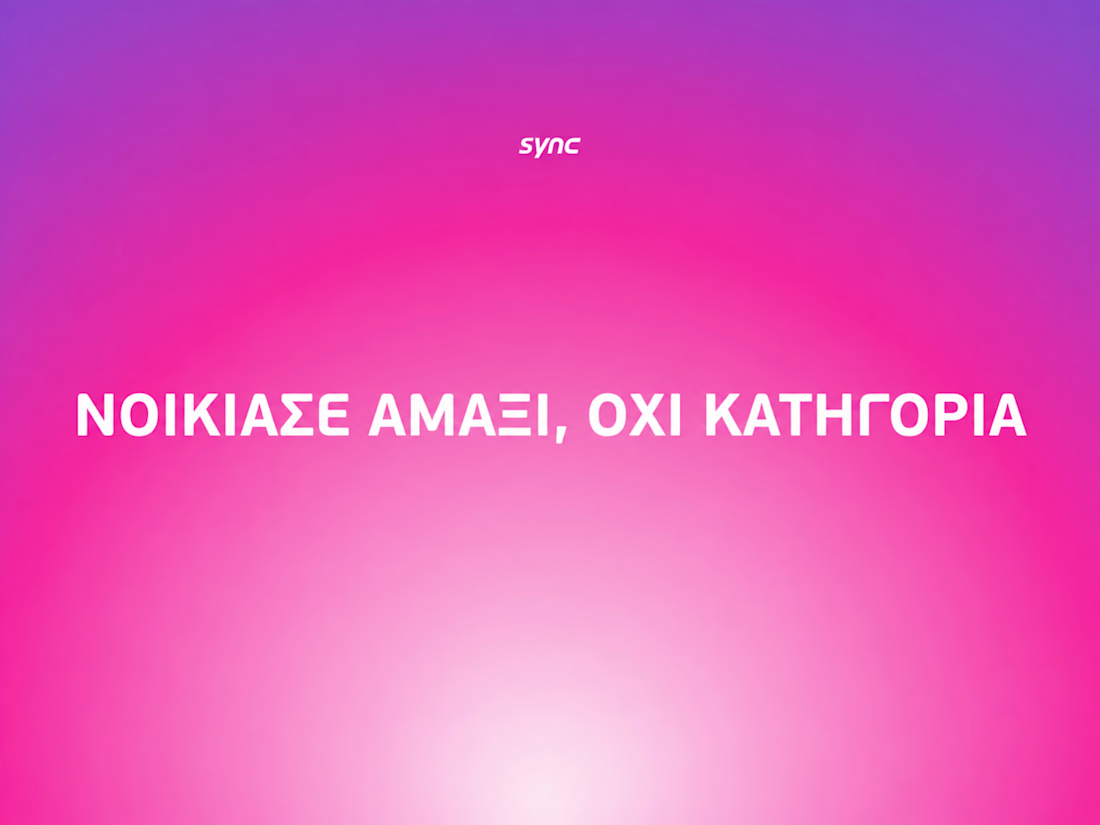

The way the oversized promise carries through the pink palette is really effective—the close-up crops make the car feel immediate without losing the campaign idea.

SURCO | Latin Bar & Restaurant Brand Identity
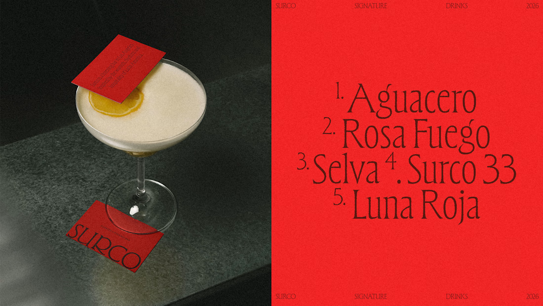
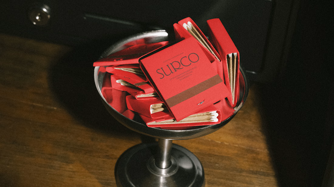
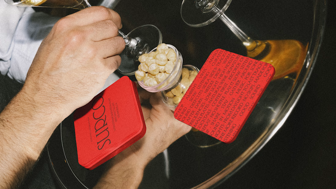
SURCO is a Latin bar and restaurant in Los Angeles where food, cocktails, vinyl and nightlife come together.
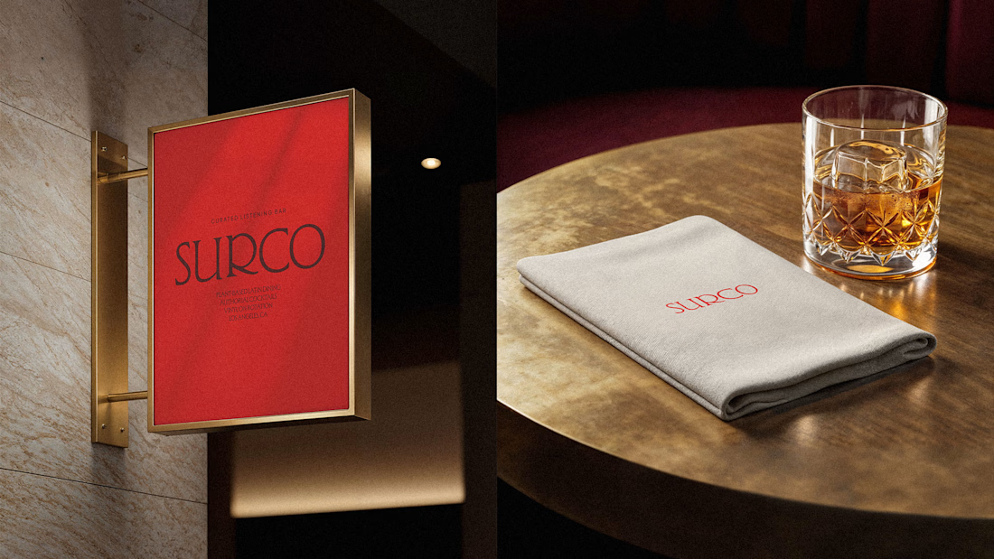
I developed a complete visual identity designed to feel warm, energetic and contemporary, without relying on the usual visual clichés associated with Latin restaurants. The system combines bold typography, a rich color palette, and art direction inspired by late nights, shared tables, music and the atmosphere of the bar.
The identity was extended across menus, signage, social media, printed materials and environmental applications, creating a flexible system that feels recognizable across every touchpoint.
Services: Brand Identity, Logo Design, Art Direction, Visual System, Graphic Design
Full project:
https://www.behance.net/gallery/255628447/Surco

Beautiful work!