
God'spower Ogooluwa
Bringing your brand to life with bold, creative designs.



Introducing LOOP .
A real estate brand concept built around a simple idea: a strong brand identity should make a business recognizable, consistent, and memorable.
From the geometric wordmark to the bold colour palette, every choice was intentional.
Because real estate is about more than properties; it's also about the trust and perception a brand builds.
That's where strategic design makes the difference.
More case study from this brand coming soon.
Have a brand that needs a stronger visual identity? Let's connect. 🤝🏽
2
83
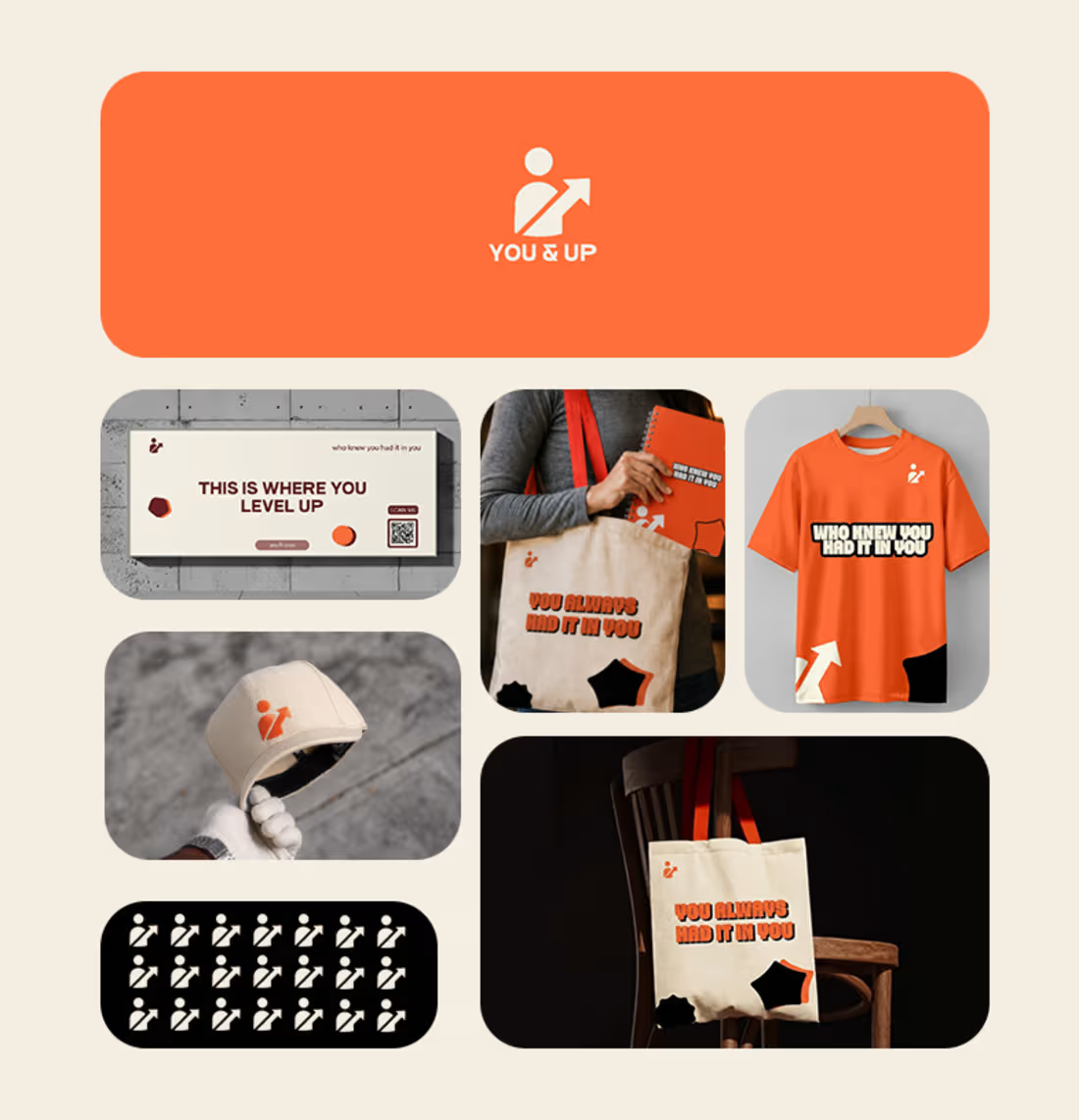
YOU&UP — A Brand Built to Move People
YOU&UP is a personal-growth brand focused on goals, discipline, self-improvement, and taking meaningful action.
For this project, I didn't want to create another motivational brand built around generic quotes. I approached the identity from the idea that inspiration should lead to action.
I developed a visual direction that feels energetic, approachable, and progressive, while creating a content system built around six strategic pillars:
Mindset & Perspective — changing how people think.
Discipline & Consistency — building sustainable habits.
Goals & Progress — turning ambitions into achievable steps.
Action & Nudges — encouraging immediate action.
Real-Life Growth — connecting with everyday experiences.
Community — creating participation and belonging.
The goal was to make the visuals more than individual social media designs. They needed to work together as a recognizable and scalable brand system.
From the visual identity to the content structure, every decision was made to keep YOU&UP's message clear and consistent:
Don't just want growth. Move towards it.
This project reflects how I approach brand identity: strategy first, design second.
1
2
199
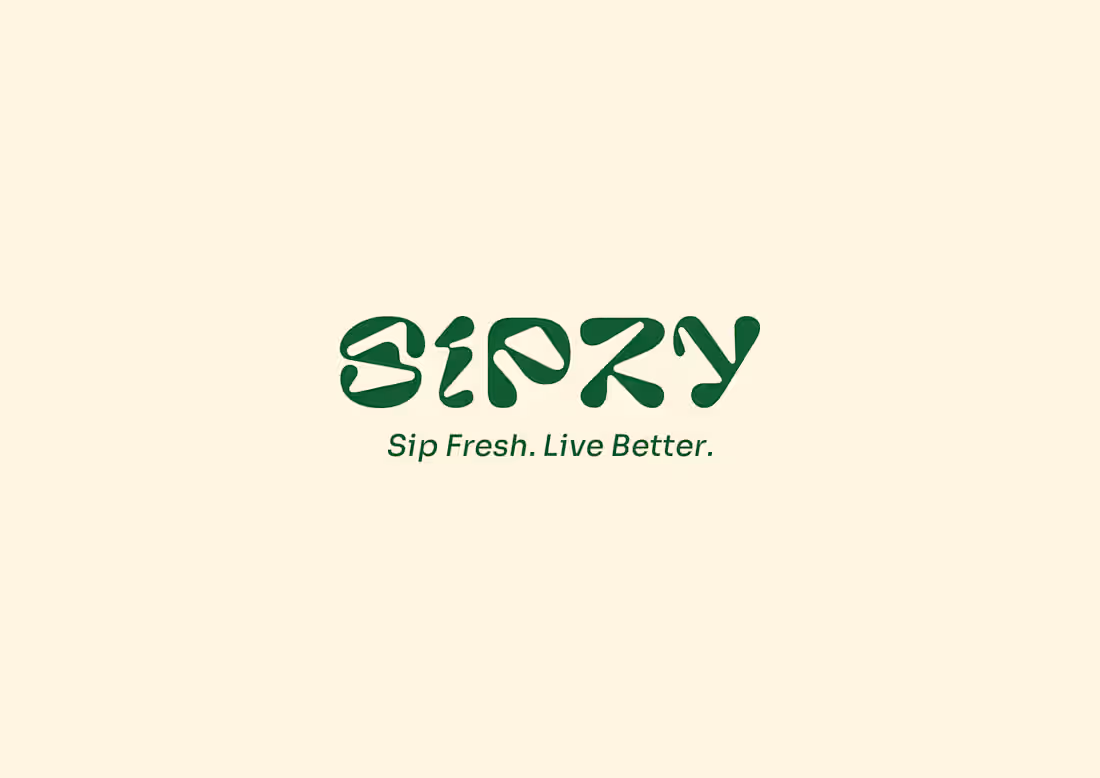
Talking about this brand SIPZY, one of my favorite brand ever made starting from the logo (WORDMARK) down to the packaging.
What came to my mind was that what if a beverage brand could be refreshing visually as the drink itself.
So I designed SIPZY to be a vibrant beverage brand concept designed to showcase how bold visual identity and packaging can transform a product into a memorable brand experience.
The packaging design will be in my next post.
4
7
122
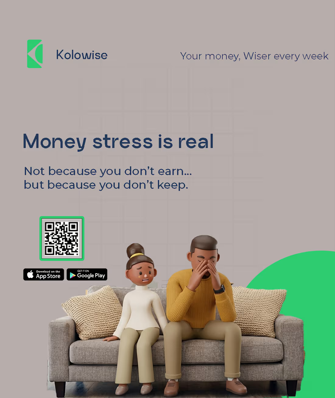
Some social ads design for a fintech brand.
what do you think about it ?
1
99