The network for creativity
Join 1.25M professional creatives like you
Connect with clients, get discovered, and run your business 100% commission-free
Creatives on Contra have earned over $150M and we are just getting started
Back to feedPost
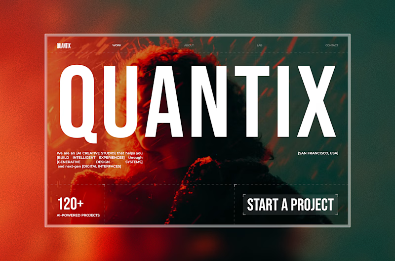
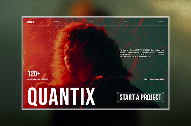
Taste Test
Exploring two directions for the same concept.
Which one feels stronger?👀
One leans into strong typography to grab attention instantly.
The other shifts focus to visual storytelling with a more immersive feel.
14 voted
16%
72 voted
84%
86 votes
Closed
"Visual first" is better, How about you try "Bold Type Focus" but the text "QUANTIX" is below the face, so the face can be seen clearly while other elements move up. What do you think?
focus on message delivering, hence go with the visual first 😃
Bold definitely hits stronger on first impression.
In this Age, Show don't Tell 🚀
Visuals always do the heavy lifting in communication
Awesome work
Nice work
other option?
Nice
Visual First is much better for me.
Both are great but I am keen to Visual First.
I think both designs are fine, but the style depend on your brand or business personality type.
Visual First
Great work
The poll numbers (84% for Visual First) align perfectly with what we typically see in landing page A/B tests.
From an analytics perspective, the "Bold Type" version creates friction, the massive "QUANTIX" text competes directly with your "Start a Project" CTA. In the "Visual...
Amazing!
Both of them are awesome, but the second one is bold. So 2
The network for creativity
Join 1.25M professional creatives like you
Connect with clients, get discovered, and run your business 100% commission-free
Creatives on Contra have earned over $150M and we are just getting started
Related posts
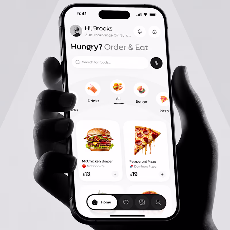
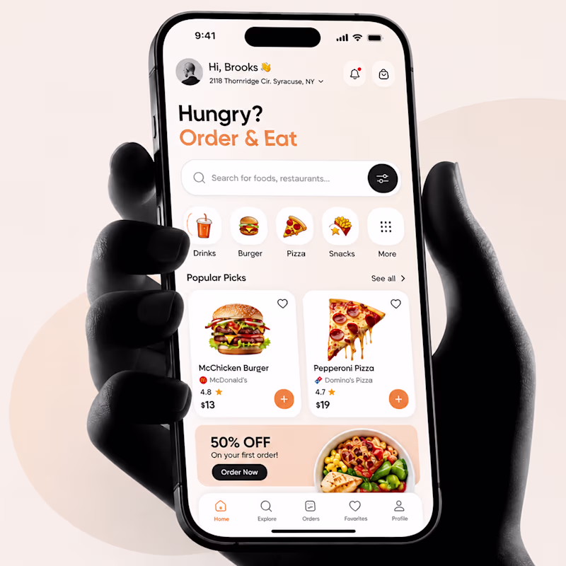
🎨 Design Challenge
Which version catches your attention first?
Now I need your opinion 👇
✅ Left
✅ Right
23 voted
23%
78 voted
77%
101 votes
Closed
This is a great reminder that design isn't just about functionality—it's also about creating a feeling.
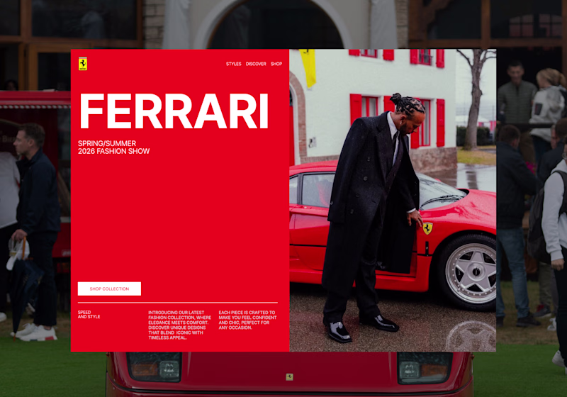
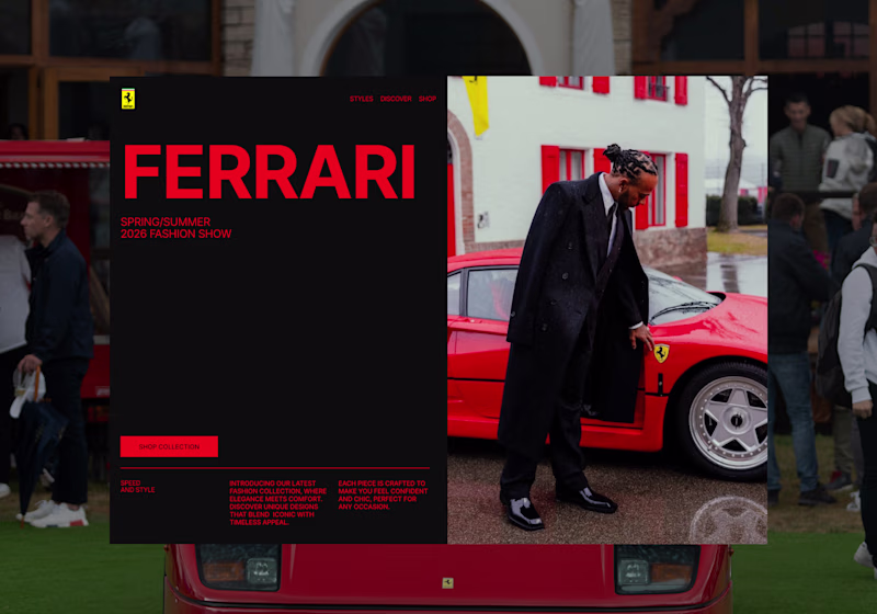
I’m exploring two hero directions for a Ferrari-inspired fashion landing page concept and testing which visual direction feels stronger.
Direction 1 uses the classic Ferrari red as the main brand moment. It feels bold, energetic, and instantly recognizable, with a cleaner fashion editorial layout.
Direction 2 shifts the experience into a darker, more luxury-driven direction. The black background makes the red feel sharper and gives the page a more premium, high-fashion feel.
Both directions have a different impact:
Direction 1: bold, iconic, energetic
Direction 2: luxury, dramatic, fashion-forward
I’m leaning toward Direction 2 because it feels more elevated and editorial, but I’d love to hear which one feels stronger at first glance.
12 voted
48%
13 voted
52%
25 votes
Closed
its actually a tough choice to make ngl. But i have to go with direction 2 as the colors are much more influenced by the main image
Proud to share my submission for the #configMakeathon 🦋
Design has one job — make people feel something before they think something.
For the #ConfigMakeathon, I built a complete digital campaign experience for Butterfly Conservation's "Britain's Favourite Butterfly" — taking a public vote and transforming it into something people actually want to be part of.
The challenge wasn't technical. It was human. How do you make someone genuinely care about a species they've never noticed? How do you turn conservation data into something personal? How do you design an experience that moves people from passive viewers to active participants?
The answer was architecture — three distinct experiences working as one:
🗳️ Results Explorer — A fully filterable species discovery system built around personality vibes, wing colours, and rarity. Not a leaderboard. A world worth exploring.
🧬 Personality Quiz — A matching experience that gives every user a butterfly identity rooted in real behavioural traits. Flashy. Feisty. Adventurous. Rare. When someone sees themselves in a species, the relationship changes entirely.
🌿 Conservation Narrative — A story-first approach to ecological data that earns its urgency rather than demanding it. The stakes land harder when you already have a favourite.
This is the kind of work I find most meaningful — where design isn't decoration, it's the strategy itself.
🔗 Prototype:Prototype
Built with Figma · Figma Make · MCP
#ConfigMakeathon #Figma #UXDesign #ProductDesign #DesignForGood #ButterflyConservation @Figma @Contra @Contra HQ
Pretty Good!
Trending
Claude
Claude has entered the design space. How are you using Claude Design?
Contra University
Learn from expert creatives how to earn more using next-gen AI tools.
MagicPath
The canvas is infinite, and exploration is becoming the workflow. How are you using MagicPath?
creativeaiflow
Creative AI workflows are evolving. What tools do you use, and what are their strengths and weaknesses?
freelancerlife
Freelancer life is wins, pivots, and everything in between. What’s yours right now?