
Md Zahid Hasan Khan
I am a professional Brand Designer, I do all kind of Design


Hi this Designer Jahid. I help businesses to grow visually.
3
86
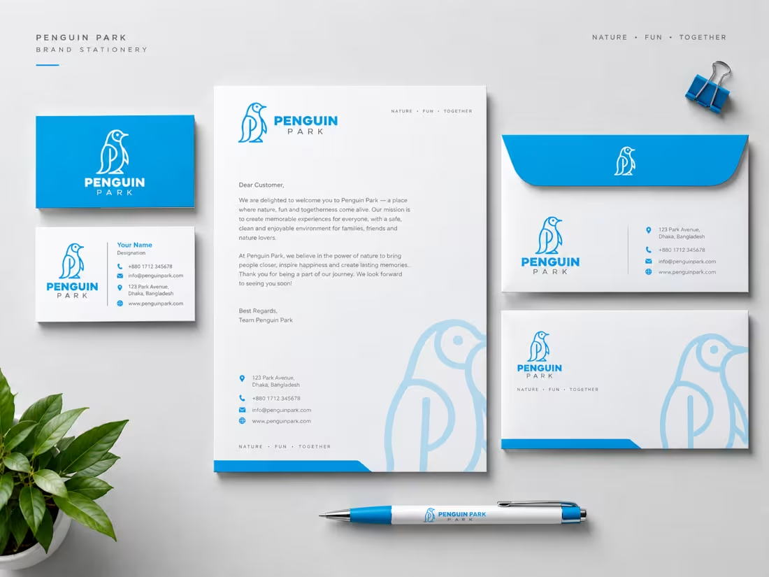
Penguin Park | Creative Minimalist Penguin Logo Design
A modern logo concept for Penguin Park, featuring a custom penguin silhouette with the letter P integrated into its body. The bright blue color palette, clean line-art construction, and balanced typography create a distinctive and memorable visual identity. A creative example of minimalist logo design, animal branding, and clever lettermark integration.
Tags: Penguin Park, Penguin Logo, Minimalist Logo, Blue Logo, Logo Design, Letter P Logo, Mascot Logo, Brand Identity, Graphic Design, Creative Branding, Logo Inspiration, Typography Design.
Hashtags: #PenguinLogo #LogoDesign #MinimalistBranding #BrandIdentity #GraphicDesign
2
5
84
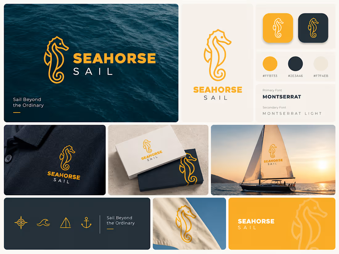
Merging marine life with nautical aesthetics! ⛵️🌊
Here’s the logo design concept for Seahorse Sail. Clean line art, warm orange tones, and versatile lockups built for modern digital brands.
Thoughts on this smart fin-to-sail concept? 💬
#LogoDesign #Branding #DesignerJahid #GraphicDesign #Minimalism
2
70
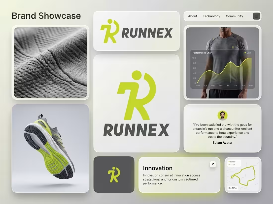
RUNNEX | Sports Brand Logo & Visual Identity
A modern sports brand identity designed around movement, speed, energy, and forward progress.
RUNNEX is a conceptual visual identity for a modern running and fitness brand.
The objective was to create a bold and memorable logo that communicates movement without relying on overly complex visual elements.
The final mark combines an “R” letterform with a dynamic running figure, creating a distinctive symbol that feels energetic and athletic.
2
100