Md Zahid Hasan Khan
I am a professional Brand Designer, I do all kind of Design
Ready for work
Md Zahid Hasan is ready for their next project!
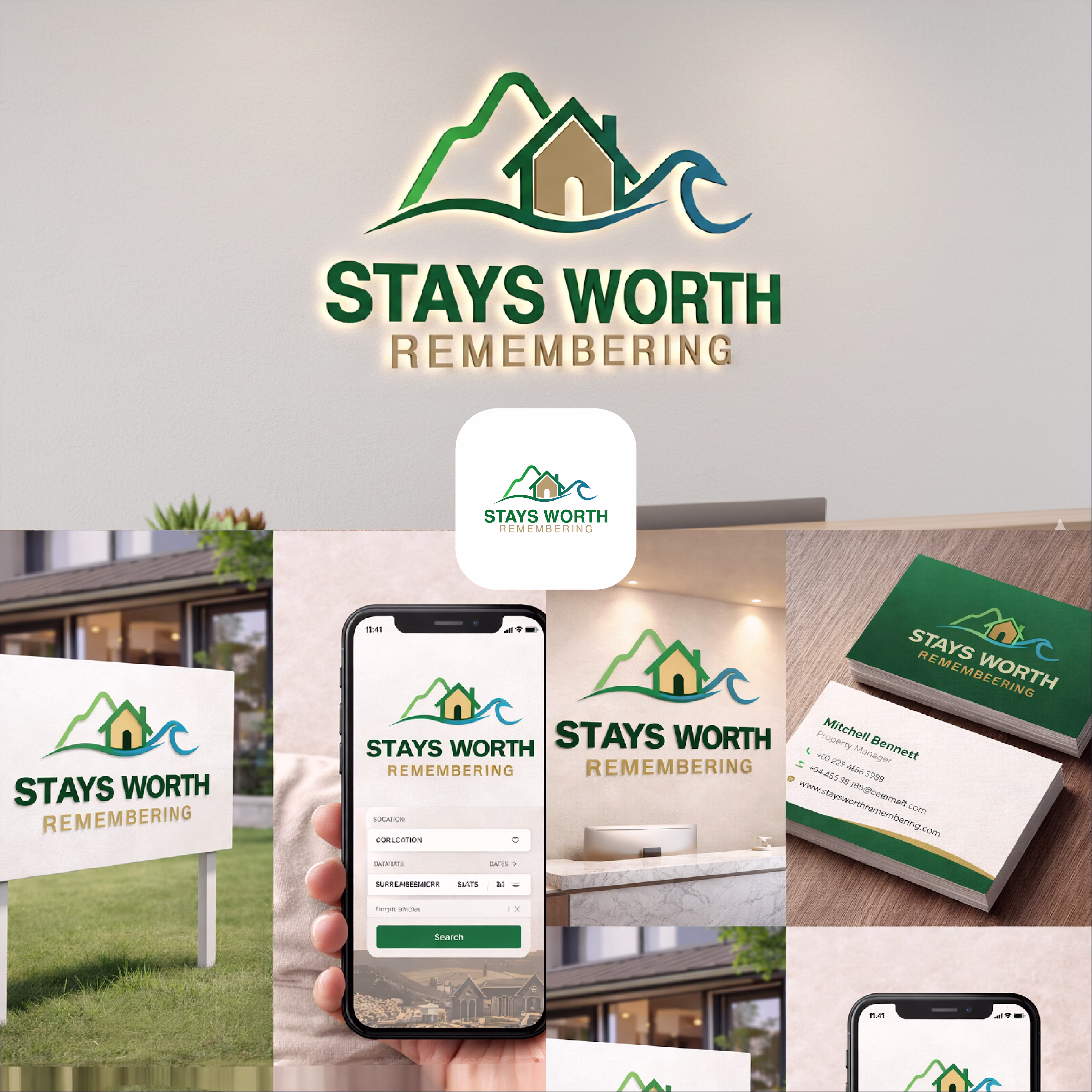
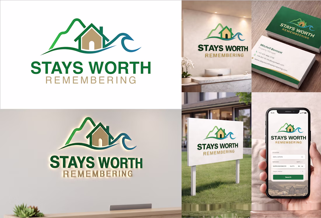
Stays Worth Remembering Travel Company Logo Design 2026.
The idea behind this logo was to create a visual identity that instantly communicates comfort, memorable experiences, and destination-based stays in a clean and meaningful way.
The mountain element represents travel,...
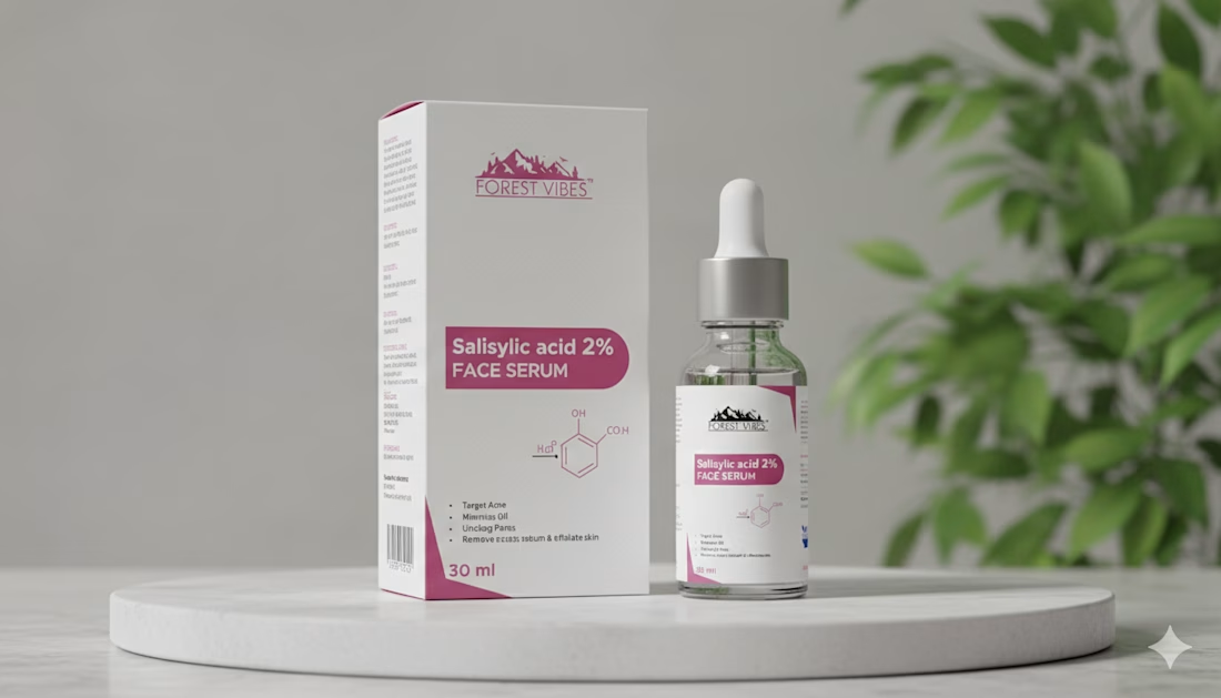
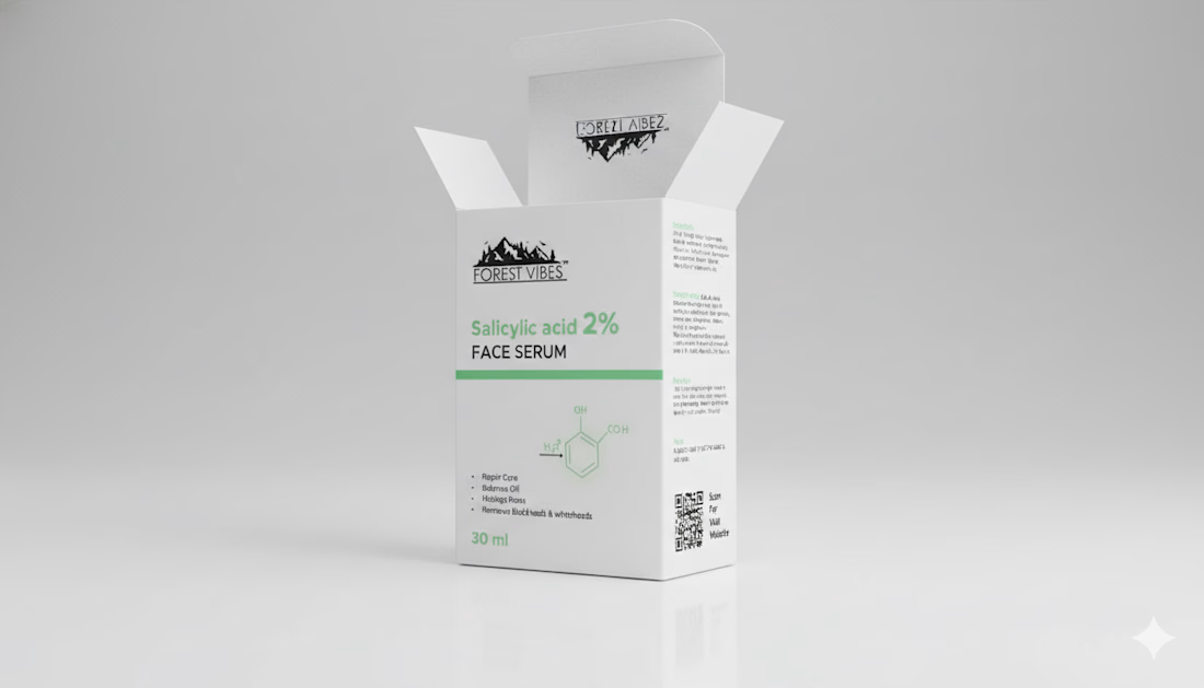
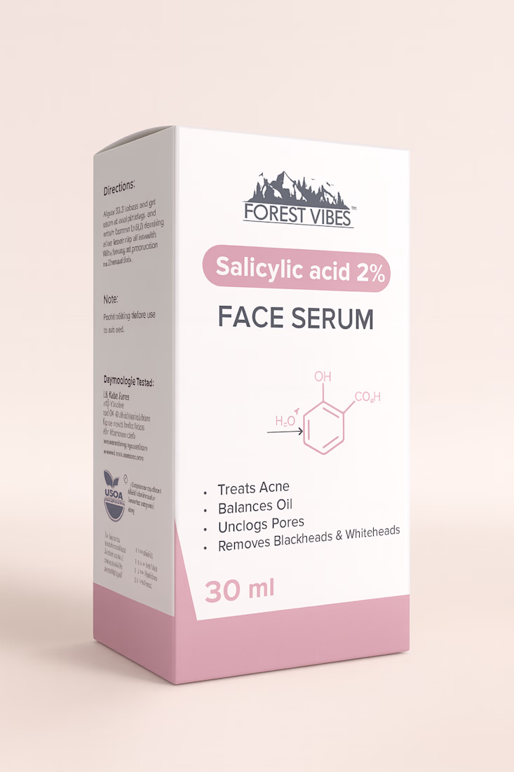
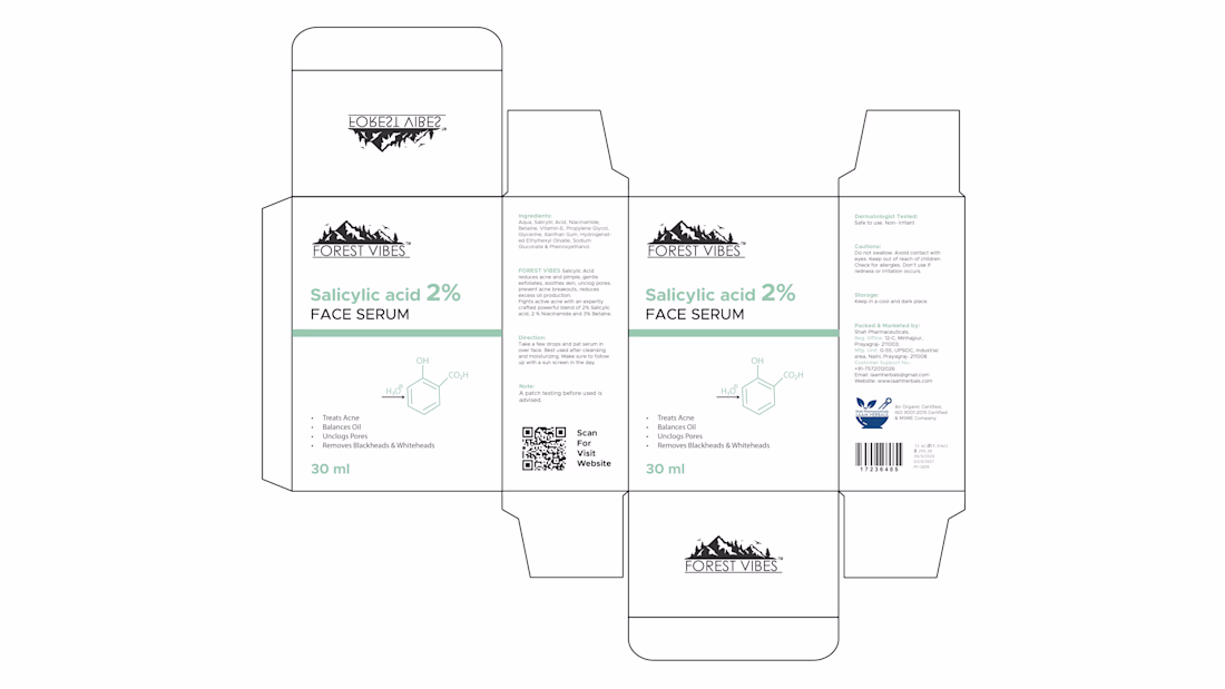
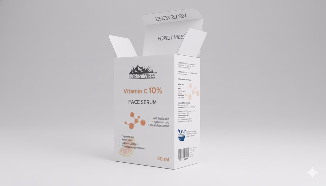
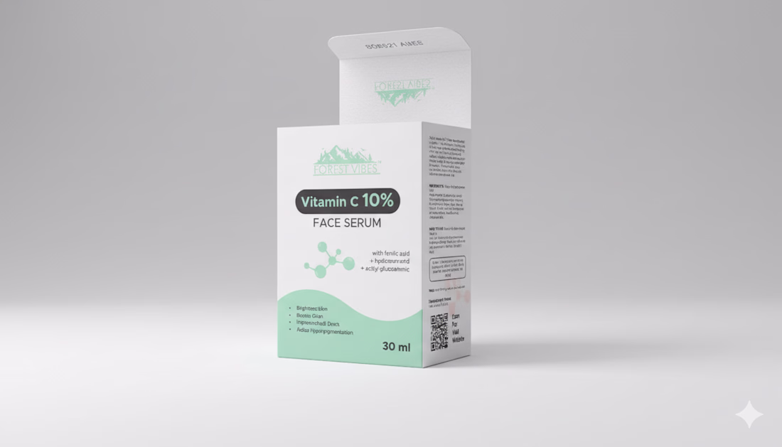
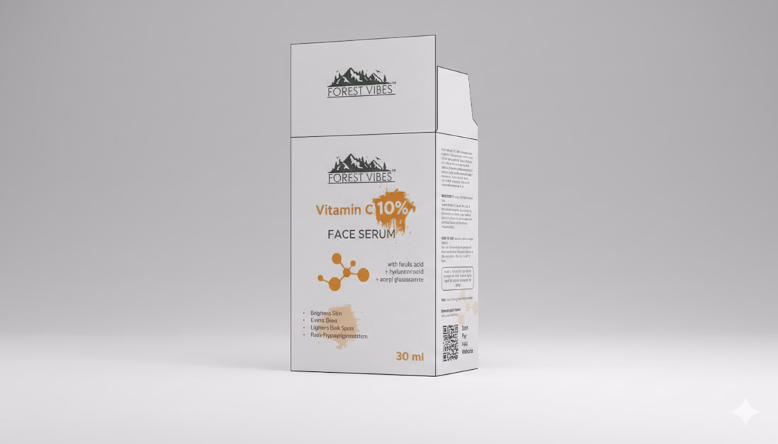
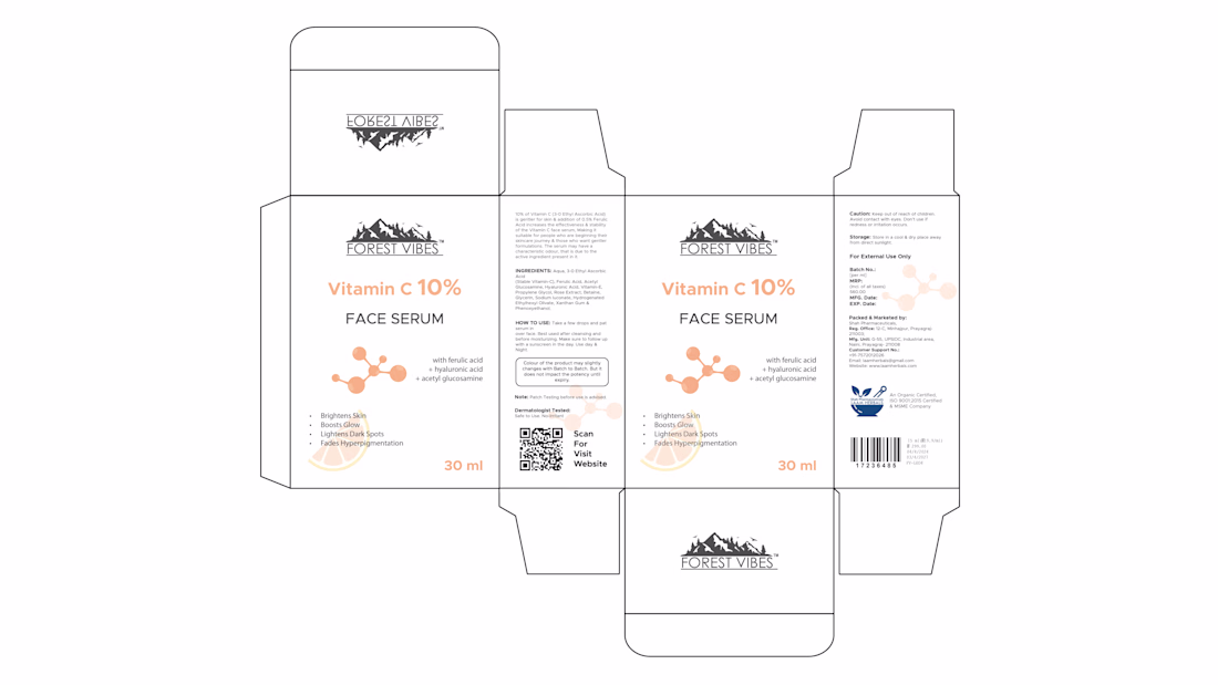
Indian Client Work Vitamin C 10% Face Serum Package Design. Here I have designed several packages of Vitamin C 10% Face Serum for my Indian client. From here, the client has finalized a design and is selling their product by printing that package. From here you can get your...
packagingbrandingpackagedesignpackagingdesignexpertsBrand DesignGraphic DesignAdobe IllustratorPackaging Design
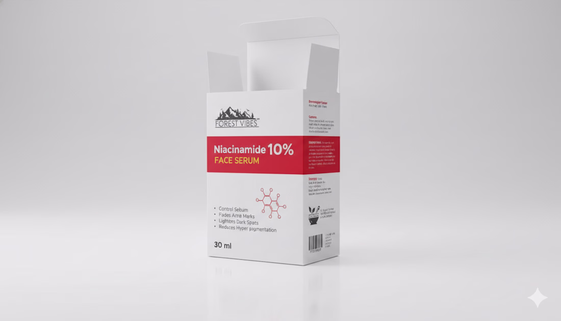
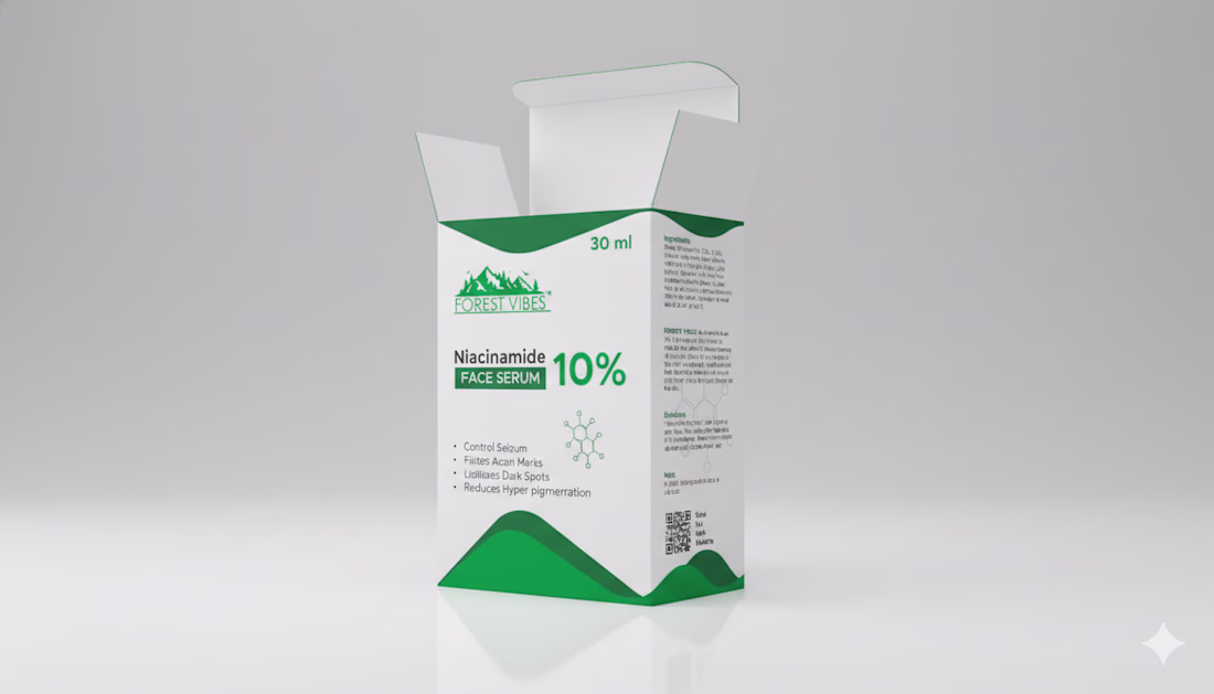
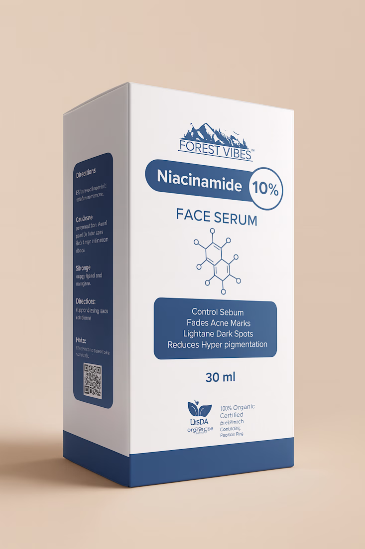
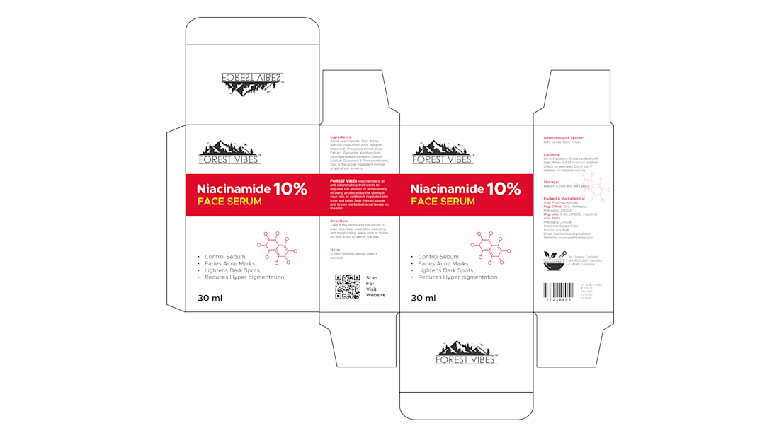
Indian Client Work Niacinamide 10% Face Serum Multiple Style Package Design. Here, I have designed several packages of Niacinamide 10% Face Serum for my Indian client. From here, the client has finalized a design and is selling their product by printing that package. From here,...
Graphic DesignPrint DesignAdobe IllustratorpackagingbrandingpackagedesignpackagingdesignexpertsPackaging Design
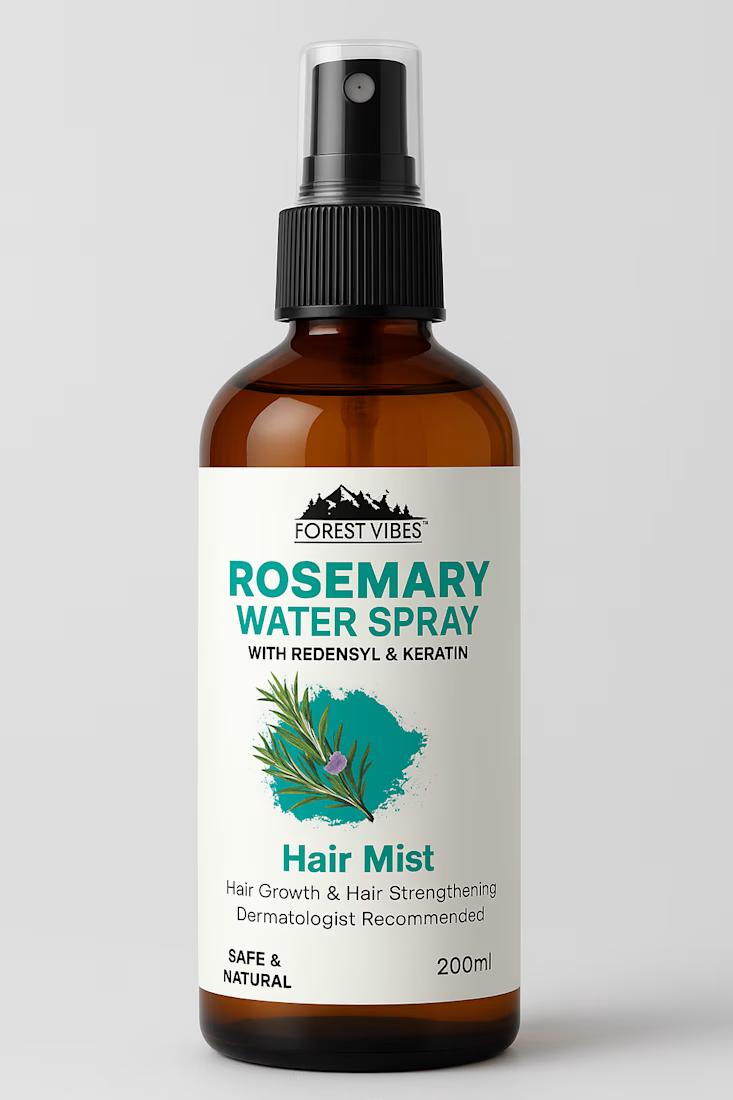
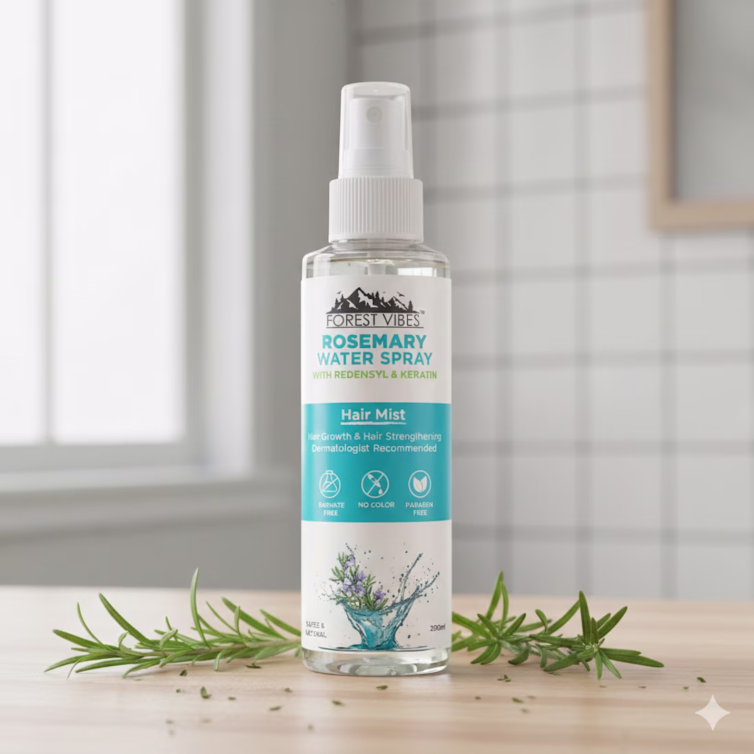
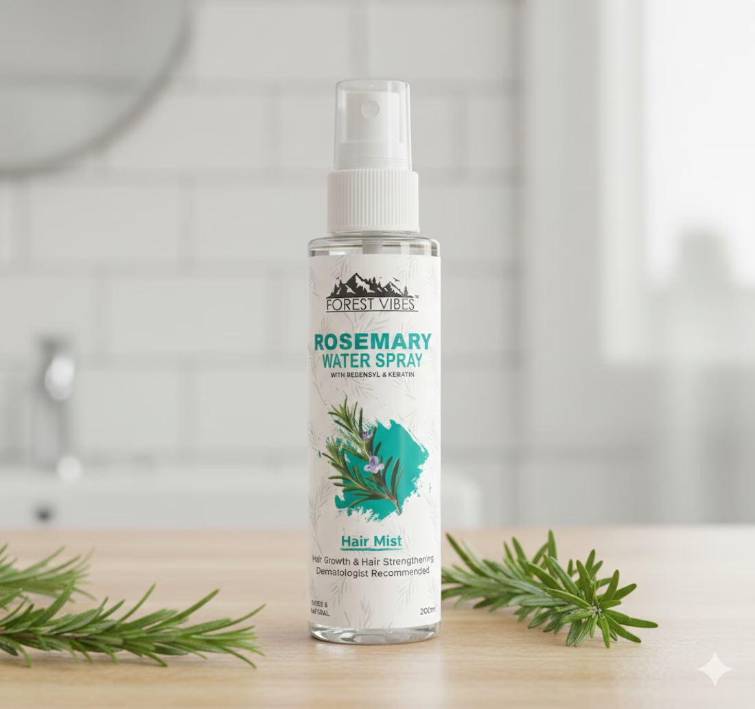
Indian Client Work Rosemary Water Spray Multiple Label Design. Here I have given samples of all the label designs I have prepared for my clients so that you can see and get ideas. My client liked one of the designs and printed that design and then sell products through the...
Logo DesignPackaging DesignlabeldesignrosemarylabeldesignwaterspraylabeldesignGraphic DesignAdobe Illustrator
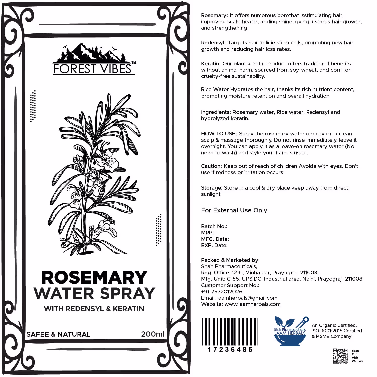
Here I have given samples of all the package designs I have prepared for my clients so that you can see and get ideas. My client liked one of the designs and printed that design and then sold it. If you want, you can also get such a label design from me. I also do full branding...