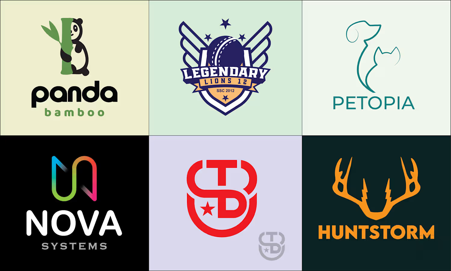
Md Zahid Hasan Khan
I am a professional Brand Designer, I do all kind of Design
New to Contra
Md Zahid Hasan is ready for their next project!
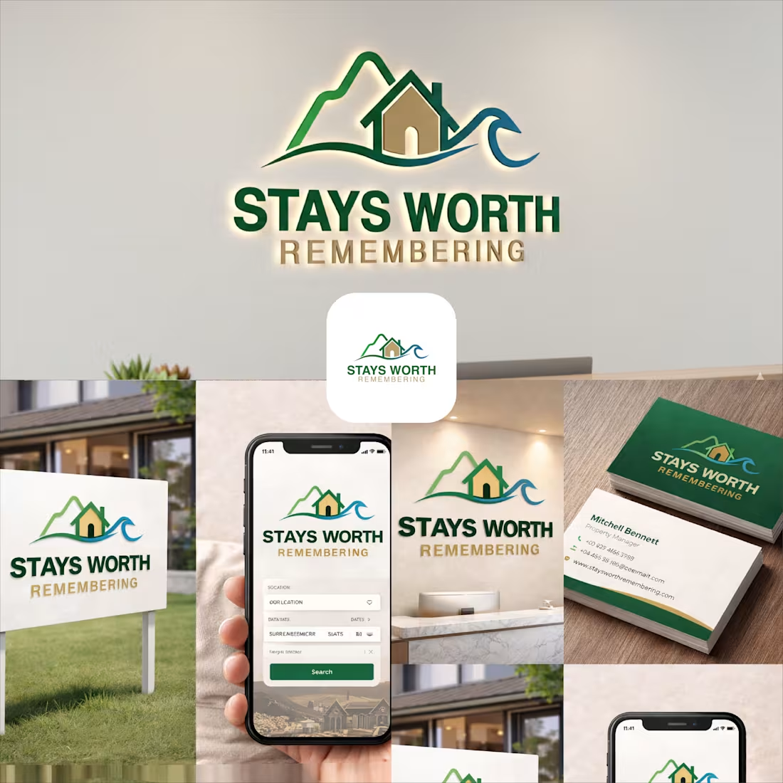
Stays Worth Remembering Travel Company Logo Design 2026.
The idea behind this logo was to create a visual identity that instantly communicates comfort, memorable experiences, and destination-based stays in a clean and meaningful way.
The mountain element represents travel, adventure, peaceful escapes, and beautiful destinations. It gives the brand a sense of exploration and unforgettable journeys. The house placed in the center symbolizes comfort, hospitality, safety, and the feeling of being “at home” no matter where someone travels.
The wave element was added to represent relaxation, premium vacation experiences, and destinations connected to nature, lakes, beaches, or peaceful environments. Together, the mountain, home, and wave create a complete story of travel and memorable stays.
For the typography, I used a bold and clean font to make the brand look professional, trustworthy, and easy to recognize across both digital and physical platforms. The word “REMEMBERING” uses a softer gold tone to create a warm emotional feeling and reinforce the idea that these stays are not just accommodations, but experiences people will remember for a long time.
The green color palette represents nature, growth, relaxation, and trust, while the blue wave adds freshness, calmness, and a travel-inspired feeling. Overall, the logo was designed to feel welcoming, modern, memorable, and versatile for signage, branding materials, business cards, websites, and mobile applications.
1
9
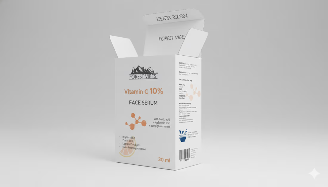
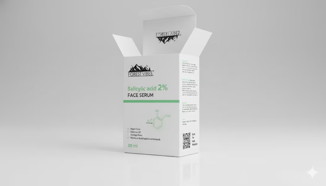
Indian Client Work Vitamin C 10% Face Serum Package Design. Here I have designed several packages of Vitamin C 10% Face Serum for my Indian client. From here, the client has finalized a design and is selling their product by printing that package. From here you can get your design ideas if you want and those who want to package such products can contact me. I am here for you. You (http://you.you/) can design labels for your products, and if you want, you can get your company's full branding done by me. If you want to get ideas about my designs, you can check out my entire portfolio, so if you need this service, be sure to contact me.
2
54
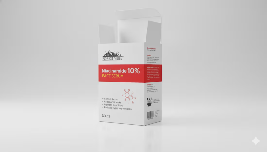
Indian Client Work Niacinamide 10% Face Serum Multiple Style Package Design. Here, I have designed several packages of Niacinamide 10% Face Serum for my Indian client. From here, the client has finalized a design and is selling their product by printing that package. From here, you can get your design ideas if you want, and those who want to package such products can contact me. I am here for you. You can design labels for your products, and if you want, you can get your company's full branding done by me. If you want to get ideas about my designs, you can check out my entire portfolio, so if you need this service, be sure to contact me.
2
2
74
Indian Client Work Rosemary Water Spray Multiple Label Design. Here I have given samples of all the label designs I have prepared for my clients so that you can see and get ideas. My client liked one of the designs and printed that design and then sell products through the Label. If you want, you can also get such a label design from me. I also do full branding projects, so those who are going to start a new company can hire me for the full branding and product packaging design of the company.
2
76
Here I have given samples of all the package designs I have prepared for my clients so that you can see and get ideas. My client liked one of the designs and printed that design and then sold it. If you want, you can also get such a label design from me. I also do full branding projects, so those who are going to start a new company can hire me for the full branding and product packaging design of the company.
2
70
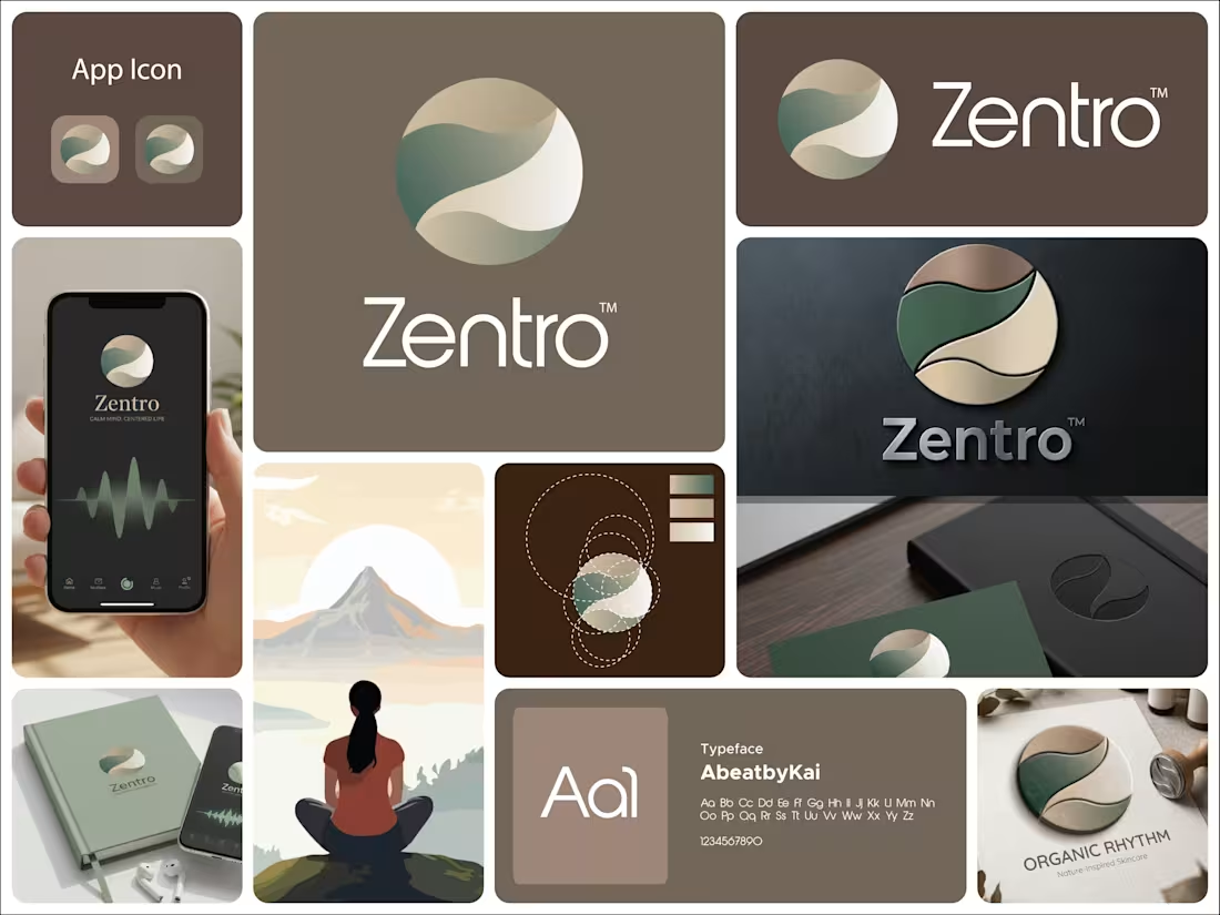
This logo for Zentro is built around calm, balance, and centered living.
The symbol is a circular form, representing wholeness, unity, and completeness. It reflects the idea of being centered, both mentally and emotionally, which aligns perfectly with a meditation or mindfulness-focused brand.
Inside the circle, the flowing shapes create a soft, continuous movement. These curves feel natural and organic, almost like a gentle path or breath flow. They subtly guide the eye through the mark, reinforcing a sense of calm and balance rather than tension or sharp direction.
There’s also a quiet suggestion of a path or journey within the form. It hints at self-discovery and inner alignment without being literal, keeping the design minimal but meaningful.
The color palette plays a big role here. The muted greens and earthy beige tones bring a grounded, natural feeling. Green connects to growth and harmony, while the warm neutrals add softness and stability. Together, they create a peaceful and reassuring visual tone.
The typography is clean and modern, providing contrast to the organic symbol. It keeps the identity clear and professional while letting the icon carry the emotional and conceptual weight.
Overall, the logo communicates a simple idea: Zentro is about finding balance, staying centered, and moving through life with calm and clarity.
4
140
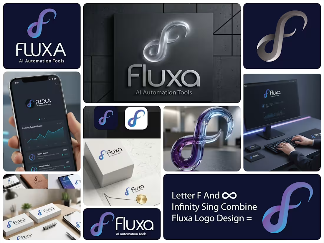
This logo for Fluxa – AI Automation Tools is built around the idea of continuous flow, adaptability, and intelligent systems.
The symbol is the core of the identity. It takes on an infinity-like form, representing endless processes, automation loops, and systems that keep running without interruption. At the same time, the shape subtly hints at an “F,” tying it directly back to the brand name.
The smooth, flowing curves communicate flexibility and evolution. Nothing feels rigid. This reflects how AI systems adapt, learn, and optimize over time rather than staying fixed.
The gradient blend of blue and violet adds depth and a sense of movement. Blue brings trust and technology, while the shift into violet introduces innovation and forward-thinking. Together, they create a modern, intelligent feel.
The typography is clean and minimal, allowing the symbol to carry the concept. It keeps the brand grounded and professional, making it suitable for tech platforms and scalable across different use cases.
The spacing and simplicity also reinforce clarity, which is key for a brand focused on automation and efficiency.
Overall, the logo communicates a clear message: Fluxa is about seamless, continuous systems that evolve, adapt, and work effortlessly in the background.
1
90
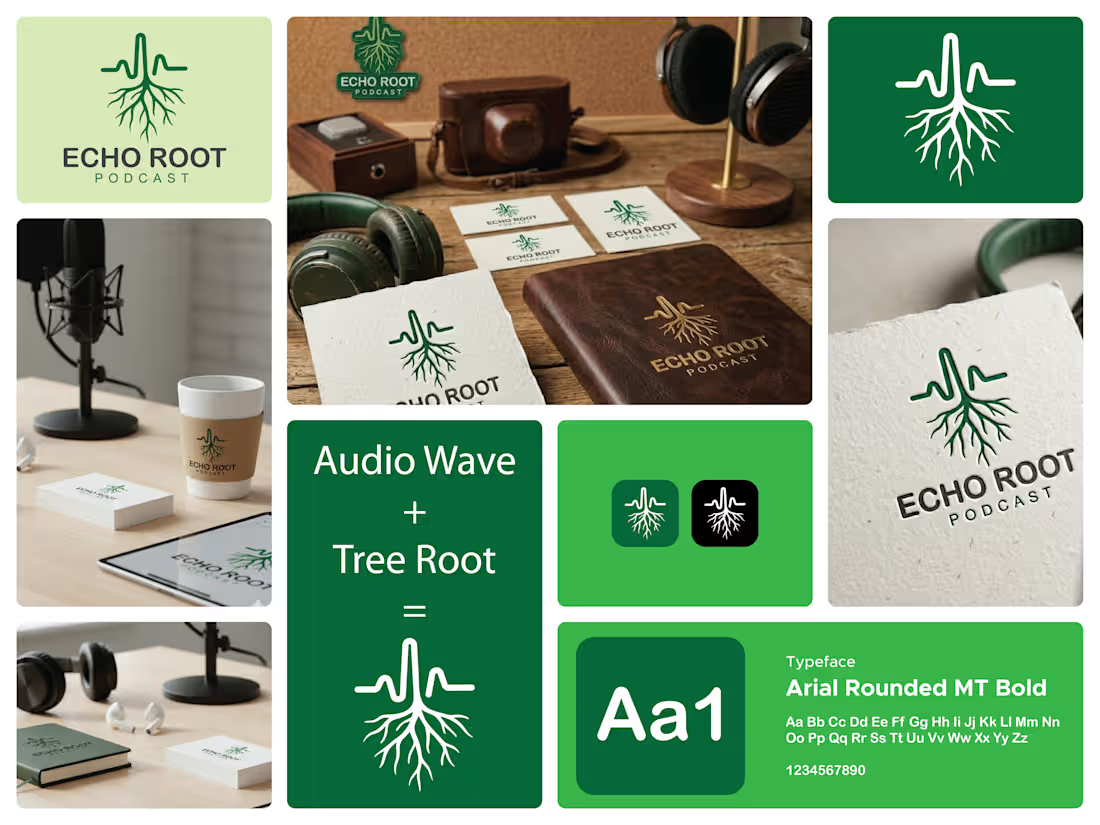
This logo for Echo Root Podcast is built around a strong, meaningful dual concept—sound and origin.
At the top, the waveform represents audio, voice, and storytelling. It instantly connects to the idea of a podcast, where conversations, ideas, and messages are constantly flowing. The waveform is clean and controlled, suggesting clarity and well-structured content.
As the line moves downward, it transforms seamlessly into roots. This transition is the core idea of the logo. It visually communicates that every voice, every story, and every idea has a deeper origin. The roots symbolize depth, foundation, and connection to something real and meaningful.
The vertical flow from waveform to roots creates a sense of direction. It feels grounded, as if the content isn’t just surface-level noise but something that goes deeper and resonates.
The green color reinforces this idea. It represents growth, authenticity, and natural connection, aligning with the concept of rooted stories and organic conversations.
The typography is simple and stable, allowing the symbol to carry the concept. The spacing in “PODCAST” adds a bit of air and rhythm, subtly echoing the idea of sound waves.
Overall, the logo communicates a clear message: this is a platform where voices don’t just speak, they connect back to something deeper.
2
88
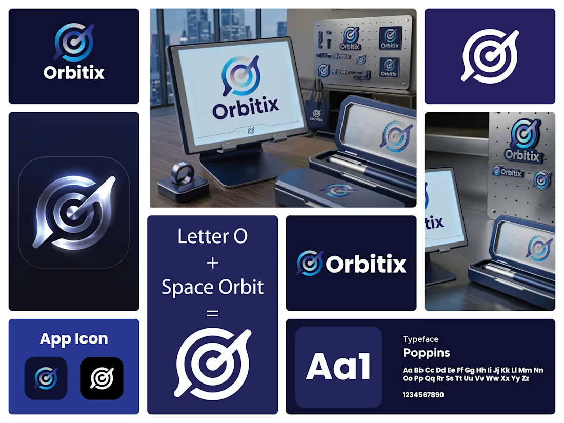
I designed this logo for Orbitix to capture the idea of staying focused and moving with purpose. The circular form represents an orbit, symbolizing consistency, flow, and staying on track. At the same time, it works like a target, which reflects precision and goal-setting.
The central point anchors everything. It represents the user’s core focus, while the surrounding rings show progress and structure. The angled pointer cutting through the circle adds direction and momentum. It suggests action, not just planning. It’s about execution.
I kept the form minimal but intentional. The slight break in the outer ring adds a dynamic feel, like motion in progress rather than something static. It also prevents the logo from feeling closed or rigid.
The gradient transitions from deep blue to lighter cyan to give it a modern, tech-driven look while also adding depth. It hints at growth, clarity, and forward movement.
The typography is clean and solid to balance the symbol. It keeps the brand grounded while the icon carries the motion and concept.
Overall, the logo is about alignment, direction, and staying in orbit with your goals.
1
99
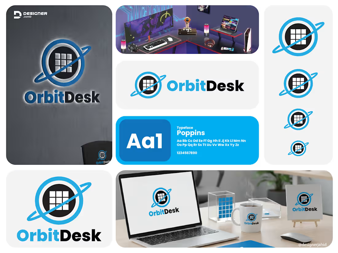
This logo combines technology, structure, and movement into one clean visual identity.
Symbol Meaning
Orbital ring — The blue ring circling the center represents motion, connectivity, and continuous workflow. It gives a sense of systems operating smoothly, like satellites in orbit. This supports the idea of efficiency and always-active digital infrastructure.
Central grid inside the circle — The square grid looks like a workspace layout, dashboard, or organized data blocks. This symbolizes structure, productivity, and digital work environments. It visually connects to the word " desk " as a place where tasks are managed.
Planet-like form — Together, the circle and orbit create a planet impression, reinforcing the name OrbitDesk and suggesting global reach, scalability, and smart systems working in sync.
2
3
78
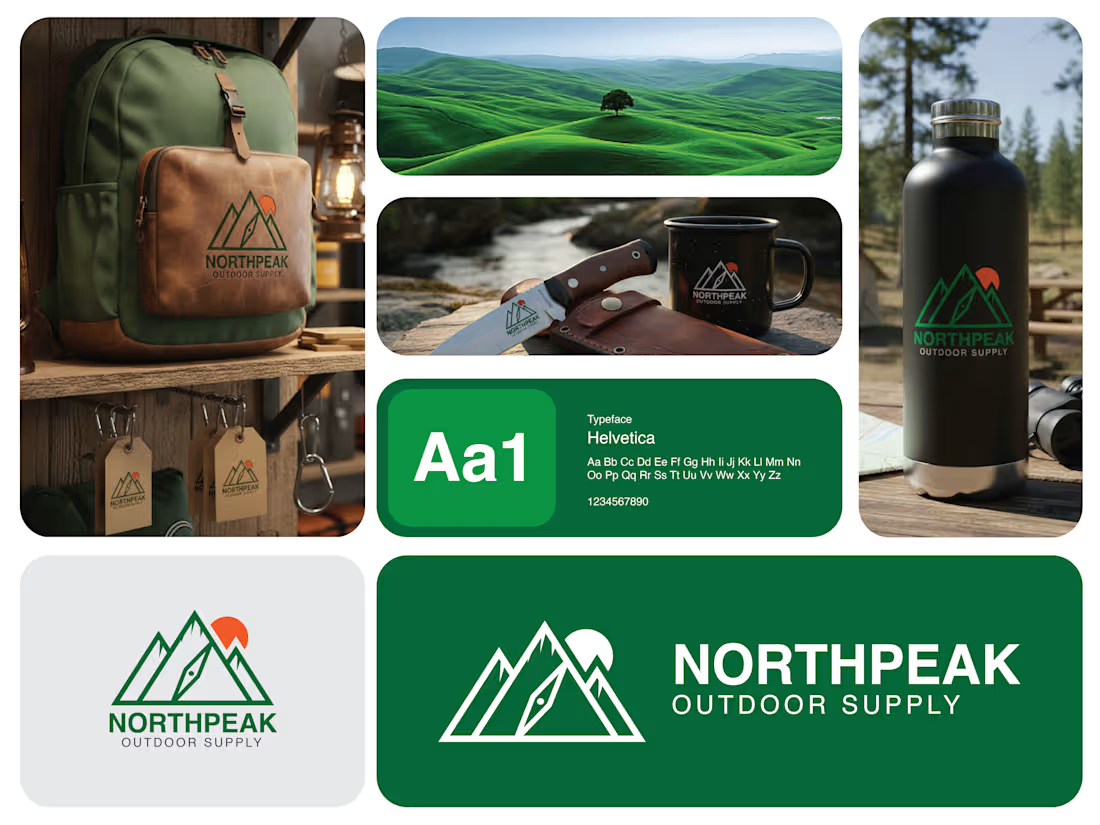
🏔 Where Adventure Meets Elevation 🏔
A logo is more than a mark. It’s the spirit of a brand captured in a single glance. Here’s my latest design for Northpeak Outdoor Supply, built to represent strength, exploration, and the call of the wild.
At the heart of the design stands a bold mountain formation, symbolizing resilience, ambition, and the thrill of reaching new heights. The sharp, structured peaks reflect durability and performance, while the subtle trail detail represents guidance, movement, and the journey every adventurer takes.
The rising sun adds warmth and energy, capturing the beauty of early starts, endless horizons, and unforgettable outdoor moments. Paired with clean, confident typography, the identity balances rugged adventure with modern clarity.
2
3
104
Aesthetic & Wellness Clinic Identity Design
2
0
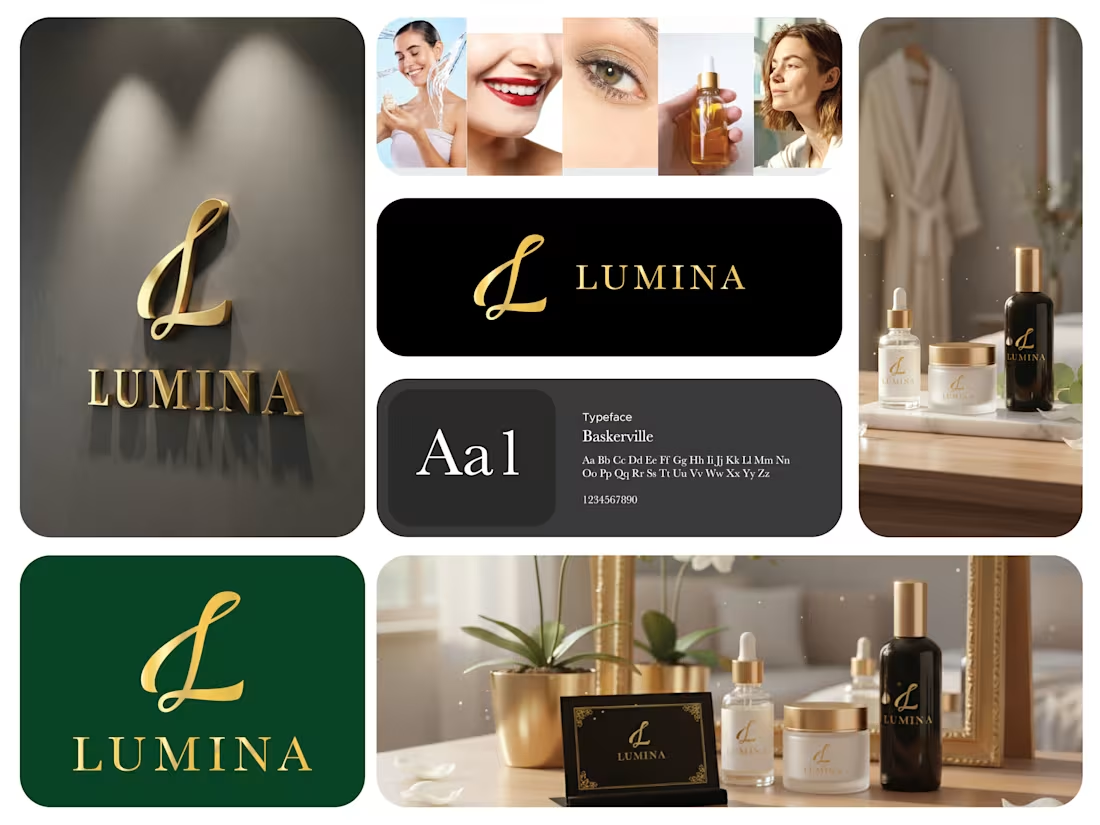
This mark is built to communicate luxury, clarity, and strong brand recognition through simplicity.
The core of the design is the monogram “L.” It’s rendered in a flowing, calligraphic style that introduces elegance and femininity without becoming overly decorative. The controlled curves and smooth stroke transitions give the mark a refined, premium character while keeping it visually balanced. This makes it distinctive enough to function as a standalone brand icon.
The typography for “LUMINA” is clean and structured, which creates contrast against the expressive monogram. That balance between fluid and structured forms helps the logo feel both graceful and grounded. The spacing and alignment are carefully managed to maintain visual harmony and readability across different sizes.
7
5
89
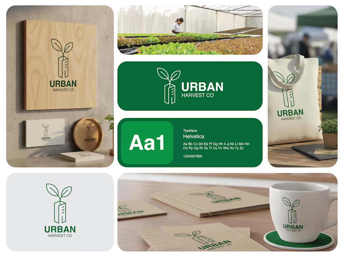
The logo combines urban development and sustainable growth into one simple visual idea.
Main symbol
The building shape represents the city, architecture, and modern urban living.
From the top of the building grows a sprout with two leaves, symbolizing nature, renewal, and cultivation.
Together, it communicates the idea of green life growing within the city or agriculture integrated into urban spaces.
Meaning
It visually expresses the concept of urban farming, sustainability, or eco-focused city development. The message is that nature and infrastructure can coexist and grow together.
Style
The minimal line design keeps it clean, modern, and scalable.
The green color reinforces themes of environment, freshness, and growth.
The balanced geometry makes it feel structured and professional, aligning with an organized urban brand.
2
85
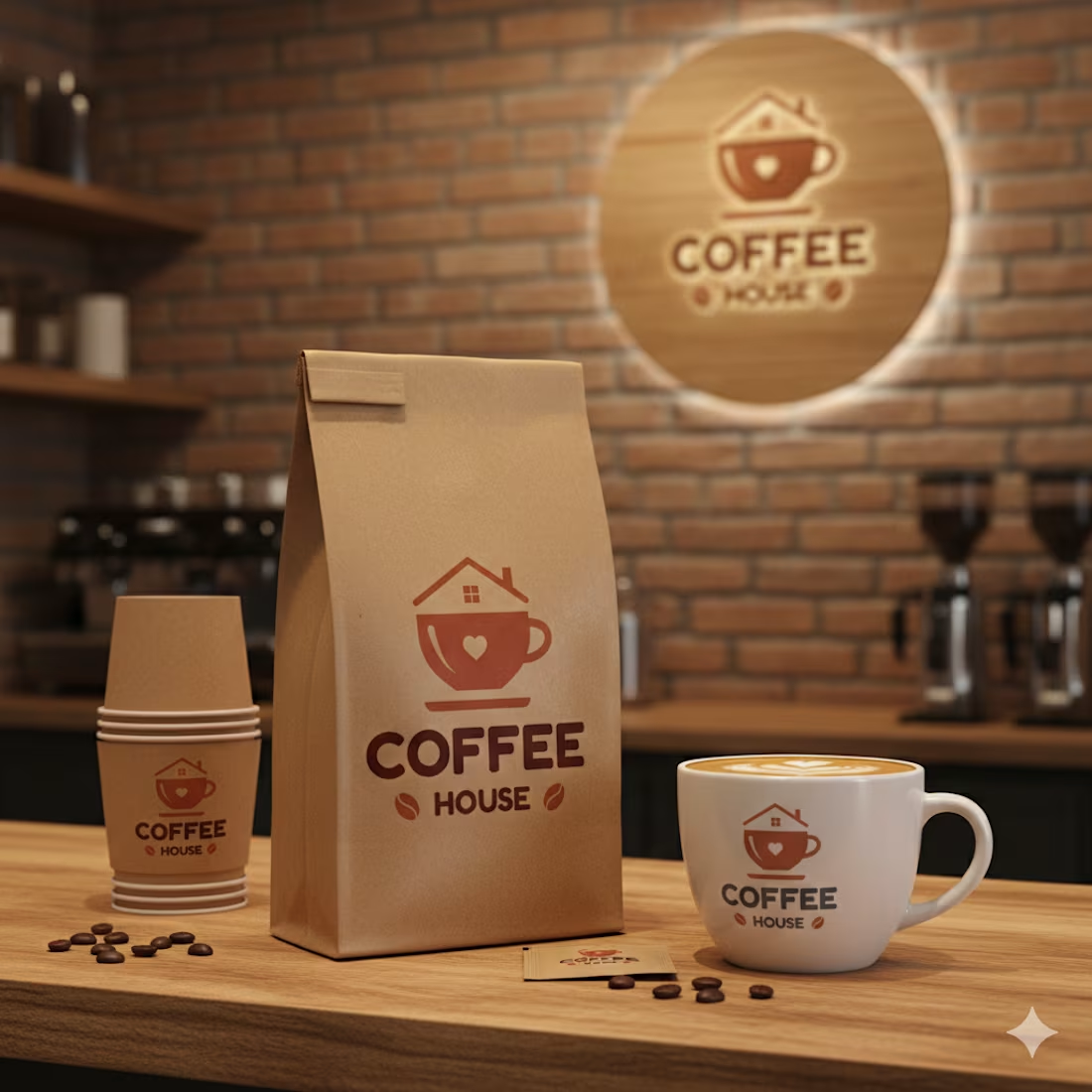
1. Visual Metaphor: "Coffee House."
The most prominent feature is the integration of a house and a coffee cup. By placing a roof (complete with a chimney and window) directly over the cup, the logo literally illustrates the name "Coffee House." It suggests that your shop isn't just a place to buy a drink, but a destination that offers the warmth, safety, and comfort of a home.
2. Emotional Anchors
The Heart Silhouette: Positioned in the center of the cup, the heart acts as a focal point. It communicates that the brand is driven by passion, friendly service, and a love for the craft of coffee making.
Curved Geometry: The rounded edges of the cup, the saucer, and the typeface avoid sharp, aggressive angles. This creates a "soft" visual landing, reinforcing the brand's personality as welcoming and community-oriented.
2
2
71
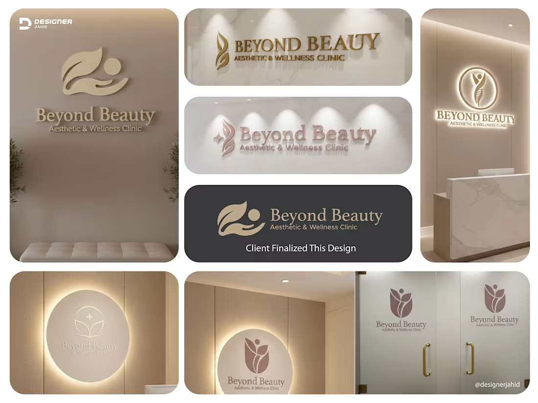
This identity was developed as a complete system, not a single logo. Each version is designed to adapt to different clinic touchpoints while keeping one clear visual language.
The core symbol combines a leaf, a hand, and a human form into one flowing mark. It represents the balance between nature, care, and professional treatment. The leaf speaks to healing, renewal, and wellness. The hand reflects trust, protection, and personalized attention. The human figure places the patient at the center of the experience.
Across the wall logos, reception signage, glass doors, and illuminated panels, the mark maintains its softness and clarity. The rounded shapes and smooth curves create a calming presence, which is essential in a medical and wellness environment. Nothing feels sharp or aggressive.
1
75
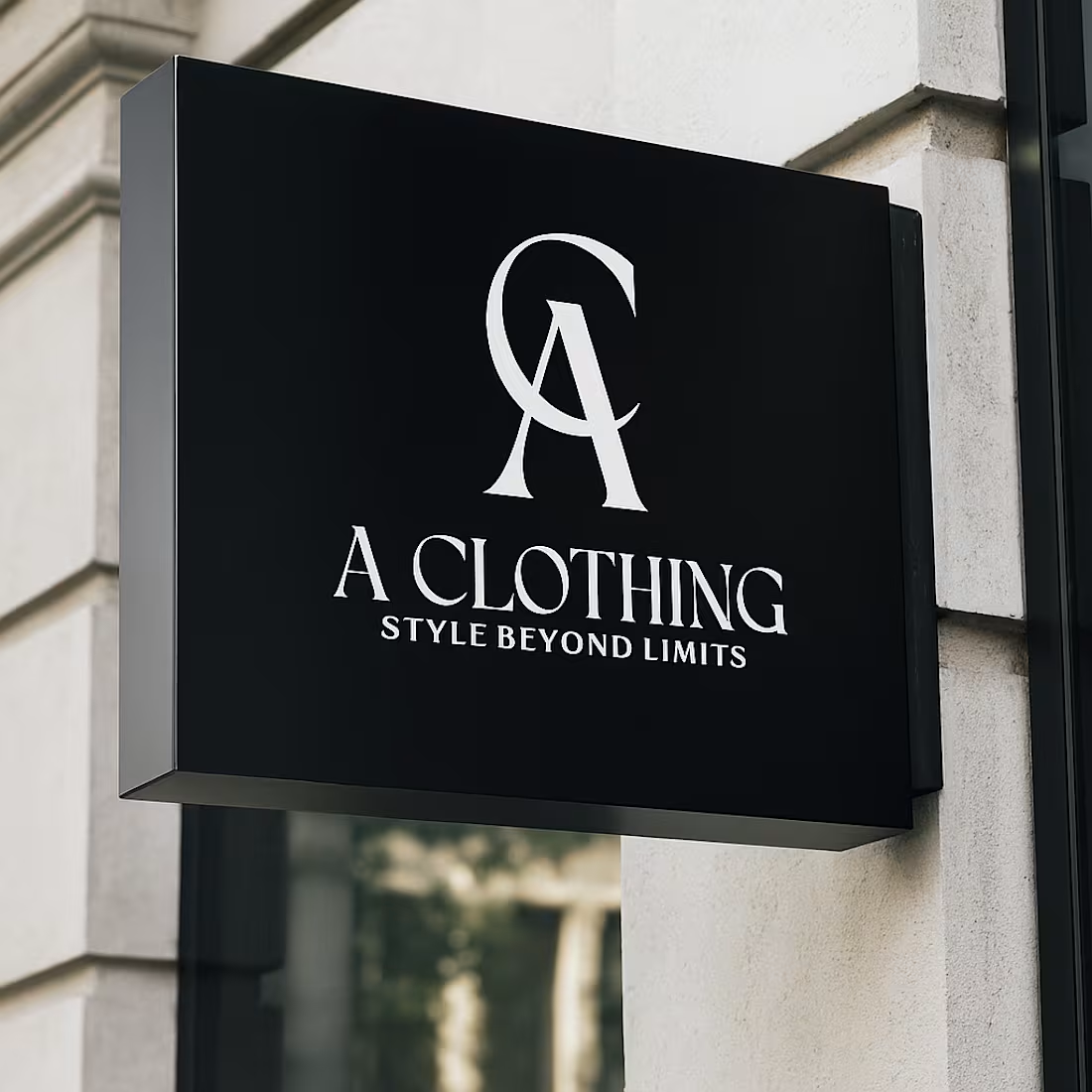
This logo uses a clean, high-fashion approach that leans into confidence and simplicity.
At the top, the interlocked A and C form a strong monogram. The overlap is intentional. It creates a sense of unity and balance while also giving the mark a premium, editorial feel. The sharp serifs and smooth curves suggest elegance, structure, and modern luxury, similar to what you see in high-end fashion houses.
The typography below is spaced and refined. “A CLOTHING” is bold but restrained, which reinforces brand authority without feeling loud. The tagline “STYLE BEYOND LIMITS” is set smaller and lighter, letting the main name lead while clearly communicating ambition and forward thinking.
The black-and-white palette keeps it timeless and versatile. It works equally well on clothing labels, storefronts, packaging, and social media.
2
67
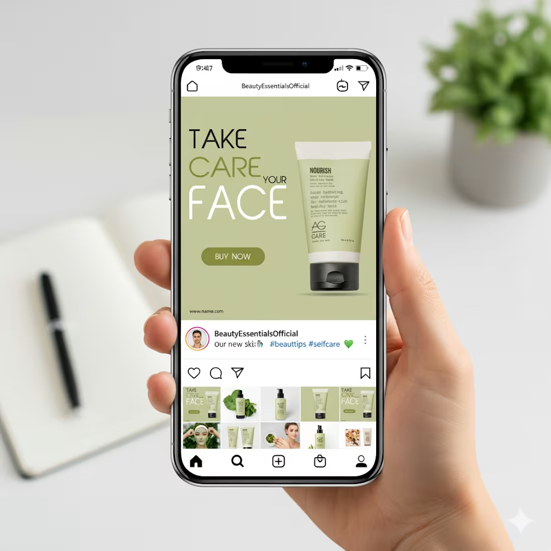
This design focuses on calm, care, and clarity, which fits perfectly with a skincare product.
The soft green background immediately communicates freshness, nature, and hydration. It creates a soothing mood and helps the product feel gentle and trustworthy. Nothing feels loud or aggressive, which is important for beauty and self-care brands.
The typography hierarchy is very intentional.
“FACE” is large and bold to grab attention while scrolling.
“TAKE CARE YOUR” stays lighter so it supports the message without overpowering it. This balance keeps the layout readable and visually clean.
The product is placed on the right with plenty of breathing space. That negative space makes the packaging feel premium and keeps the focus exactly where it should be. The subtle shadow adds depth without making it look heavy or artificial.
3
67
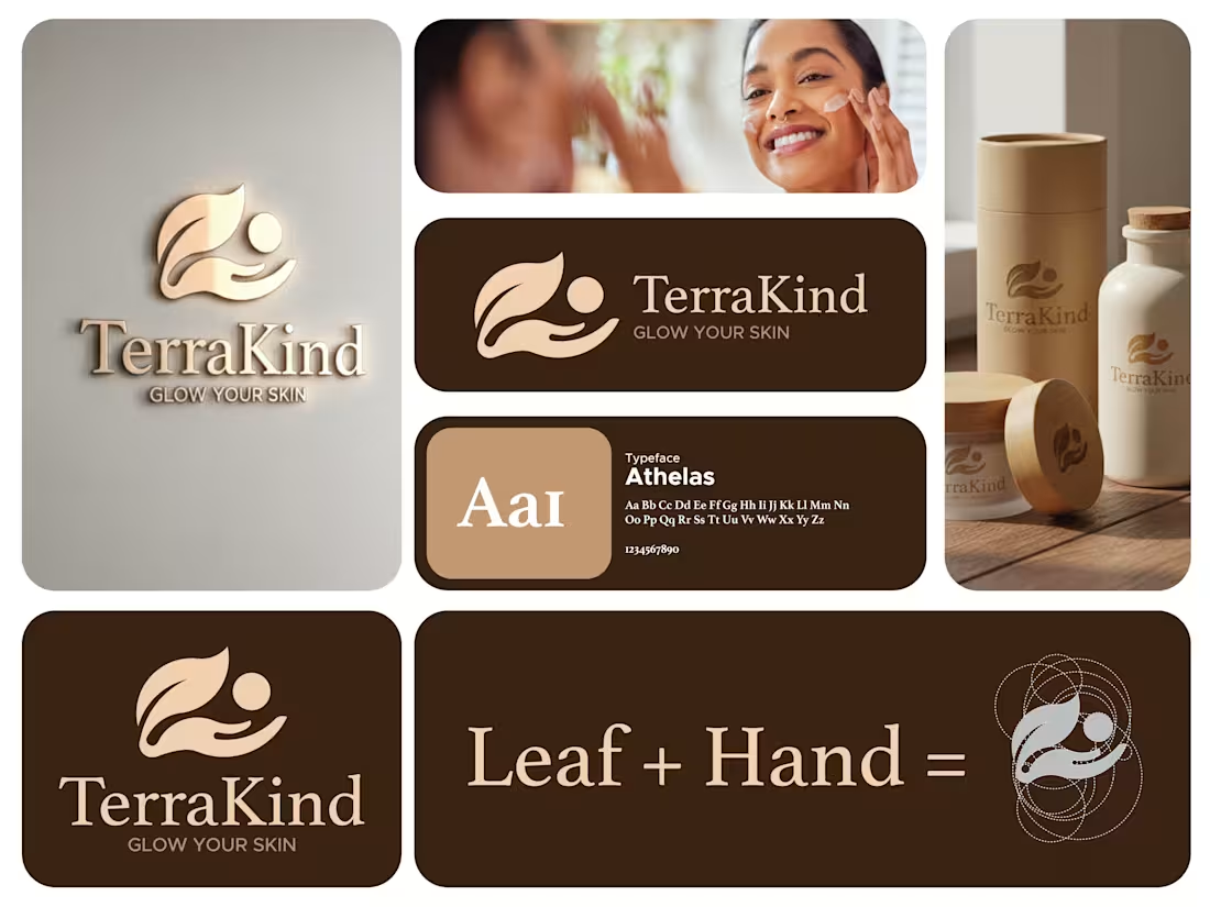
💠 Where Nature Meets Care 💠
A logo isn’t just a symbol — it’s how a brand feels and heals. Here’s my latest design for TerraKind, a premium skincare brand built on organic purity, self-love, and the gentle power of the earth.
The mark is a thoughtful fusion of a Leaf and a Hand, forming a silhouette that represents the harmony between natural ingredients and the human touch. The soft curves and grounded earth tones reflect a commitment to glowing skin and sustainable wellness.
👉 Strong logos don’t just look premium — they tell a story of care. Let’s design an identity that resonates as deeply as your brand's mission.
📧 Email: designerjahid1@gmail.com (mailto:designerjahid1@gmail.com) 📱 WhatsApp: +8801758497793
#LogoDesign #BrandIdentity #TerraKind #SkincareBranding #MinimalLogo #DesignerJahid #BeautyBranding
4
6
136
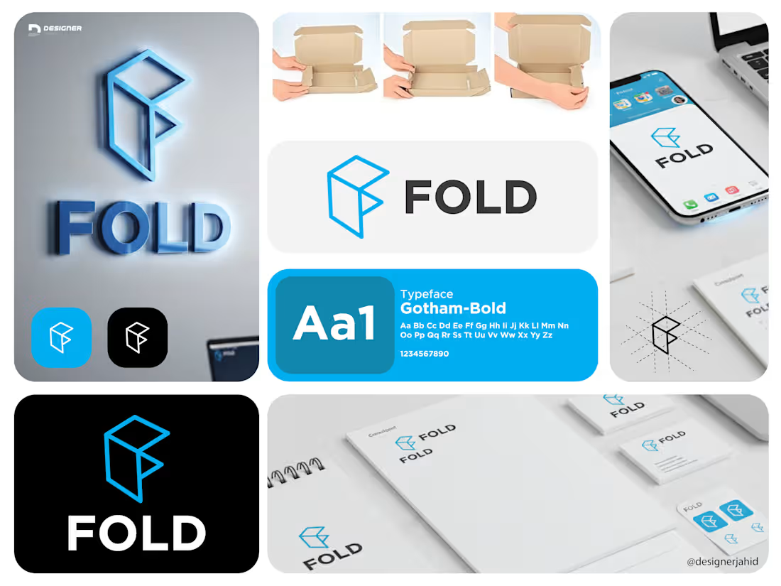
Logo Explanation: FOLD
The FOLD logo is built around the idea of structure, simplicity, and transformation.
The symbol is a geometric mark derived from folded planes, forming an abstract “F”. Its shape is inspired by the physical act of folding, referencing efficiency, organization, and smart use of space. This directly aligns with the brand’s focus on productivity and clarity.
Sharp edges and clean angles give the mark a modern, tech-forward feel, while the balanced proportions keep it simple and memorable. The design avoids unnecessary detail, allowing the logo to remain strong and recognizable at any size.
The typography is bold and minimal, chosen for clarity and confidence. The wordmark complements the icon without competing with it, reinforcing a sense of stability and focus.
3
61
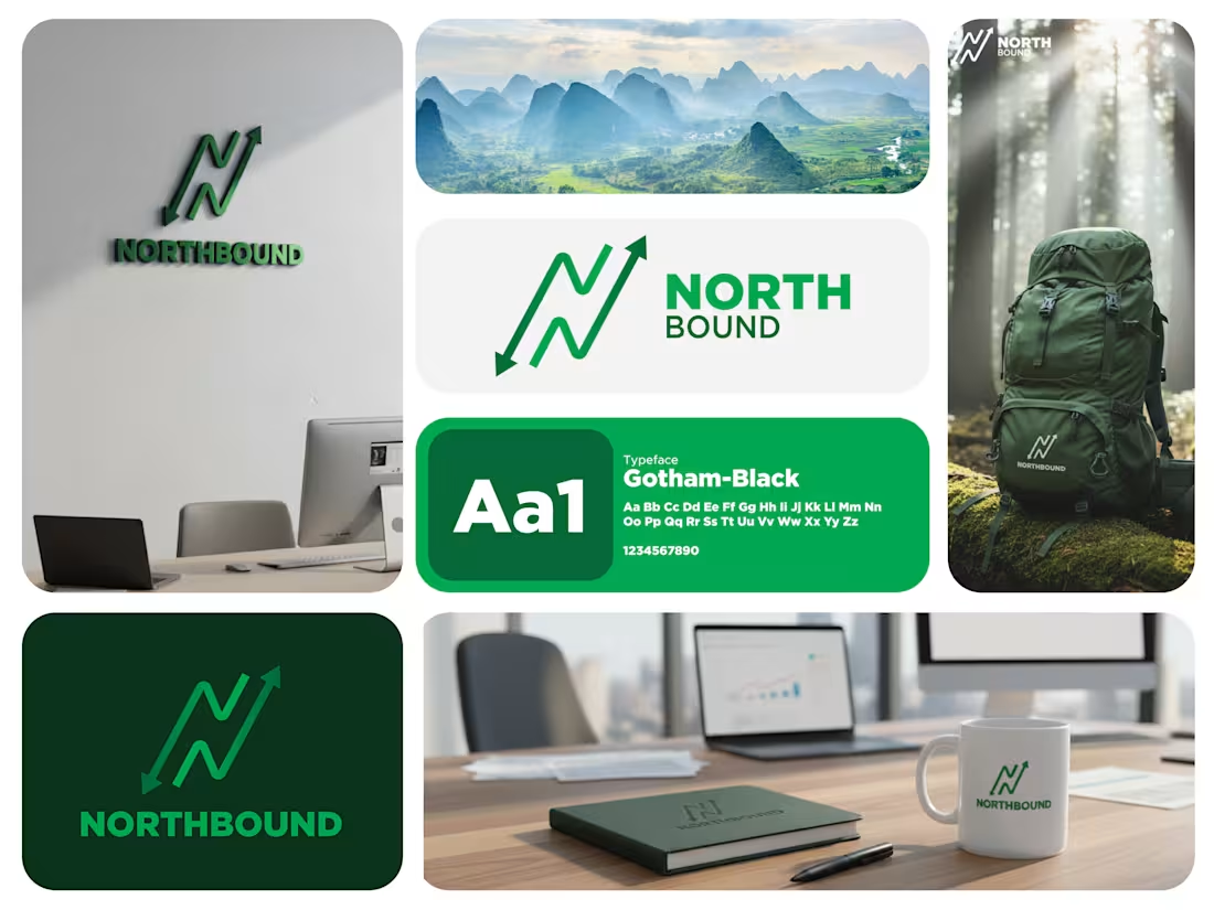
At the center is a custom symbol shaped like the letter “N”, created from a continuous, trail-like line. This form mirrors a hiking path that rises and dips, subtly reflecting terrain, elevation changes, and the natural rhythm of outdoor journeys.
The arrowheads at each end reinforce navigation and purpose. The upward arrow clearly points north, symbolizing progress, discovery, and the drive to move forward into new landscapes. The opposing arrow suggests awareness, preparedness, and respect for the journey, values that are essential in hiking and adventure culture.
The sharp, angular flow of the mark echoes mountain ridges and switchback trails without using literal mountain icons. This keeps the logo clean, modern, and versatile while still feeling rooted in the outdoors. #letternlogo #travellogo
3
4
63
This YouTube thumbnail is designed to be highly eye-catching and is focused on demonstrating a "Glow Effect.
Subject: A smiling, professionally dressed man (in a white shirt and grey tie) is positioned prominently on the right side.
Glow Effect: A vibrant, bright green glow radiates from behind the man, creating a strong contrast against the black background. This immediately draws attention and illustrates the "Glow Effect" mentioned in the text.
Background: The background is a solid black, which maximizes the impact and visibility of the glow and the text.
Text Hierarchy: The text is large and uses high-contrast colors to stand out:
"GLOW" is in a neon green/yellow-green gradient, directly matching the glow effect.
"EFFECT" is in a bold, solid yellow.
"THUMBNAIL" is in white text, slightly smaller, defining the subject matter.
1
57
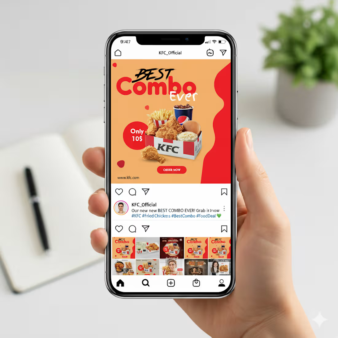
This Instagram post is built to grab attention fast. The layout uses a bold headline that highlights the offer right away, with “Best Combo Ever” placed prominently so viewers instantly understand the message. I used warm tones in the background to make the food look even more appetizing, and the red accents help guide the eye toward key details like the price and the call-to-action.
The combo box sits at the center as the main focus, supported by clean shadows to give it depth. The “Only 10$” badge stands out clearly for quick scanning, and the “Order Now” button at the bottom creates a natural flow that nudges the viewer to take action. Overall, the design is simple, bright, and easy to understand within a second of scrolling.
2
2
57
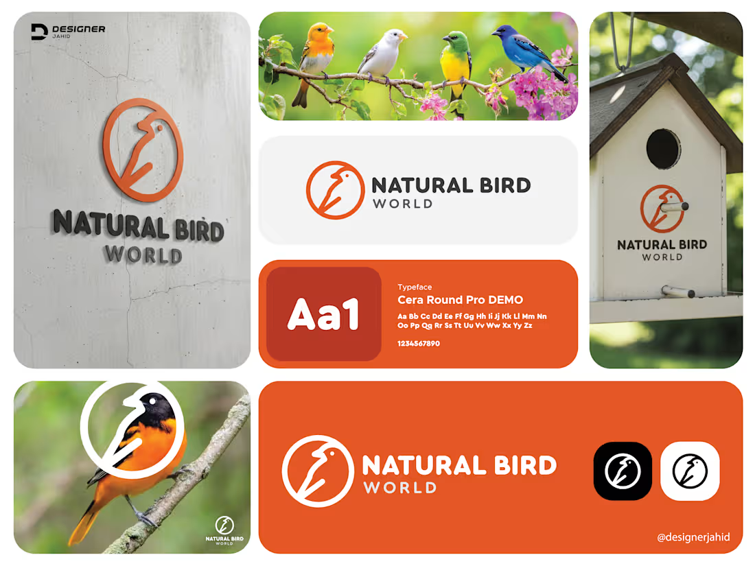
This logo represents Natural Bird World, and my goal was to create something simple, modern, and friendly. I designed a minimal bird symbol using clean lines inside a circular frame. The circle represents harmony, nature, and protection, while the continuous line style gives the bird a soft, natural feel.
The warm orange color brings energy and makes the icon stand out, while the dark grey typography keeps the overall look balanced and professional. The typeface is rounded and smooth, which matches the approachable style of the icon.
Overall, this logo reflects nature, calmness, and trust. It’s easy to recognize, works well at any size, and can be used across branding, packaging, or digital platforms.
#LogoDesign #BrandDesign #BirdLogo #MinimalLogo #LineArtLogo #ModernLogo #GraphicDesigner #DesignerJahid #BrandIdentity
2
7
115
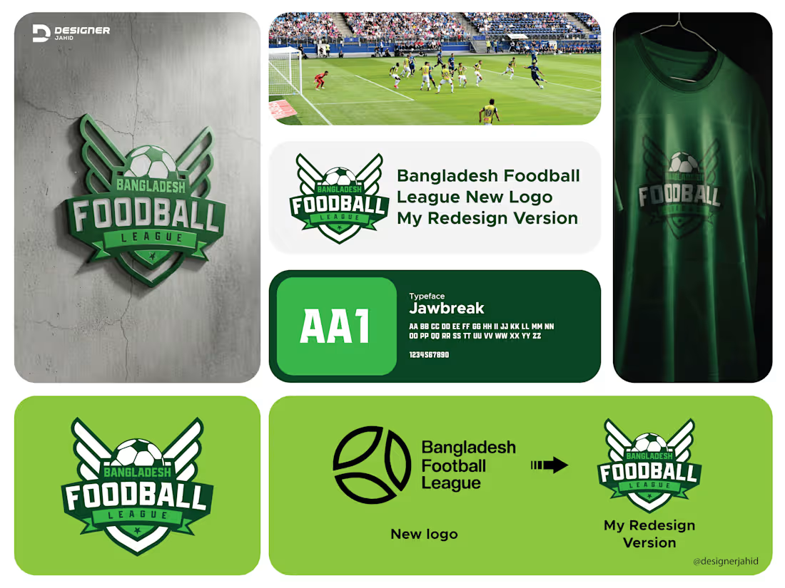
I redesigned the Bangladesh Football League logo with the goal of giving it a stronger identity and a more energetic presence. The original mark felt very minimal and didn’t fully capture the excitement of the sport, so I focused on creating something bold, modern, and meaningful.
At the center, I used a classic football to instantly communicate the purpose of the league. The wings on both sides symbolize speed, ambition, and the competitive spirit of the players. I chose a shield shape to represent strength and unity, which fits well with a national league. The typography is strong and athletic, giving the logo a confident look. I used a green color palette because it’s connected to the field and also aligns well with Bangladesh’s national colors.
6
6
114
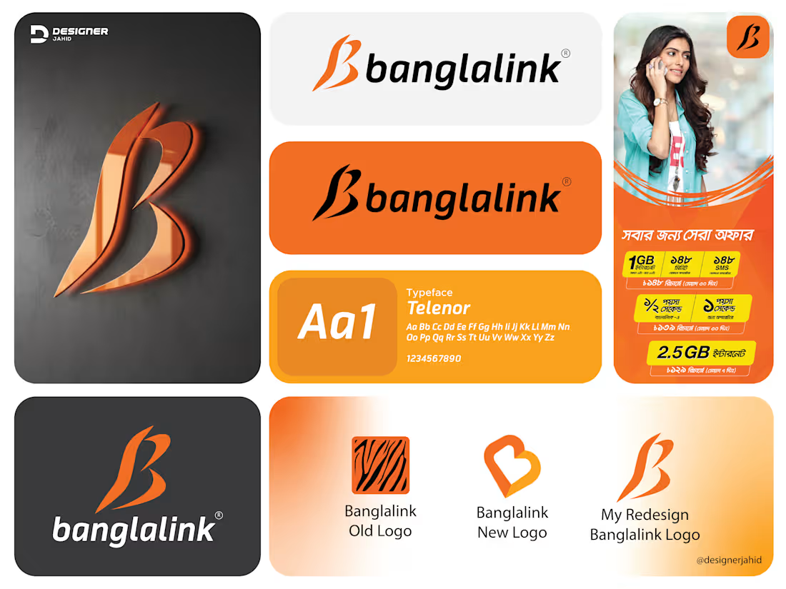
This Banglalink logo redesign is my take on refreshing the brand while keeping its identity intact. I started with the letter B, then shaped it using the flow and sharpness of the Royal Bengal Tiger pattern. Since the tiger has always been an important part of Banglalink’s branding, I wanted to bring that symbolism forward in a cleaner, more modern way.
The curves you see in the logo come from the motion and energy of tiger stripes. They make the mark feel fast, bold, and confident, which matches Banglalink’s personality as a dynamic telecom brand. I kept the signature orange tone because it’s instantly recognizable and gives the logo a strong visual presence.
#banglalinknewlogo #banglalinklogoredesign #letterblogo #monogramlogo #combinationmarklogo #letterlogo #alphabetlogo
2
3
91
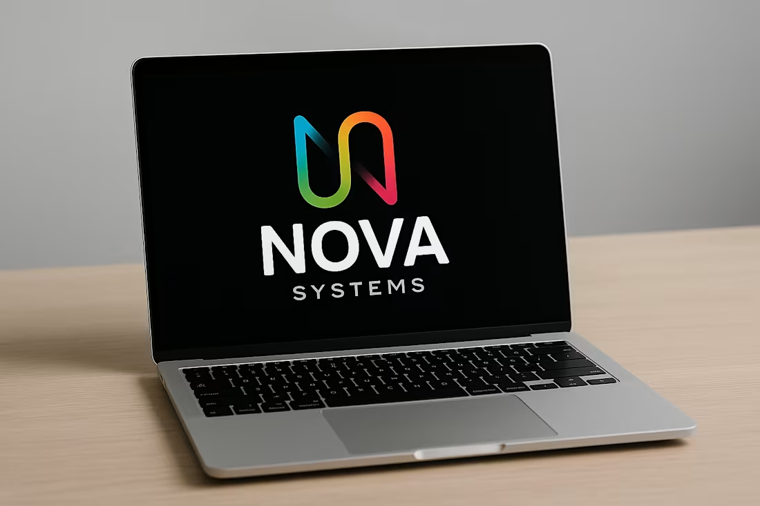
Letter N and S Combine Nova System Technology logo design 2025.
🔹 Concept Overview
The logo combines creativity and logic — perfect for a tech or innovation-based company like Nova Systems. It uses a custom monogram where the letters “N” and “S” are merged into one continuous, flowing shape.
🔹 Symbol Meaning
The main shape forms the letter “N”, which represents Nova.
With a subtle curve and gradient flow, it also hints at an “S”, connecting to Systems.
Together, it forms a single symbol that shows unity, innovation, and forward movement — key traits for a modern tech brand.
🔹 Hidden Detail
At the bottom, the designer has highlighted how:
N = the main symbol, and
S = the same symbol rotated or adapted, showing how both letters are cleverly built from the same base form — a smart, consistent design system.
1
78
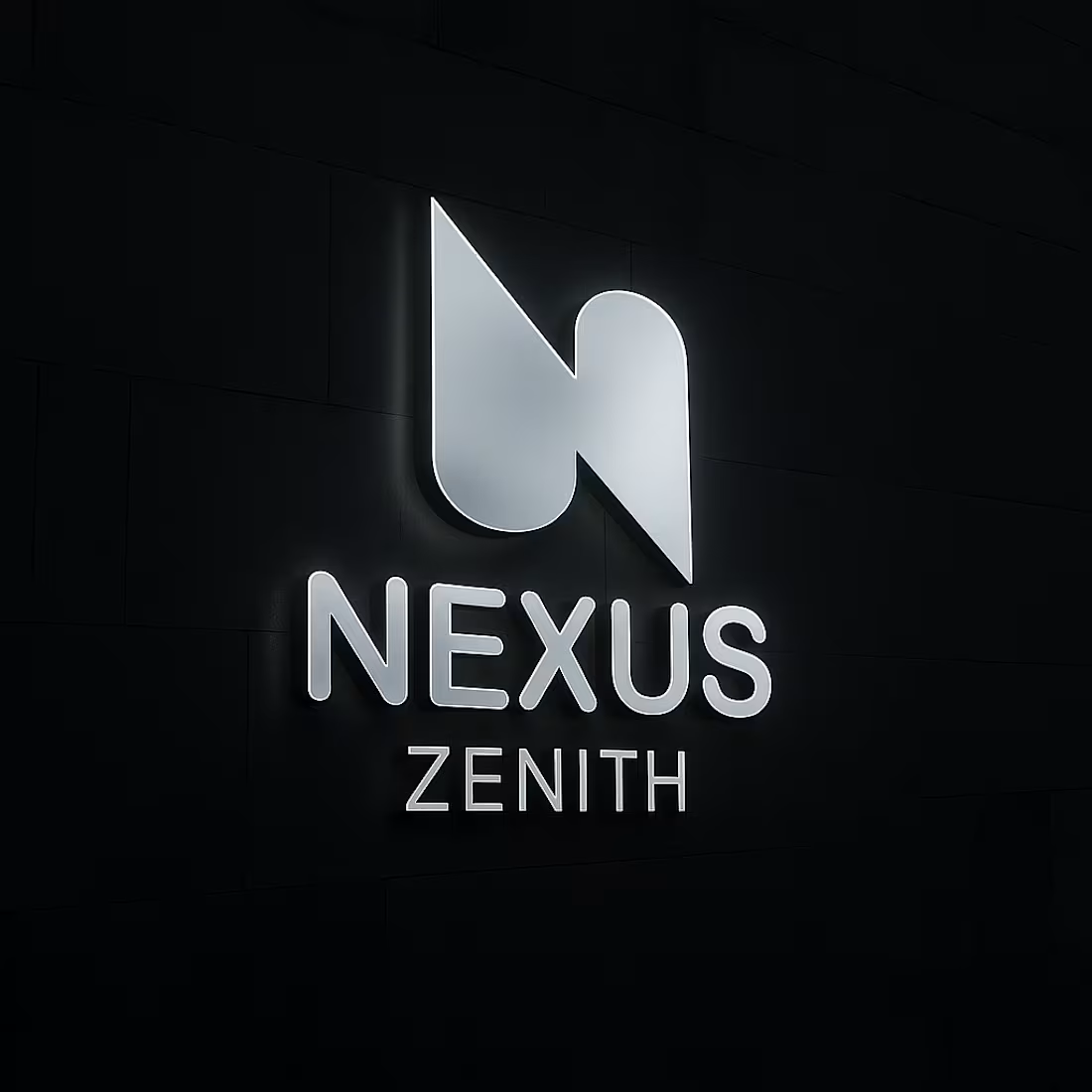
Letter N and Z combine Nexus Zenith Technology Company Logo.
The NEXUS ZENITH logo you shared is a clean, modern design with smart geometric symbolism and strong visual logic. Here’s a breakdown of its structure and meaning:
1. Primary Symbol
The main mark is an abstract, minimalist shape that cleverly combines:
The letter “N” for Nexus
The letter “Z” for Zenith
The designer achieved this by merging two mirrored shapes:
The left side forms a diagonal and a curve that represent half of the letter N.
The right side mirrors this but is flipped vertically, subtly creating the Z when viewed together.
This duality symbolizes connection and unity—fitting for the word Nexus (which means a link or bond).
Concept Summary
N = Nexus → Connection, unity
Z = Zenith → Peak, excellence
The fusion of N and Z visually represents the brand’s theme
1
63
I can create every type of logo design and marketing materials for your company.
1
67
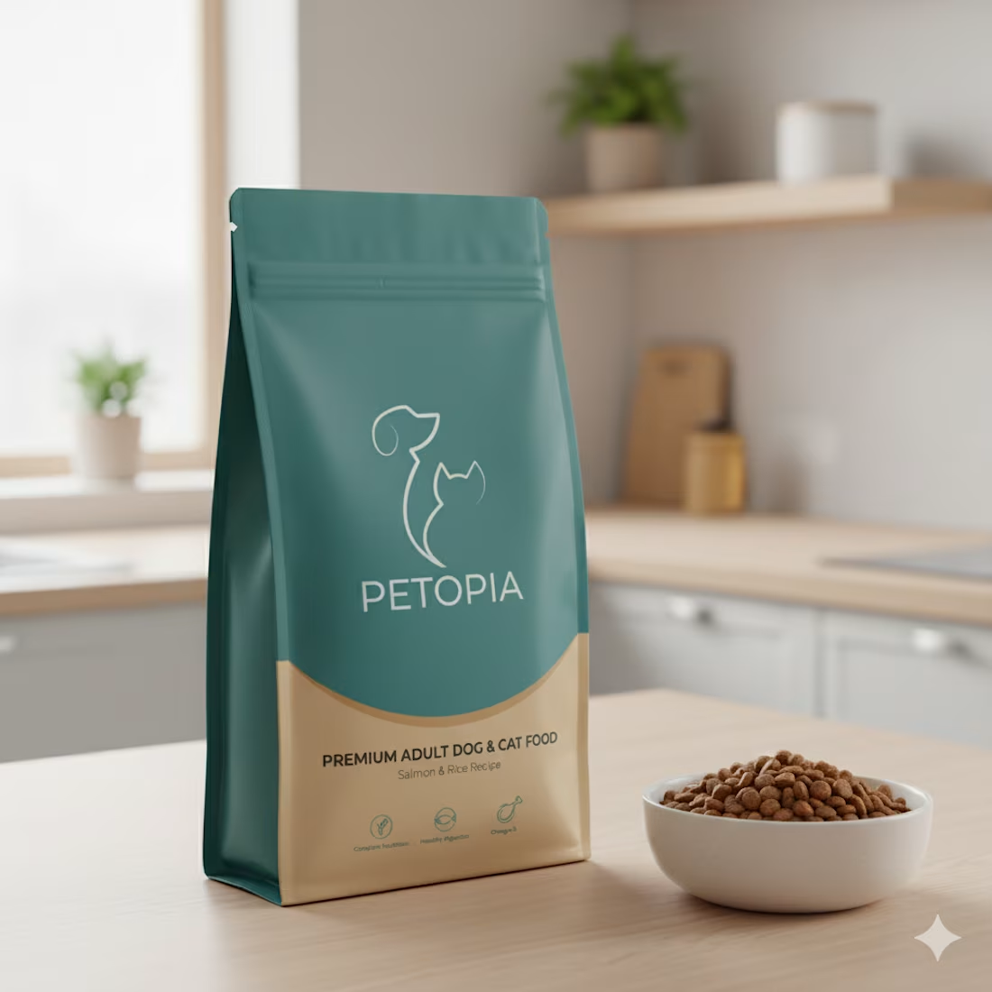
The design merges a cat and a dog into one continuous, flowing outline — their shapes form a plant-like silhouette, suggesting growth, care, and life. It captures the essence of harmony between pets and nature, aligning with the idea of nurturing animals lovingly and naturally.
Design Breakdown
Combined Silhouette: The dog and cat share a single curved line that connects them, emphasizing unity and companionship.
Floral Suggestion: The overall contour subtly resembles a plant stem with buds or leaves, representing growth, vitality, and natural well-being.
Typography: “PETOPIA” is written in clean, geometric sans-serif letters — modern, balanced, and easy to read. The typography complements the logo’s minimal line art.
Color: The teal/green tone suggests freshness, trust, and calm, all qualities tied to pet care and wellness.
1
47
