Aesthetic & Wellness Clinic Identity Design
Md Zahid Hasan Khan

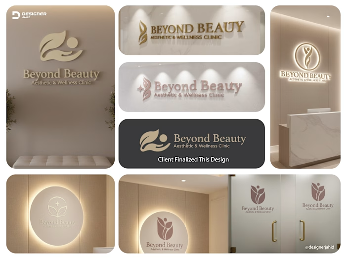
This identity was developed as a complete system, not a single logo. Each version is designed to adapt to different clinic touchpoints while keeping one clear visual language.
The core symbol combines a leaf, a hand, and a human form into one flowing mark. It represents the balance between nature, care, and professional treatment. The leaf speaks to healing, renewal, and wellness. The hand reflects trust, protection, and personalized attention. The human figure places the patient at the center of the experience.
Across the wall logos, reception signage, glass doors, and illuminated panels, the mark maintains its softness and clarity. The rounded shapes and smooth curves create a calming presence, which is essential in a medical and wellness environment. Nothing feels sharp or aggressive.
The color palette stays within ivory, beige, nude, and soft gold tones, reinforcing a sense of luxury without excess. These colors work beautifully with lighting, marble textures, and neutral interiors, making the clinic feel premium, warm, and welcoming.
Typography is elegant but controlled. “Beyond Beauty” feels refined and reassuring, while “Aesthetic & Wellness Clinic” grounds the brand in credibility and professionalism.
Together, these logo applications show flexibility, consistency, and purpose. The brand feels calm, trustworthy, and elevated, exactly what clients expect when they walk into an aesthetic and wellness clinic.
Like this project
Posted Feb 21, 2026
This identity was developed as a complete system, not a single logo. Each version is designed to adapt to different clinic touchpoints while keeping one clear