This identity was developed as a complete system, not a sing...
Md Zahid Hasan Khan
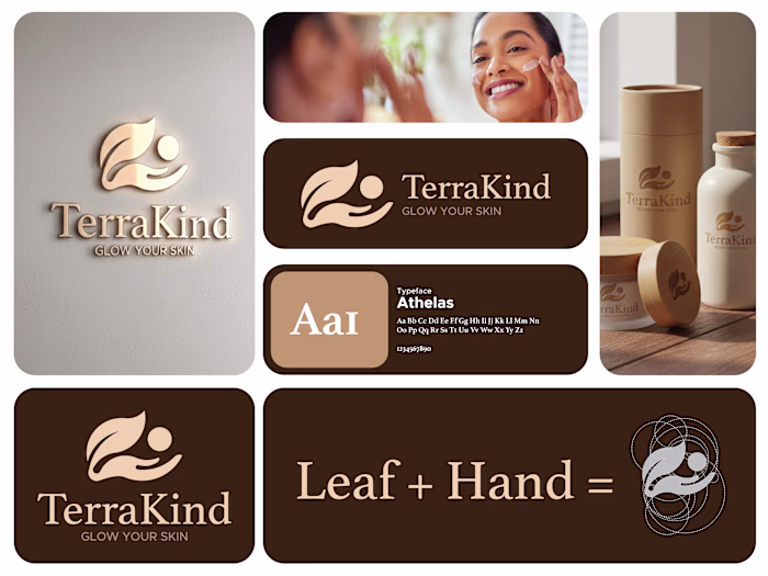
This identity was developed as a complete system, not a single logo. Each version is designed to adapt to different clinic touchpoints while keeping one clear visual language.
The core symbol combines a leaf, a hand, and a human form into one flowing mark. It represents the balance between nature, care, and professional treatment. The leaf speaks to healing, renewal, and wellness. The hand reflects trust, protection, and personalized attention. The human figure places the patient at the center of the experience.
Across the wall logos, reception signage, glass doors, and illuminated panels, the mark maintains its softness and clarity. The rounded shapes and smooth curves create a calming presence, which is essential in a medical and wellness environment. Nothing feels sharp or aggressive.
Like this project
Posted Jan 27, 2026
This identity was developed as a complete system, not a single logo. Each version is designed to adapt to different clinic touchpoints while keeping one clea...
Likes
0
Views
1