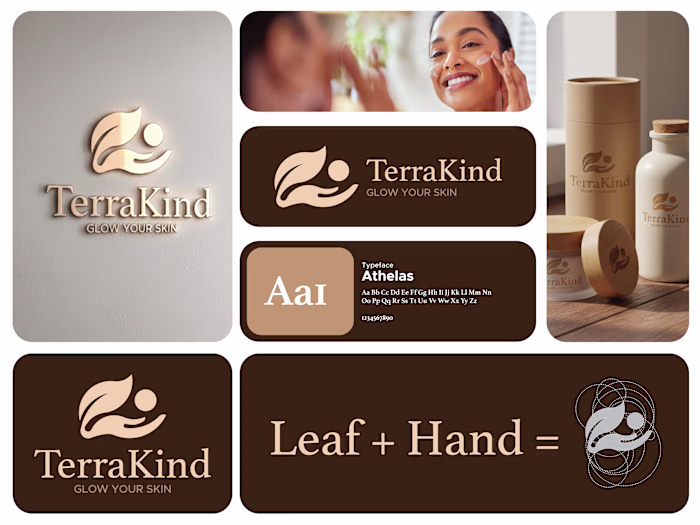
This design focuses on calm, care, and clarity, which fits p...
Md Zahid Hasan Khan
This design focuses on calm, care, and clarity, which fits perfectly with a skincare product.
The soft green background immediately communicates freshness, nature, and hydration. It creates a soothing mood and helps the product feel gentle and trustworthy. Nothing feels loud or aggressive, which is important for beauty and self-care brands.
The typography hierarchy is very intentional.
“FACE” is large and bold to grab attention while scrolling.
“TAKE CARE YOUR” stays lighter so it supports the message without overpowering it. This balance keeps the layout readable and visually clean.
The product is placed on the right with plenty of breathing space. That negative space makes the packaging feel premium and keeps the focus exactly where it should be. The subtle shadow adds depth without making it look heavy or artificial.
Like this project
Posted Jan 14, 2026
This design focuses on calm, care, and clarity, which fits perfectly with a skincare product. The soft green background immediately communicates freshness, n...
Likes
0
Views
0