
Md Mehdi Hasan
UI UX designer | UI/UX Design | Webflow | Figma | Framer
- 5.00
- Rating
- 139
- Followers
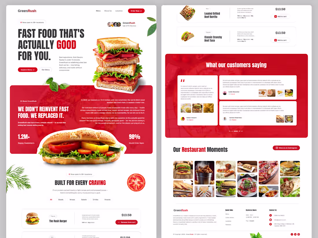
GreenRush – Modern Fast Food & Restaurant Website Template
Description
GreenRush is a modern and visually engaging fast food restaurant website template designed for burger shops, cafes, healthy food brands, and modern restaurants. Featuring a bold typography style, vibrant food visuals, customer reviews, menu showcases, and interactive sections, this template delivers a premium user experience that helps food businesses stand out online. Perfect for restaurants looking for a clean, conversion-focused, and development-ready design.
Template Highlights
Modern & Clean Restaurant UI Design
Eye-Catching Hero Section
Interactive Food Menu Layout
Customer Testimonial Section
Instagram Food Gallery
Fully Responsive Structure
Conversion-Focused CTA Buttons
Perfect for Fast Food, Cafes & Restaurants
1920px Desktop Layout
Organized Auto Layout & Components
Easy to Customize in Figma
Development Ready Design System
0
119
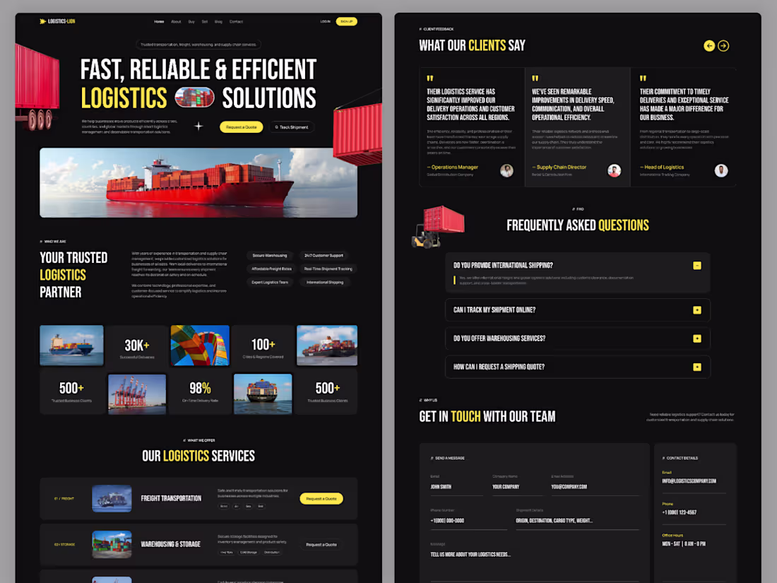
Logistics-Lion — Dark Logistics Website UI/UX Template
Logistics-Lion is a modern dark-themed one-page logistics website template designed in Figma for cargo, freight, shipping, warehouse, and transportation businesses. Featuring a clean UI, bold typography, shipment tracking sections, responsive layouts, and conversion-focused design. Perfect for logistics startups and supply chain companies looking for a professional web presence.
#logistics #darkui #webdesign #uidesign #uxdesign #figma #landingpage #shipping #cargo #transportation #supplychain #modernui #websiteinspiration #uiux #darktheme
1
154
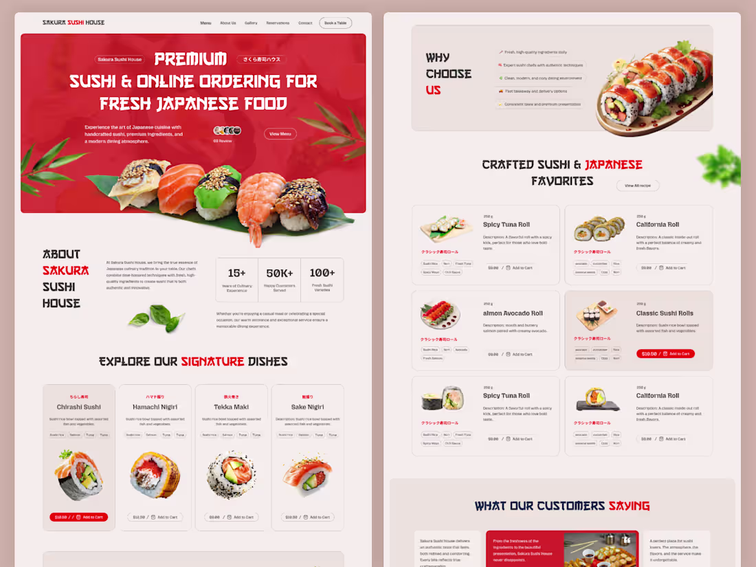
Sakura Sushi House – Japanese Restaurant Landing Page Figma Template (1920px)
Sakura Sushi House is a modern and visually engaging Japanese restaurant landing page Figma template designed for sushi bars, Asian restaurants, food delivery services, and online ordering platforms. Built on a 1920px wide layout, this template delivers a premium, full-width browsing experience with a bold hero section, menu showcase, food cards, testimonials, reservation CTA, gallery, and contact sections.
Crafted with clean structure, strong typography, and high-quality visuals, the design uses Auto Layout for easy customization and efficient workflow. Ideal for designers, developers, and restaurant businesses looking for a professional and conversion-focused website design.
3
253
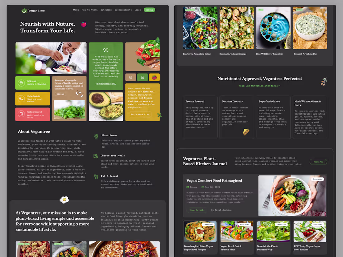
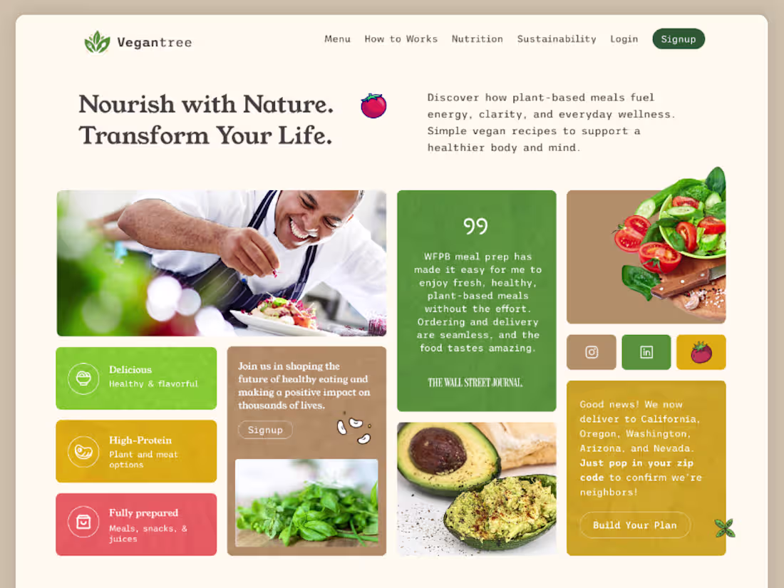
Vegantree Vegan Food & Nutrition Website Figma Template UI
Vegantree is a modern and visually engaging plant-based meal and nutrition website Figma template designed for healthy food brands, vegan restaurants, meal prep services, and wellness platforms. Built on a 1440px wide layout, this template offers a balanced and elegant design with a strong focus on lifestyle, sustainability, and nutrition.
The layout features a bold hero section, meal showcases, feature highlights, blog/journal section, testimonials, and social media integration—creating a complete user experience for food and wellness businesses. With clean typography, soft color palettes, and high-quality imagery, Vegantree delivers a fresh and organic visual identity.
Designed using Auto Layout, the template is fully customizable, well-organized, and ideal for designers and developers looking to create a professional, conversion-focused website in the health and wellness niche.
1
2
254
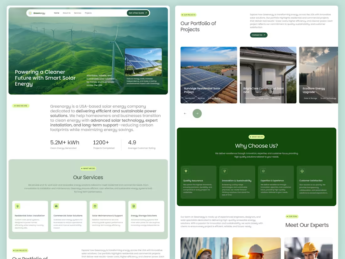
Greenargy – Renewable Energy & Solar Solutions Template
Greenargy is a modern and high-performance Figma template designed for solar and renewable energy businesses. It features clean layouts, conversion-focused sections, and scalable components—perfect for showcasing services, projects, and sustainable solutions across the USA market.
4
528
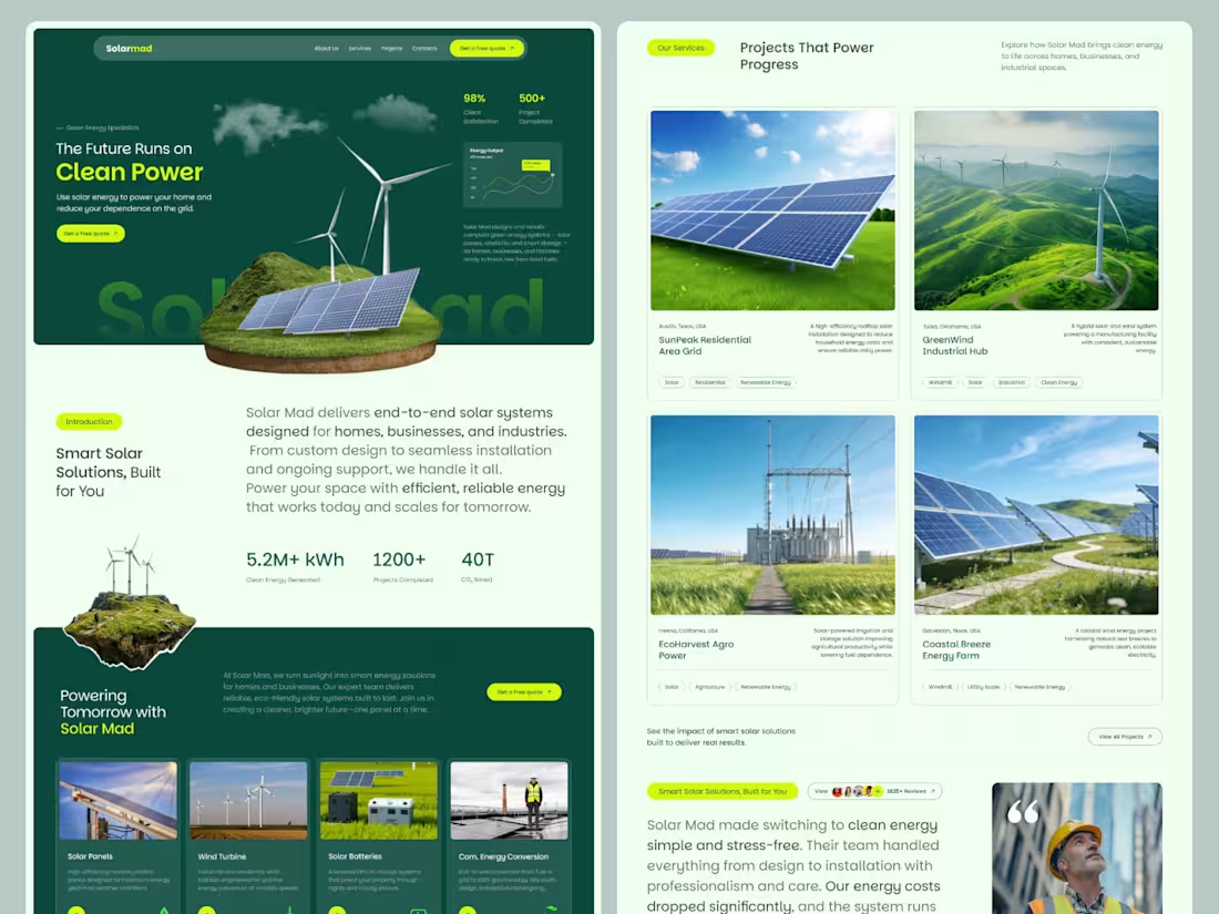
Modern Solar and Renewable Energy Website Template
Solarmad is a clean, modern one-page website template designed for solar and renewable energy businesses. Built on a 1920px wide layout, it combines bold visuals with a structured flow to showcase services, projects, and brand value. Perfect for companies looking to present sustainable energy solutions with clarity, professionalism, and impact.
Features:
- 1920px full-width, modern and responsive layout
- Clean, minimal design with strong visual hierarchy
- Hero section with call-to-action
- Services, projects, and testimonials sections
- Smooth scrolling one-page navigation
- Optimized for performance and fast loading
- Easy to customize structure and content
- SEO-friendly and well-organized layout
3
232
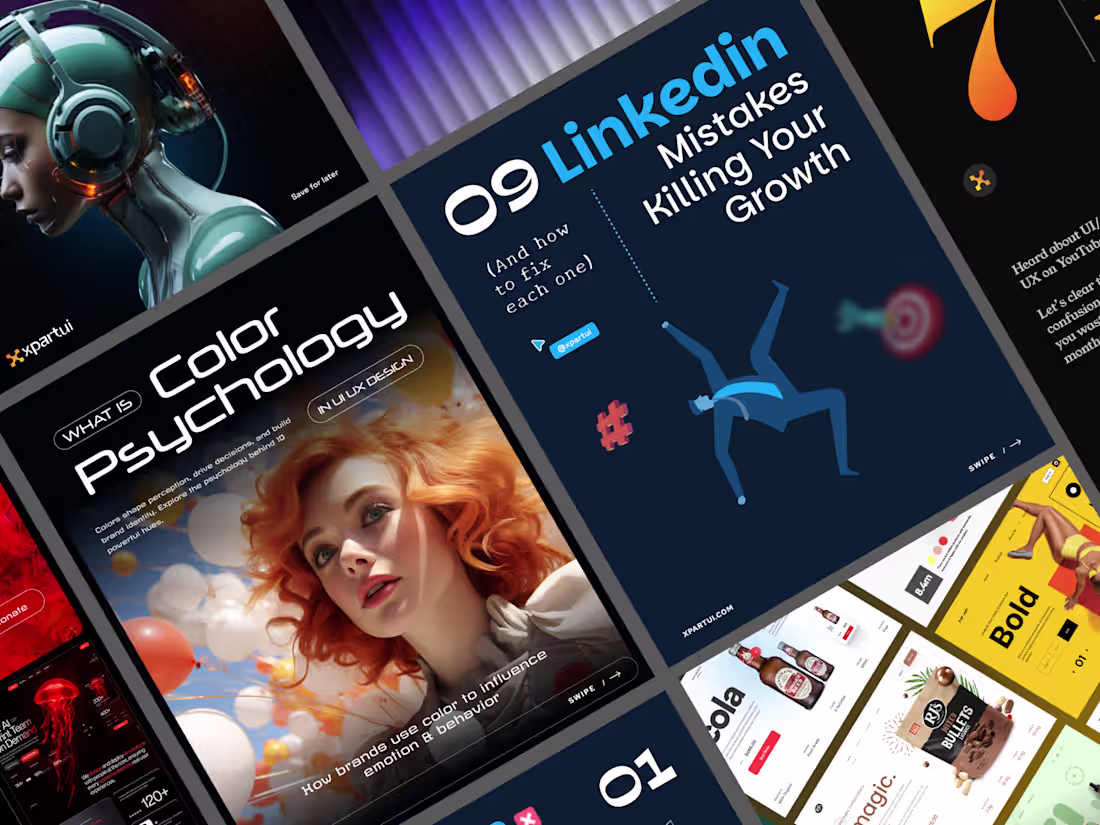
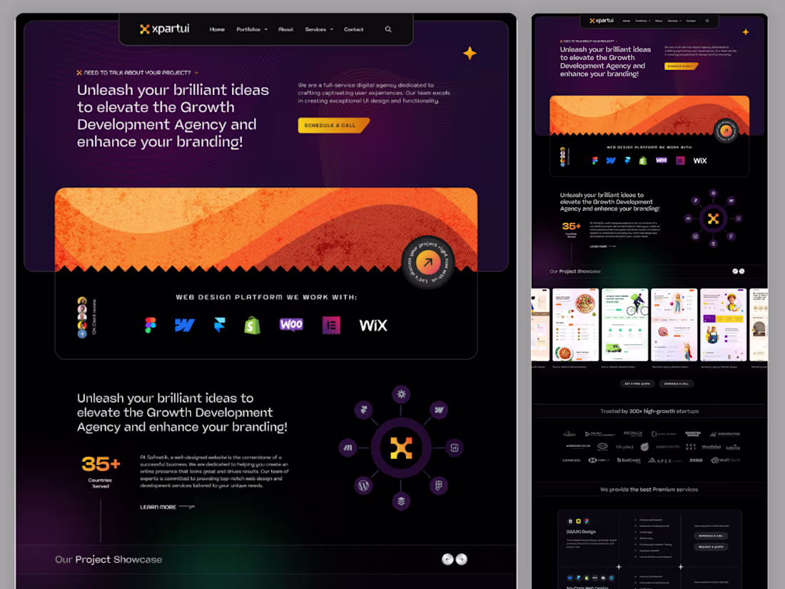
Instagram Carousel Design Projects for XpartUI
A collection of high-impact Instagram carousel designs created for XpartUI, focused on storytelling, engagement, and brand consistency. Each slide is crafted to capture attention, deliver value, and guide users through a seamless visual journey—perfect for boosting reach, interaction, and conversions on social media.
1
5
494
FlowChefs Vegan Platform Design
3
4
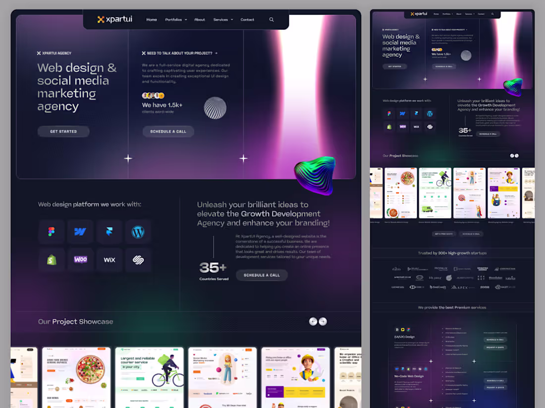
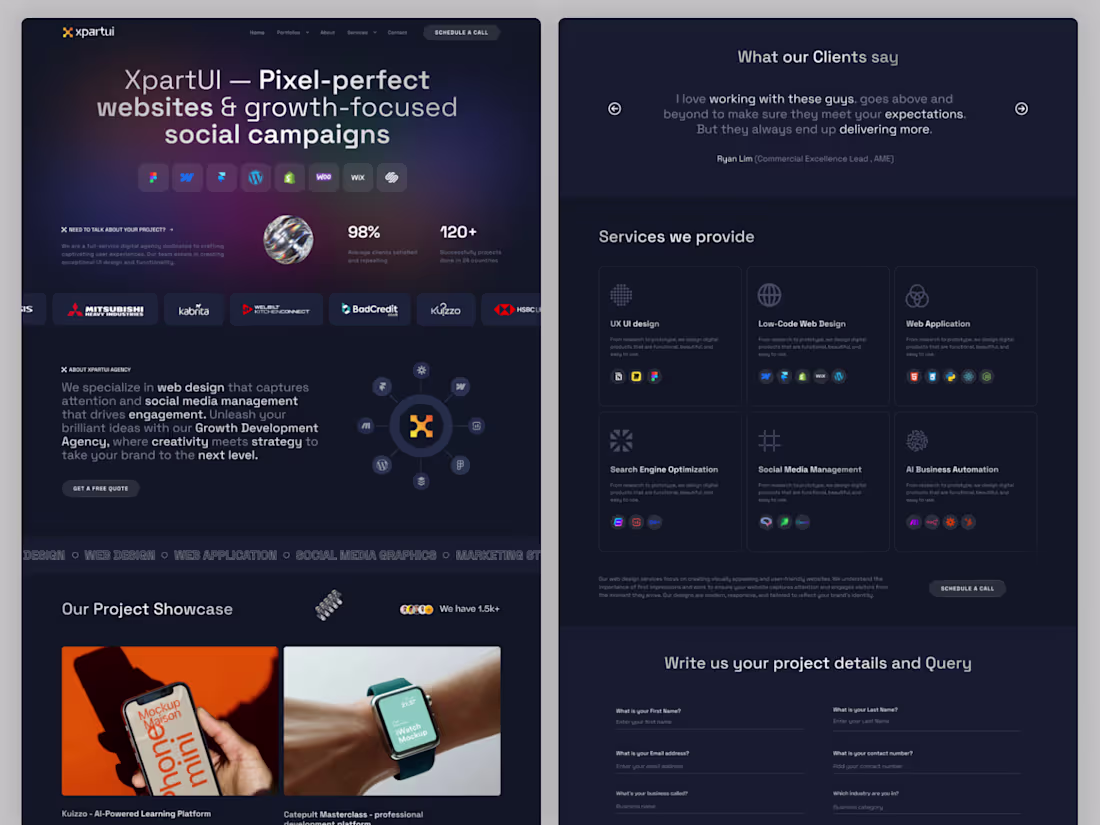
XpartUI – Website UI/UX Design Crafted in Figma
XpartUI is a modern design and development agency specializing in high-quality website UI/UX design using Figma. We create clean, user-centered interfaces with pixel-perfect precision, ensuring seamless user experiences and developer-ready designs. Our Figma-based workflow allows for efficient collaboration, rapid prototyping, and scalable design systems tailored for business growth.
1
4
455
Vegantree – Vegan Recipe & Food Blog One Page Figma Template
Description:
Vegantree is a modern, clean, and visually engaging one-page Figma template designed for vegan recipe sharing platforms, food blogs, and healthy lifestyle websites. Built on a 1440px grid with a 12-column layout, it ensures a well-balanced and responsive design structure. This template includes beautifully crafted sections for featured recipes, categories, blog posts, and user engagement, making it ideal for content creators and food enthusiasts. With organized layers, auto layout, and reusable components, Vegantree helps you design and launch a professional vegan food website quickly and efficiently.
1
3
125
Ecommerce website design idea...
6
518
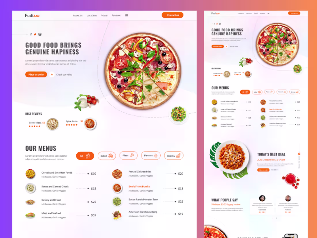
Fudizza – Modern Food & Restaurant Website Template
Fudizza is a stylish and user-friendly website template designed for food businesses, restaurants, and cafes. With a clean UI/UX, appetizing visuals, and smooth navigation, it helps showcase menus, highlight dishes, and drive online orders—creating a delightful digital experience for customers.
3
406
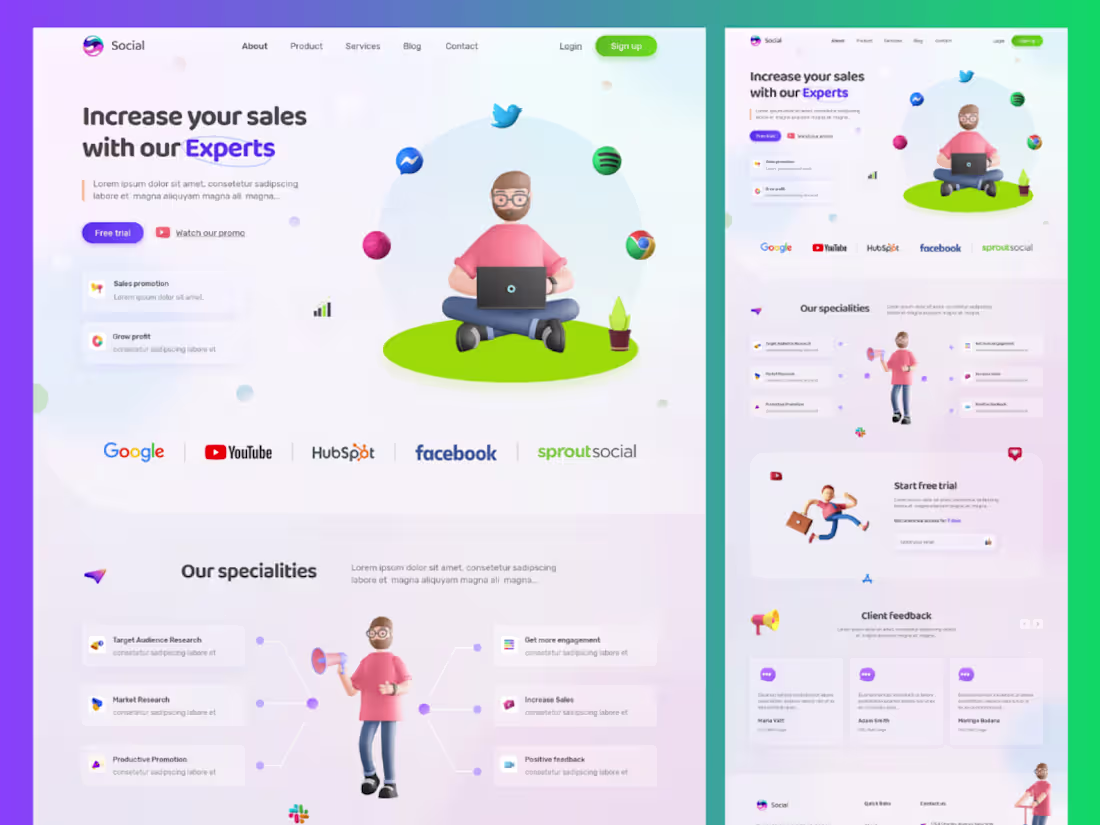
SocialBoost – Social Media Marketing Website Template
SocialBoost is a modern and conversion-focused website template designed for social media marketing agencies, digital marketers, and personal brands. With clean layouts, engaging visuals, and strategic UX, it helps showcase services, case studies, and client success stories effectively. Perfect for building a strong online presence and turning visitors into loyal clients.
#socialmedia #websitedesign #agency #marketingagency
3
286
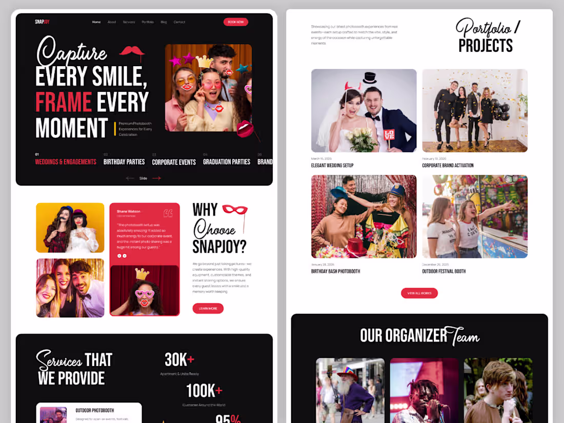
Modern Photobooth Rental Website – One Page Figma Template
A sleek and modern one-page website template designed for photobooth rental and photo-based businesses. This Figma template features a clean layout, engaging sections, and conversion-focused design to help showcase services, portfolio, and client experiences effortlessly. Perfect for event photographers, photobooth owners, and creative agencies looking for a stylish online presence.
#FigmaTemplate #WebDesign #UIDesign #LandingPage #OnePageWebsite #Photobooth #PhotographyWebsite #CreativeDesign #UXDesign #WebsiteTemplate #ModernDesign #PortfolioWebsite #EventBusiness #DigitalProduct #UIUX
2
227
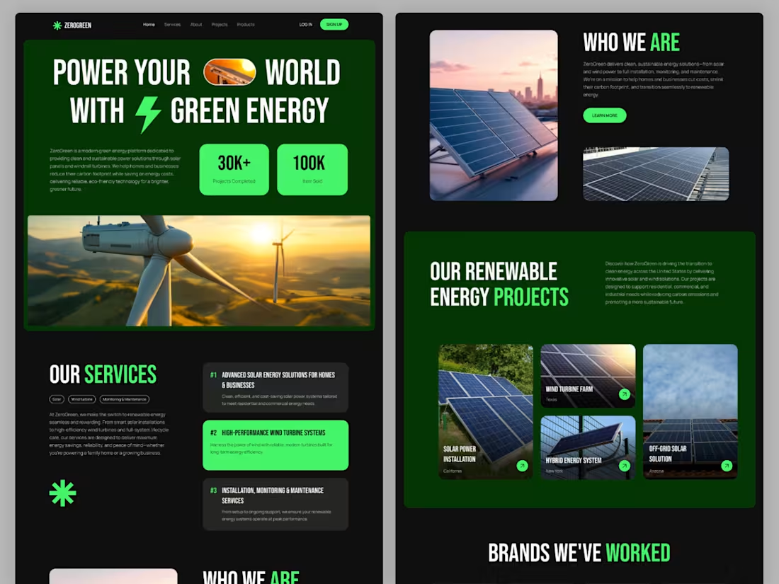
ZeroGreen Solar Energy – Modern Home Page Figma Template
ZeroGreen is a clean, modern, and development-ready 1440px wide Figma template designed for renewable energy websites. Built with a fully structured Auto Layout system, this one-page home design is perfect for solar and wind energy businesses. It offers a professional, scalable, and easy-to-customize layout, making it ideal for fast development and seamless UI-to-code conversion.
#ZeroGreen #SolarEnergy #RenewableEnergy #GreenEnergy #WindTurbine #FigmaTemplate #UIUXDesign #WebDesign #LandingPageDesign #ModernWebsite #CleanDesign #AutoLayout #DevelopmentReady #SustainableEnergy #EcoFriendlyTech
4
283
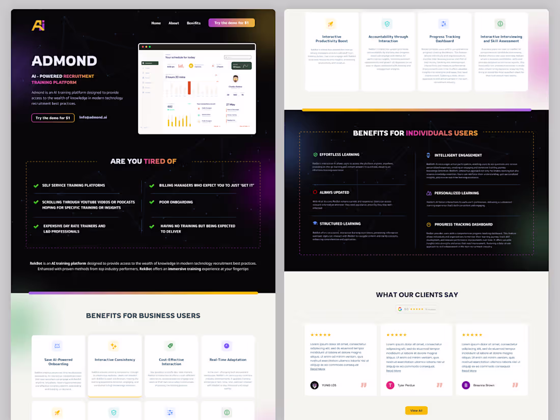
Admond – AI-Powered HR Training SaaS Landing Page
Admond is a modern SaaS landing page designed for an AI-driven HR training platform. Built to streamline employee development and onboarding, the design highlights intelligent automation, personalized learning paths, and performance tracking. With a clean UI, strong visual hierarchy, and conversion-focused sections, it effectively communicates value while driving engagement and sign-ups.
2
276
🍽️ Food, Restaurant, Café & Chef Website Design
We design modern and appetizing websites for restaurants, cafés, and food businesses that showcase menus, highlight signature dishes, and attract more customers. Our UI/UX approach focuses on visual storytelling, easy navigation, and seamless online ordering to create a delightful digital dining experience.
5
456
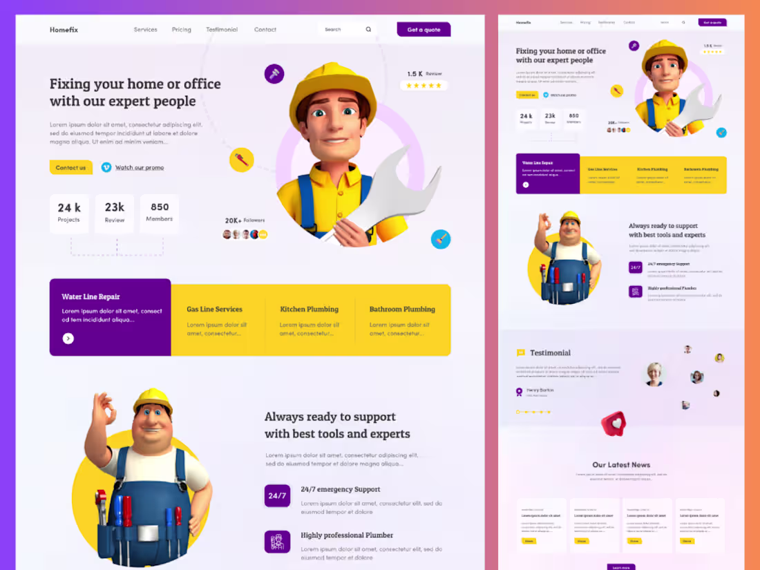
HomeFix – Plumber & Home Services Website Template
HomeFix is a clean and professional website template crafted for plumbers and home service businesses. Designed to build trust and generate leads, it features service showcases, booking sections, customer testimonials, and clear call-to-actions. With a user-friendly layout and modern UI, HomeFix helps businesses present their expertise and connect with customers effortlessly.
3
246
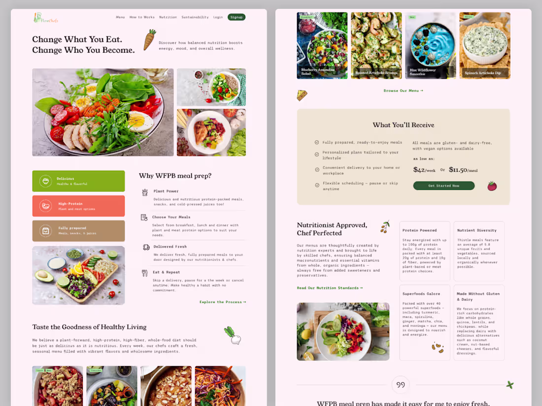
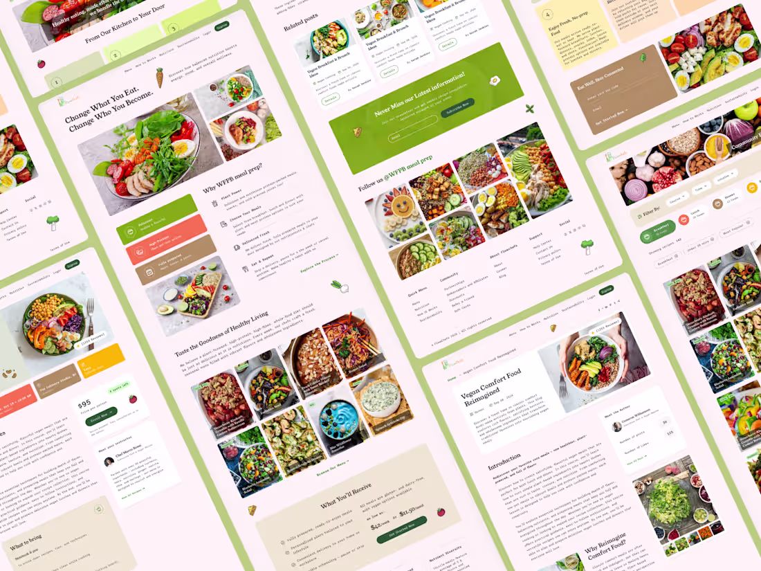
FlowChefs – Vegan Food Platform 🌱
We recently designed FlowChefs, a modern and user-friendly platform focused on vegan food lovers. This project includes a complete website and dashboard experience, combining recipe discovery, food delivery, and engaging blog content in one seamless ecosystem.
Our goal was to create a visually appealing, easy-to-navigate interface that enhances user experience while promoting healthy, plant-based living. From intuitive browsing to smooth order management, every detail was crafted with clarity, functionality, and aesthetic balance in mind.
3
437
XpartUI – Website UI/UX Design Crafted in Figma
XpartUI is a modern design and development agency specializing in high-quality website UI/UX design using Figma. We create clean, user-centered interfaces with pixel-perfect precision, ensuring seamless user experiences and developer-ready designs. Our Figma-based workflow allows for efficient collaboration, rapid prototyping, and scalable design systems tailored for business growth.
2
250
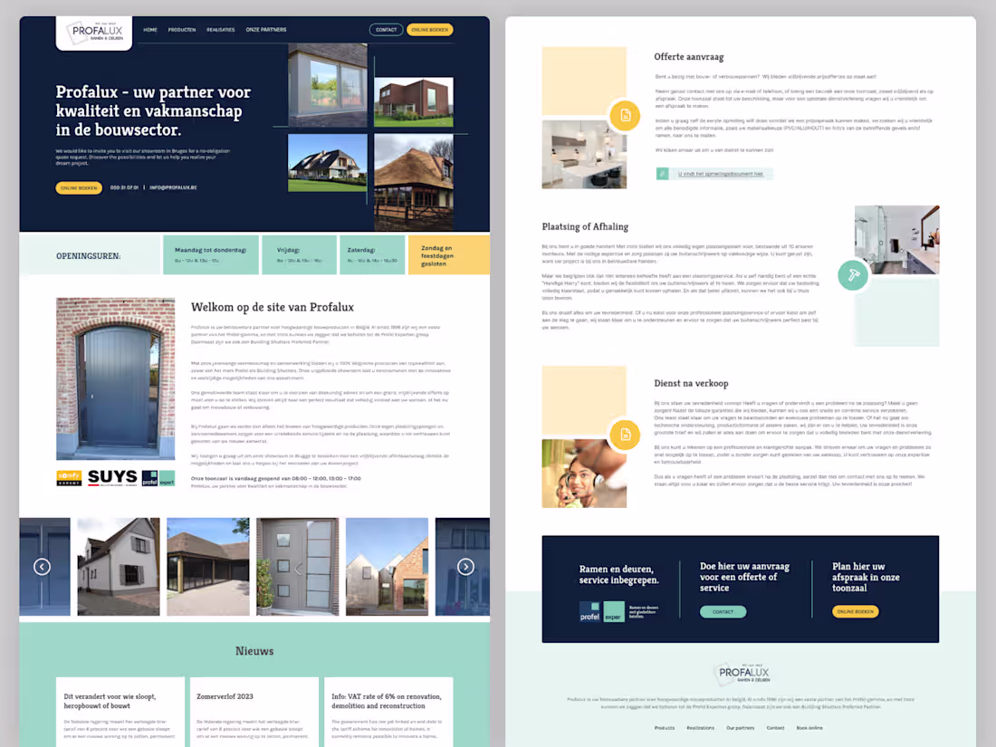
Profalux – Modern Home Renovation Website UI/UX Design
We designed a clean and conversion-focused website for Profalux, a Belgium-based home renovation company. The UI/UX emphasizes trust, clarity, and service presentation, helping users بسهولة explore renovation solutions. With a modern layout, intuitive navigation, and responsive design, the platform enhances user engagement and drives more inquiries.
https://www.figma.com/design/2ZbdwLZL1XCYYCYMK3ZeBb/profalux.be-backup
3
219
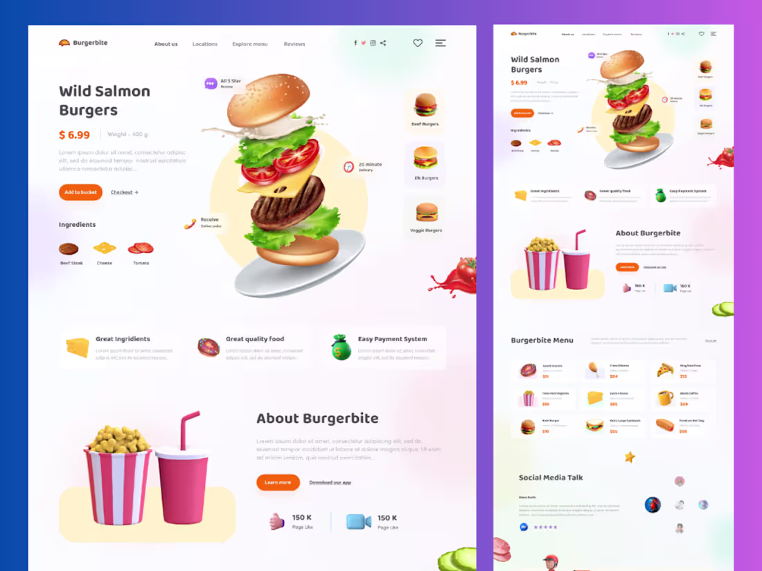
Burgerbite – Modern Food & Restaurant Website Template
Burgerbite is a stylish and user-friendly website template designed for food businesses, restaurants, and cafes. With a clean UI/UX, appetizing visuals, and smooth navigation, it helps showcase menus, highlight dishes, and drive online orders—creating a delightful digital experience for customers.
3
272
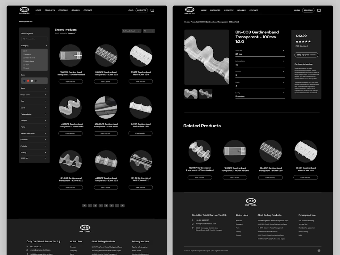
OZ-IS Dar Tekstil – Industrial Textile Website UI/UX Design in Figma
We crafted a clean and professional UI/UX design in Figma for OZ-IS Dar Tekstil, a globally recognized textile manufacturer. The project included the homepage, product listing, and detailed product pages—designed to clearly present their wide range of curtain tapes, technical textiles, and accessories. The interface focuses on structured navigation, product clarity, and a modern industrial aesthetic to enhance user experience and support global business communication.
3
207
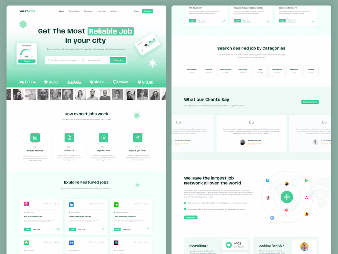
XpartUI Jobs – Job Portal UI/UX Design Template in Figma
XpartUI Jobs is a modern and scalable job portal UI/UX design template crafted in Figma. Designed for seamless hiring experiences, it features intuitive job search, advanced filtering, recruiter dashboards, and clean user flows—helping both employers and job seekers connect efficiently with a smooth and engaging interface.
3
292
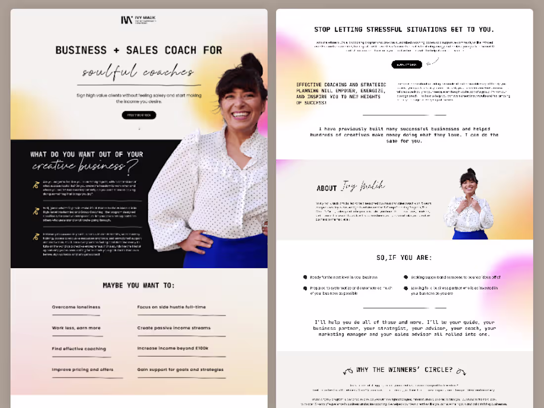
IVY Malik – UI/UX Landing Page Design in Figma for Soulful Business & Sales Coaching
We designed a high-converting landing page UI/UX in Figma for IVY Malik, tailored for soulful coaches who want to attract high-value clients without feeling salesy. The design focuses on clear messaging, emotional storytelling, and conversion-driven user flow—helping build trust, elevate personal branding, and guide users toward confident, income-generating actions.
3
252
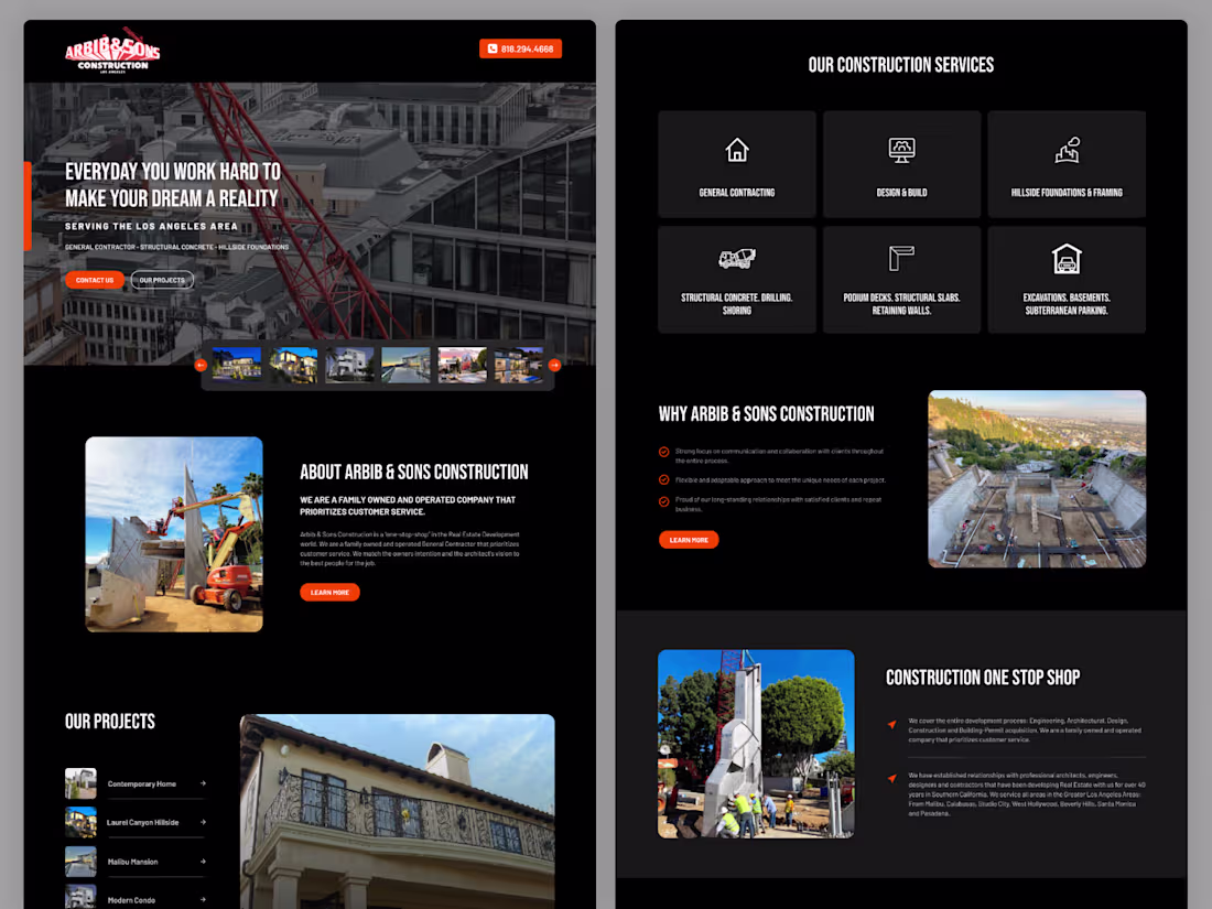
Large Construction website UI design and wordpress development
2
103
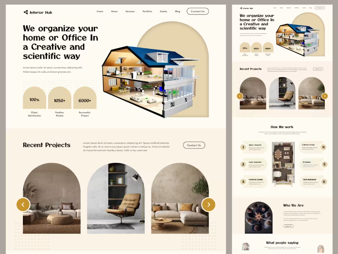
Interior Hub – Modern UI/UX Design for Interior & Home Services
Interior Hub is a clean and visually rich UI/UX design crafted in Figma for interior design studios and home service businesses. The design highlights project showcases, service listings, and client testimonials with a smooth, intuitive user flow—helping brands present their work elegantly and convert visitors into clients.
3
294
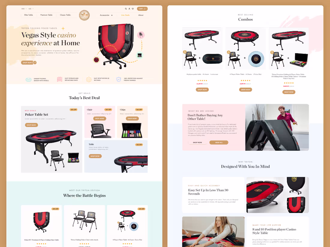
Triton Poker Tables E-commerce Website Design
Designed and developed an e-commerce website for Triton Poker Tables, a brand specializing in premium home poker tables. The project focused on creating a sleek, user-friendly shopping experience, with strong product presentation, intuitive navigation, and a modern design tailored to enthusiasts and casual players alike.
3
204
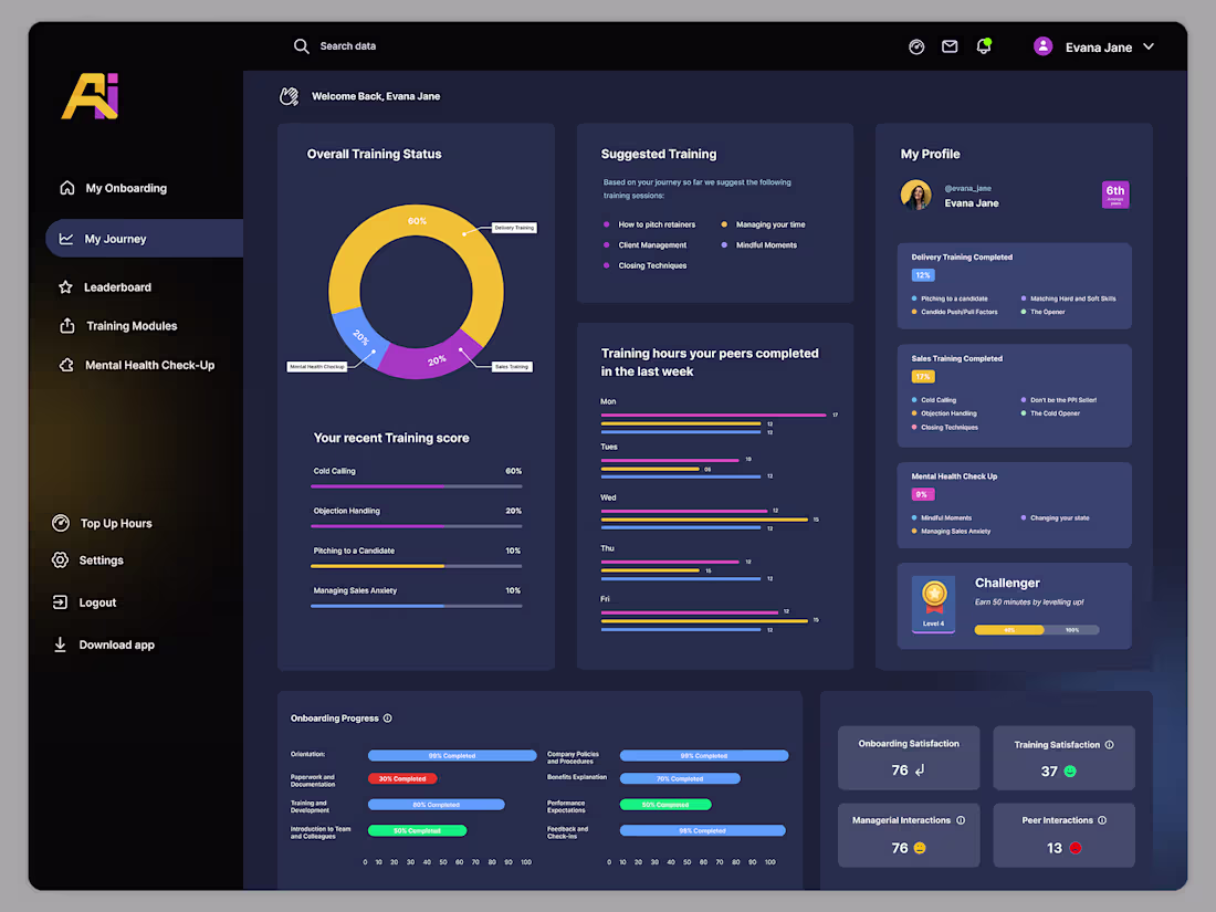
Admond – HR Training Platform UI/UX Design
We designed a modern and intuitive UI/UX for Admond, an HR training platform focused on seamless learning and workforce development. The design enhances user engagement with clean layouts, structured course flows, and easy navigation—making it simple for teams to access training, track progress, and improve skills efficiently.
2
166
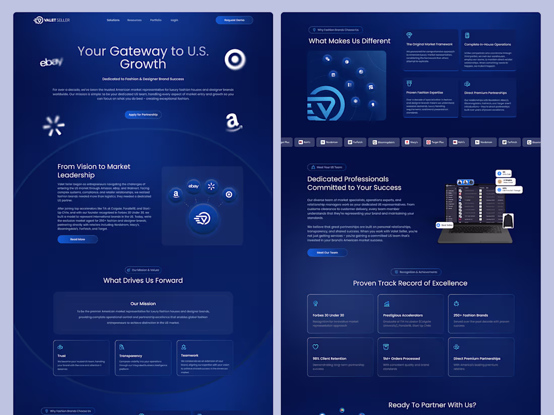
Valetseller is a modern CRM web application landing page designed to showcase seamless customer management solutions. The UI/UX focuses on clarity, efficiency, and conversion—highlighting key features, simplifying user journeys, and creating a professional, engaging first impression for businesses looking to streamline their sales and client relationships.
4
333
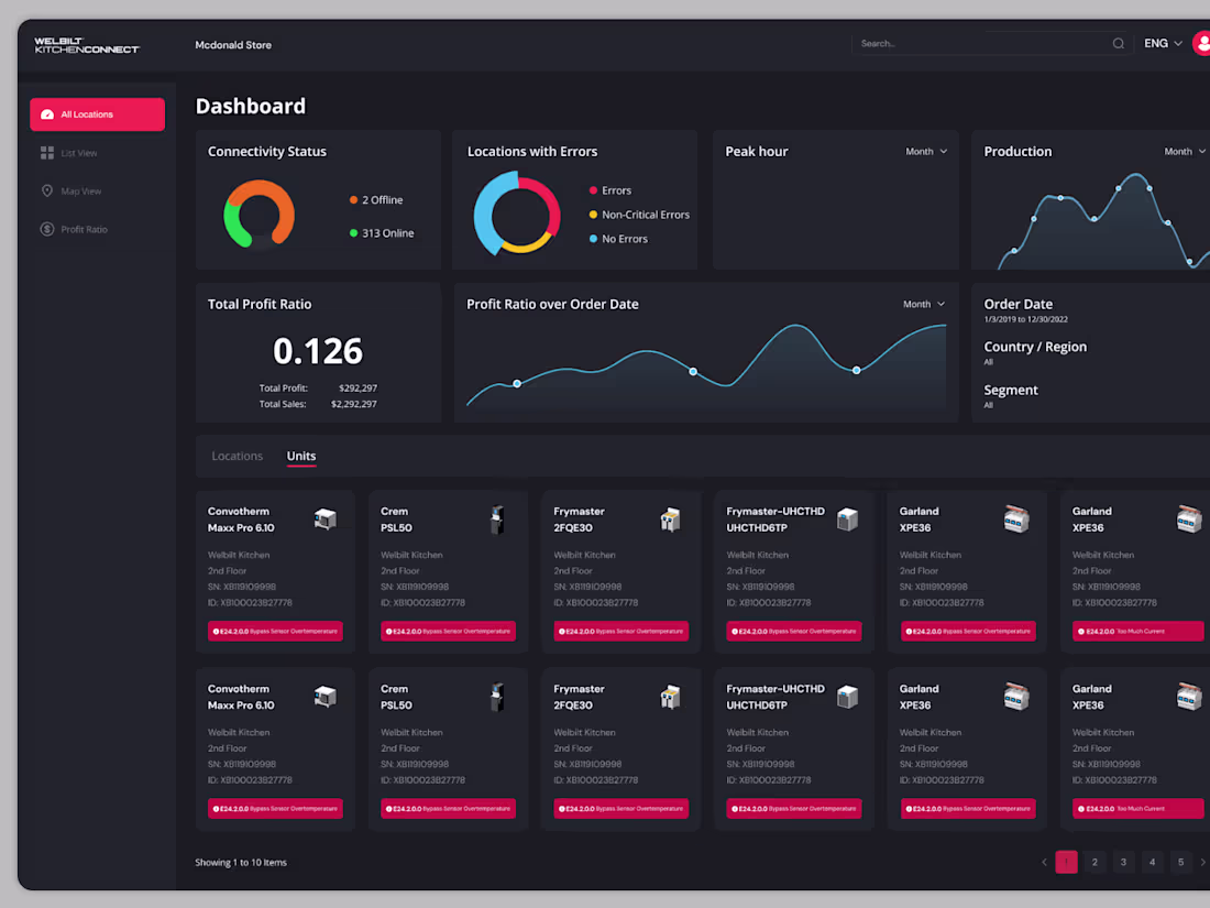
Title: Wellbit Kitchen – Smart Kitchen Dashboard Experience
Description:
Welcome to the Wellbit Kitchen dashboard, where smart technology meets modern culinary living. Designed to enhance kitchen connectivity and efficiency, this experience was crafted through a complete process including brand identity, style guide, UI research, and UI design. With a total of 48 thoughtfully designed screens, the dashboard delivers a seamless, intuitive, and engaging user journey for a smarter kitchen lifestyle.
Figma Preview:
https://www.figma.com/design/FGjsrR9g1mc59tpU8n0R4c/Welbilt-Kitchen-Connect?node-id=55-28522&p=f&t=9i3jGNs5Nj3NuYWX-0
2
163
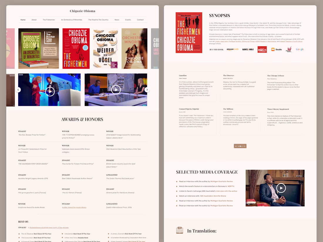
Chigozie Obioma – Author Website UI/UX Design in Figma
We designed a refined and engaging UI/UX website in Figma for Chigozie Obioma, showcasing his literary works and personal brand. The website features dedicated book sections, author videos, interviews, and testimonials—crafted with a clean layout and immersive storytelling approach to connect readers with the author’s journey and publications.
Author: https://chigozieobioma.com/
1
4
231
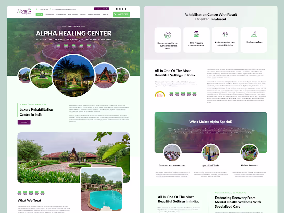
Alpha Healing Center UI/UX Design focuses on creating a calm, supportive, and user-friendly digital experience for a leading rehabilitation center in Gujarat, India. The design emphasizes clarity, accessibility, and trust—making it easy for users to explore treatment programs, understand holistic recovery approaches, and seek help with confidence. By combining modern aesthetics with empathetic design principles, the platform ensures a seamless and reassuring journey for individuals and their families.
4
308
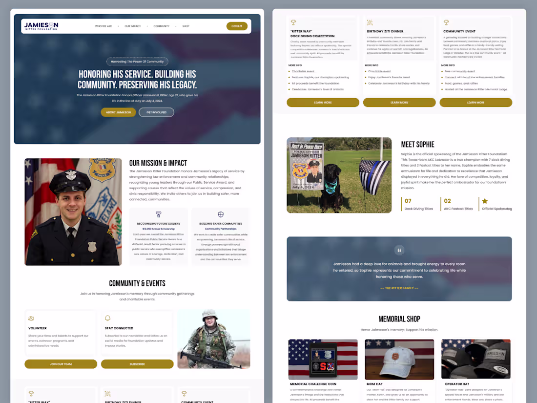
Jamieson Ritter Foundation Website Design & Framer Development
Designed and developed a 6-page website for the Jamieson Ritter Foundation, honoring Officer Jamieson R. Ritter’s legacy. The project included a complete Figma design system and a fully responsive Framer build, focused on storytelling, community engagement, and a clear presentation of the foundation’s mission and impact.
3
169
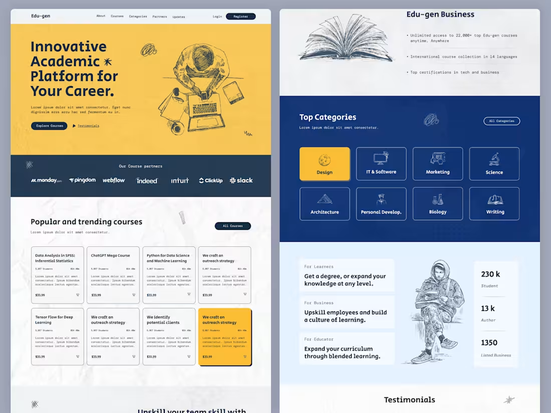
Edu-gen LMS Website – Online Learning Platform UI UX Design
Edu-gen LMS is a modern and user-friendly online learning platform UI/UX design created to deliver a seamless digital education experience. The template features a clean layout, intuitive navigation, and well-structured course system, making it easy for users to explore, enroll, and learn.
Designed for online academies, course platforms, and EdTech startups, Edu-gen LMS includes essential sections like course listings, instructor profiles, student dashboards, and learning interfaces, providing a complete solution for building a professional eLearning website.
3
292
Genesis Academy – Education Portal UI/UX Design in Figma
Genesis Academy is a modern education portal UI/UX design crafted in Figma, built to deliver a seamless learning experience for students and educators. The platform features structured course navigation, student dashboards, progress tracking, and interactive learning modules—designed with clarity, accessibility, and engagement in mind to support effective digital education.
5
237
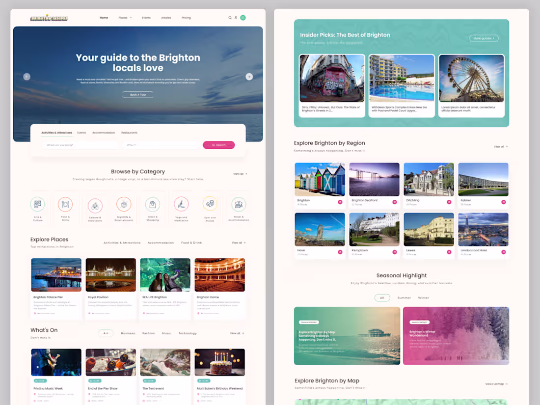
Brighton Insider – Modern Minimal UI Design
Designed a clean and modern 16-page UI for Brighton Insider, focusing on simplicity, clarity, and strong visual hierarchy. The interface uses minimal layouts, refined typography, and subtle interactions to create an intuitive and polished user experience.
3
154
Website design and development agency website design and development
1
161
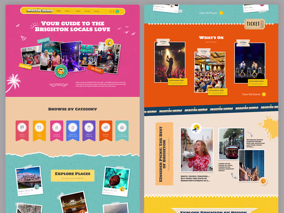
Brighton Insider – Fun & Quirky UI Design System
Designed a vibrant 16-page UI experience for Brighton Insider, blending playful visuals with intuitive usability. The project focuses on bold typography, engaging layouts, and a distinctive personality that captures the spirit of local discovery while maintaining a smooth user experience.
3
153
LMS website UI Design
2
6
296
Today I got a knock from a client on Fiverr.
He was looking for a car-selling website with unique, high-end features. I shared some of my previous relevant work, but instead of just explaining ideas… I decided to show him.
I gathered all the requirements, structured everything, and turned it into a detailed prompt. Then I used it to create a live demo experience, uploaded it to my server, and sent him the link.
After that, I simply asked:
“Did I capture everything correctly?”
His reaction?
He was genuinely surprised.
He told me it was beyond his expectations — and he was ready to move forward immediately.
👉 Outcome: https://xpartui.com/sw/timeless-machines.html
This is the power of not just telling… but showing.
#UIUX #WebDesign #Fiverr #ClientWork #DesignProcess #UXDesign #FreelanceLife
2
4
127
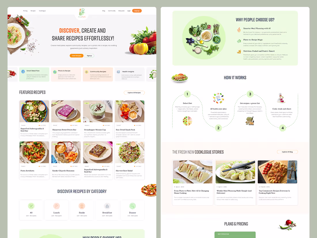
FlowChefs is a vibrant and user-friendly platform designed to help users discover, create, and share recipes effortlessly. With an intuitive UI/UX, it encourages seamless browsing, easy recipe creation, and community-driven sharing—making cooking more engaging, creative, and accessible for everyone.
4
314
Edujar 2 is an intuitive Learning Management System (LMS) platform designed to deliver engaging and organized online education. It provides structured courses, interactive lessons, and user-friendly tools to help learners and educators connect, learn, and grow efficiently.
1
3
272
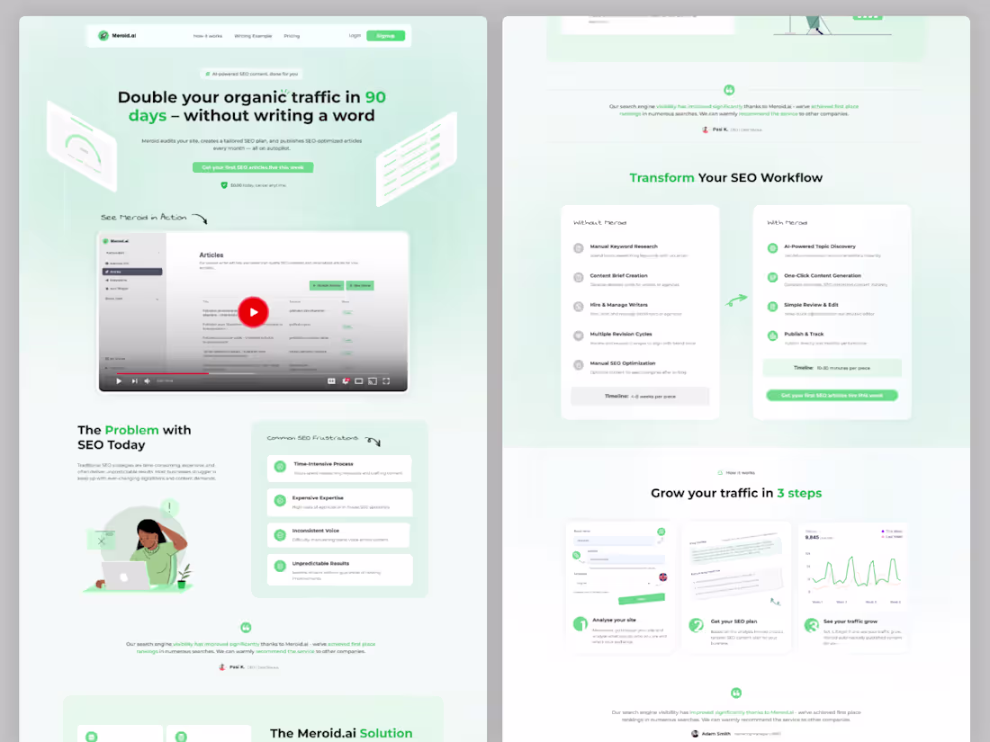
Meroid.ai (http://Meroid.ai) – AI-Powered Marketing Solution
Meroid.ai (http://Meroid.ai) is an advanced AI-driven marketing platform designed to simplify and supercharge content creation for businesses. From generating compelling titles to crafting engaging paragraphs and social media posts, Meroid.ai (http://Meroid.ai) helps brands communicate effectively with their audience.
The platform also includes smart tag and hashtag generation, ensuring maximum reach and visibility across digital channels. Built with efficiency and growth in mind, Meroid.ai (http://Meroid.ai) empowers businesses to boost engagement, save time, and scale their marketing efforts with ease.
1
98
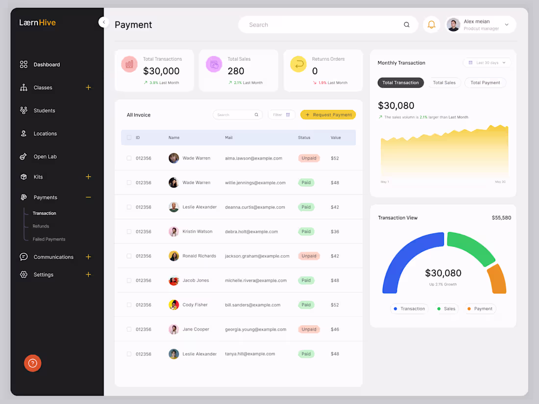
Learnhive is a comprehensive LMS dashboard system designed for students from Grade 5 to Grade 11, tailored specifically for both admins and parents. It features a complete set of 31 dashboards, offering powerful tools for monitoring academic progress, managing courses, tracking performance, and enhancing communication—creating a well-structured and engaging learning environment.
1
4
295
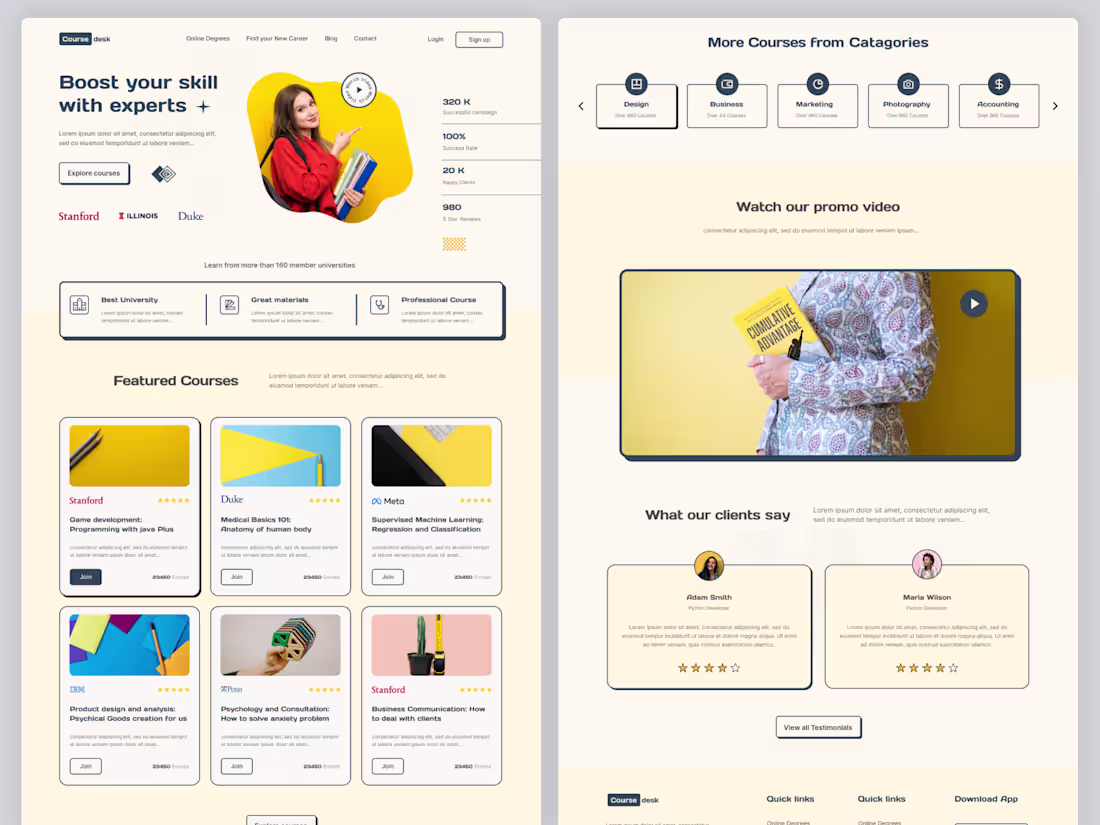
Coursedesk is an intuitive Learning Management System (LMS) platform designed to deliver engaging and organized online education. It provides structured courses, interactive lessons, and user-friendly tools to help learners and educators connect, learn, and grow efficiently.
3
275
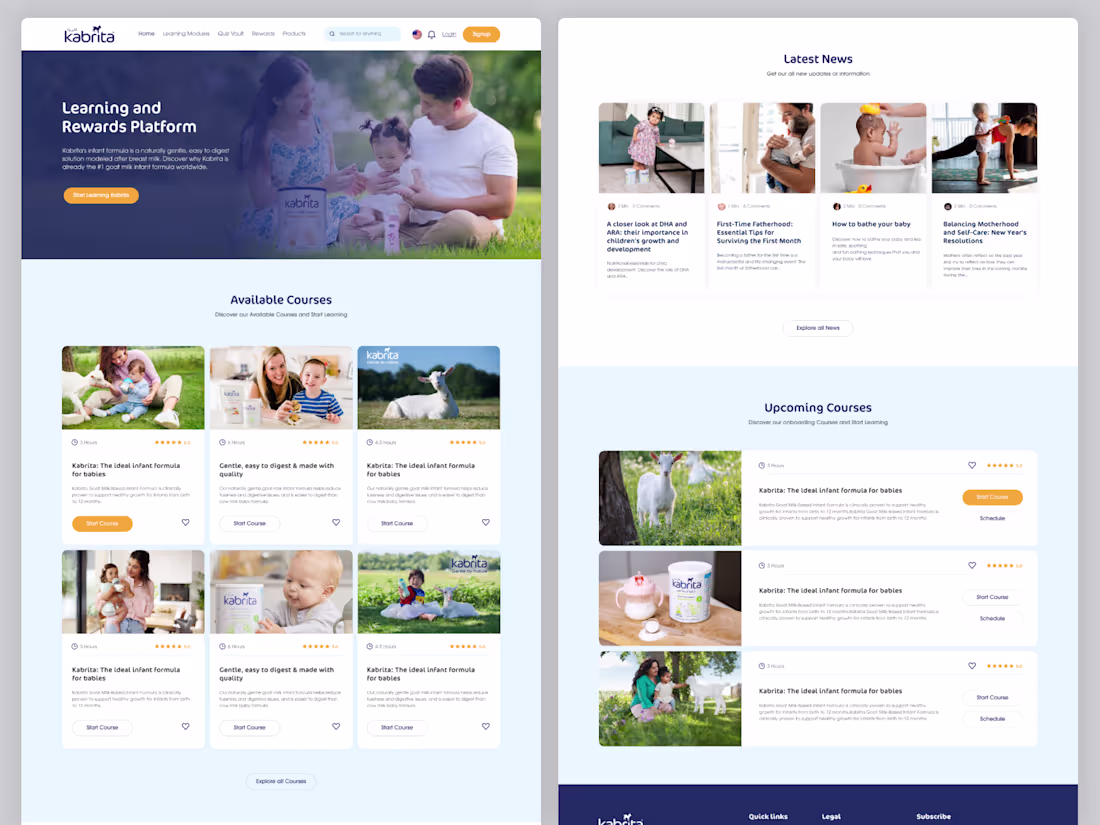
Kabrita LMS Website UI/UX Design is a clean and user-centered learning platform interface crafted to deliver a seamless educational experience. The design focuses on intuitive navigation, visually appealing layouts, and accessible course structures, ensuring users can بسهولة explore content, track progress, and stay engaged throughout their learning journey.
3
271
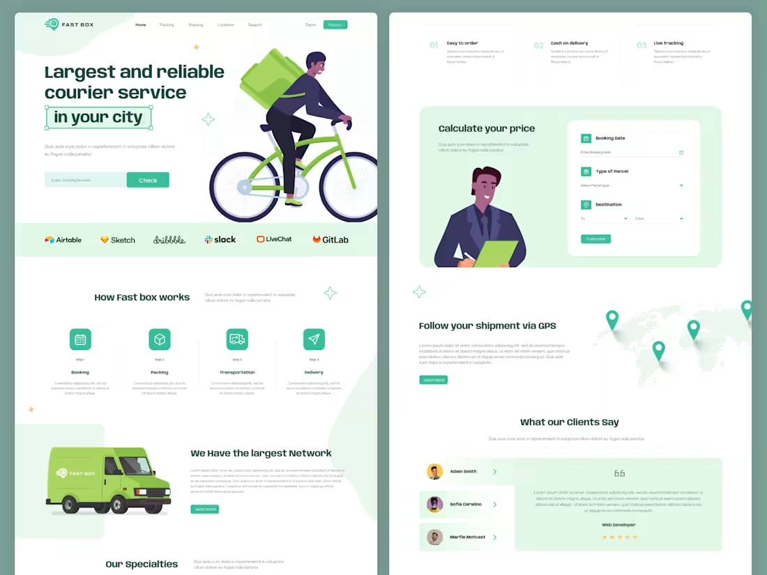
Courier Service & Product Delivery Website UI UX – Figma Template
Courier Service & Product Delivery Website UI UX Design is a modern and professional Figma website template designed for courier companies, delivery services, logistics businesses, and product delivery platforms.
This template is built to help businesses present their delivery services, logistics solutions, and shipping operations in a clean and user-friendly way. The layout focuses on fast service communication, easy navigation, and clear call-to-action sections to improve customer engagement and conversions.
2
256
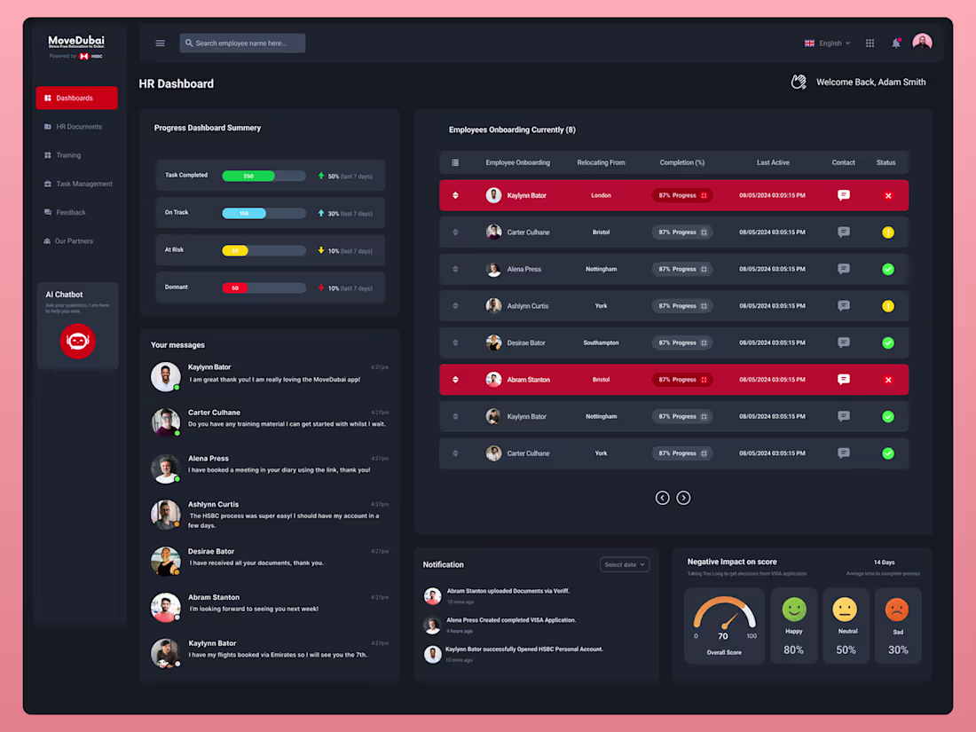
Move Dubai – Dark CRM Dashboard UI/UX Design
A sleek and modern dark-themed CRM dashboard designed for Move Dubai, focused on clarity, performance, and usability. Crafted in Figma, the UI delivers a clean data hierarchy, intuitive navigation, and visually engaging components—helping teams manage leads, track performance, and streamline workflows with efficiency and style.
1
170
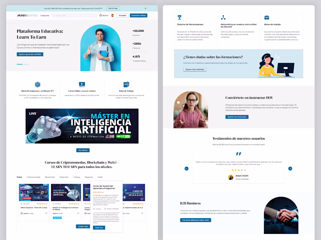
Mundo Crypto is a modern Learning Management System (LMS) website designed to simplify cryptocurrency education. It offers structured tutorials, beginner-friendly guides, and interactive learning experiences to help users understand blockchain, trading, and digital assets with ease.
2
252
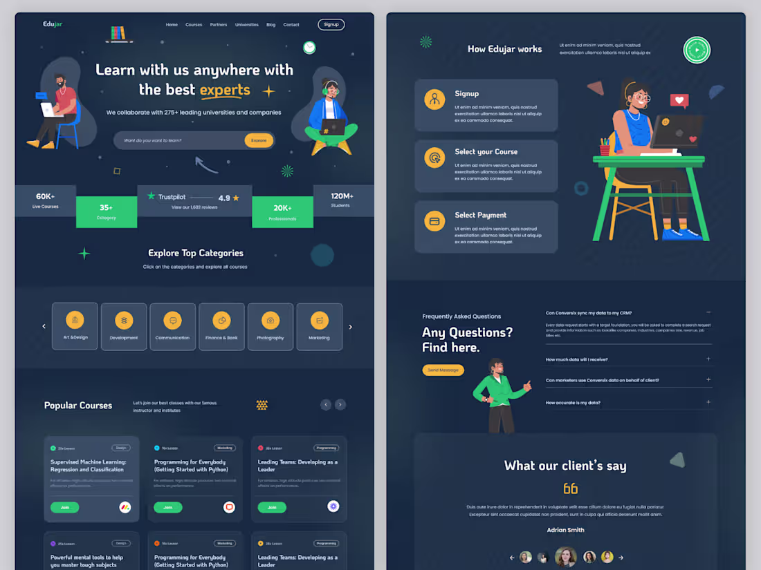
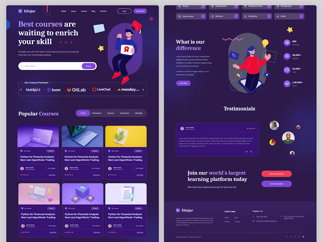
Edujar is an intuitive Learning Management System (LMS) platform designed to deliver engaging and organized online education. It provides structured courses, interactive lessons, and user-friendly tools to help learners and educators connect, learn, and grow efficiently.
1
256
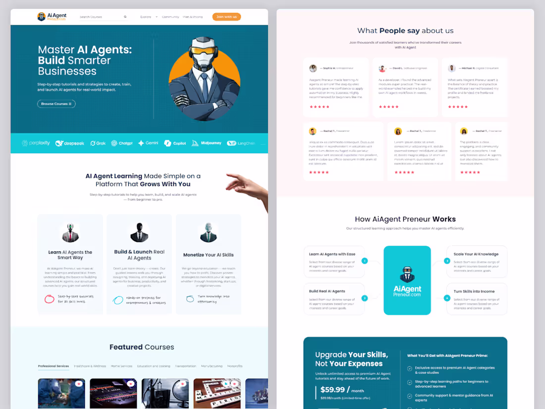
AI Agent Preneur – LMS Website UI UX Design
AI Agent Preneur is a modern LMS website design built for an AI-focused learning platform that teaches users how to create and use AI agents. The design delivers a smooth and engaging experience with a clean interface, structured course layout, and intuitive navigation.
Focused on practical learning and future-ready skills, the platform includes features like course modules, tutorials, dashboards, and learning progress tracking, making it ideal for users exploring AI tools, automation, and digital entrepreneurship.
0
254
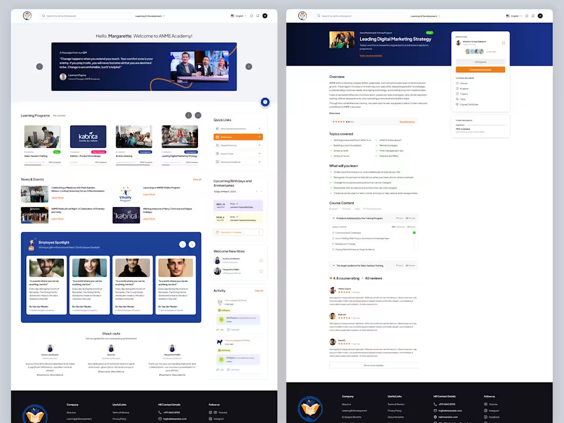
ANME Academy – Online Education Website UI UX Design
ANME Academy is a modern and user-friendly online education platform UI/UX design created to deliver a seamless digital learning experience. The project focuses on building a structured and engaging interface for students, instructors, and educational institutions.
The design is crafted with a clean layout, intuitive navigation, and well-organized course structure, allowing users to easily explore courses, access learning materials, and manage their learning journey.
0
260
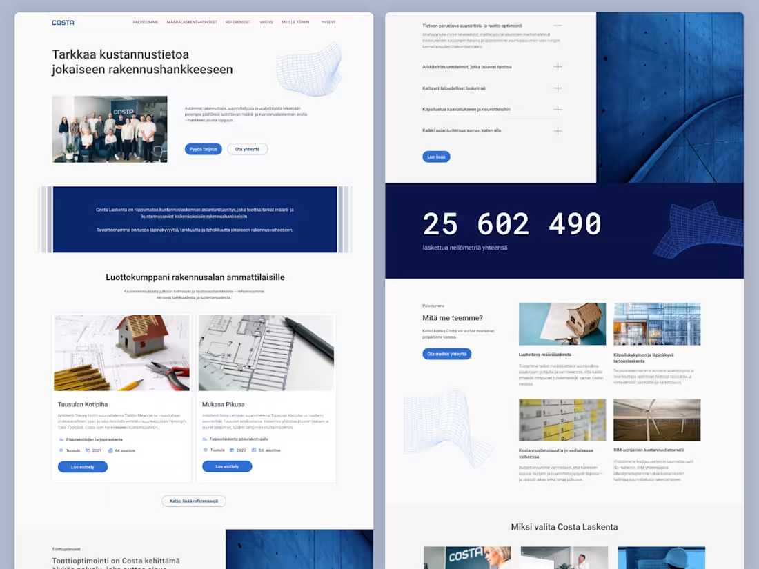
Costa – Construction Cost Intelligence Platform | Website Design (Figma)
Costa is a modern digital platform designed for a Finland-based cost estimation and construction consultancy firm. Built around the idea of delivering accurate cost insights for every construction project, this project focuses on clarity, trust, and data-driven decision-making.
Costa empowers developers, designers, and contractors to make better decisions through reliable quantity surveying and cost estimation services—supporting projects from early planning to final execution. The platform communicates complex information in a clear and structured way, ensuring users can easily understand project costs, scope, and optimization opportunities.
A key feature highlighted in the experience is Tonttioptimointi, Costa’s proprietary intelligent service that helps clients optimize land use and maximize the profitability of residential developments. This positions Costa not just as a service provider, but as a strategic partner in construction planning.
The design approach emphasizes a clean, professional, and minimal aesthetic, reflecting precision and trust. Strong grid systems, clear typography, and well-organized content blocks ensure a seamless user experience tailored to industry professionals.
This Figma website project was crafted with scalability and development in mind, featuring a fully structured, design system-ready layout that allows for efficient handoff and implementation.
Costa represents a balance of technical expertise and modern digital design—bringing transparency, accuracy, and efficiency to every stage of the construction process.
0
283
Food or restaurant, cafe, or chef's website design
2
3
231
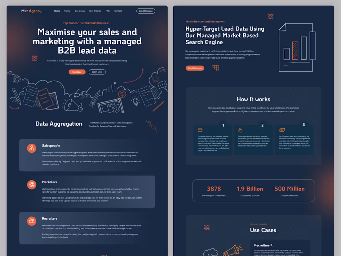
MKET Agency – B2B Sales & Marketing Website UI UX Design
MKET Agency is a modern and conversion-focused website design created for a B2B lead generation and marketing service. The platform helps businesses maximize their sales and marketing performance with managed B2B lead data, enabling smarter targeting and better customer acquisition.
The design features a clean corporate layout, strong call-to-actions, and a structured presentation of services, making it ideal for agencies focused on lead generation, data-driven marketing, and business growth solutions.
1
236
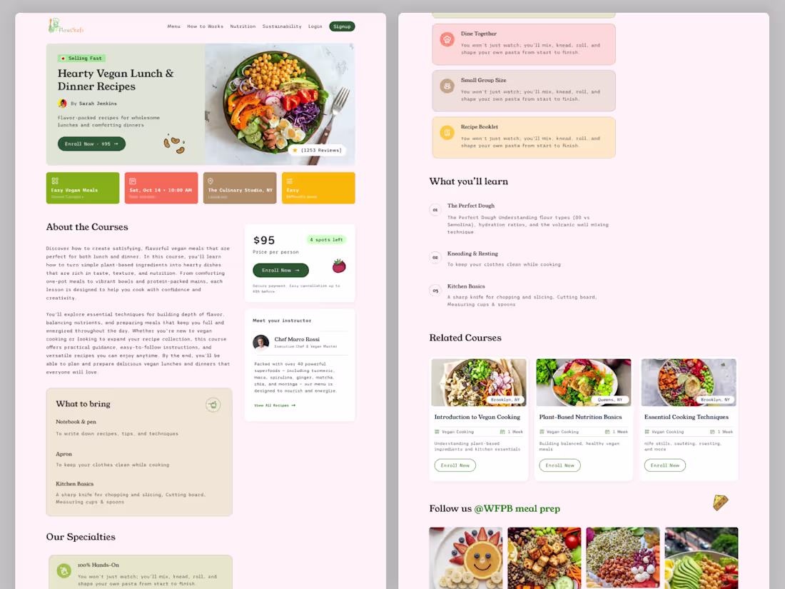
FlowChefs – Vegan Food Platform 🌱
We recently designed FlowChefs, a modern and user-friendly platform focused on vegan food lovers. This project includes a complete website and dashboard experience, combining recipe discovery, food delivery, and engaging blog content in one seamless ecosystem.
Our goal was to create a visually appealing, easy-to-navigate interface that enhances user experience while promoting healthy, plant-based living. From intuitive browsing to smooth order management, every detail was crafted with clarity, functionality, and aesthetic balance in mind.
2
331
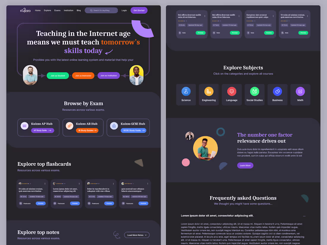
Kuizzo LMS Website – Online Learning Platform UI UX Design
Kuizzo LMS is one of our largest and most advanced learning management system (LMS) website designs, built to support modern digital education. Guided by the vision “Teaching in the Internet age means we must teach tomorrow’s skills today,” the platform delivers a seamless and engaging learning experience.
The design focuses on intuitive navigation, structured course management, and user-friendly dashboards, enabling students and instructors to interact efficiently. With a modern UI and scalable layout, Kuizzo LMS is ideal for online academies, training platforms, and digital education ecosystems.
2
215
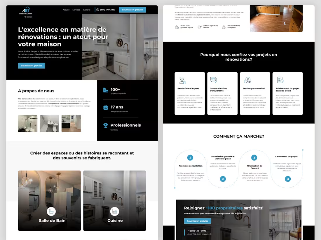
ARJ Construction – Website UI/UX Design
We designed a modern and professional website for ARJ Construction, a Canada-based company, focusing on clarity, trust, and strong visual presentation. The project includes 6 fully designed pages along with responsive mobile versions, ensuring a seamless experience across all devices.
Our approach emphasized clean layout, intuitive navigation, and structured content hierarchy, helping users easily explore services and build confidence in the brand. The design is crafted in Figma with a developer-ready system, making the transition from design to development smooth and efficient.
Contact – XpartUI Agency
📧 Email: hello@xpartui.com
(mailto:hello@xpartui.com)📱 WhatsApp: +8801536101044
2
248
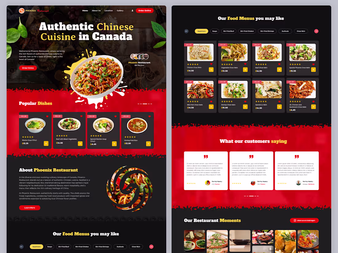
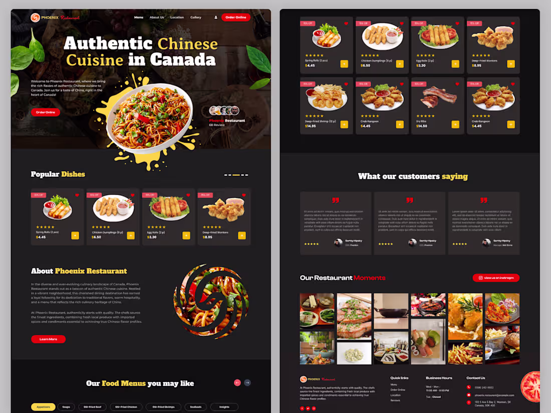
Phoenix Restaurant – Homepage Design (Figma)
Phoenix Restaurant is a warm and inviting digital experience designed for an authentic Chinese dining brand based in Canada. This project focuses on capturing the richness of traditional Chinese cuisine while presenting it through a modern and accessible web experience.
Centered around the message “Authentic Chinese Cuisine in Canada,” the website introduces visitors to a restaurant that blends cultural heritage with contemporary dining. Phoenix Restaurant is positioned as a trusted culinary destination known for its flavorful dishes, warm hospitality, and commitment to preserving authentic Chinese cooking traditions.
Our design approach focused on creating a visually rich and appetizing homepage experience that immediately reflects the essence of the restaurant. Strong imagery, elegant typography, and balanced composition were used to evoke a sense of tradition, warmth, and quality.
2
2
293
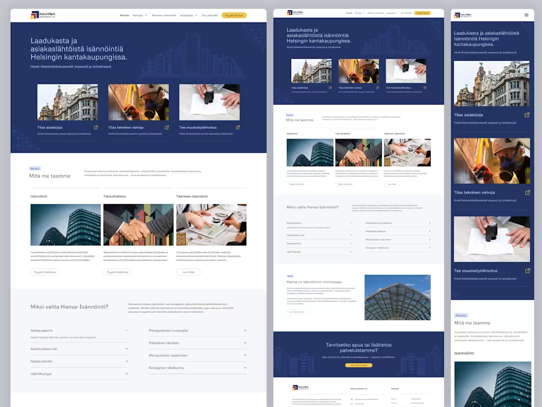
HANSA Isännöinti Oy – Property Management Website | Figma Design
HANSA Isännöinti Oy is a Helsinki-based property management company focused on delivering high-quality, customer-centric services in the heart of the city. This project was designed to reflect the company’s core values—transparency, reliability, and personalized service—while presenting complex property management solutions in a clear and accessible way.
The platform communicates HANSA’s mission to provide comprehensive property management services for housing companies and residents. From administrative operations and financial management to technical maintenance, every aspect is handled with professionalism and efficiency. A key feature of the service is enabling users to access property documents quickly and effortlessly, enhancing convenience through modern digital solutions.
2
282
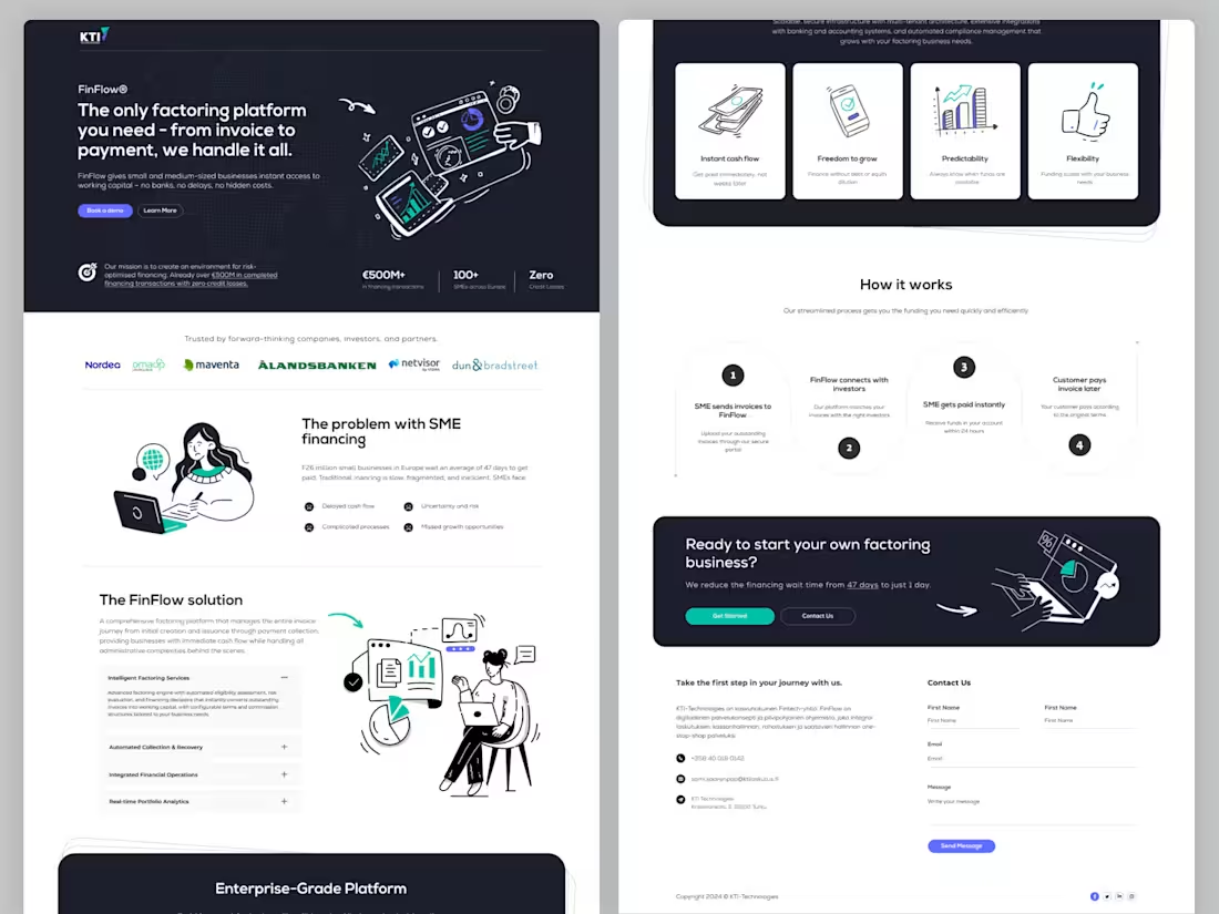
KTI – FinFlow Factoring Platform | Homepage Design (Figma)
FinFlow is a modern financial platform designed to simplify and accelerate cash flow for small and medium-sized businesses. Built around the promise of “the only factoring platform you need – from invoice to payment,” this project focuses on transforming complex financial processes into a seamless digital experience.
The platform addresses a critical challenge in SME financing—delayed payments. With millions of businesses across Europe waiting an average of 47 days to get paid, traditional financing methods remain slow, fragmented, and inefficient. FinFlow offers a smarter alternative by providing instant access to working capital, eliminating the need for banks, long approval cycles, and hidden costs.
2
281
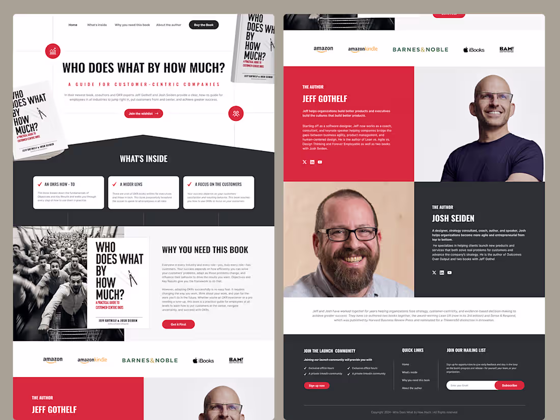
Book Landing Page UI/UX Design – “Who Does What By How Much?”
This project focuses on designing a modern and conversion-driven landing page for the book “Who Does What By How Much?”. The goal was to create a visually engaging experience that effectively showcases the book’s value, highlights key insights, and encourages users to take action.
The design combines strong typography, bold color contrast, and structured layouts to guide users through the content—from introduction and key takeaways to author profiles and purchase options. Special attention was given to user flow and readability, ensuring visitors can easily explore the book’s benefits and connect with the authors.
Key features include:
Clean and modern landing page layout
Clear content hierarchy for better readability
Engaging author showcase sections
Strategic call-to-action placements for conversions
Responsive and user-friendly design approach
This project reflects a balance between storytelling and usability, delivering a seamless experience that supports both branding and marketing goals.
2
286
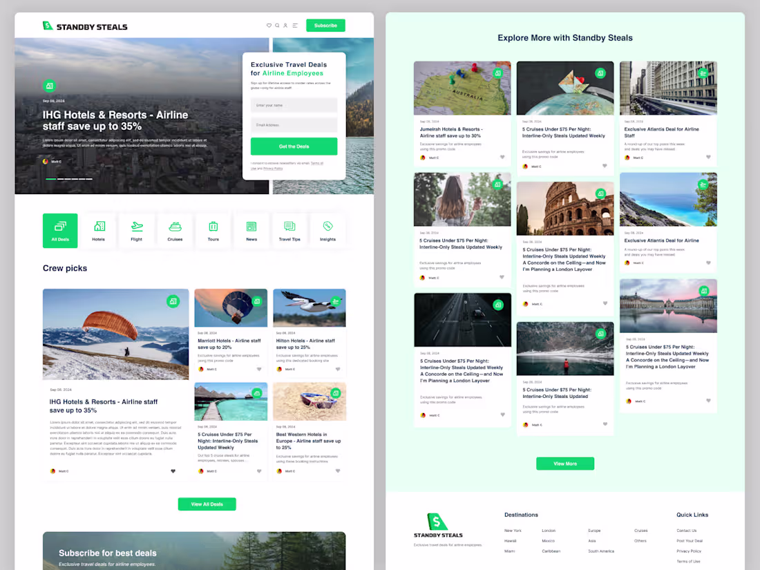
Standby Steal – Travel Deals Blog Platform | Website Design (Figma)
Standby Steal is a niche travel platform designed to serve airline employees with access to exclusive travel deals and curated content. Built around the idea of unlocking smarter, more affordable travel, the platform combines deal discovery with engaging blog content to inspire and inform.
With the core message “Exclusive Travel Deals for Airline Employees,” the experience is tailored for a specific audience that frequently travels and seeks better value on hotels, tours, transportation, and more. Users can easily explore destinations and uncover savings through a clean, intuitive interface.
2
247
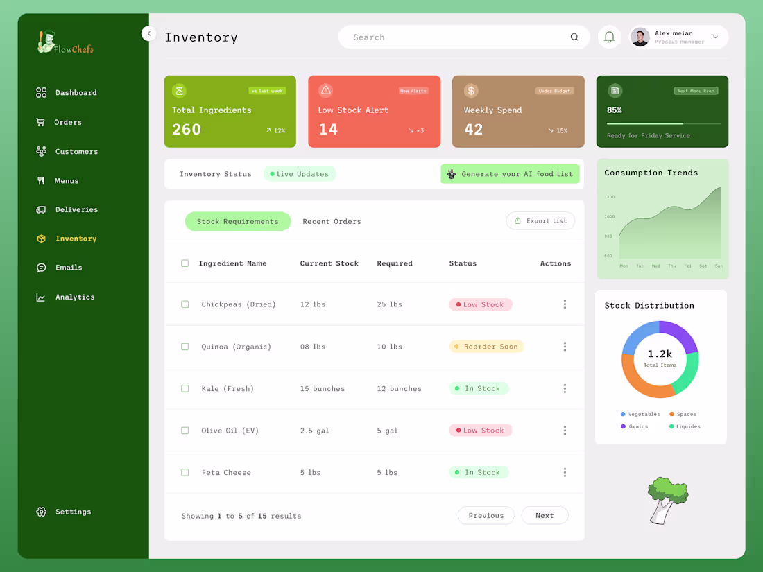
We recently designed FlowChefs, a modern and user-friendly platform focused on vegan food lovers. This project includes a complete website and dashboard experience, combining recipe discovery, food delivery, and engaging blog content in one seamless ecosystem.
Our goal was to create a visually appealing, easy-to-navigate interface that enhances user experience while promoting healthy, plant-based living. From intuitive browsing to smooth order management, every detail was crafted with clarity, functionality, and aesthetic balance in mind.
1
280
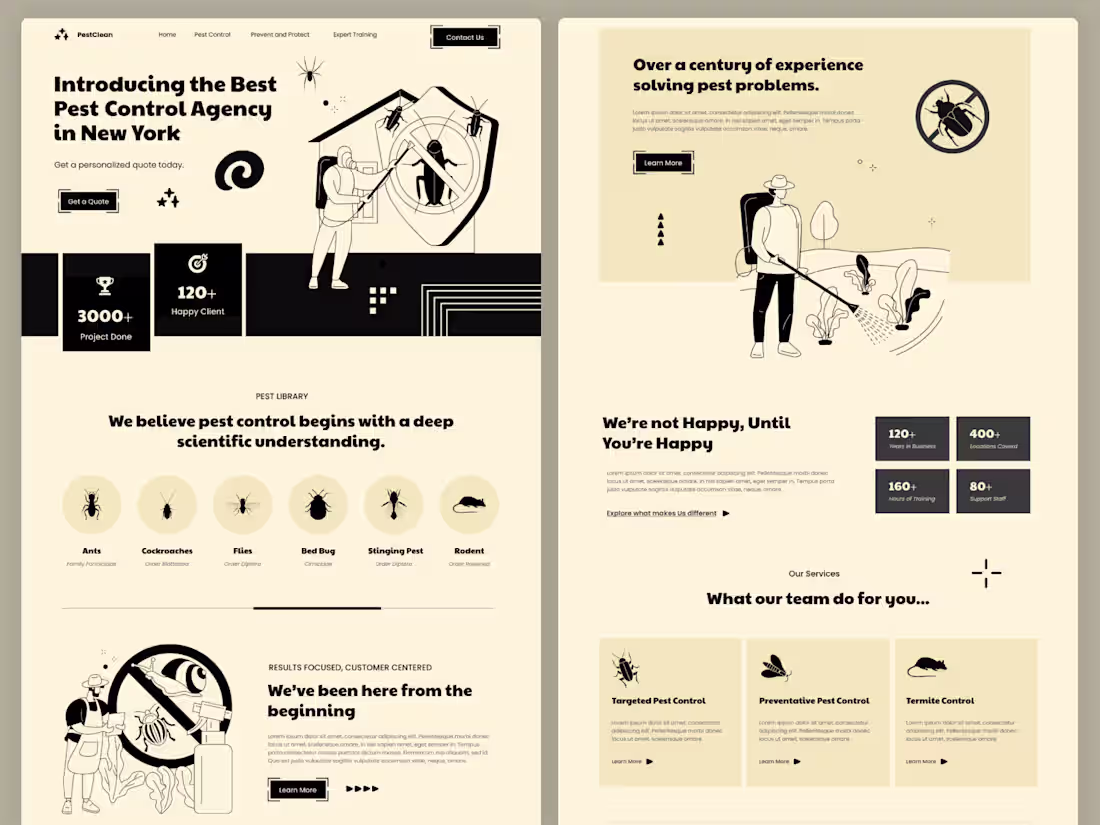
Pest Control Service Website UI UX – Figma Template
Pest Control Service Website UI UX Design is a modern and professional Figma website template designed for pest control companies, cleaning services, exterminators, and home maintenance businesses.
This template features a clean, service-focused layout that helps businesses clearly present their pest control solutions, service areas, and expertise while building trust with customers. It is ideal for companies offering termite control, mosquito control, rodent removal, home sanitization, and commercial pest management services.
The design includes essential sections such as service listings, treatment details, pricing plans, testimonials, service areas, and contact/booking forms, making it easy for customers to understand services and request appointments.
1
181
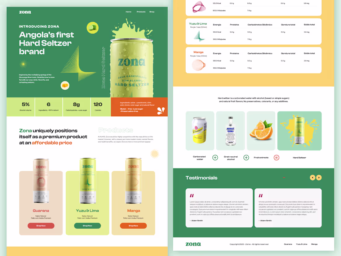
Zona – Angola’s First Hard Seltzer Brand | Website Design (Figma)
Zona is a bold and refreshing digital experience crafted for Angola’s first hard seltzer brand—an identity rooted in nature, culture, and a new generation of consumers. Inspired by the revitalizing springs of Huambo that feed the Okavango River basin, this project translates the essence of freshness, vitality, and connection into a modern web experience.
Our design approach focused on capturing Zona’s core philosophy: redefining how people have fun through easy-drink, flavorful, and refreshing beverages. The visual language blends clean layouts with vibrant accents, reflecting both the purity of natural ingredients and the energy of a multicultural Africa.
At its heart, Zona is more than a beverage brand—it’s a movement. One that celebrates creativity, community, and the diverse ecosystem of Angola. From creatives and athletes to thinkers and innovators, the brand aims to resonate with a new generation seeking identity, connection, and authenticity.
This Figma website project was designed with scalability and usability in mind, featuring 6 fully designed pages in both desktop (1440px) and mobile versions. The layouts are clean, modern, and development-ready, with well-structured components and a consistent design system to ensure seamless handoff.
Through this project, we aimed to build not just a website, but a digital extension of Zona’s vision—fresh, inclusive, and deeply connected to its roots.
0
259
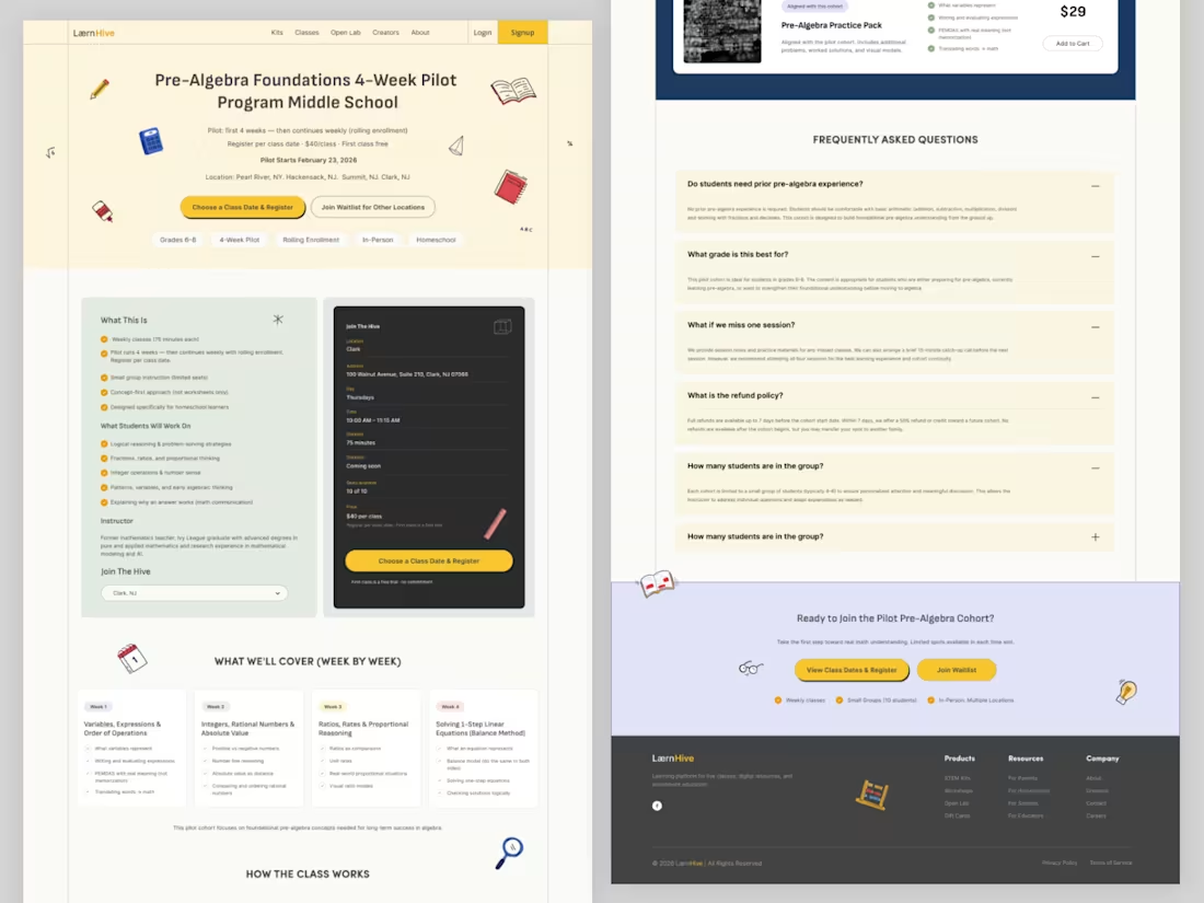
LærnHive – STEM Learning Platform | Website Design (Figma)
LærnHive is an engaging and concept-driven digital platform designed to make STEM education more accessible, interactive, and meaningful for middle school learners. Built around the idea of “Pre-Algebra, done the right way,” this project focuses on simplifying complex concepts through structured learning and hands-on exploration.
The platform is tailored במיוחד for homeschool students in grades 5–8, combining concept-first pre-algebra classes, interactive math open labs, and hands-on STEM kits that bring science and engineering to life—without relying on screens. From building experiments to testing real-world ideas, LærnHive encourages active learning and curiosity-driven thinking.
A key highlight of the platform is the Pre-Algebra Foundations 4-Week Pilot Program, designed to strengthen core mathematical understanding while keeping students engaged through practical applications and guided experiences.
0
225
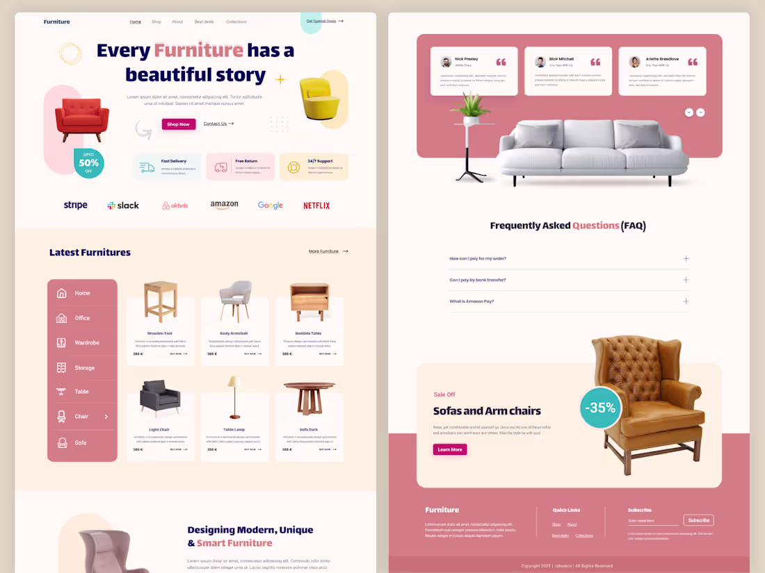
Furniture Shop eCommerce Website UI UX – Online Furniture Store Figma Template
Furniture Shop eCommerce Website UI UX Design is a modern and elegant Figma website template designed for online furniture stores, home decor brands, interior design shops, and eCommerce businesses.
This template features a clean, minimal, and product-focused layout that helps showcase furniture items in a visually appealing way while providing a smooth shopping experience. It is ideal for businesses selling sofas, chairs, tables, beds, home decor items, and modern interior products.
The design includes essential eCommerce sections such as featured products, product categories, product details, shopping cart, customer reviews, and promotional banners, allowing you to create a complete online furniture store.
With a focus on user experience,
0
169